Project
LifeWave Brand Platform & Visual System
Client
LifeWave
Sector
Global Wellness Technology
Role
Lead Designer / Art Direction
Scope of Works
Brand Film Visualization
Visual Identity System
Typography & Color System
Icon System
Imagery Direction
Global Templates
Packaging Exploration
LifeWave Brand Platform & Visual System
Client
LifeWave
Sector
Global Wellness Technology
Role
Lead Designer / Art Direction
Scope of Works
Brand Film Visualization
Visual Identity System
Typography & Color System
Icon System
Imagery Direction
Global Templates
Packaging Exploration
LifeWave is a global wellness technology company seeking to modernize its brand presence and establish greater credibility, clarity, and consistency across markets.
I led the visual rebranding effort, beginning with the cinematic campaign Be The Light, which established the emotional and conceptual foundation for the new direction. From this platform, a cohesive, science-led visual system was developed to elevate the brand’s tone while remaining scalable across products, regions, and languages.
The result is a structured yet flexible identity capable of supporting corporate communications, product marketing, and global localization at scale.
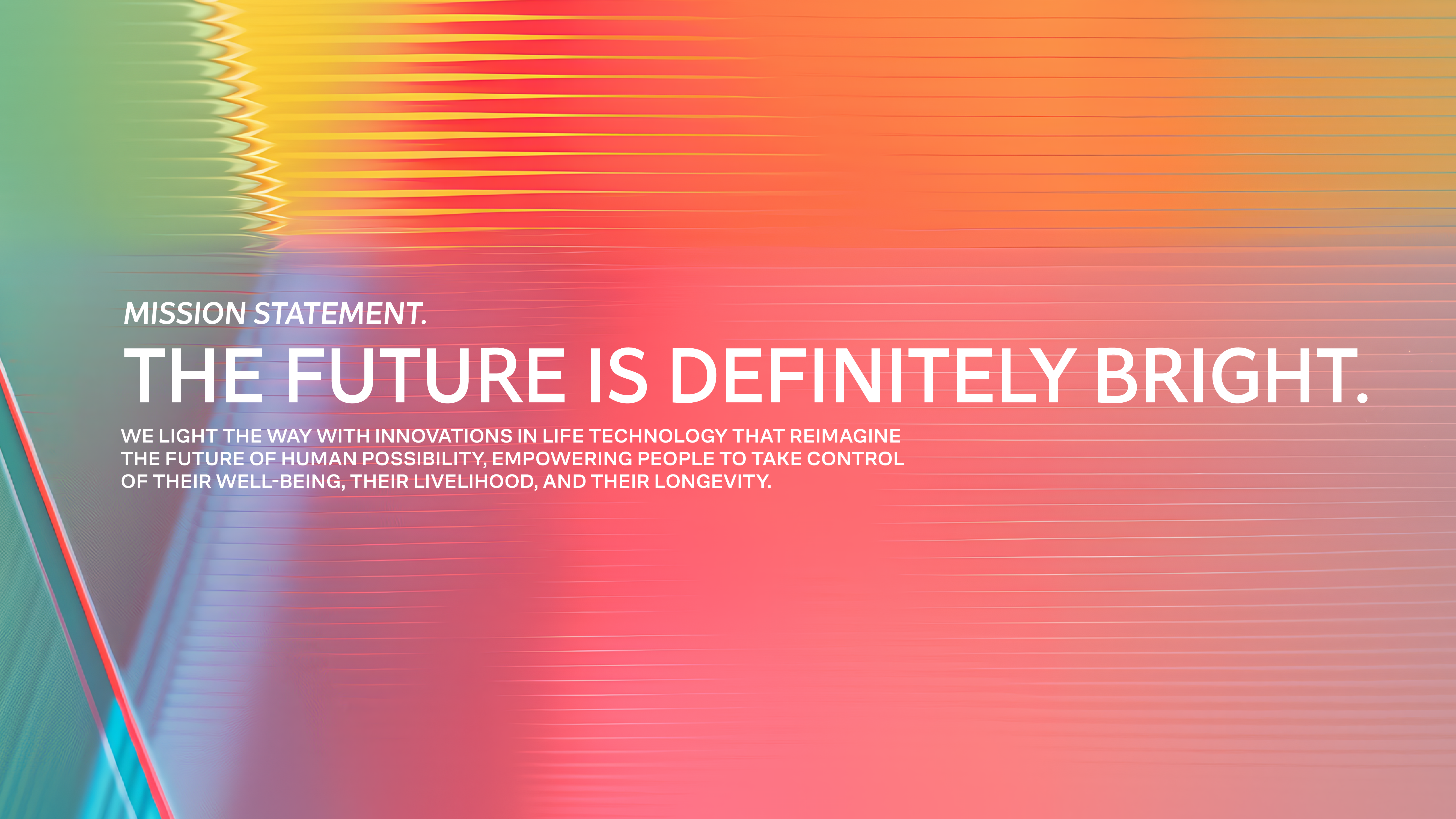
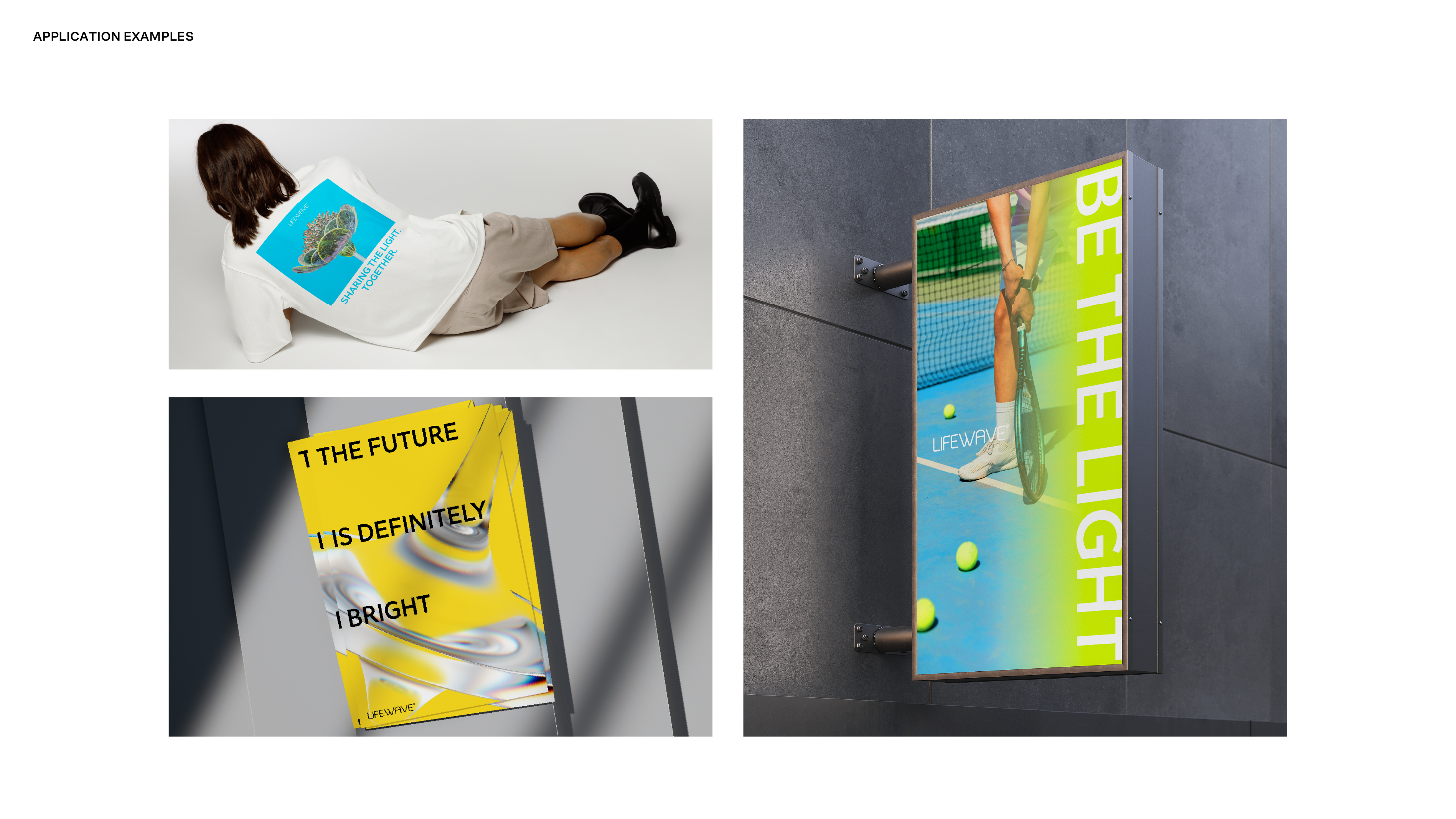
The rebrand began with a cinematic brand film titled Be The Light. Working directly with the Creative Director, I translated the script into a complete visual storyboard, defining mood, pacing, lighting, typography, and narrative structure.
The concept reframed LifeWave around the metaphor of light as both product technology and human potential. Strong contrast, illumination, and restrained typographic statements created a tone that felt forward-looking, confident, and intentional.
This campaign became the emotional foundation of the brand refresh and established internal momentum for a broader transformation.


Design Direction
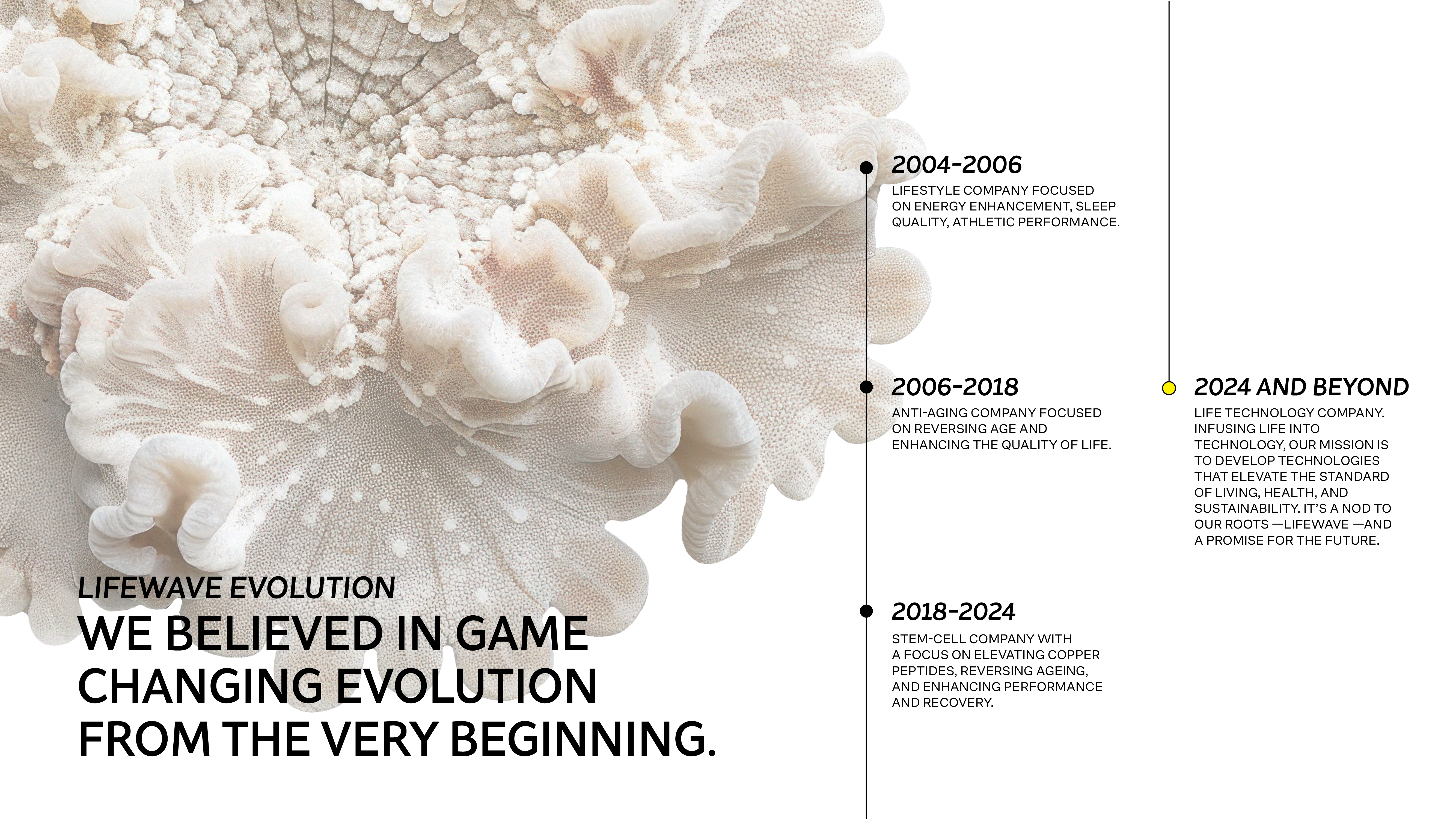
Repositioning LifeWave as a science-led life technology brand
The visual system was designed to move LifeWave away from outdated wellness tropes toward a more refined, science-led identity. The goal was to establish credibility, confidence, and long-term scalability, supporting a global brand with a clear and modern visual foundation.
Brand Vision
LifeWave’s evolving mission required a visual language that could communicate progress, longevity, and innovation. The new brand vision reframes LifeWave as a life technology company, focused on elevating human potential through science rather than traditional wellness marketing.
This vision informed the overall system across typography, color, imagery, and composition.
Visual System
The visual system emphasizes clarity, restraint, and structure. Typography, color, and composition were used intentionally to communicate credibility and confidence, reducing visual noise while creating a cohesive and modern brand presence.
Every element was designed as part of a scalable system to support global use across digital, print, and regional markets.
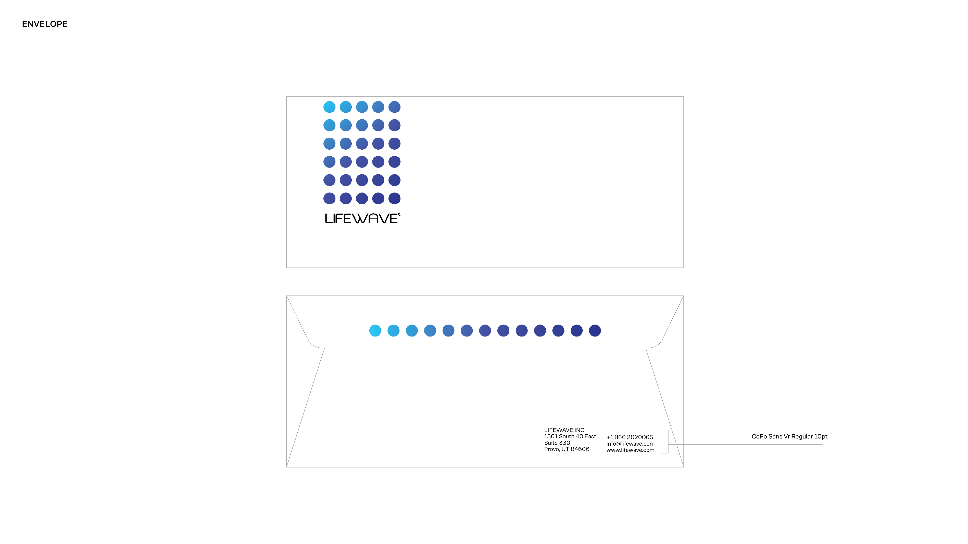
Color System
The color system moves away from expressive wellness palettes toward a more controlled, science-forward spectrum. Color is used to support hierarchy, focus, and legibility—reinforcing credibility without feeling cold or clinical.
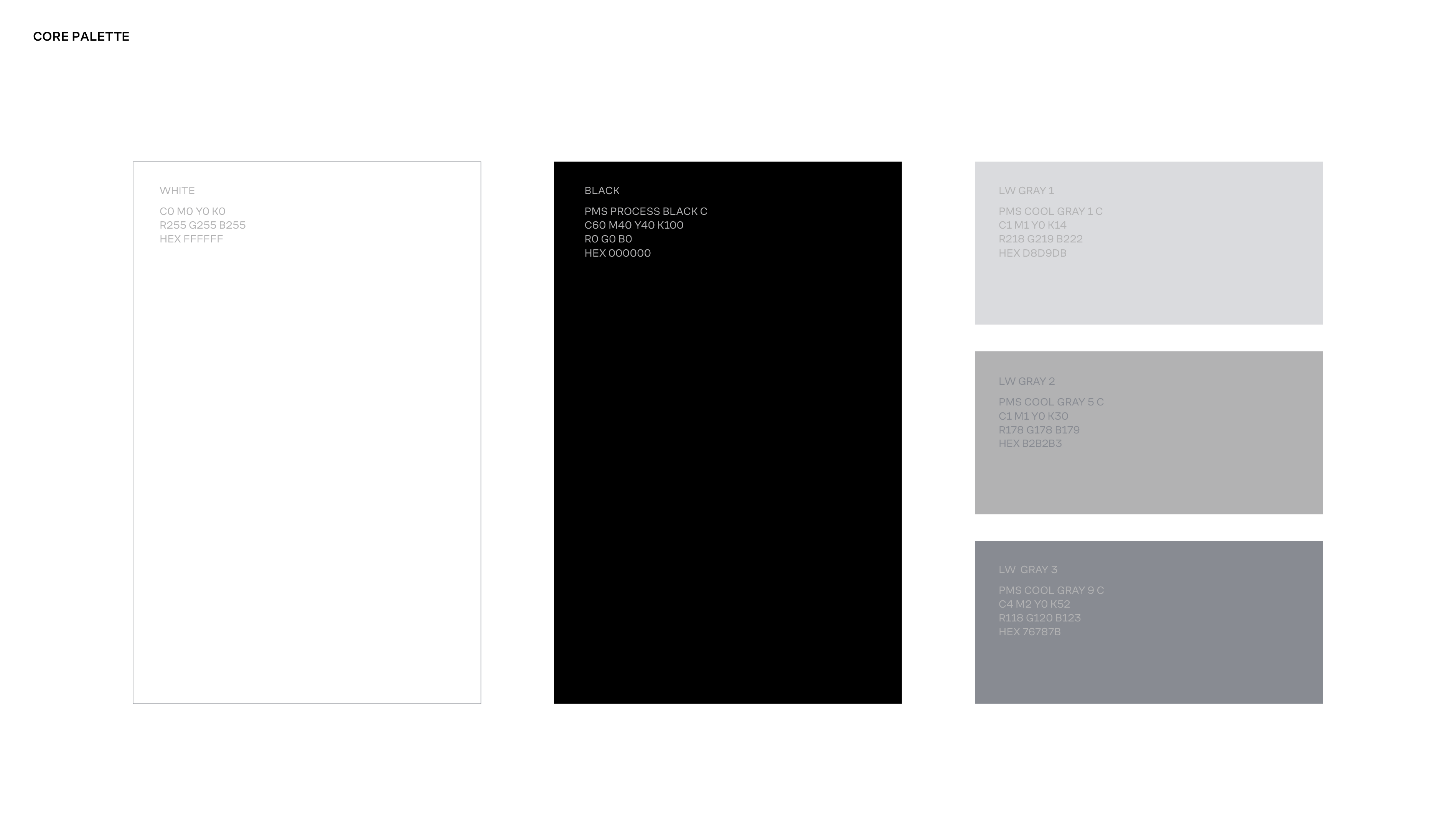
A restrained core palette of white, light grey, and black establishes clarity and structure. This is complemented by a flexible secondary palette inspired by the intersection of nature and technology, available across both print and digital applications.
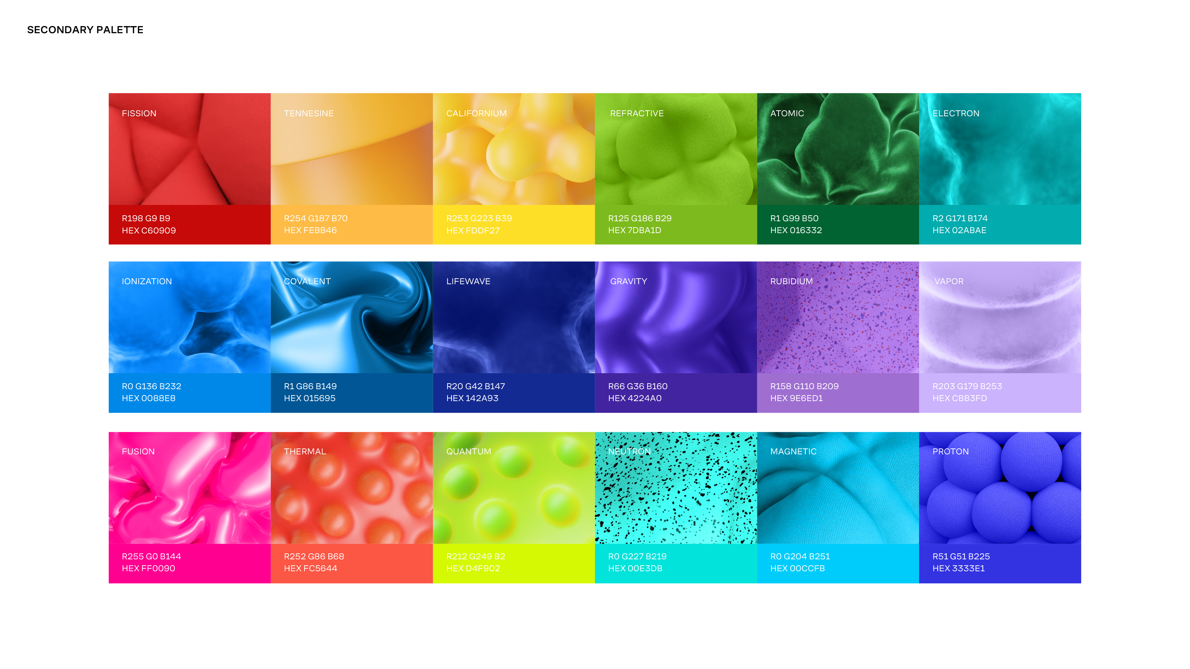
Rather than relying on a fixed set of brand colors, consistency is achieved through composition, hierarchy, and typographic control. Allowing color to adapt while maintaining a cohesive visual language.
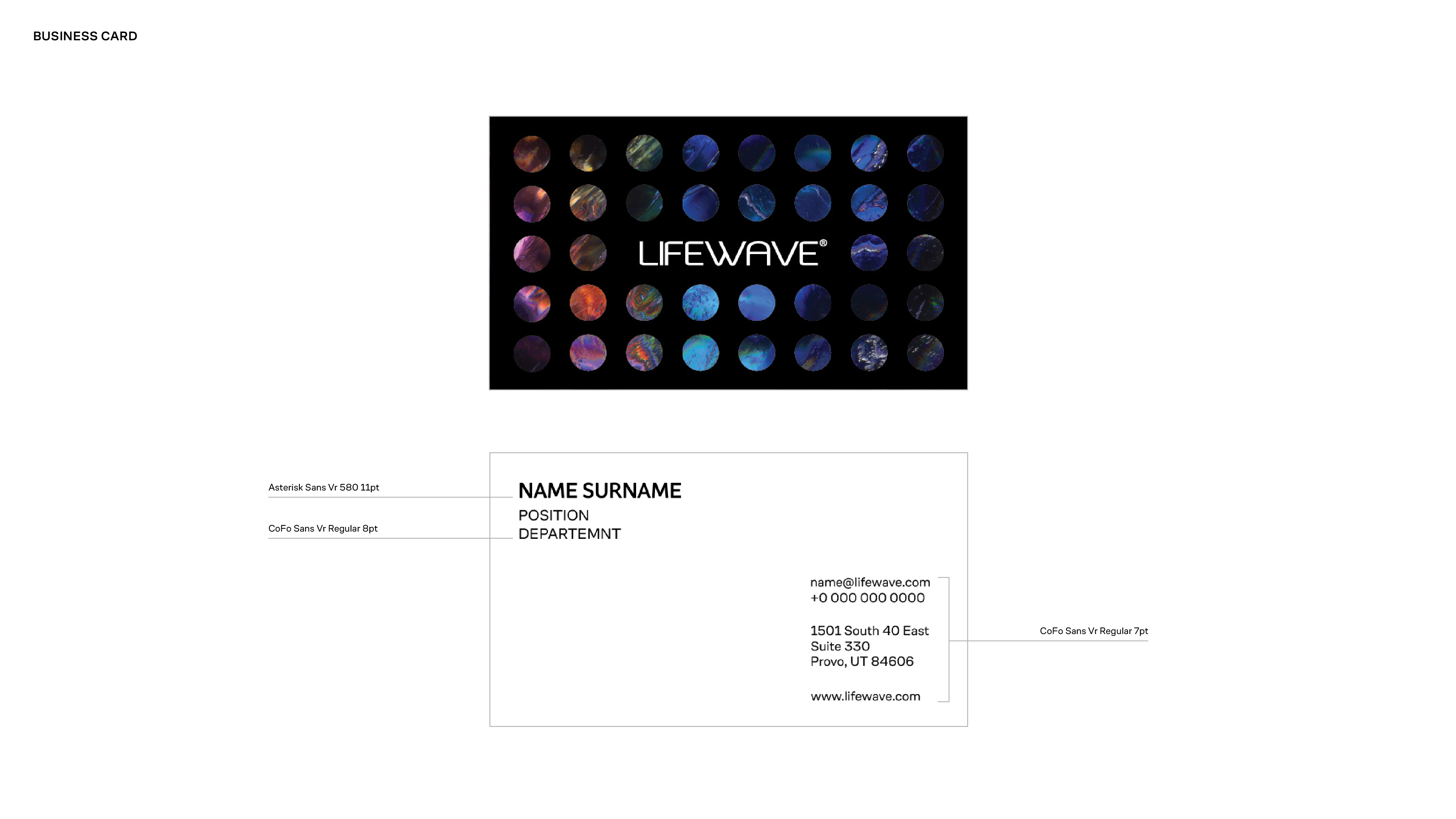
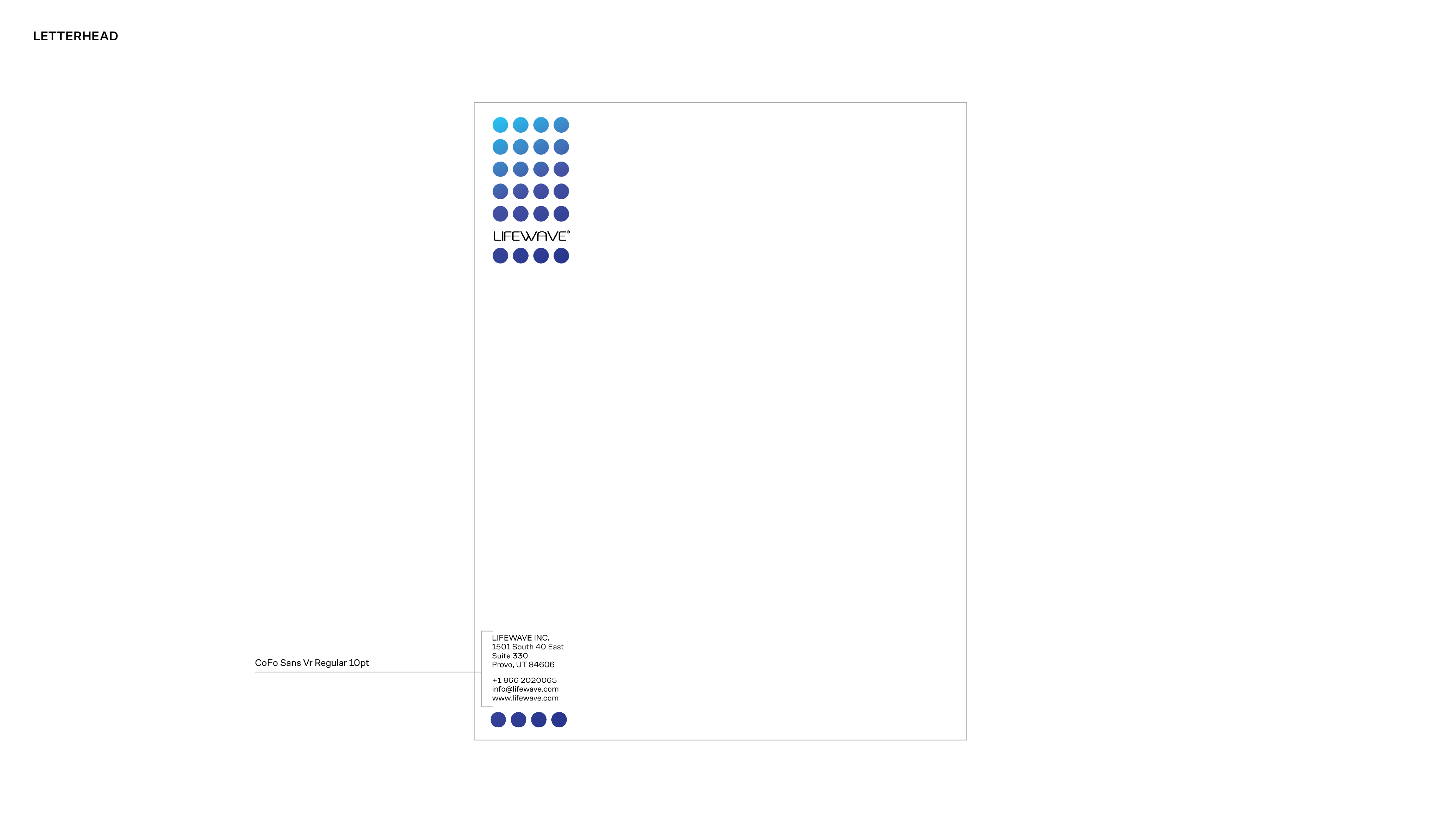
Typography
Typography functions as a core structural element of the LifeWave identity. The system prioritizes clarity, hierarchy, and legibility to support both expressive brand statements and clear informational content.
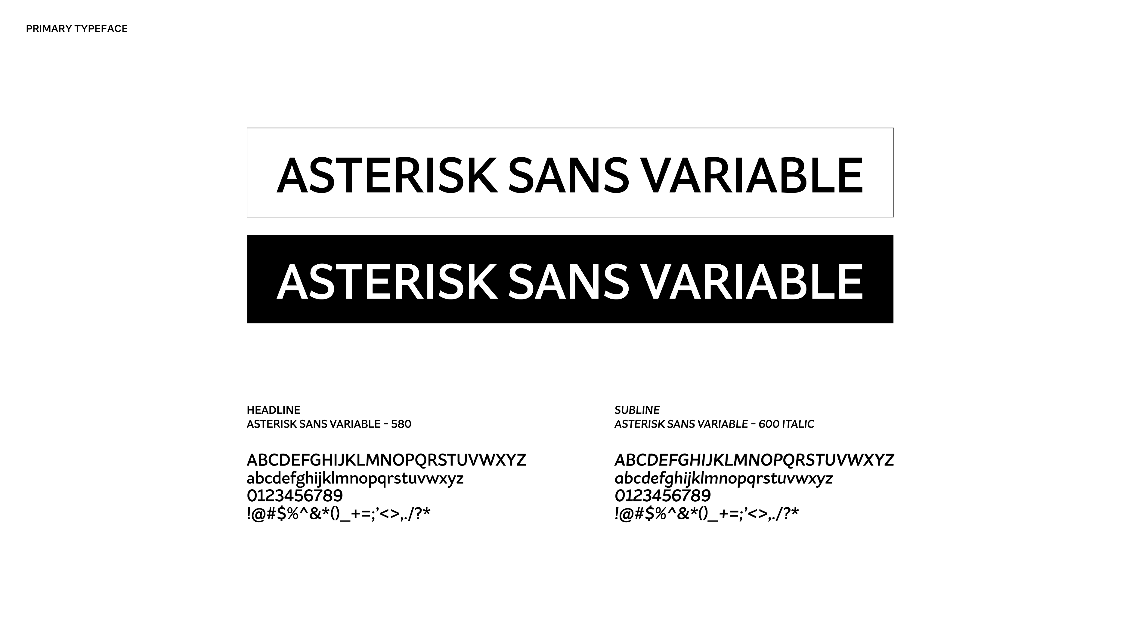
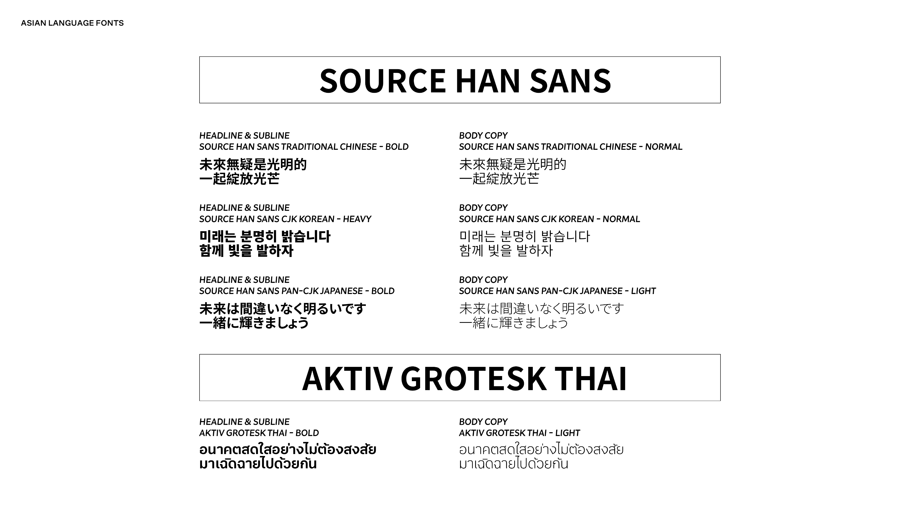
A modern, highly readable primary typeface anchors the brand across all communications, establishing confidence and consistency at every scale. For global applications, complementary Asian language typefaces were selected to match the same modern gothic sensibility, ensuring a unified visual tone across multilingual markets.
Together, the typography system reinforces structure, credibility, and cohesion while remaining flexible across print, digital, and regional use cases.
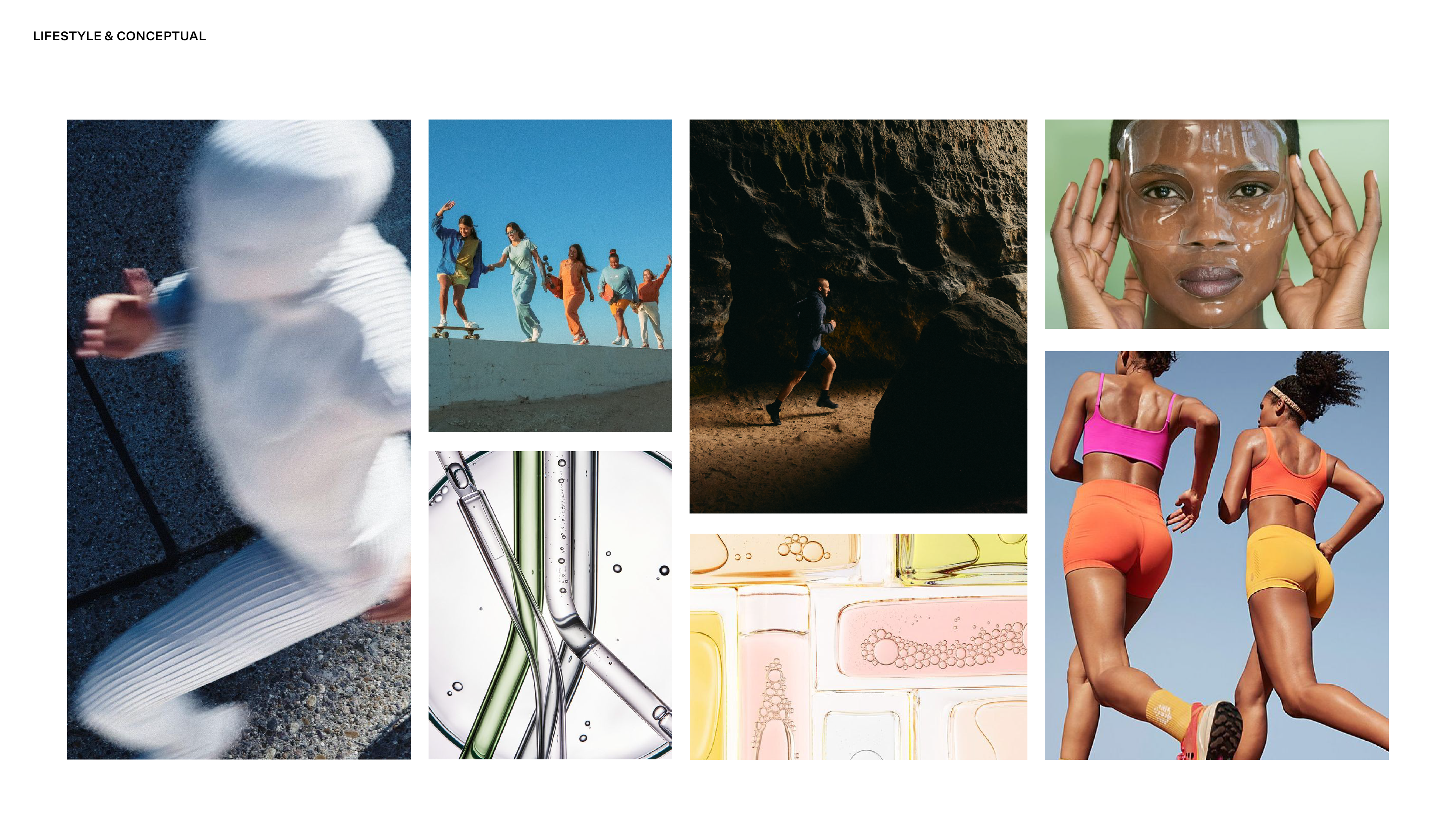
Imagery & Graphic Language
The imagery system was designed to balance science with humanity. Visuals are intentional, refined, and restrained, reinforcing credibility while remaining accessible and modern. Rather than relying on overt wellness cues, the language emphasizes clarity, precision, and confidence through composition, light, and materiality.
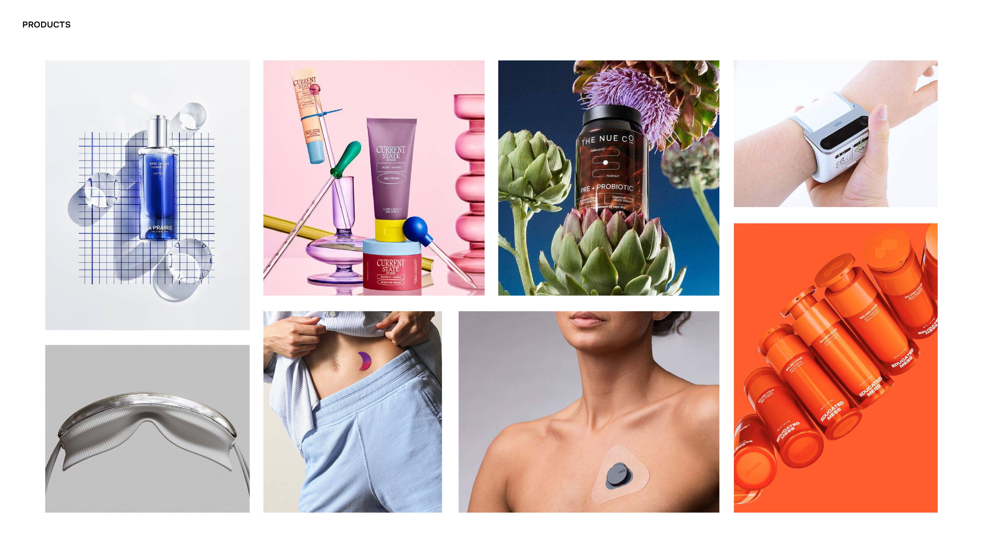
Imagery is organized across product, lifestyle, portrait, and conceptual categories to support a wide range of brand needs without visual fragmentation. Product photography prioritizes accuracy, focus, and clean surfaces. Lifestyle imagery captures real movement and natural interaction, avoiding staged or overly performative moments. Conceptual visuals draw from scientific and natural forms to express innovation, progress, and longevity.
Across all applications, the system favors simplicty and control. Visual noise, heavy retouching, and crowded compositions are intentionally avoided. The result is a cohesive, scalable visual language that supports a science-led brand narrative across global markets, platforms, and cultures.
Imagery is shown for directional purposes to illustrate the intended visual system and graphic language.
Logo & Packaging Exploration
As part of the rebrand, exploratory work was conducted on logo and packaging refinements to align more closely with the updated visual system. These explorations focused on improving clarity, cohesion, and alignment with the new science-led direction.
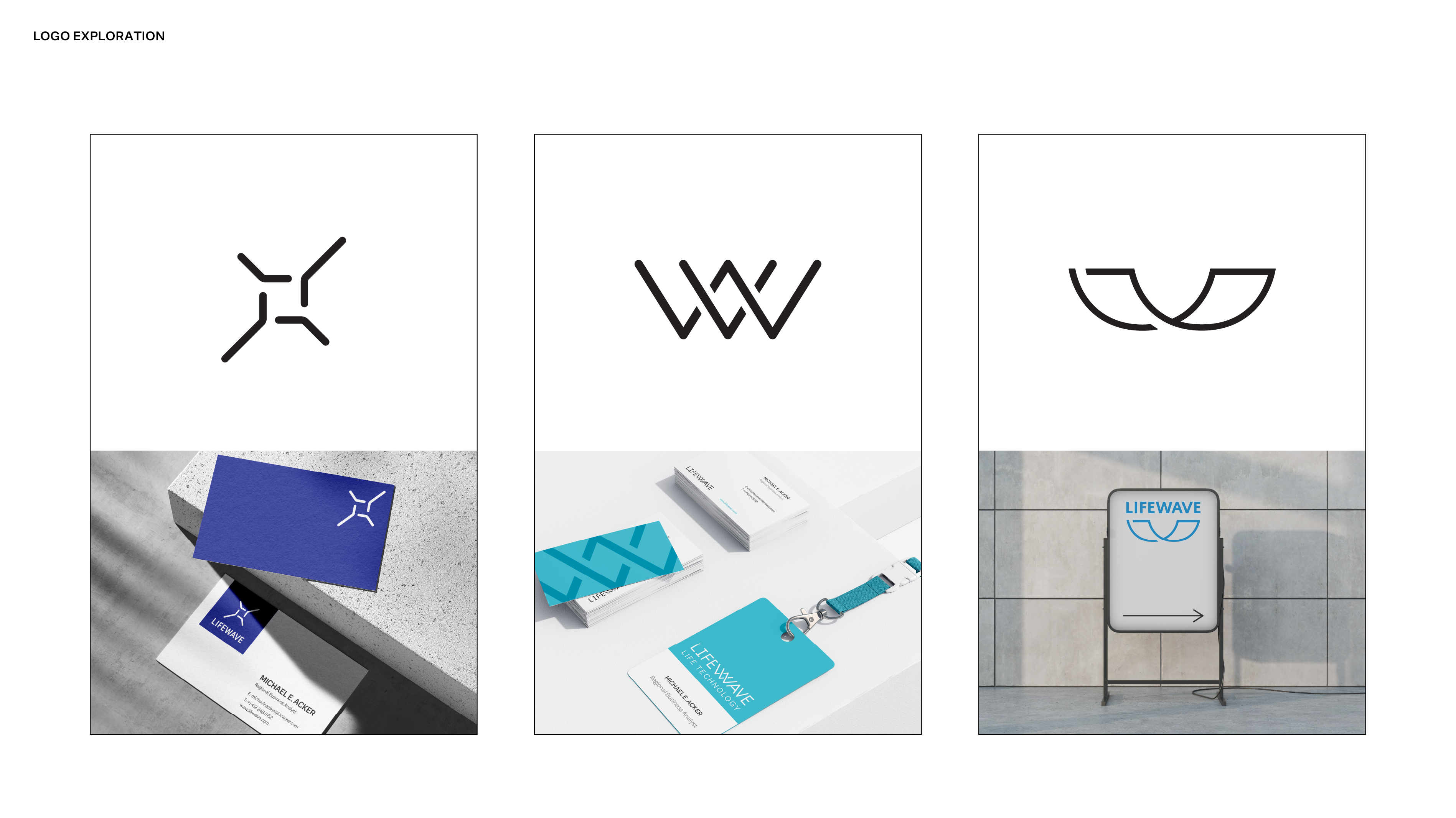
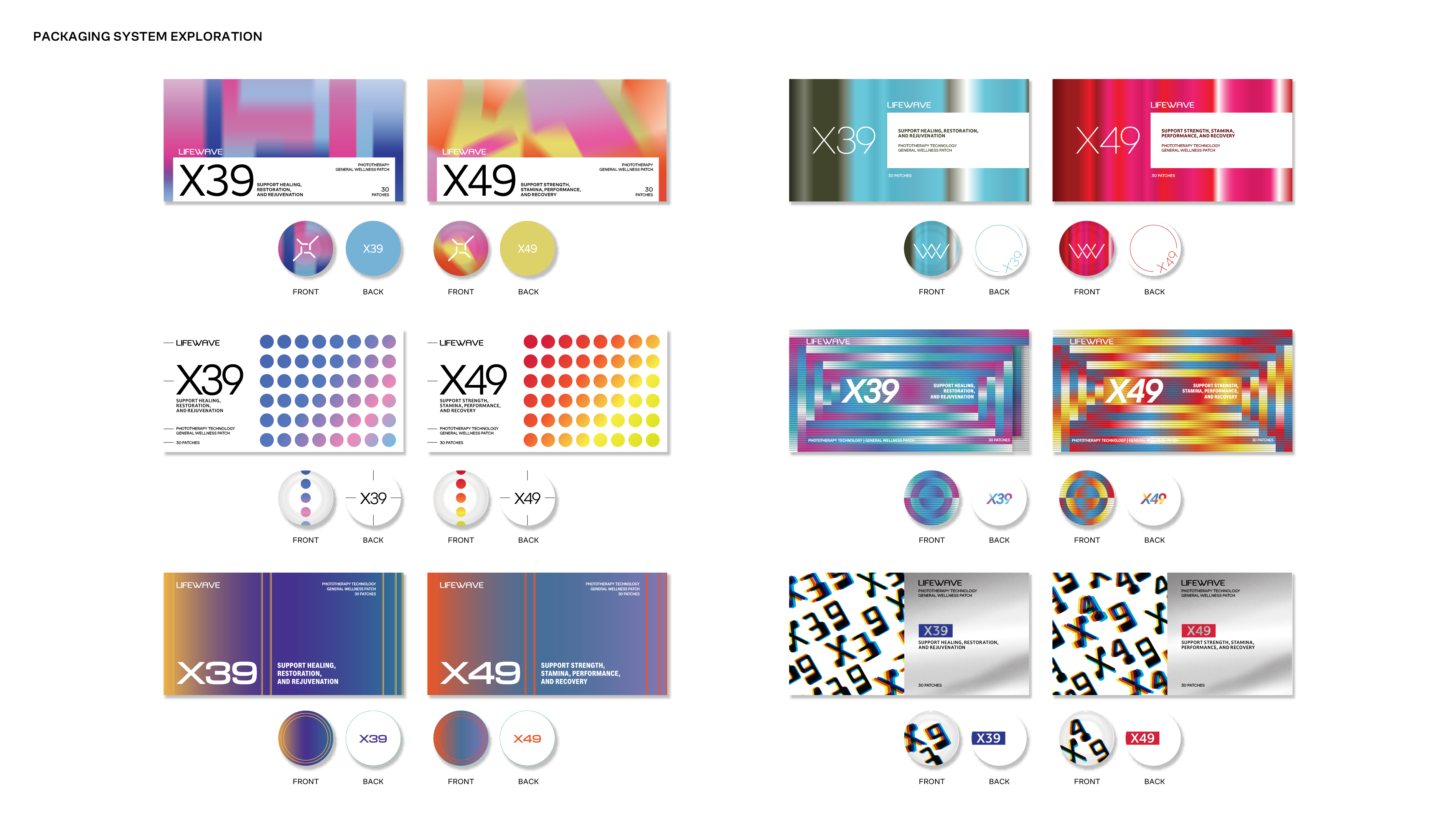
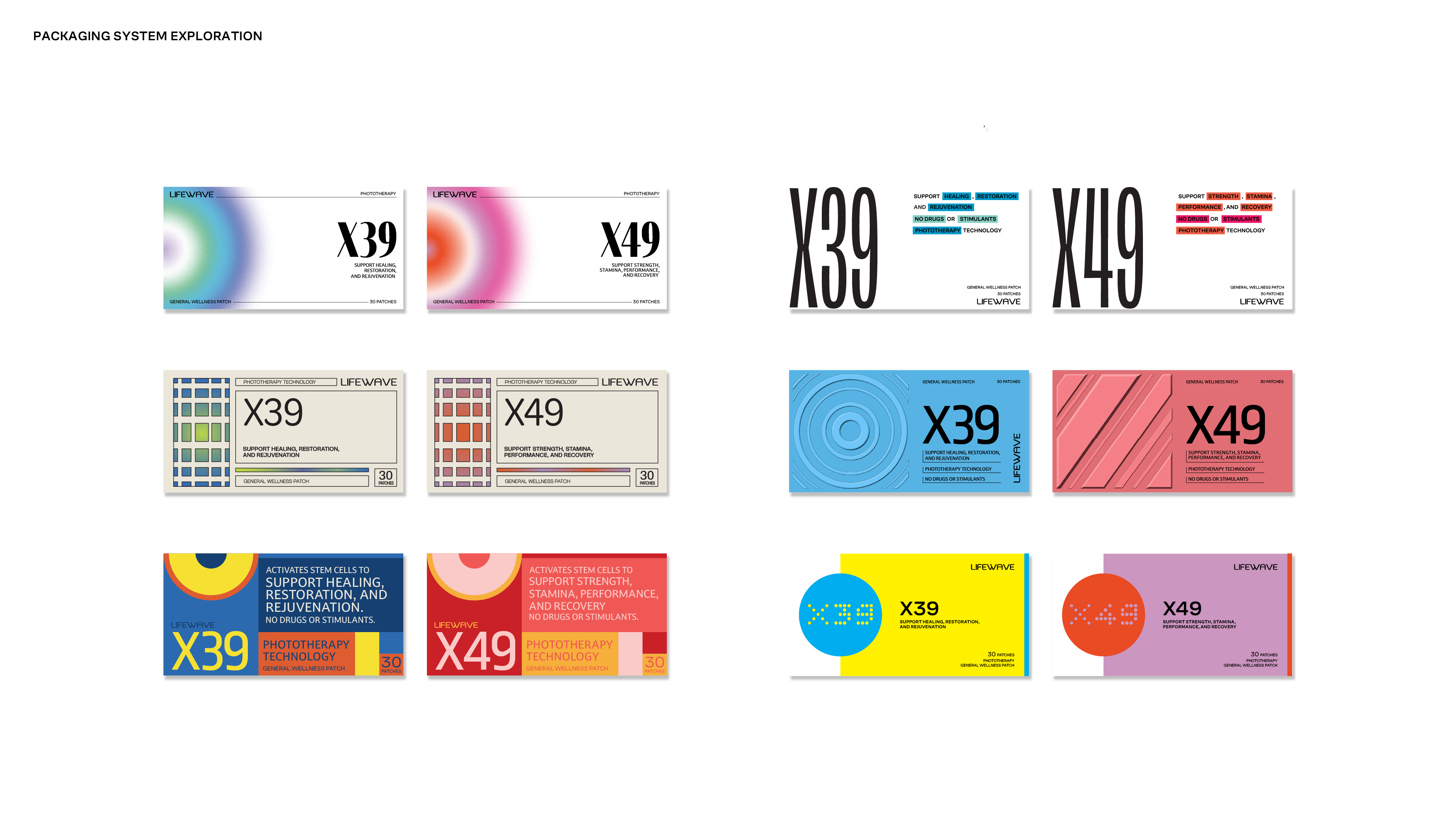
While not implemented in the final rollout, this work demonstrates how the identity could evolve cohesively across products.
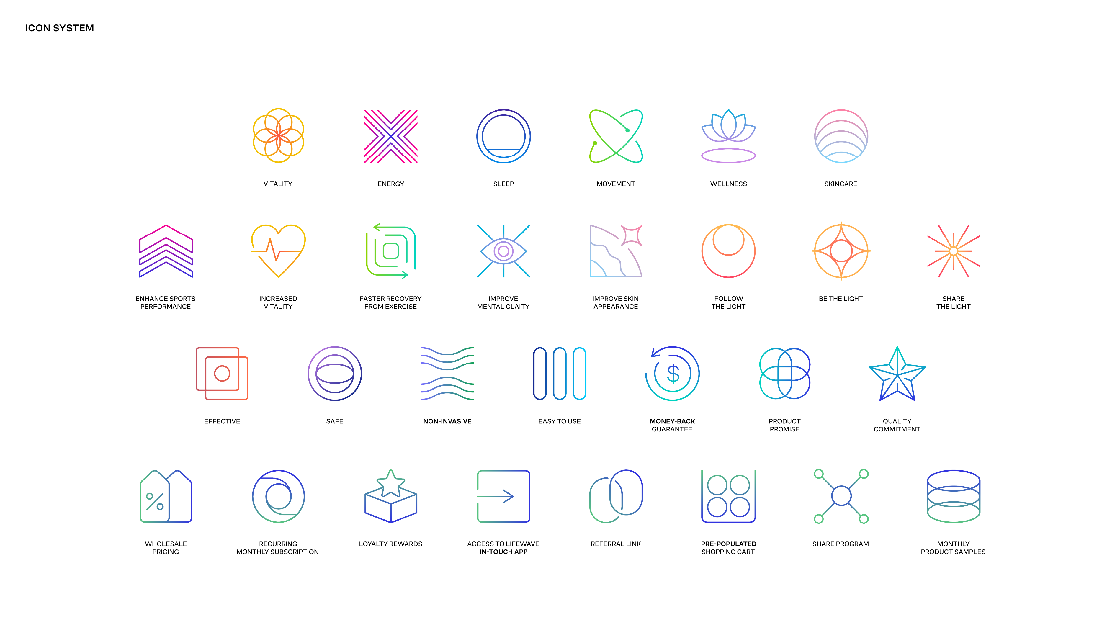
Icon system
A contemporary icon system was developed using abstract geometry, consistent line weight, and subtle gradients to convey LifeWave’s science-driven and high-tech positioning without feeling clinical. The icons balance clarity with visual energy, allowing complex concepts to feel intuitive and approachable. Built on a modular structure, the system scales seamlessly across products, digital platforms, and global applications while maintaining a cohesive visual language.
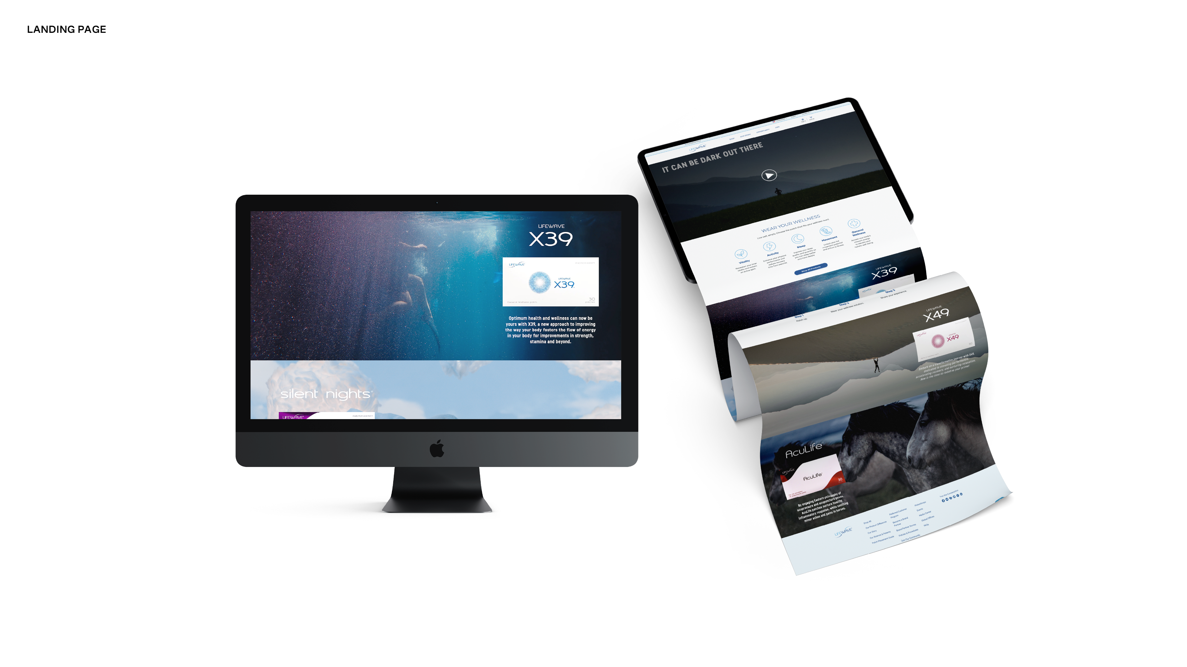
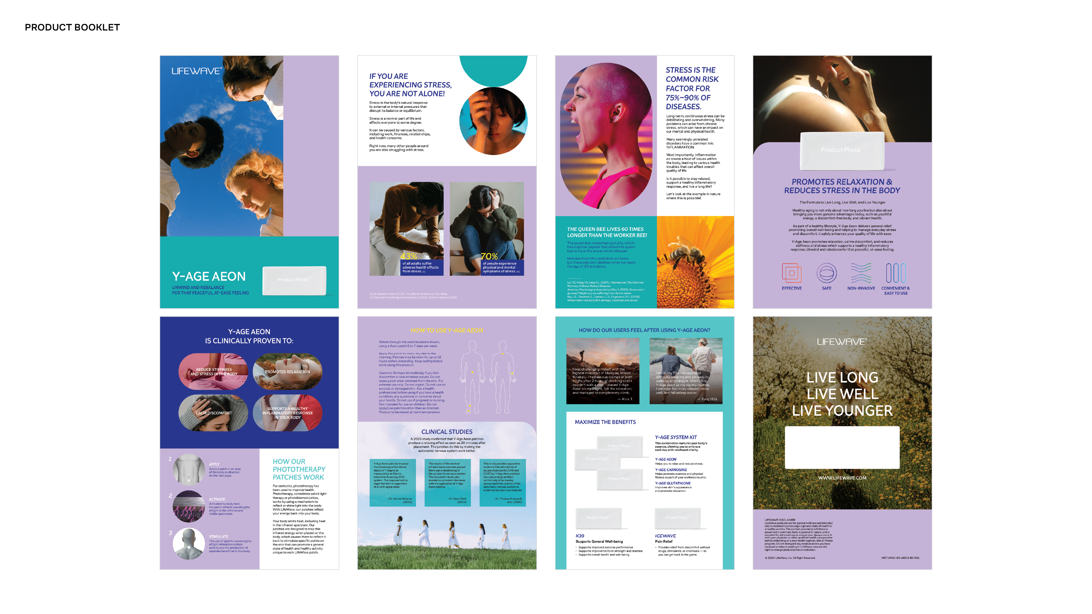
Global Templates & Localization
To support LifeWave’s global operations, a flexible yet controlled system of templates was developed across digital, print, and internal communications. The work focused on creating clarity and consistency at scale, particularly for international teams where visual execution had previously varied widely.
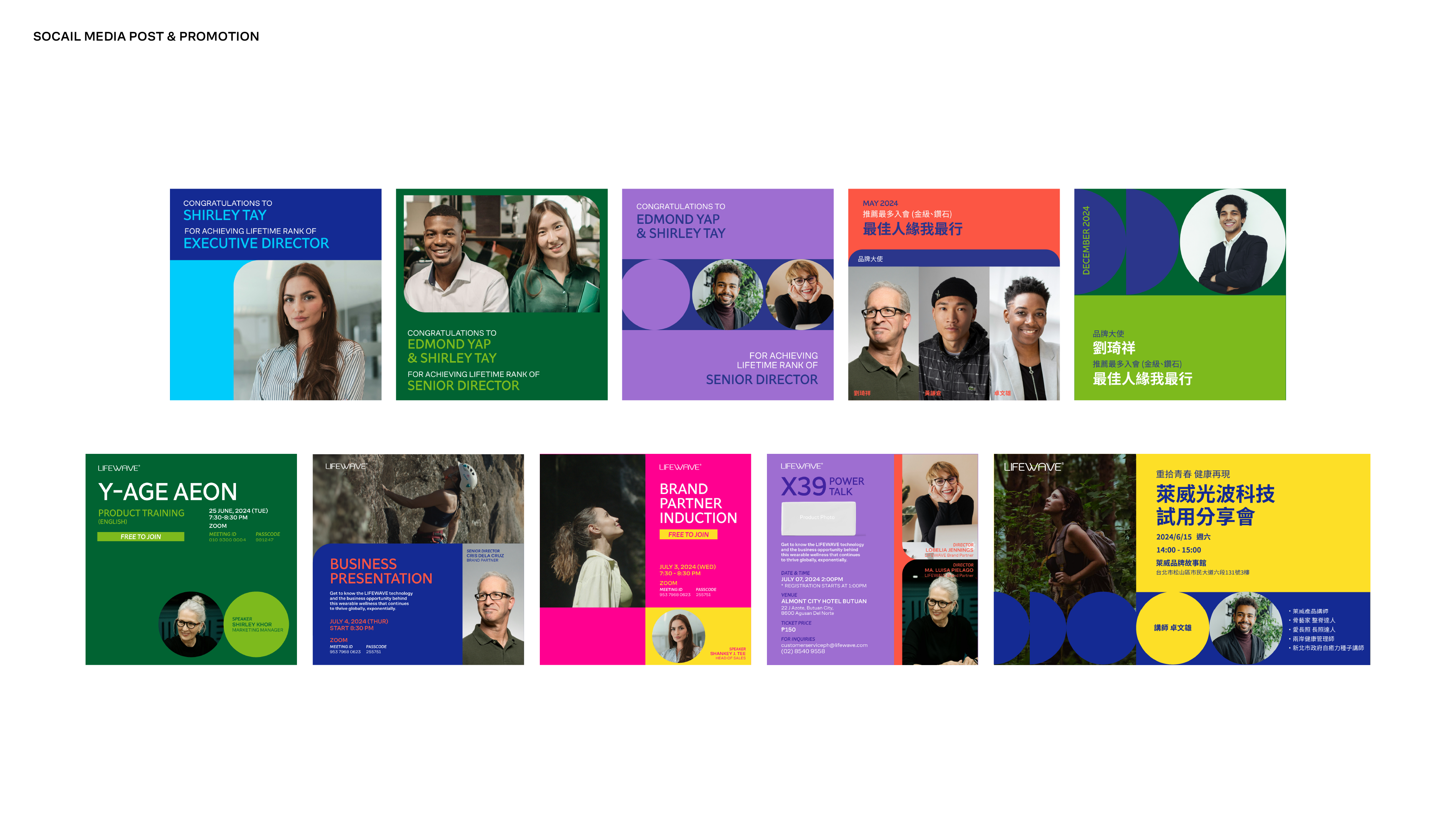
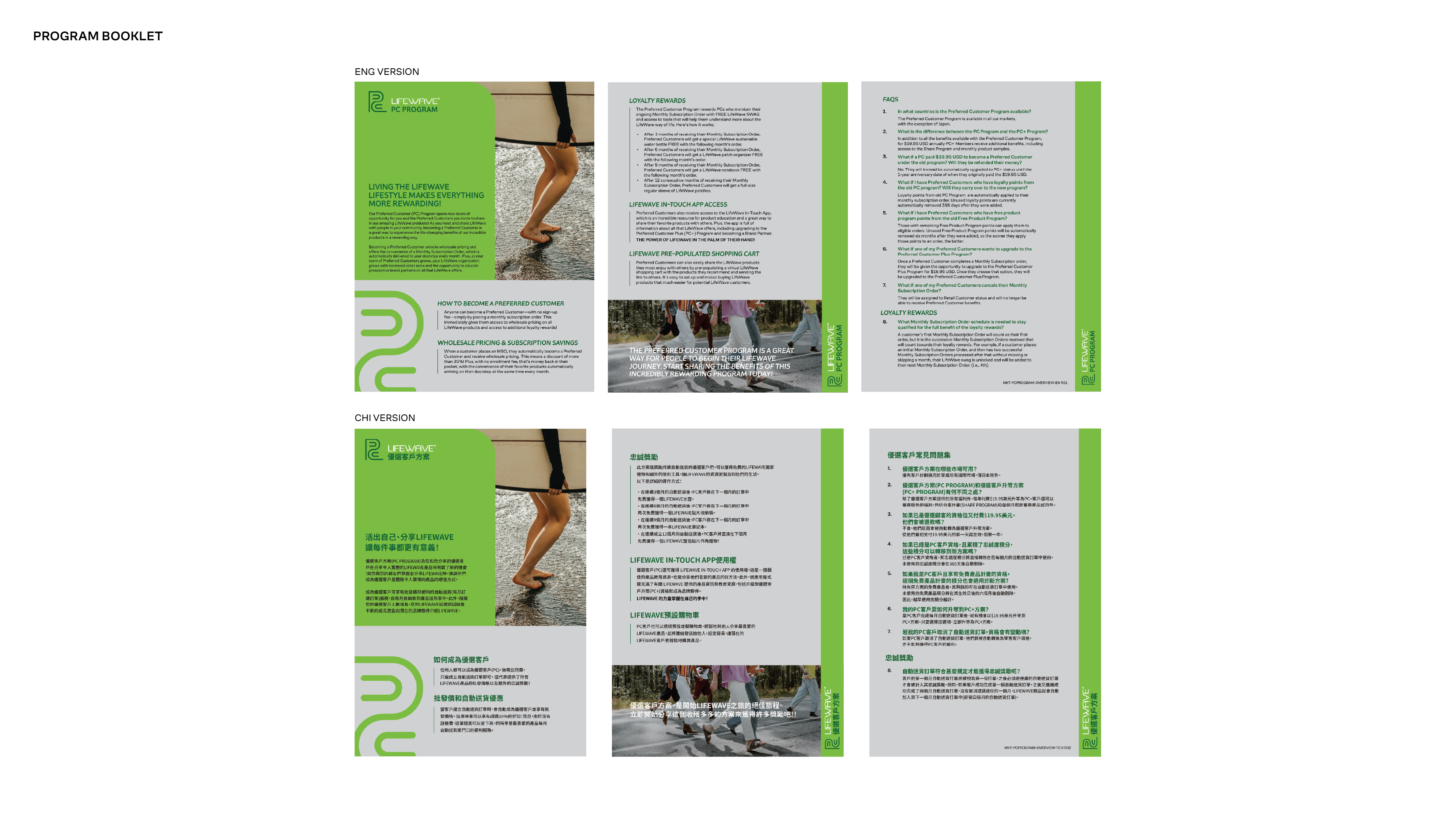
The system establishes clear rules for layout, hierarchy, typography, and spacing, allowing teams to work efficiently without compromising brand integrity. While the core templates were developed in English and Chinese, the structure was designed to scale easily across additional languages and regions, with Asian language applications maintaining the same modern, clean typographic tone as the primary brand system.
This approach ensured that regional teams could localize content confidently while preserving a unified, professional brand presence across markets.
Applications
The visual system was translated into core brand materials including the brand booklet, stationery, and foundational print assets. These applications establish tone, hierarchy, and consistency, serving as a clear reference point for future digital, marketing, and regional executions.
Outcome
The project established a modernized visual foundation for LifeWave—introducing a clearer, more credible, and more scalable brand language. The system elevated the company’s perception while providing internal teams with the tools to maintain consistency across global communications.