Project
LifeWave X20 — Product Visual System & Launch Campaign
Client
LifeWave
Sector
Global Wellness Technology
Role
Lead Designer / Art Direction
Scope of Works
Product Style Guide
Core Color Palette Development
Icon System
Packaging Exploration
User Manual & Quick Start Guide
Social & Presentation Templates
Launch Page Mockups
Campaign Storyboards
X20 is a high-end, light-infused water machine positioned as a long-term health technology investment rather than a standard appliance.
Working within the broader LifeWave brand ecosystem, I developed the complete visual system and product style guide for X20. The objective was to elevate perception, clarify complex technology, and establish a premium, science-driven presence across packaging, editorial materials, and launch communications.
Logo provided by client. Visual system and applications developed by Jane Wu.
Light as Precision Technology
The system emphasizes clarity, hierarchy, and technical confidence. Typography aligns with the master LifeWave brand for continuity, while the X20 palette introduces cooler tonal shifts and luminous accents to reflect water and light technology.
Visual restraint and structured composition position the product as engineered performance rather than lifestyle wellness.
Product Visual System
The X20 system builds on the master LifeWave brand while introducing a more focused, luminous expression tailored to the product.
Typography aligns with the parent brand for continuity. A cooler core palette and light-driven tonal accents reflect water, filtration, and illumination.

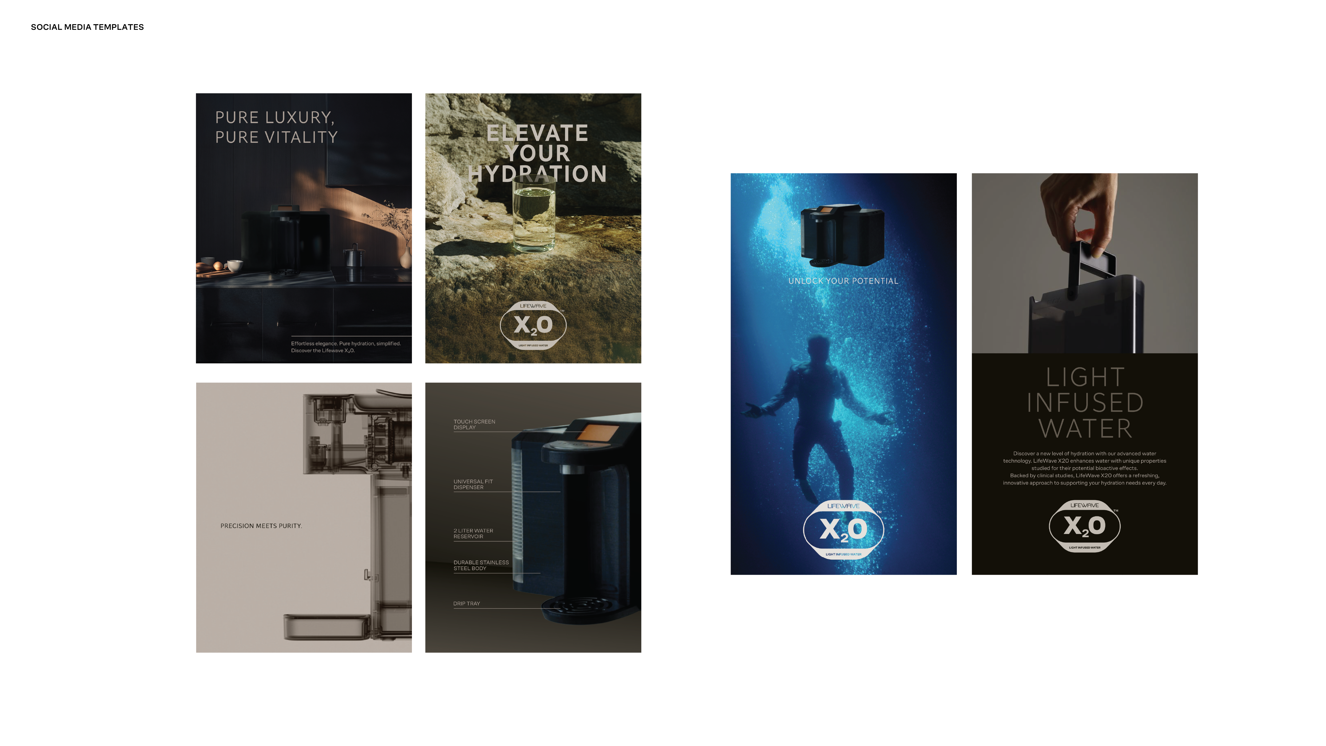
The imagery system positions X20 at the intersection of precision engineering and elevated wellness. It moves between minimal hero product shots, engineered detail, refined lifestyle integration, and abstract expressions of light and water.
Hero imagery is clean and controlled, using warm neutrals and sculpted lighting to emphasize material quality and form. Technical close-ups and transparency-inspired visuals communicate innovation and trust. Lifestyle scenes place the machine within modern, minimal interiors, showing it as part of a daily ritual rather than a standalone object.
Conceptual visuals use light, water, and reflection to evoke vitality and purity, reinforcing the idea of light-infused hydration as both science and experience.

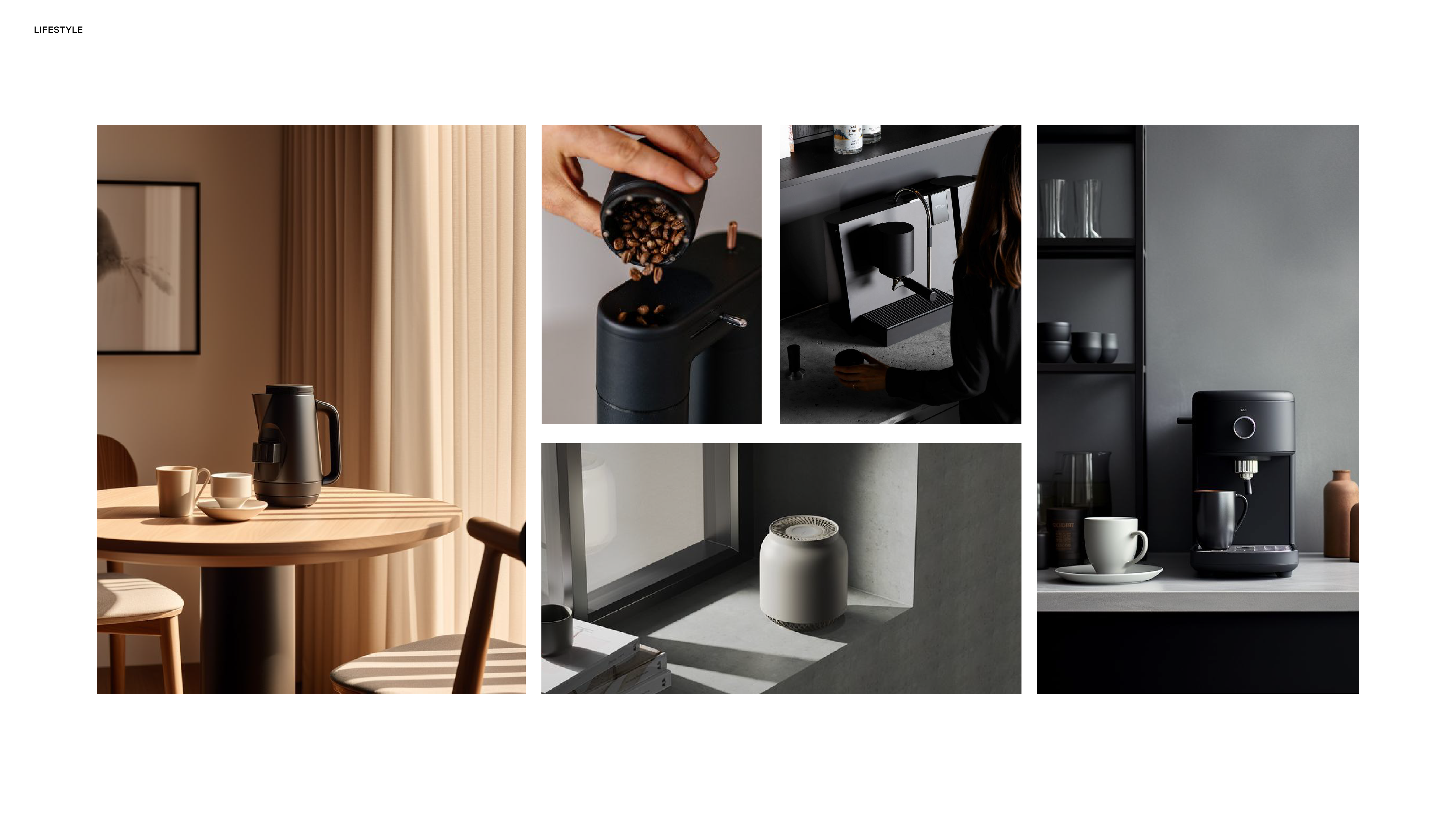
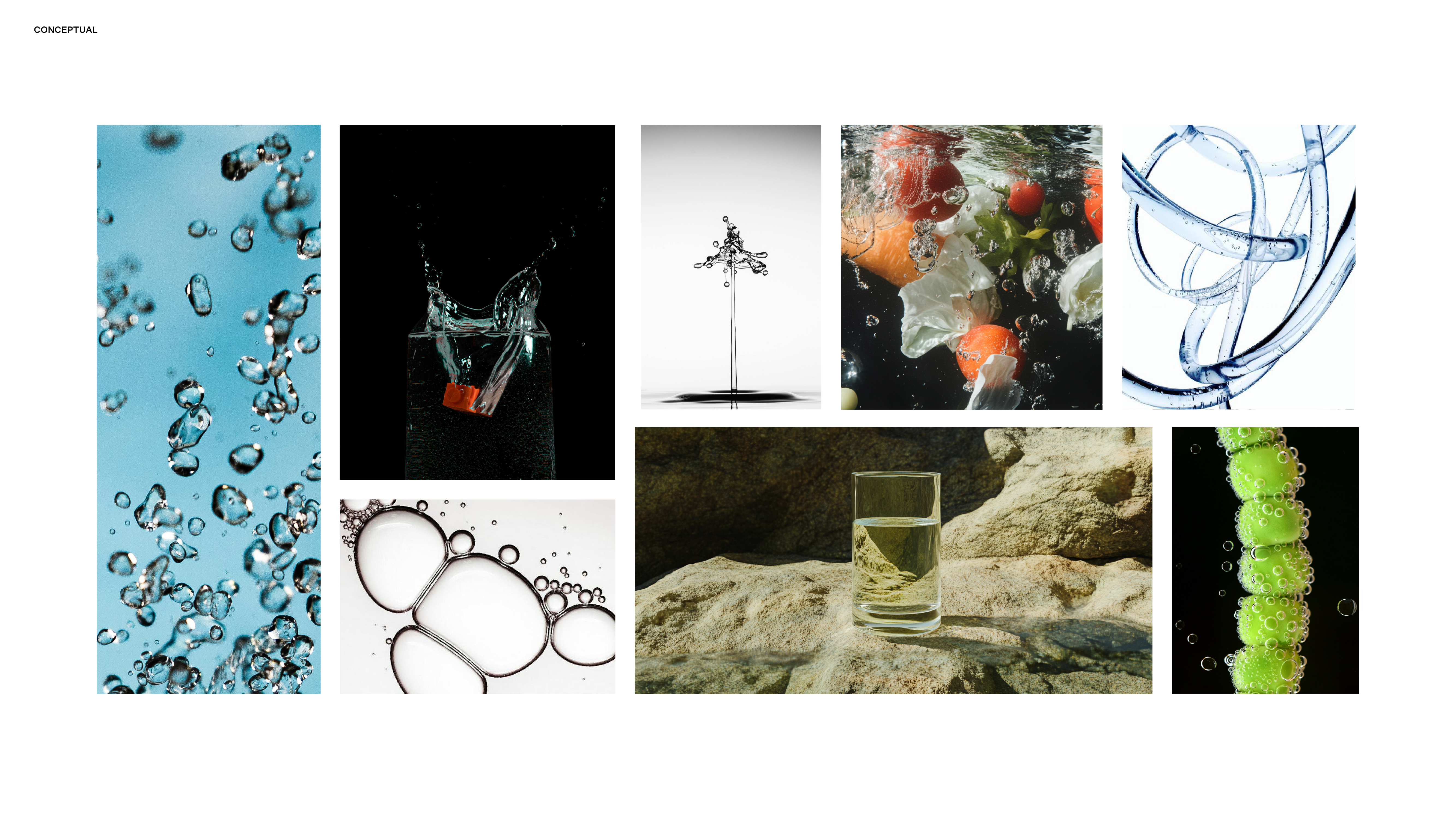
Imagery is shown for directional purposes to illustrate the intended visual system and graphic language.
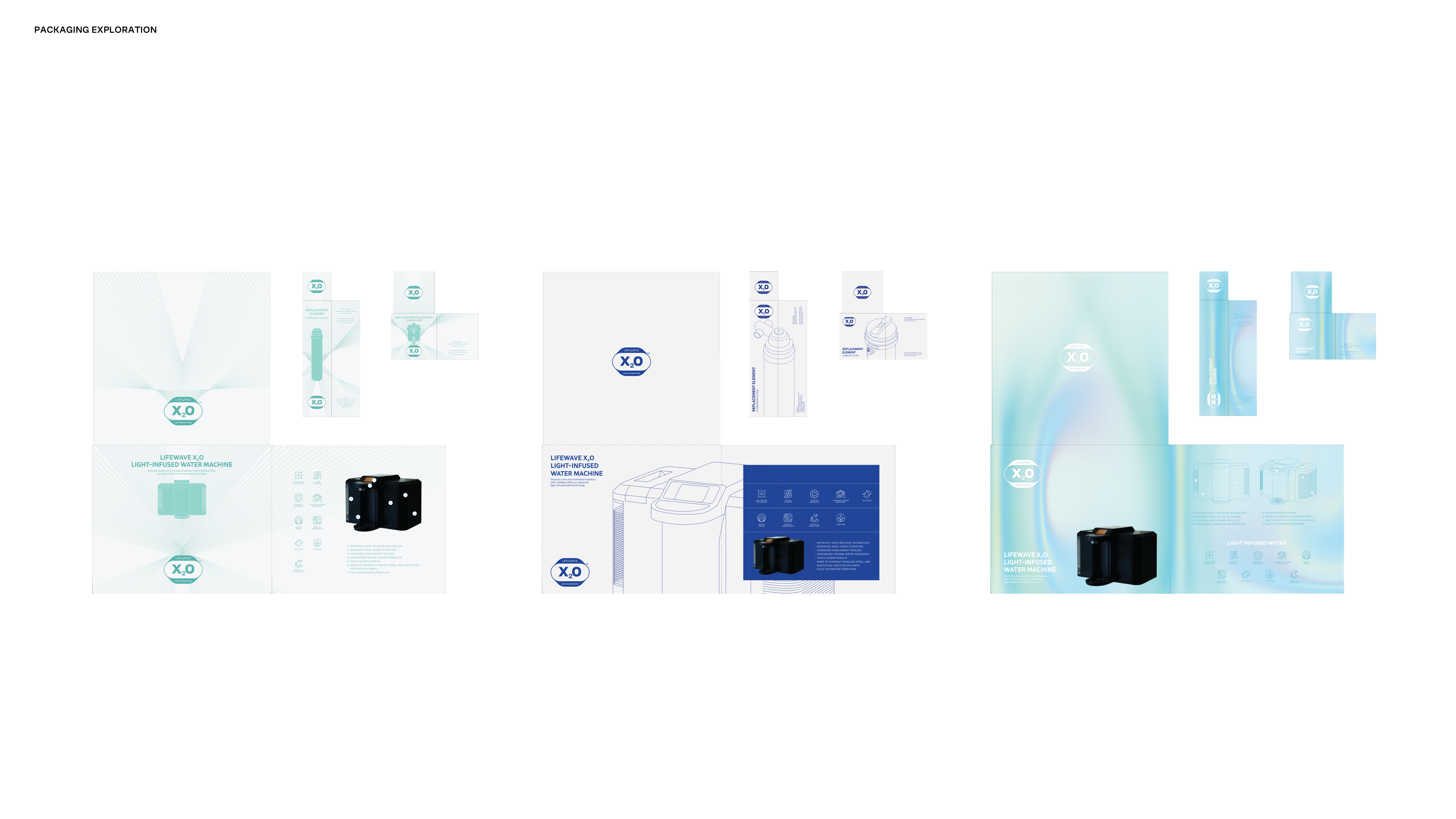
Packaging
The packaging explores how light, water, and technology can be expressed through a refined, structured system. From minimal radiance lines to atmospheric gradients and water textures, each direction balances innovation with clarity while maintaining strong hierarchy and alignment with the broader LifeWave visual language.

Applications
The system extends across print booklets, iconography, presentation templates, outdoor mockups, and launch materials, demonstrating consistency across physical and digital environments.


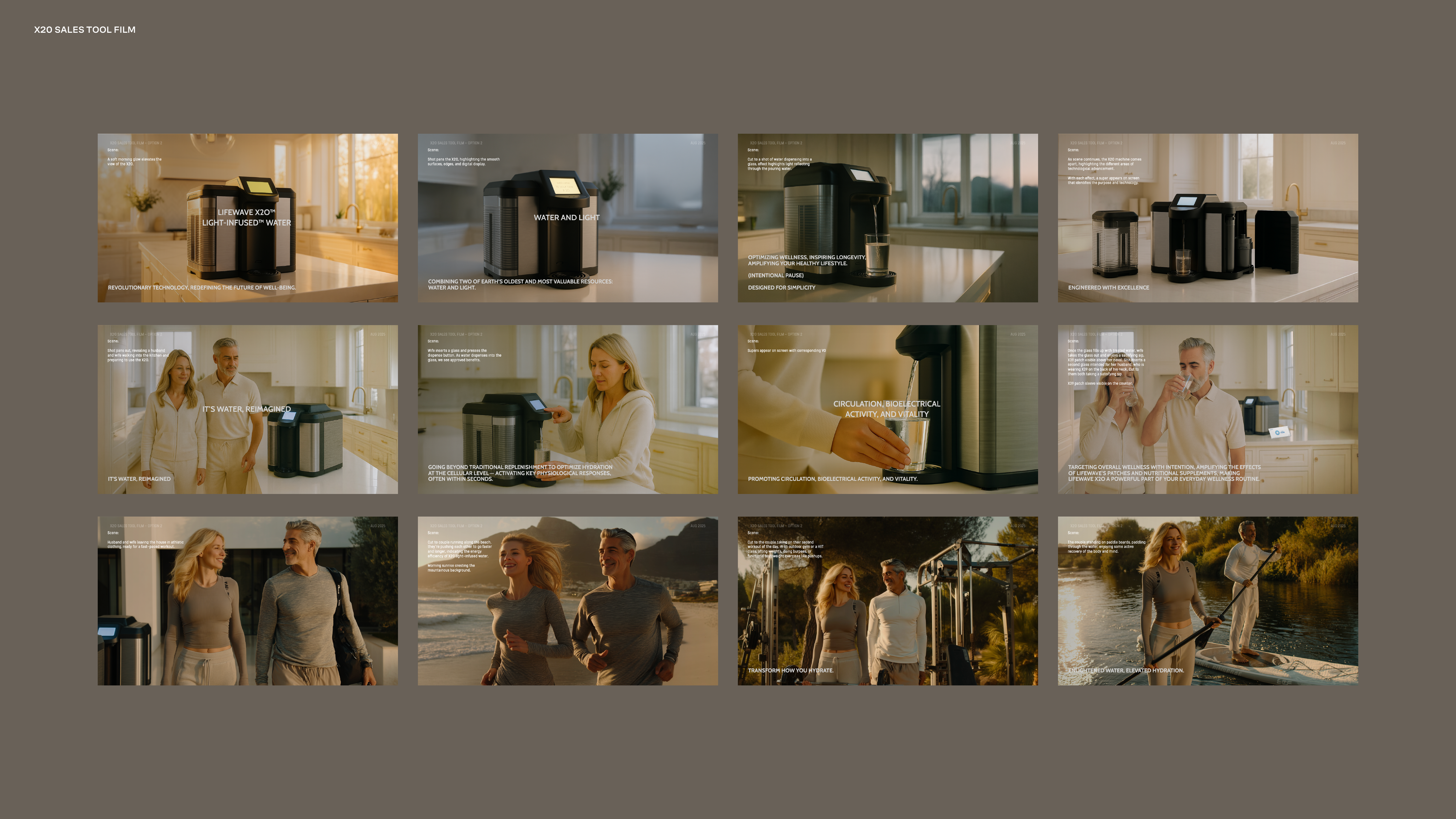
Campaign Storyboards
Launch film storyboards were developed to establish visual tone and narrative direction prior to production. Using AI-assisted image generation and compositing, I translated script concepts into cinematic sequences that defined lighting, pacing, and product positioning across campaign materials.