Project:
Rebranding Zest:
Nutrition with Purpose
Sector:
Health & Lifestyle
Scope of Works:
Branding
Packaging
Illustration
Art Direction
UX/UI Design
Rebranding Zest:
Nutrition with Purpose
Sector:
Health & Lifestyle
Scope of Works:
Branding
Packaging
Illustration
Art Direction
UX/UI Design
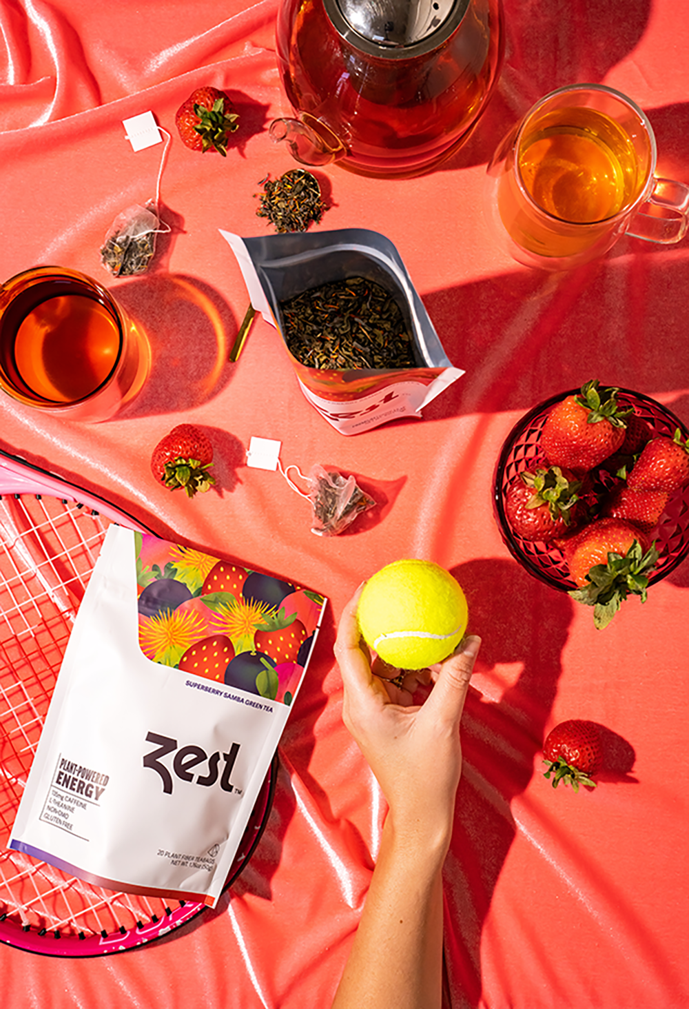
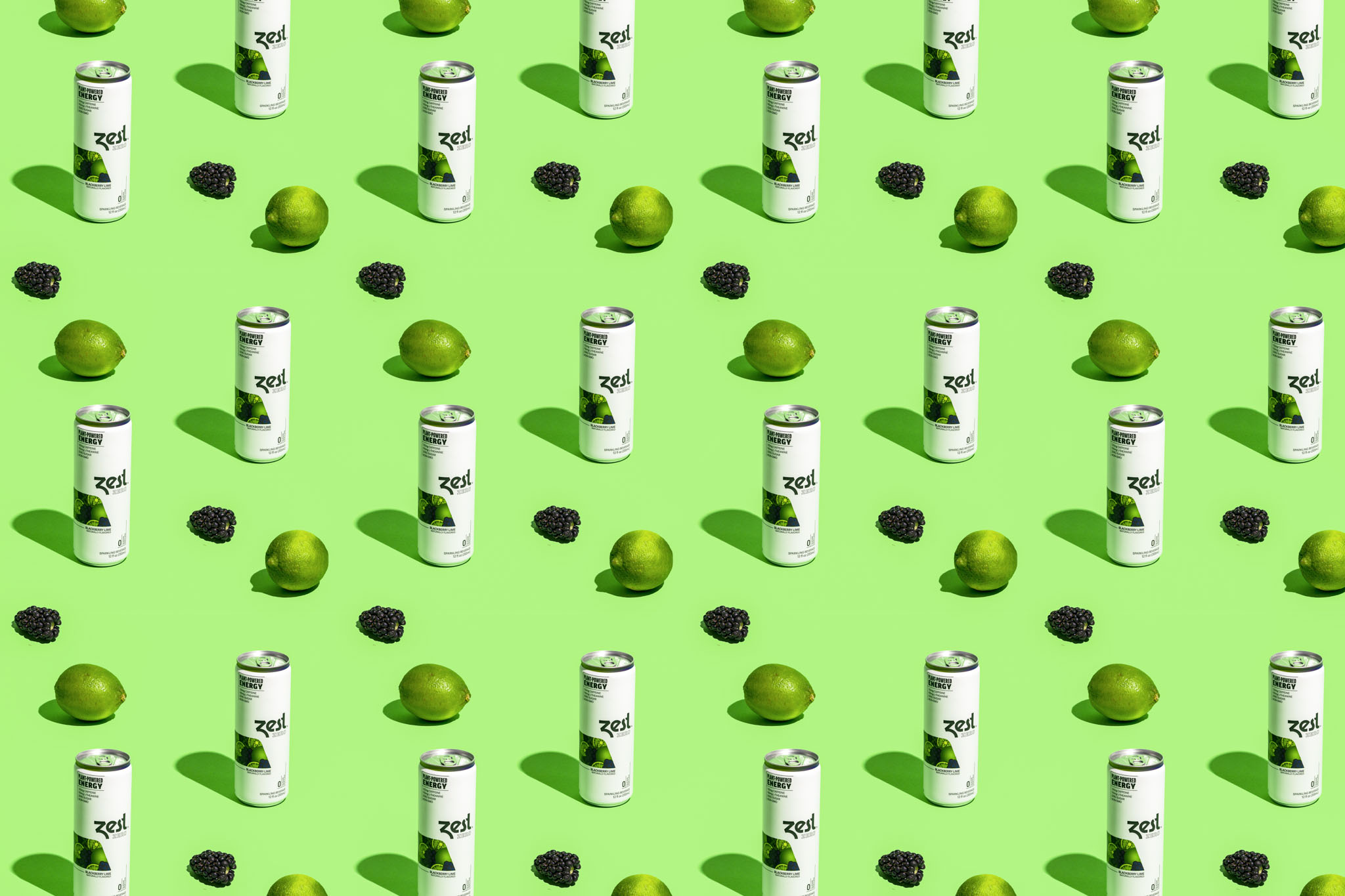
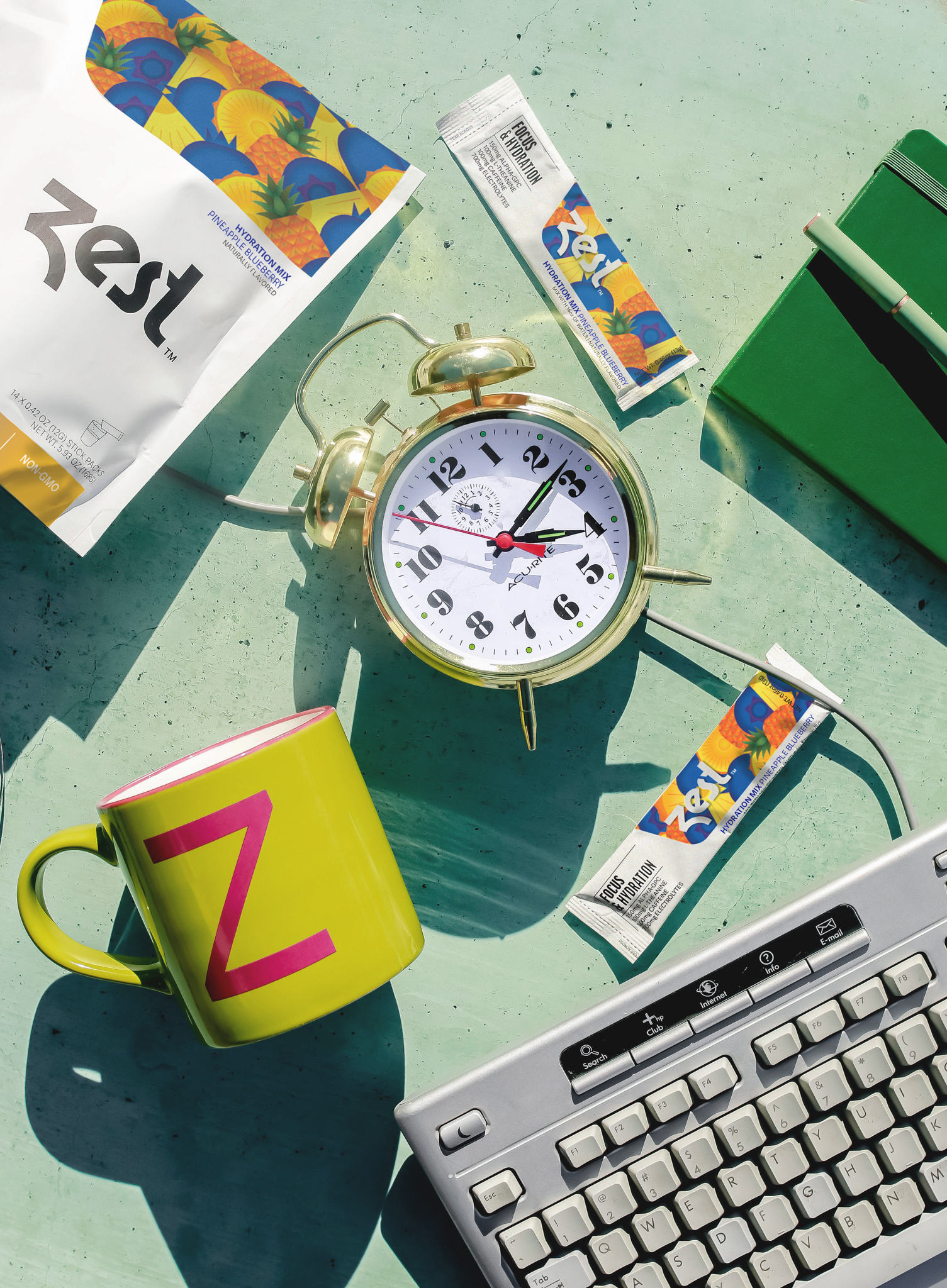
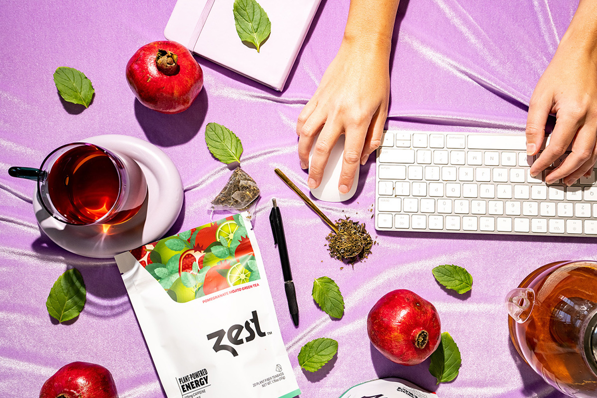
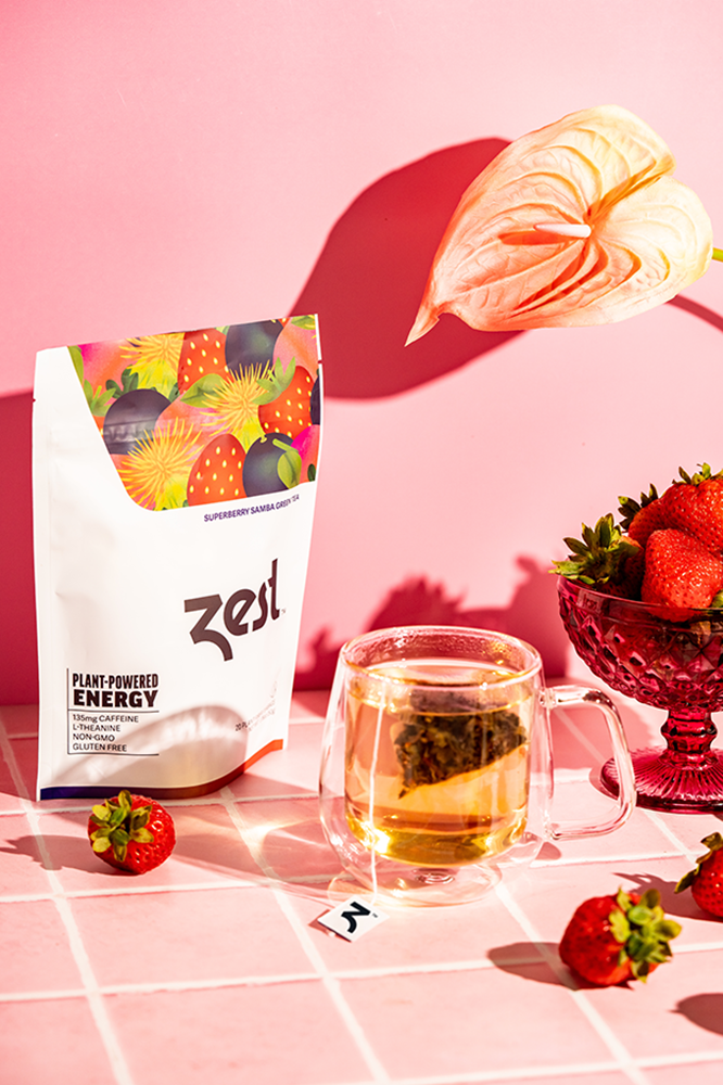
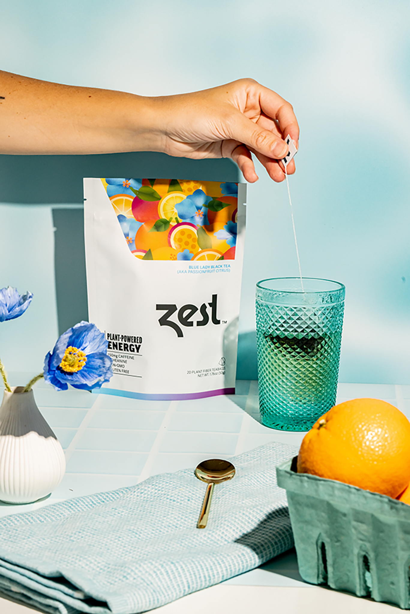
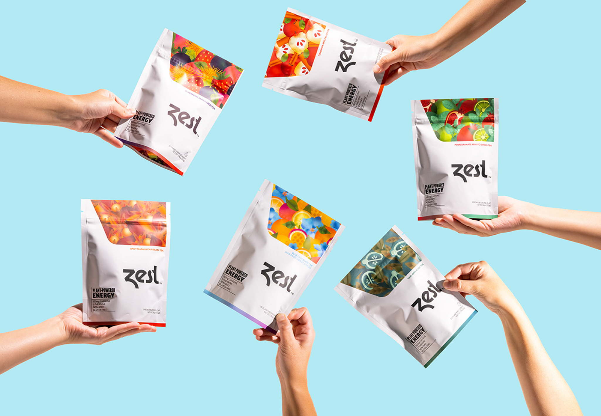
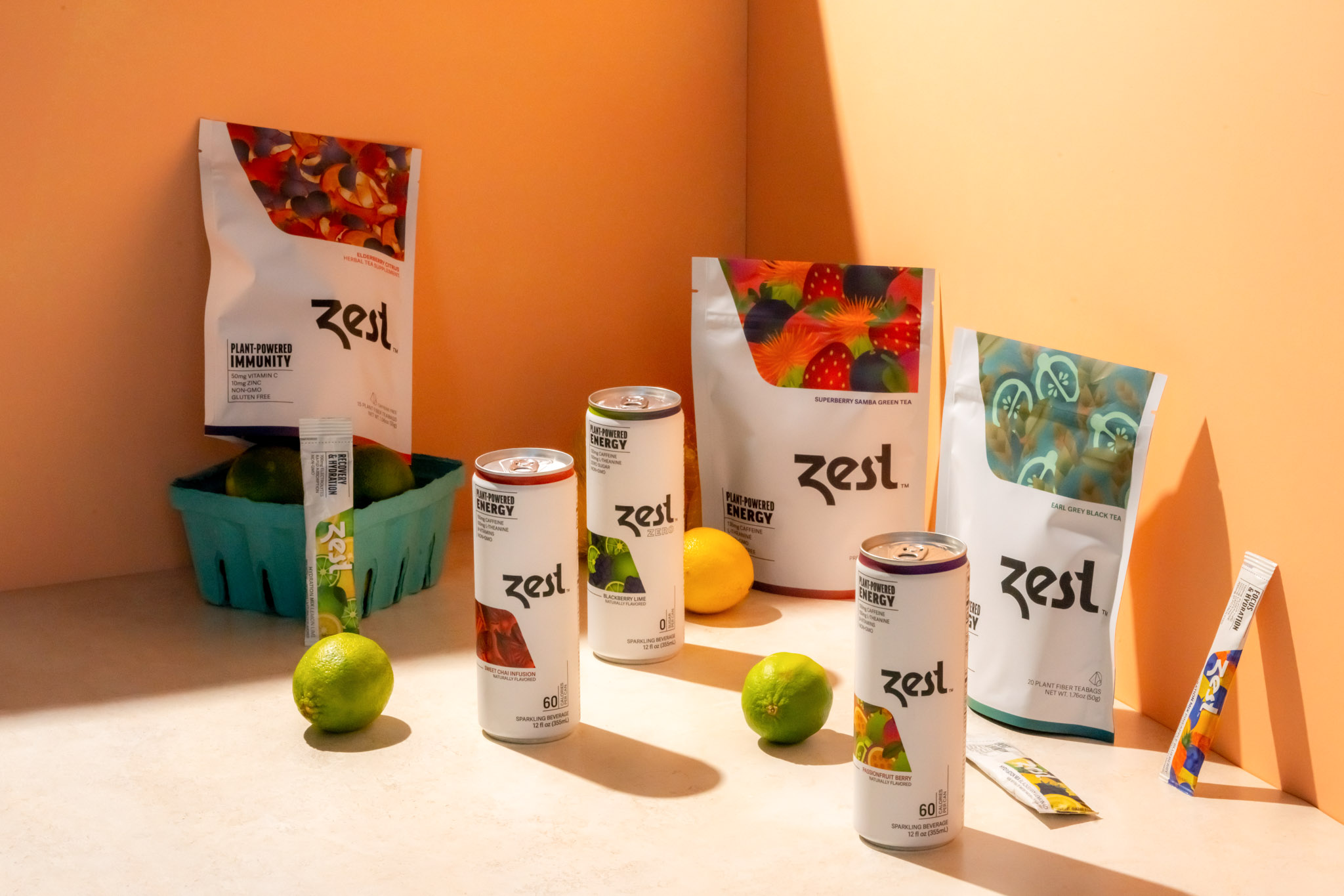
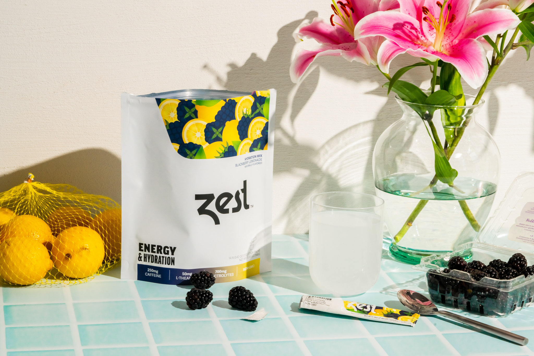
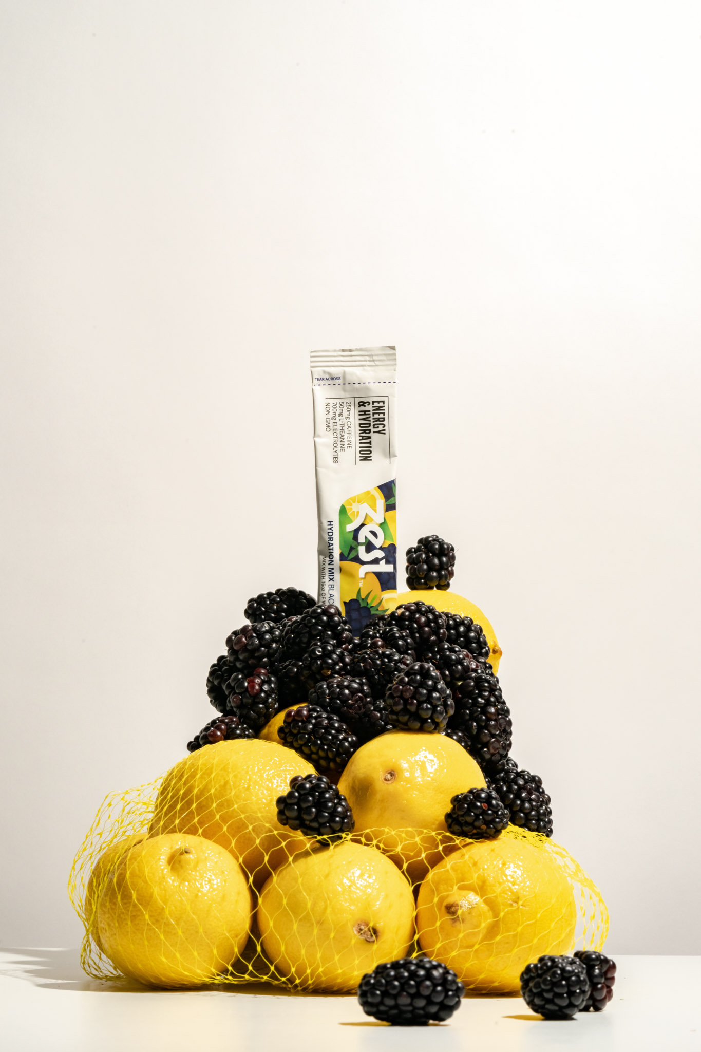
Zest, a crowd-funded tea-based beverage company founded in 2014, is undergoing a transformative rebrand to evolve into a comprehensive nutritional beverage brand. This project involves reimagining the brand's identity, packaging, and product line to meet growing customer demands for simple, science-backed nutritional solutions.
The Objective:
The primary goal was to reposition Zest from an energy-focused tea company to a holistic nutritional beverage brand. We aimed to create a professional, consistent visual identity that would resonate with health-conscious consumers and support the expansion into new functional beverage categories.
The Opportunity:
With customers seeking more from their beverages, there was a clear opportunity to broaden Zest's appeal and product range. By focusing on simple, science-backed ingredients, we could differentiate Zest in the crowded beverage market and meet the growing demand for transparent, purposeful nutrition.
The Outcome:
The rebranding project delivered a comprehensive overhaul of Zest's brand presence:
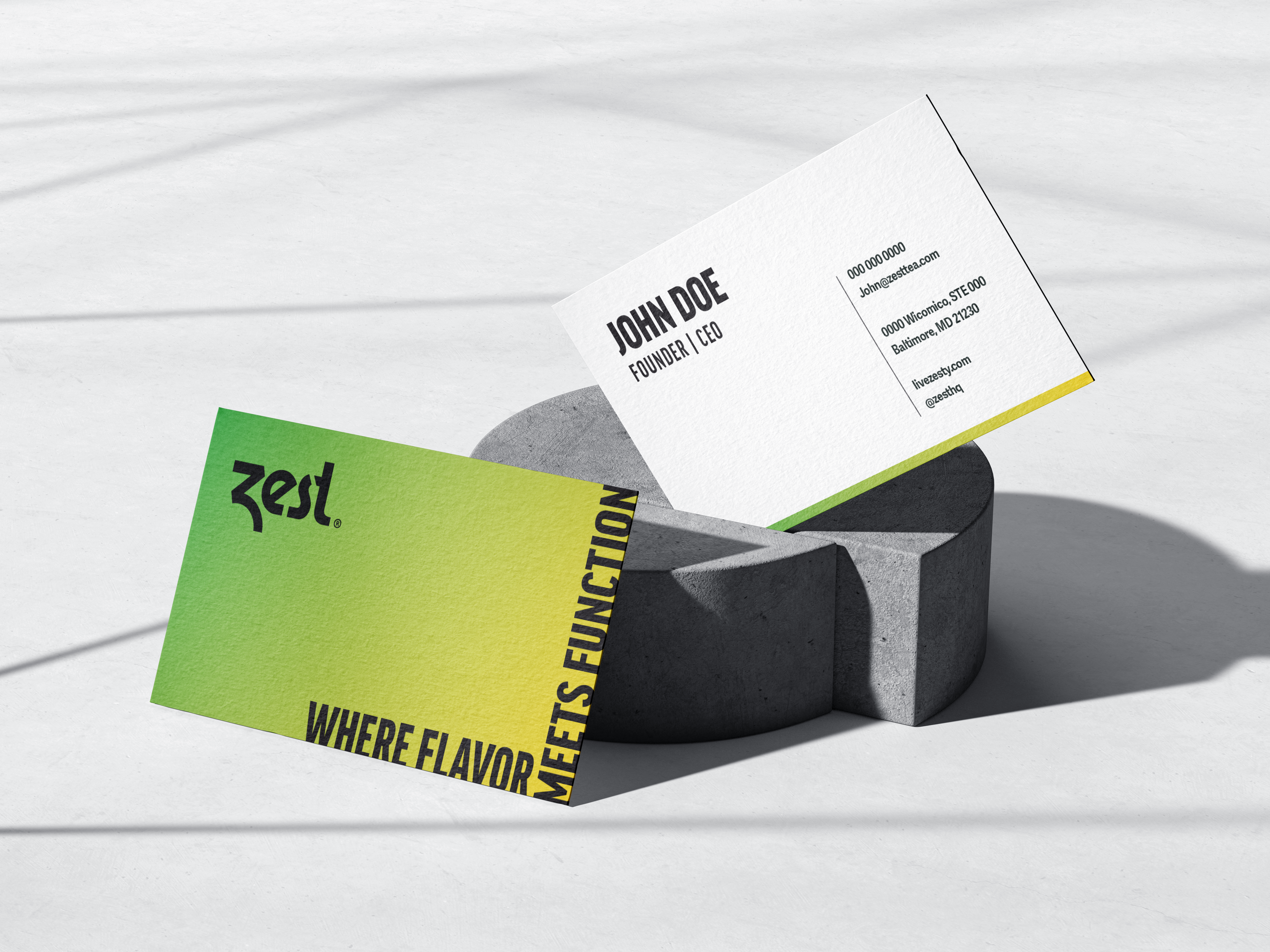
• A new visual identity balancing functionality and flavor, featuring modern typography, a refined color palette, and illustrative elements.
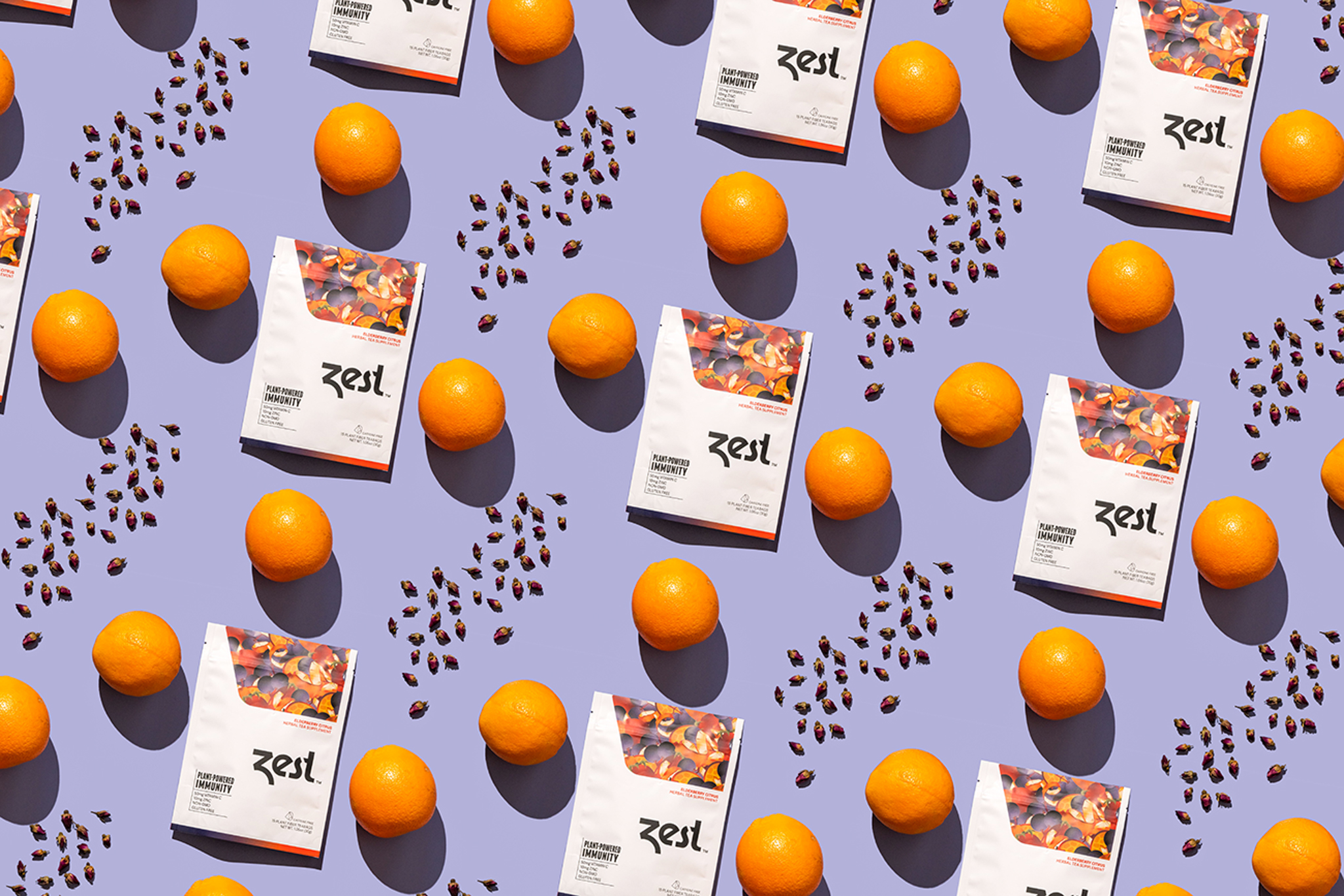
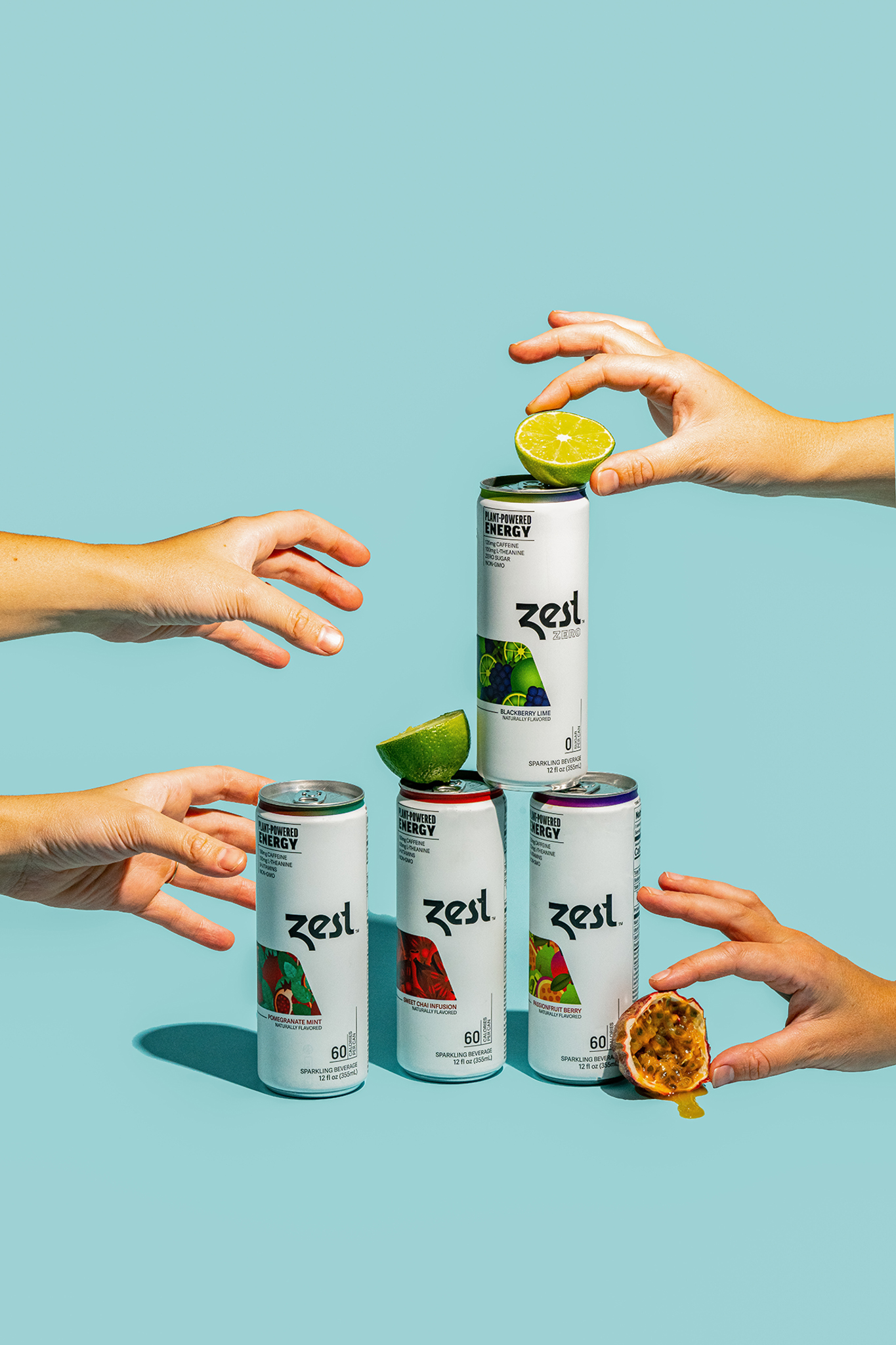
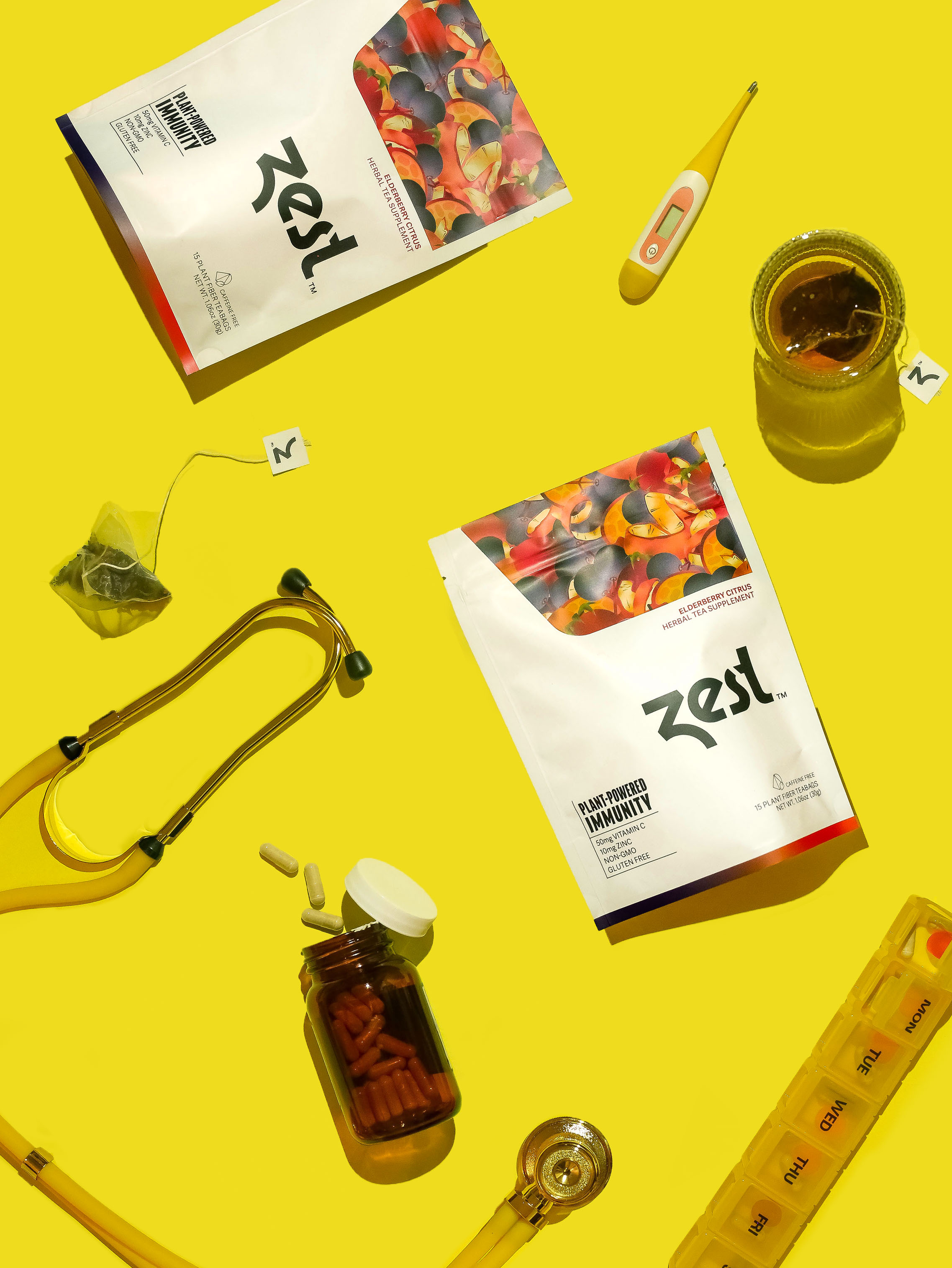
• Redesigned packaging for existing products (chipboard, tea pouches, ready-to-drink cans, and tea sachets) and new offerings (hydration powder mix and gummies).
• Art-directed photography and advertisements, including user-generated content strategies.
• A revamped UX/UI design for the website and Amazon store listings.
• A cohesive brand language that communicates Zest's commitment to helping customers "achieve more without unnecessary additives."
This rebrand positions Zest as a modern, determined brand in the nutritional beverage space, ready to expand its market presence and product line.
The primary goal was to reposition Zest from an energy-focused tea company to a holistic nutritional beverage brand. We aimed to create a professional, consistent visual identity that would resonate with health-conscious consumers and support the expansion into new functional beverage categories.
The Opportunity:
With customers seeking more from their beverages, there was a clear opportunity to broaden Zest's appeal and product range. By focusing on simple, science-backed ingredients, we could differentiate Zest in the crowded beverage market and meet the growing demand for transparent, purposeful nutrition.
The Outcome:
The rebranding project delivered a comprehensive overhaul of Zest's brand presence:
• A new visual identity balancing functionality and flavor, featuring modern typography, a refined color palette, and illustrative elements.
• Redesigned packaging for existing products (chipboard, tea pouches, ready-to-drink cans, and tea sachets) and new offerings (hydration powder mix and gummies).
• Art-directed photography and advertisements, including user-generated content strategies.
• A revamped UX/UI design for the website and Amazon store listings.
• A cohesive brand language that communicates Zest's commitment to helping customers "achieve more without unnecessary additives."
This rebrand positions Zest as a modern, determined brand in the nutritional beverage space, ready to expand its market presence and product line.
Branding
Packaging Design


Project:
The Gendermore Package
Sector:
Beauty & Health
Scope of Works:
Packaging
Illustration
3D Modeling & Rendering
Brand Identity
Motion Design
Photography
The Gendermore Package
Sector:
Beauty & Health
Scope of Works:
Packaging
Illustration
3D Modeling & Rendering
Brand Identity
Motion Design
Photography
The Gendermore Package is an innovative approach to gender-neutral design in product packaging. Instead of stripping away gender qualities, this project amplifies them through maximalist design, creating a vibrant and gender-ambiguous solution that challenges conventional packaging norms.
The Objective:
The primary goal was to redefine gender neutrality in packaging design by embracing and amplifying gender qualities rather than minimizing them. We aimed to create a series of product packages that would be visually striking, conceptually innovative, and appeal to consumers across the gender spectrum.
The Opportunity:
Current gender-neutral packaging often results in bland designs due to the removal of distinct characteristics. This project seized the opportunity to explore a new direction in inclusive design, potentially revolutionizing how brands approach gender neutrality in consumer products. By using maximalism, we could create packages that stand out in the market while addressing the growing demand for gender-inclusive products.
The Outcome:
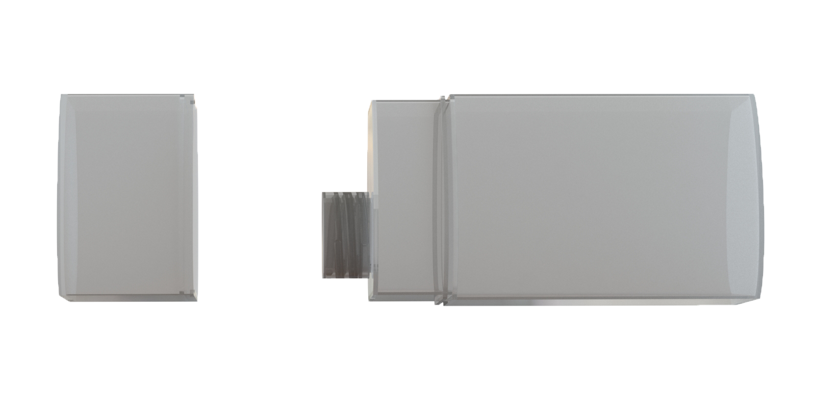
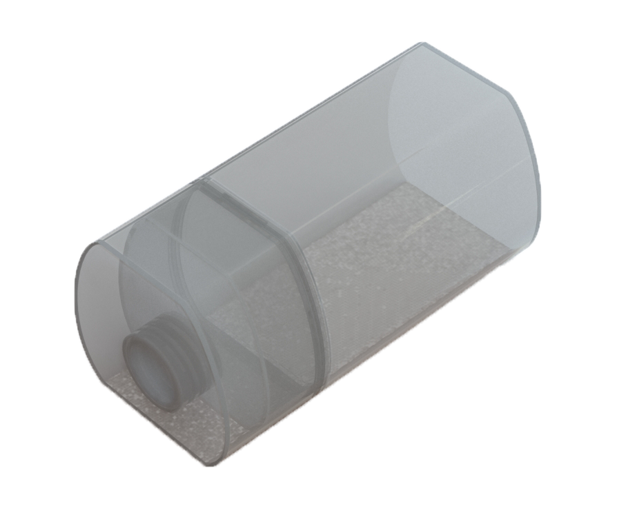
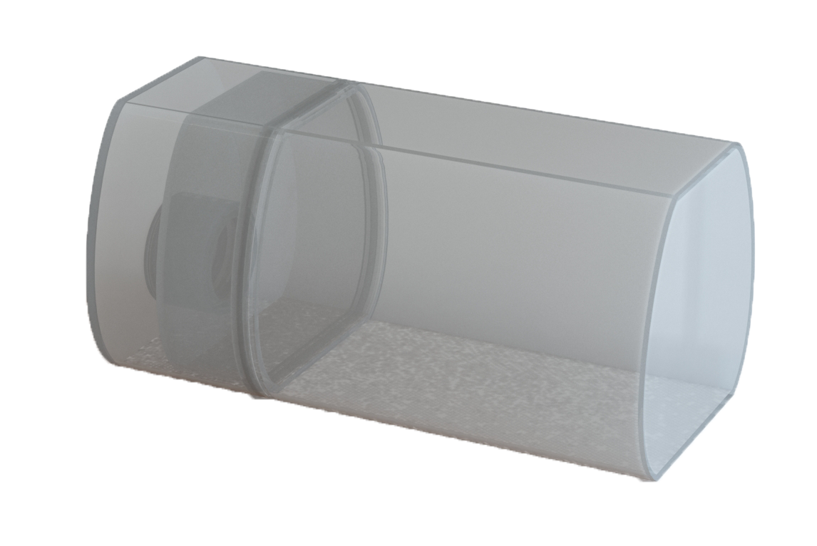
The project resulted in a diverse series of packaging designs that successfully embody the concept of gender ambiguity through maximalism. The outcomes include:
• Primary packaging designs utilizing 3D design and modeling techniques, creating unique structural elements that blur gender lines.
• Secondary packaging featuring custom branding, patterns, and illustrations that amplify gender qualities to the point of ambiguity.
• A comprehensive product line including liquid eyeliner, lip gloss, foundation stick, moisturizer, face wash, hair paste, shampoo, and gender-specific vitamins.
• A visually compelling and conceptually intriguing product range that challenges perceptions of gender in design while offering a fresh alternative to conventional gender-neutral aesthetics.
This project demonstrates how embracing complexity in design can lead to more inclusive and engaging product packaging solutions.
The primary goal was to redefine gender neutrality in packaging design by embracing and amplifying gender qualities rather than minimizing them. We aimed to create a series of product packages that would be visually striking, conceptually innovative, and appeal to consumers across the gender spectrum.
The Opportunity:
Current gender-neutral packaging often results in bland designs due to the removal of distinct characteristics. This project seized the opportunity to explore a new direction in inclusive design, potentially revolutionizing how brands approach gender neutrality in consumer products. By using maximalism, we could create packages that stand out in the market while addressing the growing demand for gender-inclusive products.
The Outcome:
The project resulted in a diverse series of packaging designs that successfully embody the concept of gender ambiguity through maximalism. The outcomes include:
• Primary packaging designs utilizing 3D design and modeling techniques, creating unique structural elements that blur gender lines.
• Secondary packaging featuring custom branding, patterns, and illustrations that amplify gender qualities to the point of ambiguity.
• A comprehensive product line including liquid eyeliner, lip gloss, foundation stick, moisturizer, face wash, hair paste, shampoo, and gender-specific vitamins.
• A visually compelling and conceptually intriguing product range that challenges perceptions of gender in design while offering a fresh alternative to conventional gender-neutral aesthetics.
This project demonstrates how embracing complexity in design can lead to more inclusive and engaging product packaging solutions.
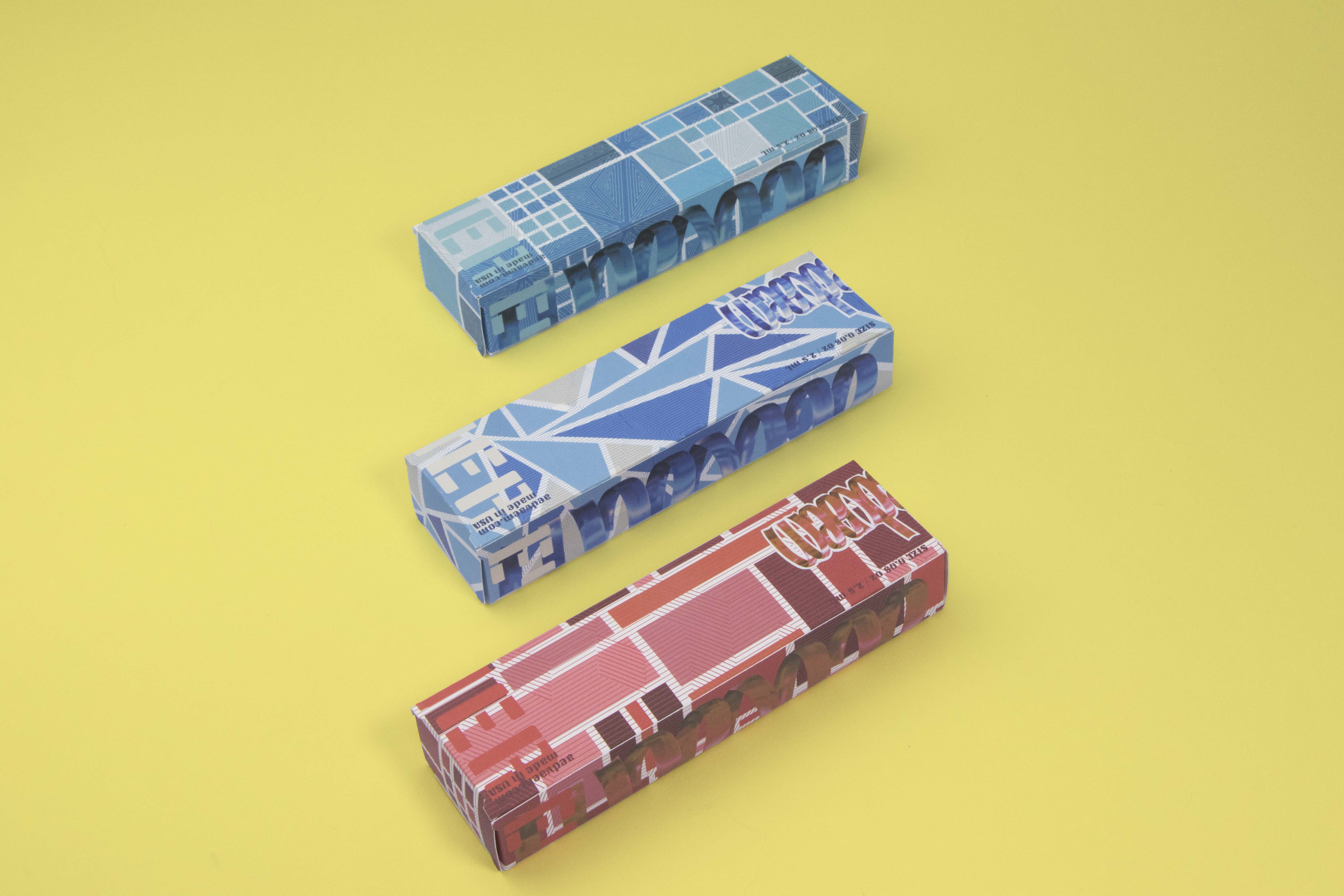
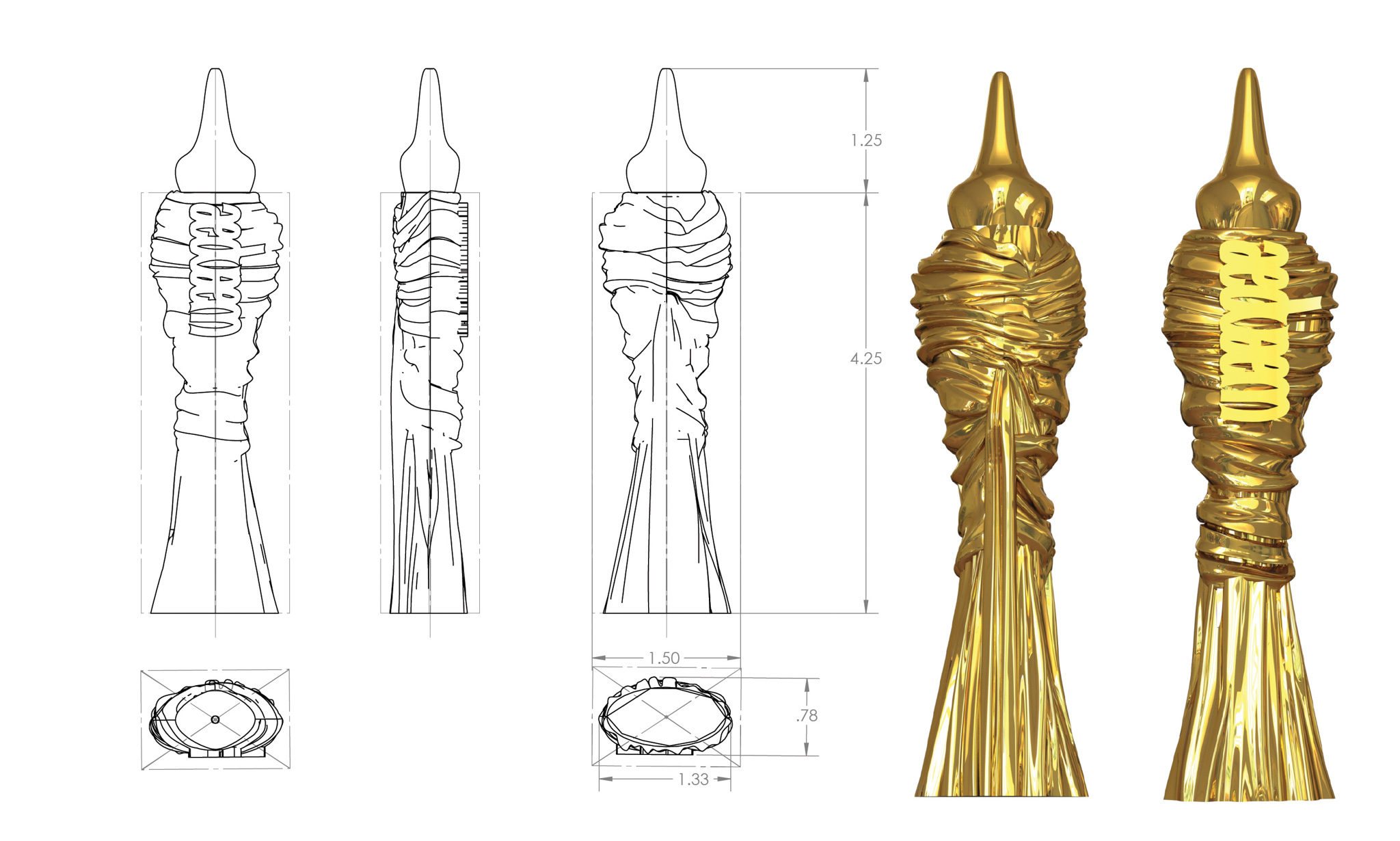
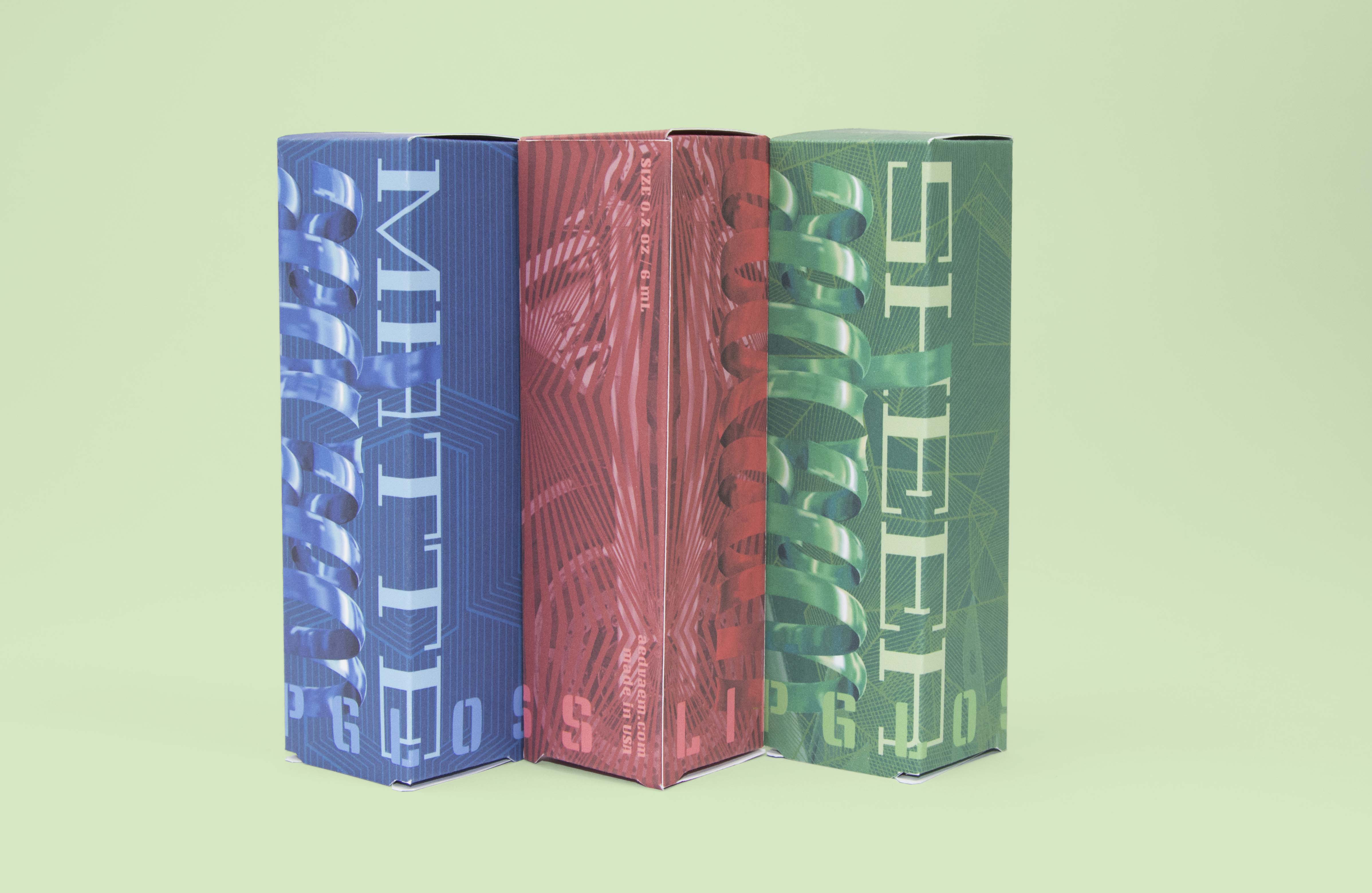
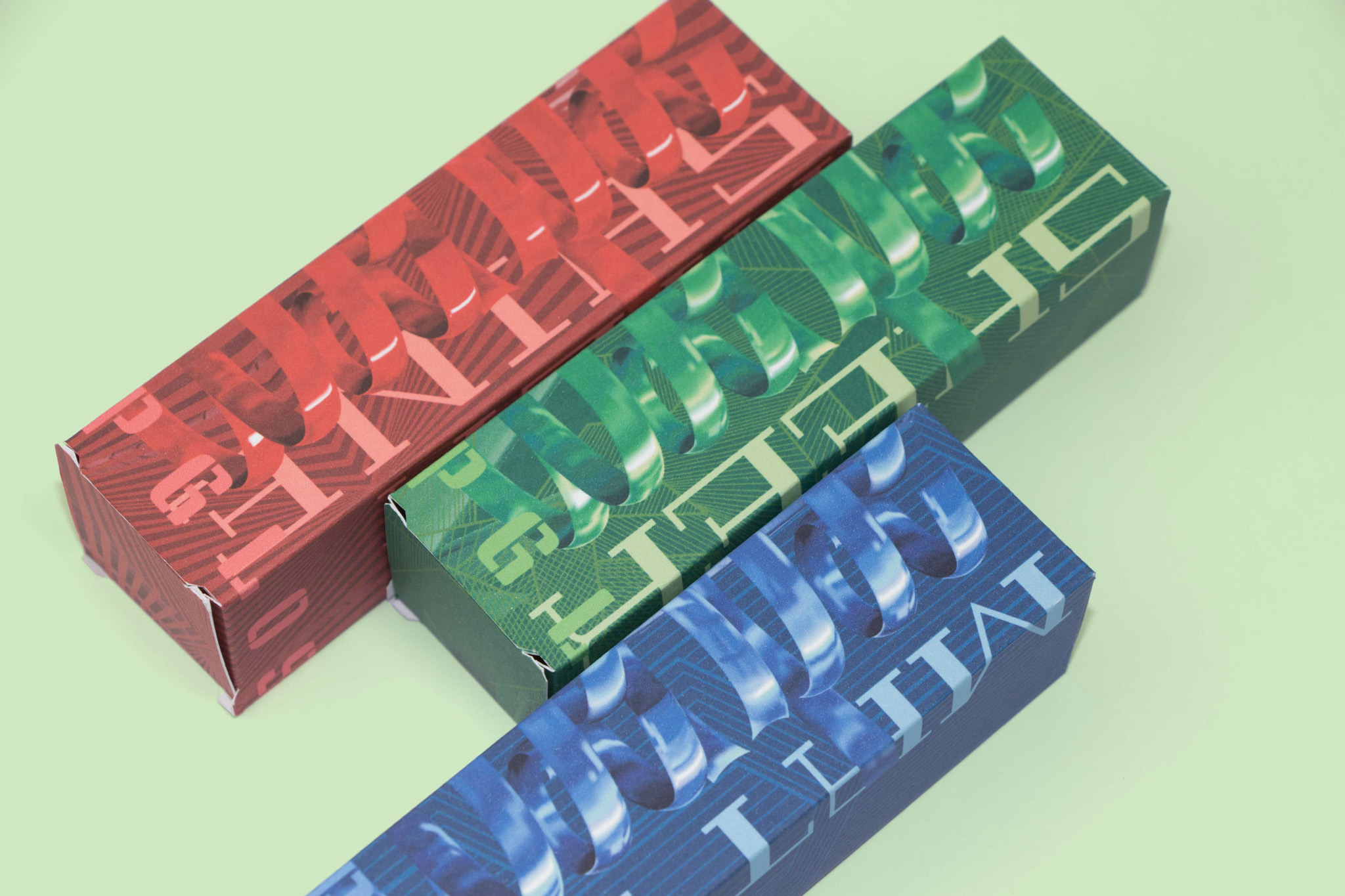
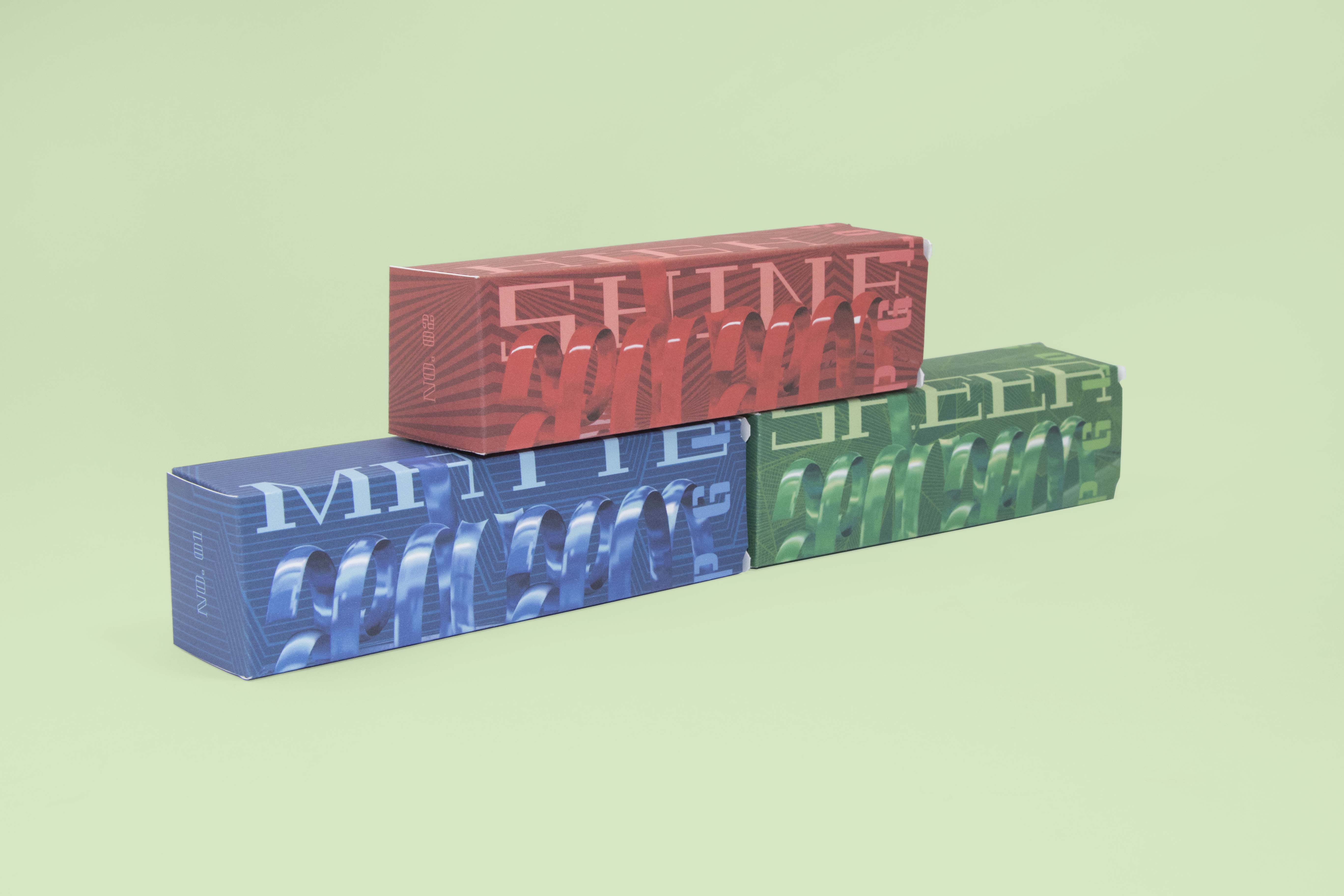
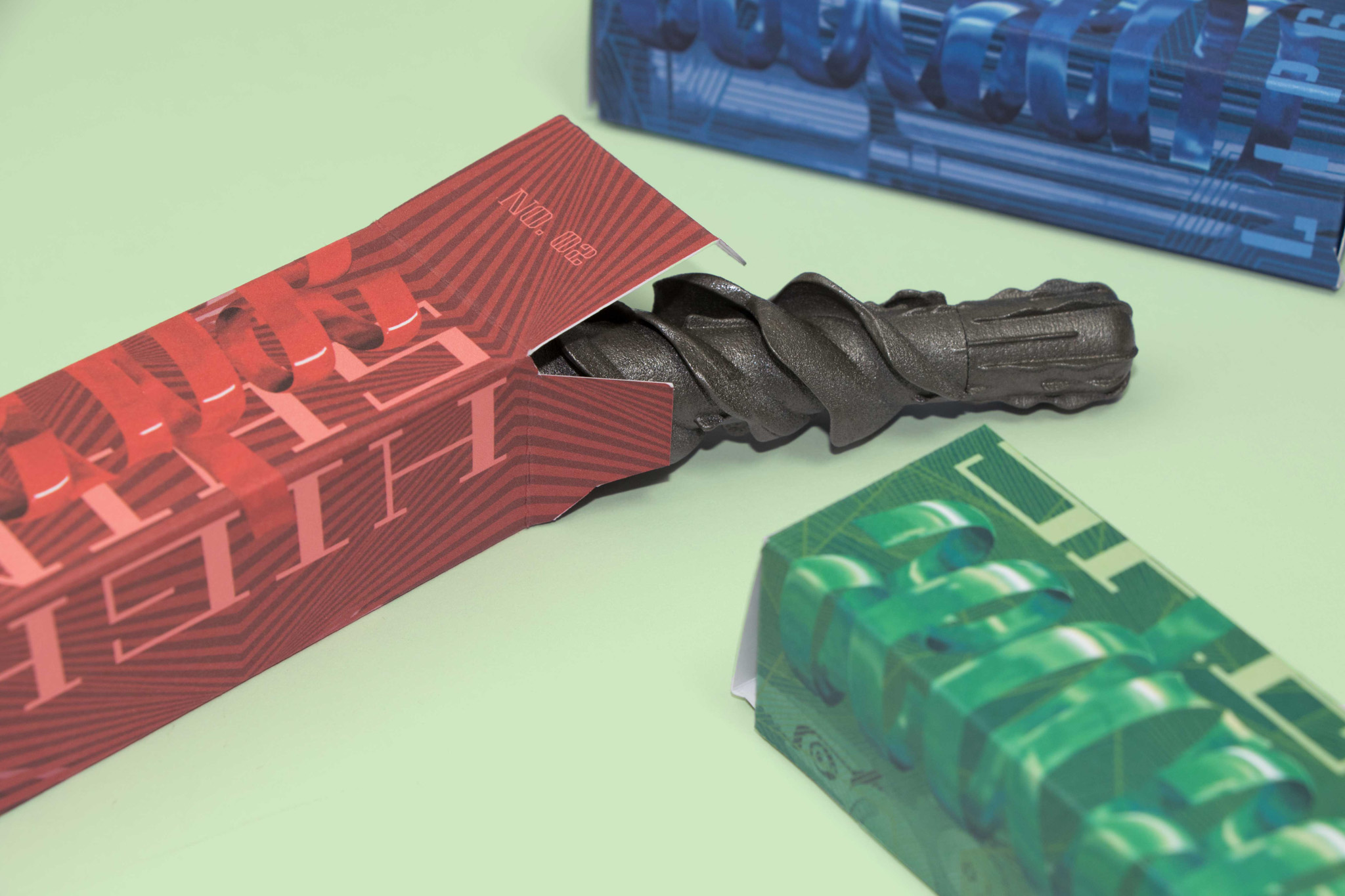
Makeup for All Genders
Liquid Eyeliner & Lip Gloss
The primary packages of eyeliner and lipgloss are designed in feminine forms, inspired by drapery and curvy forms. They are in gold and gunmetal which are portraying a masculine feeling. For the secondary packages, patterns made of straight lines, geometric shapes, and photos of metal are used to decorate based on male preference.
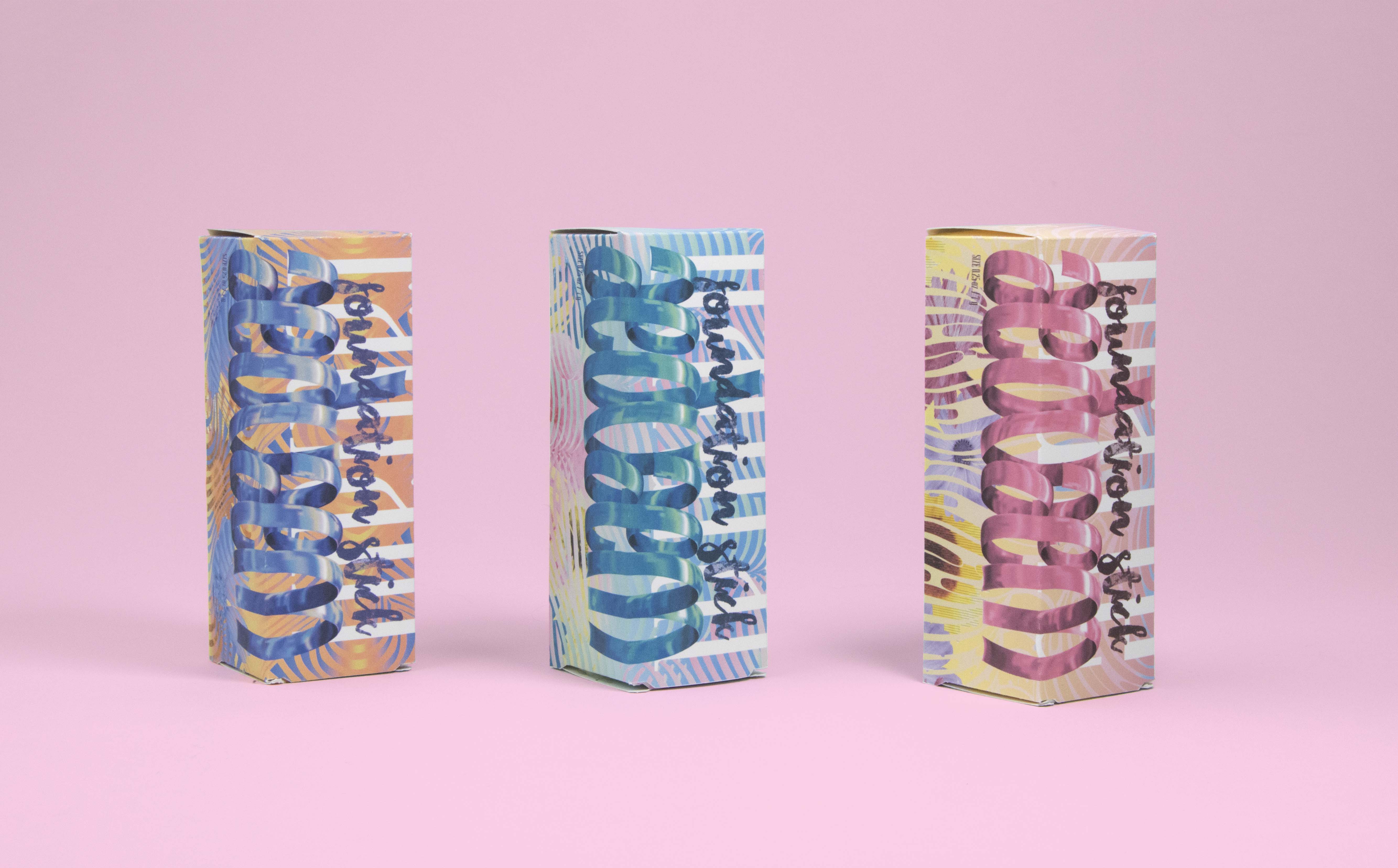
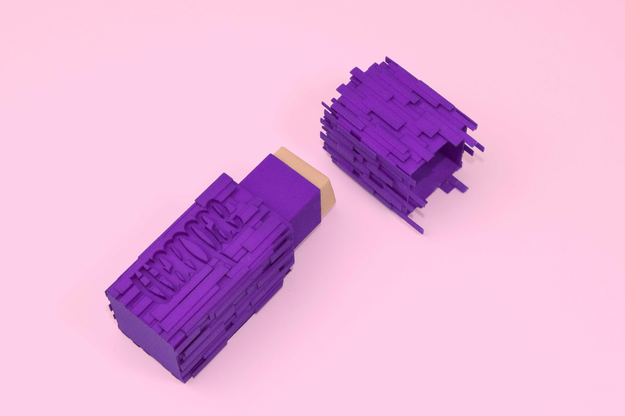
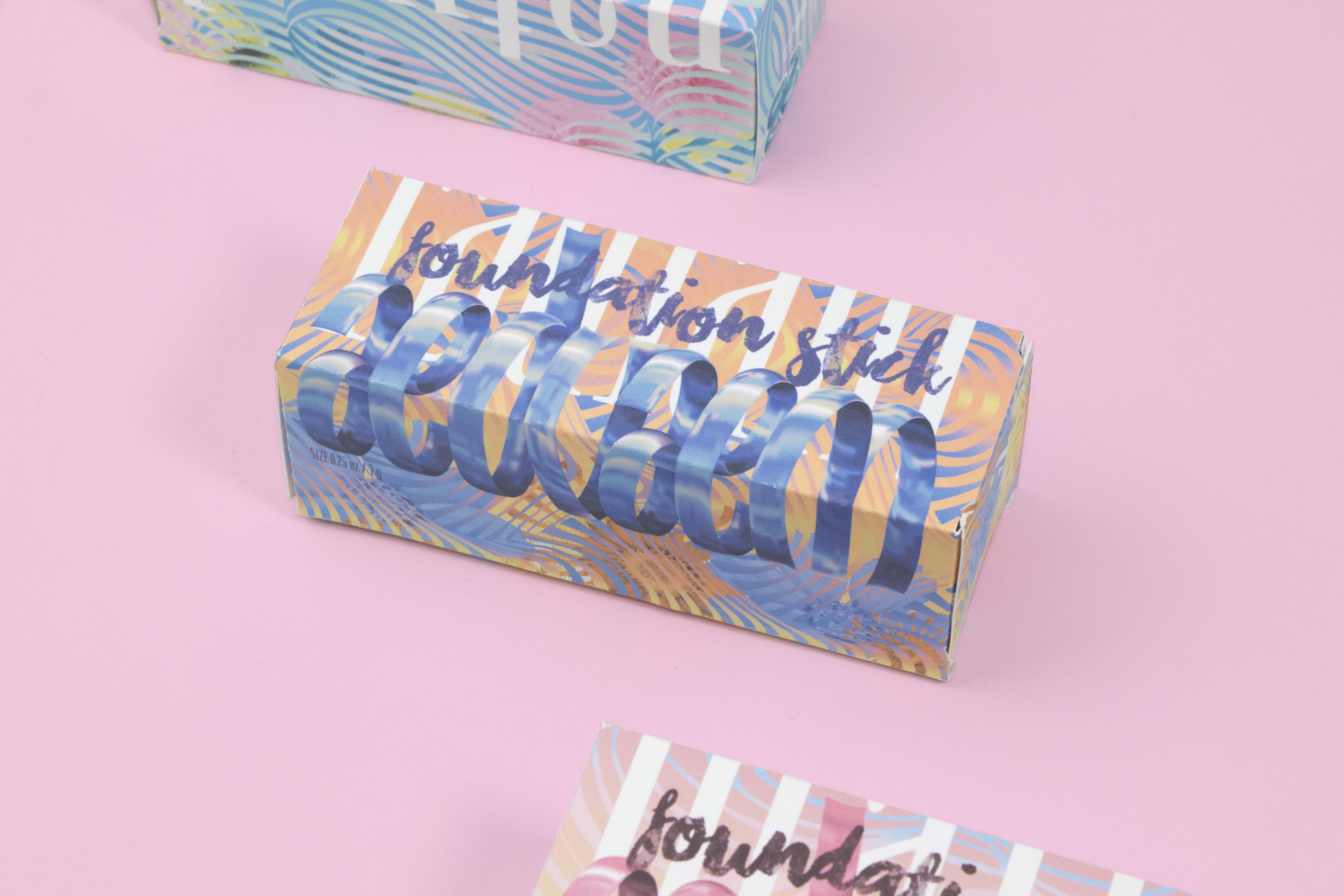
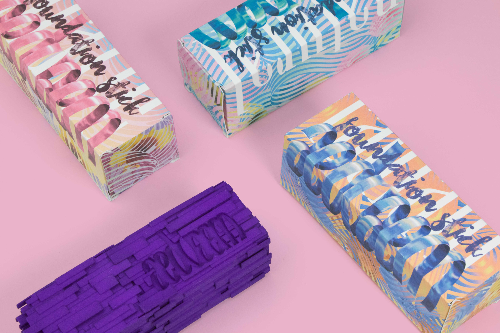
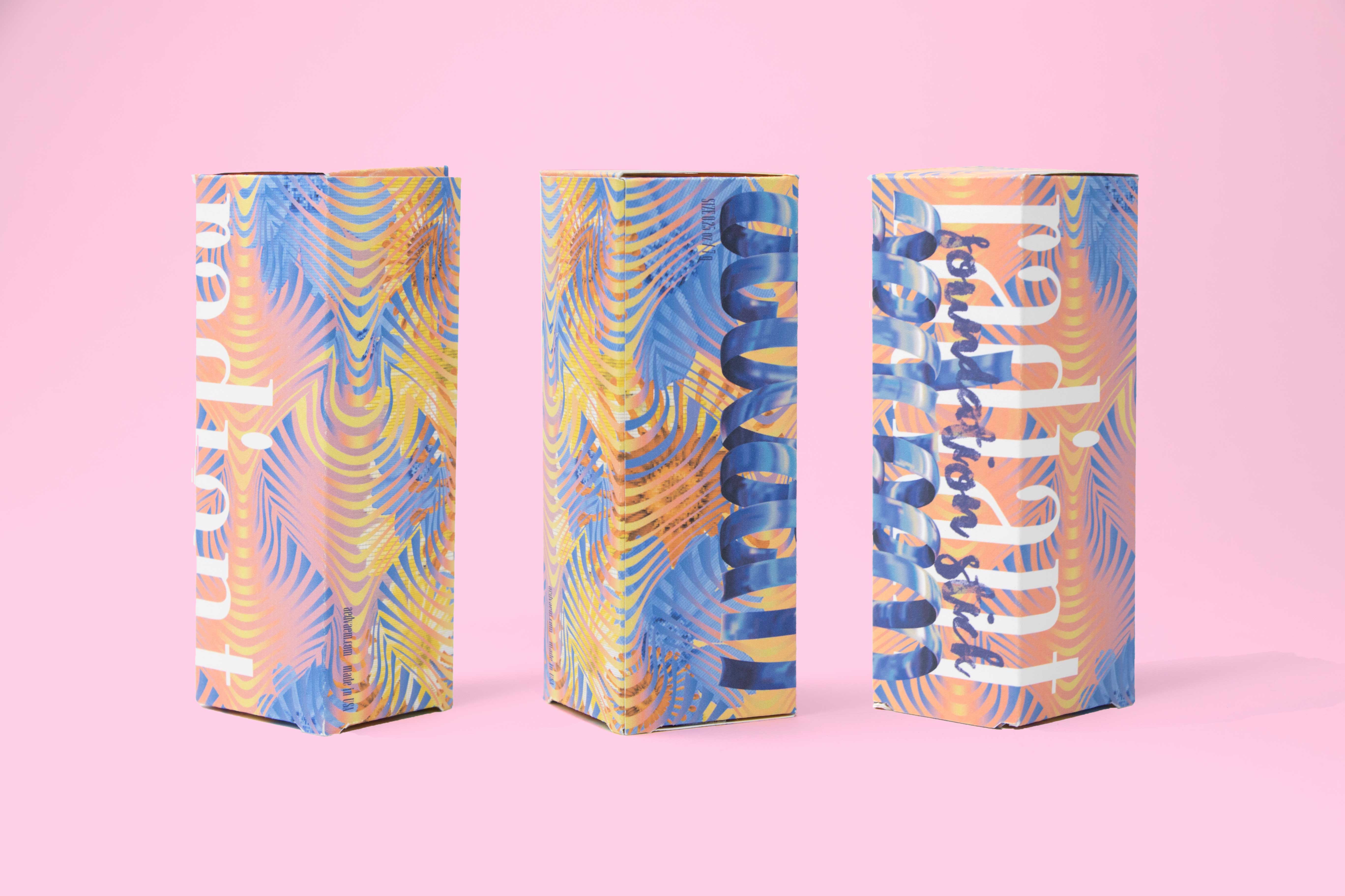
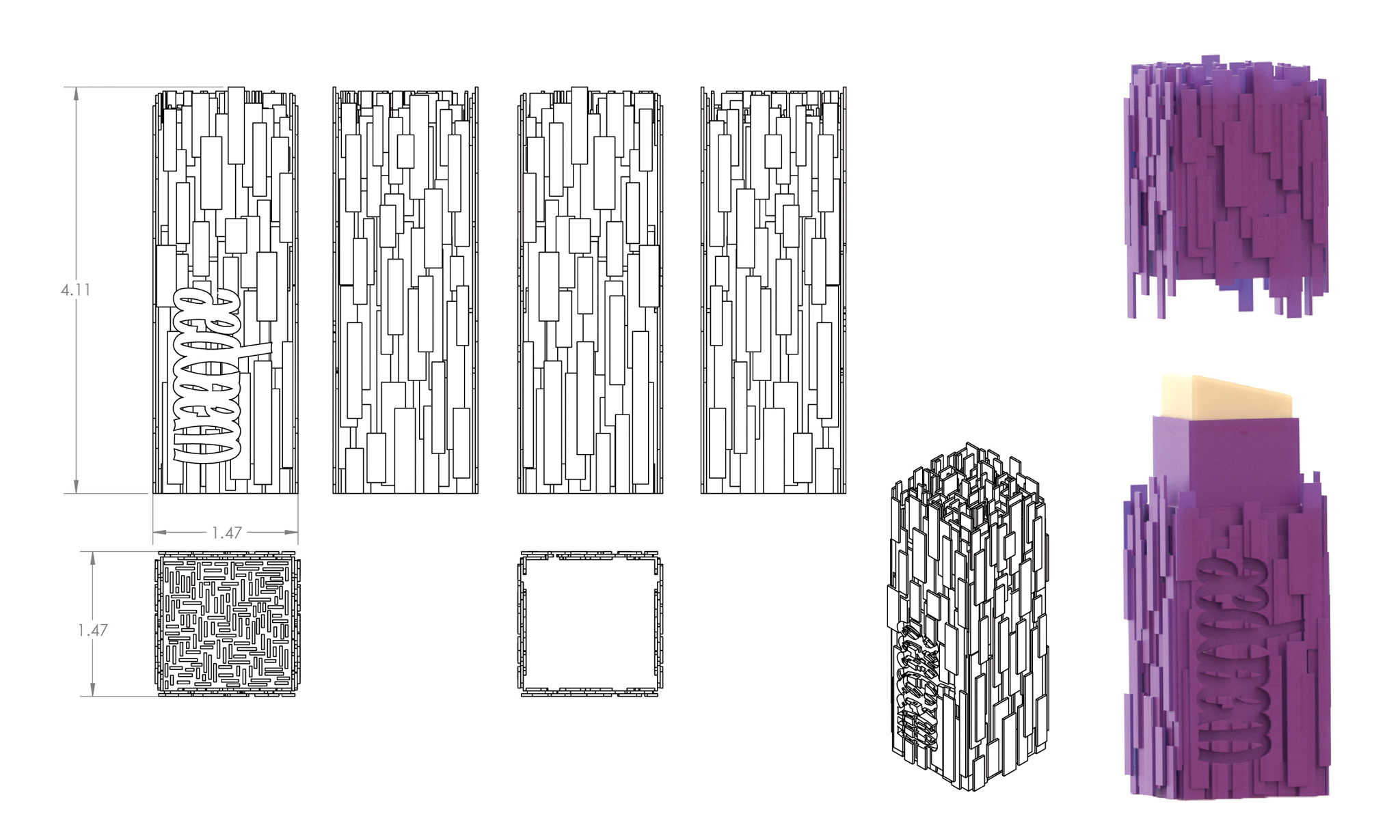
Foundation Stick
The foundation stick is packaged in an upright cuboid form with rectangular textures. It is in purple which is the least preferred color for males. The secondary packages are in pastel gradient with feminine typefaces and organic patterns, photo collages of flowers are also used.
Skincare for All Genders
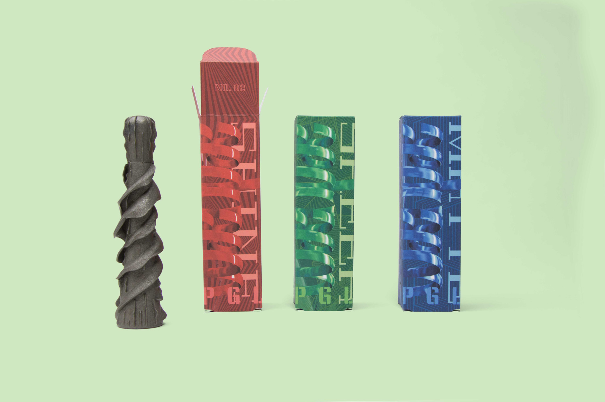
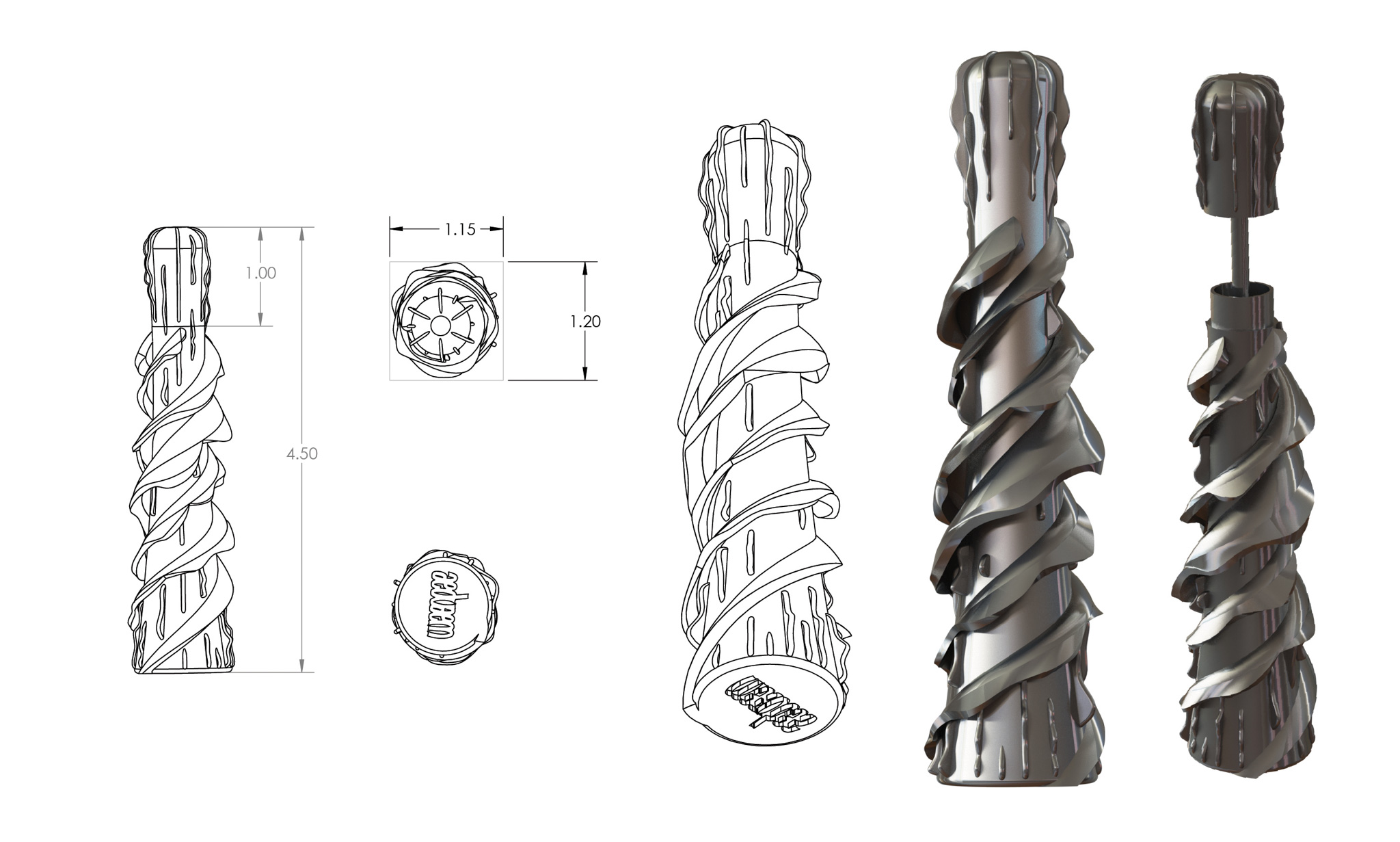
Moisturizer
The primary package of the moisturizer is designed based on male preference, which is cubic shape according to my research. The whole package is covered with a texture made of straight lines. A female-preferred color, pink, is chosen to create a gender-ambiguous perception.
The secondary packages are designed depending on female preference. Condensed, hand script and gothic typefaces are used since they are usually associated with femininity. Cones, spheres, and organic shapes are used as patterns. Iridescent effect background and pastel color tones are also added as decorated elements.
Face Wash
As for face wash, the primary package is designed based on female preference—an organic form with sphere cutouts. It is in blue to create a multi-gender feeling. The secondary packages are designed based on male preferences. Typewriter fonts, typefaces with hard edges, and rigid forms are used. Rectangular and cube patterns and glitch effect backgrounds are used as male-preferred decorated elements.
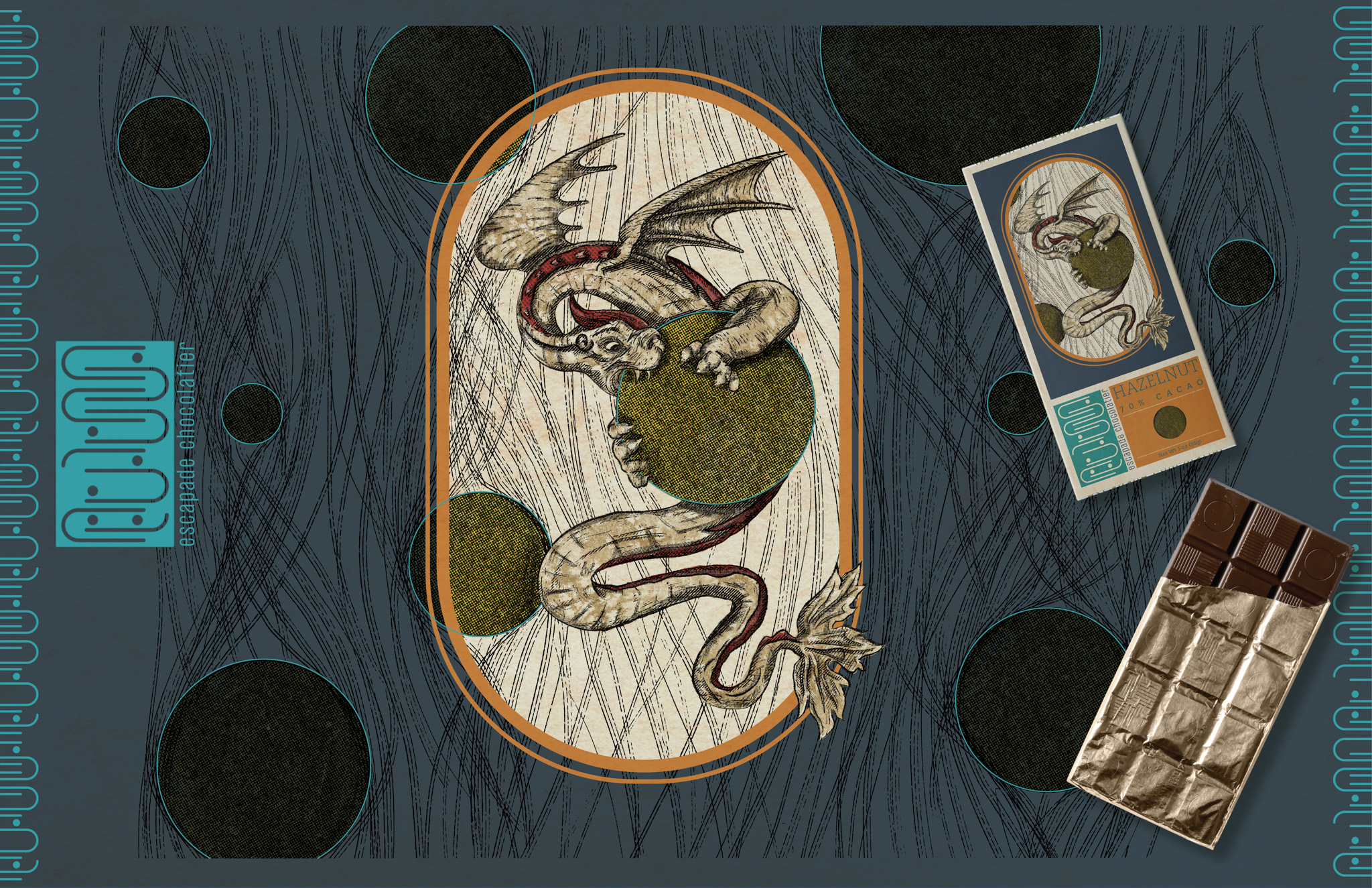
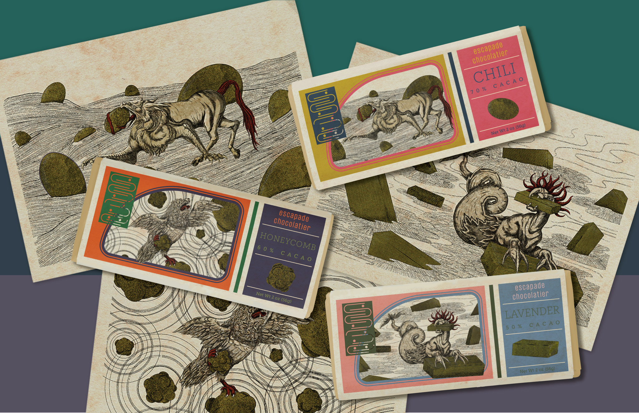
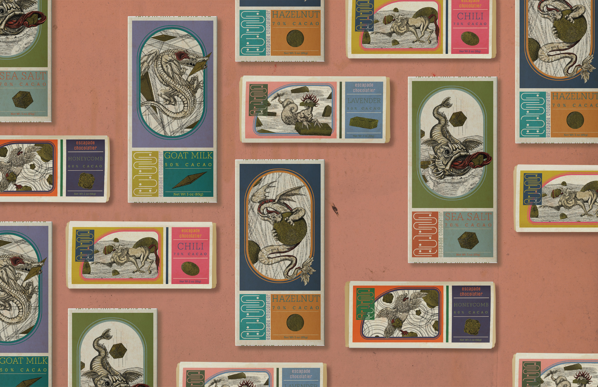
Project:
Escapade Chocolatier
Sector:
Food
Scope of Works:
Brand Identity
Packaging
Illustration
Escapade Chocolatier
Sector:
Food
Scope of Works:
Brand Identity
Packaging
Illustration
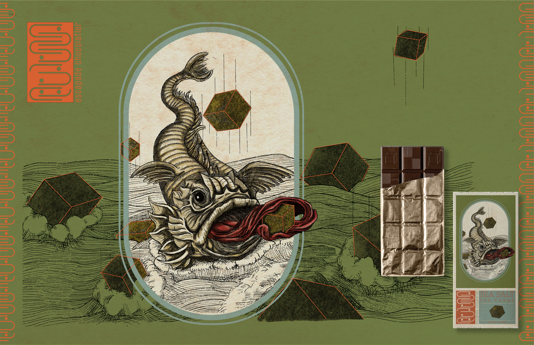
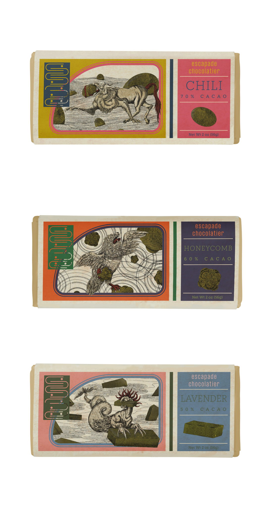
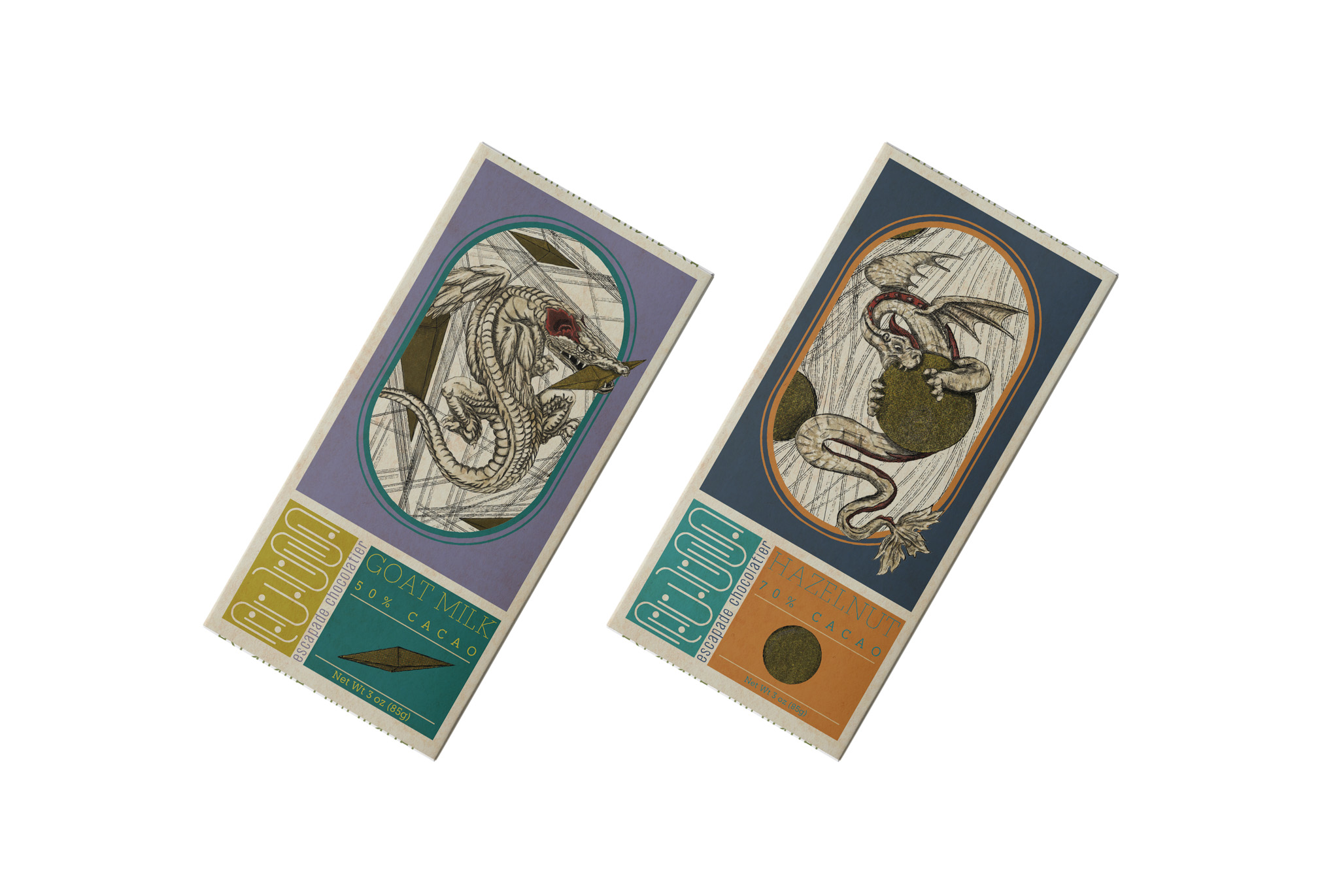
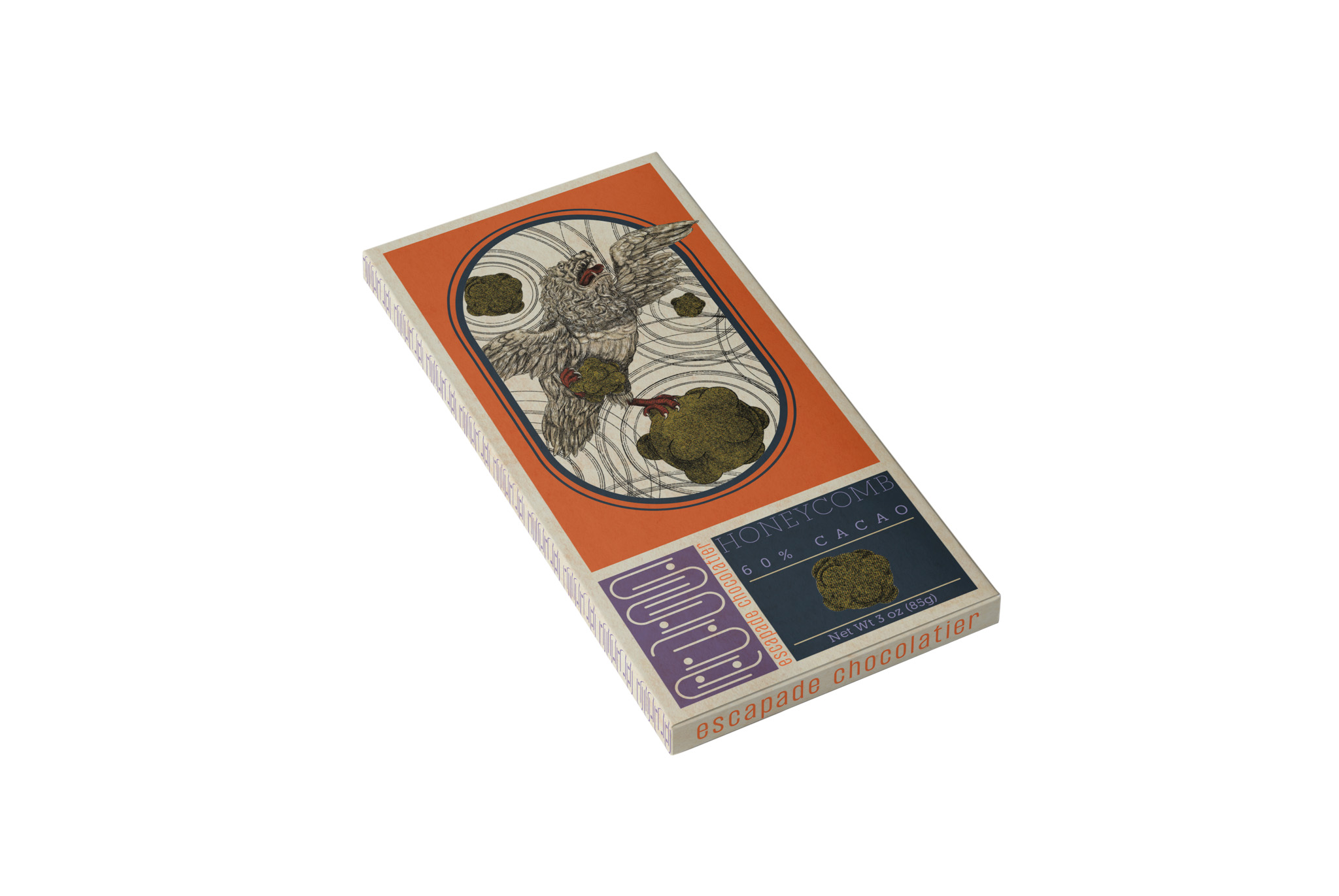
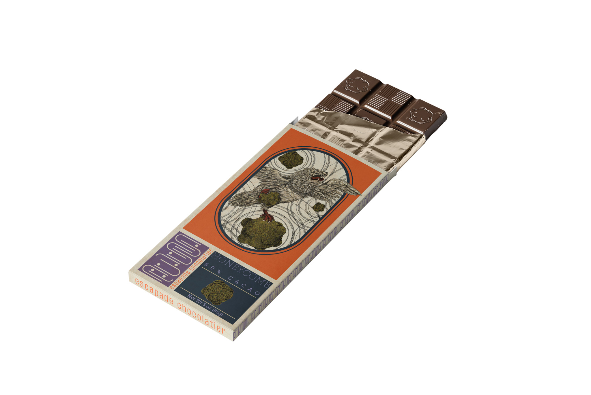
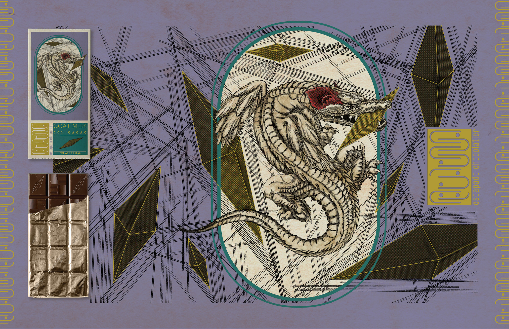
Escapade Chocolatier is a high-end concept chocolatier that transports customers to the Medieval era through visually captivating packaging featuring mysterious monsters. This multi-disciplinary project combines graphic design, packaging, illustration, and branding to create a unique chocolate experience for both in-store and retail customers
The Objective:
The primary goal was to design a distinctive brand identity and packaging system for a premium chocolate line that would stand out in the market. We aimed to create an immersive brand experience that blends Medieval folklore with contemporary design, appealing to chocolate enthusiasts seeking both quality and storytelling in their confections.
The Opportunity:
With the growing demand for artisanal and experiential food products, there was an opportunity to create a chocolate brand that goes beyond taste, offering customers a visual and imaginative journey. By tapping into the rich imagery of Medieval monsters, we could differentiate Escapade Chocolatier in a crowded market and appeal to consumers looking for products with depth and character.
The Outcome:
The project resulted in a comprehensive brand and packaging system for Escapade Chocolatier, including:
• A series of six unique chocolate bar designs, each featuring a different Medieval monster illustrated in vintage inking style with low-fi comic coloring.• Custom packaging for various product sizes, in-store drinking cups, and chocolate milk cartons.
• A cohesive visual language using geometric shapes and symbols for easy flavor identification.
• A brand logo that doubles as a decorative pattern, enhancing brand unity across all touchpoints.
• A subtle color palette that contrasts with the dramatic monster illustrations, creating a visually striking effect.
This innovative approach to chocolate packaging not only protects the product but also tells a story, bringing joy and whimsy to customers while establishing Escapade Chocolatier as a unique player in the premium chocolate market.
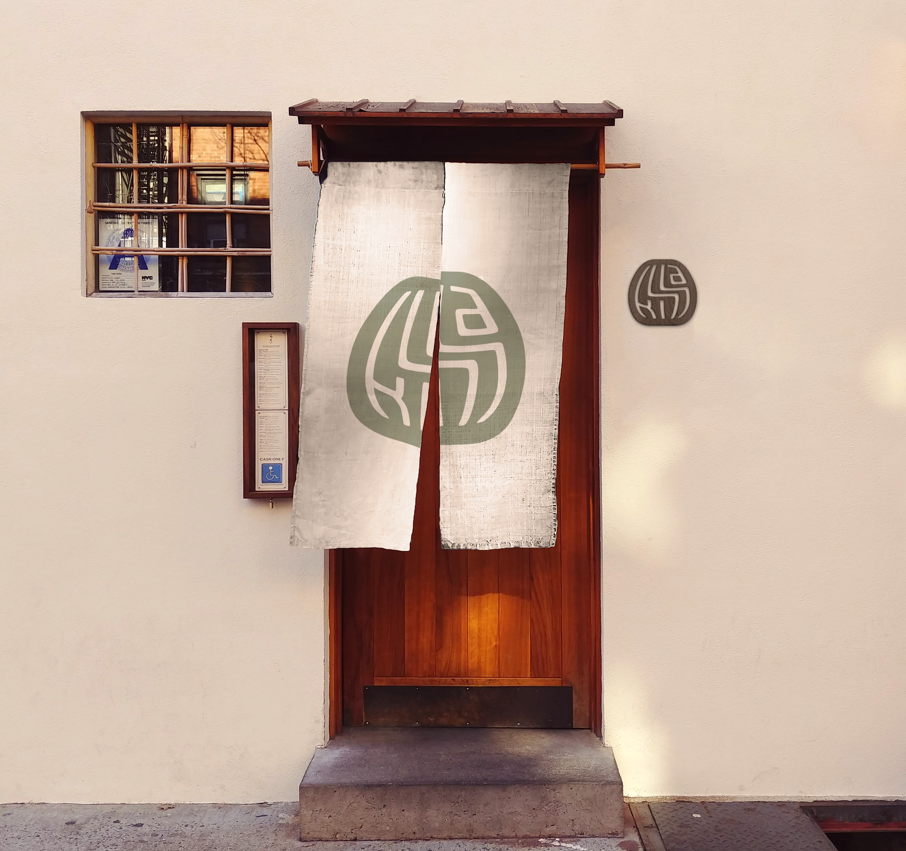
Project:
KISSA Tea Company
Sector:
Beverages
Scope of Works:
Brand Identity
Branding system
3D Modeling & Rendering
Packaging
Illustration
Brand experience
Advertising
Photography
KISSA Tea Company
Sector:
Beverages
Scope of Works:
Brand Identity
Branding system
3D Modeling & Rendering
Packaging
Illustration
Brand experience
Advertising
Photography
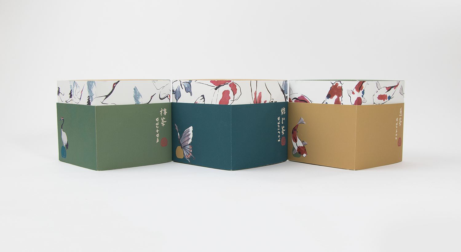
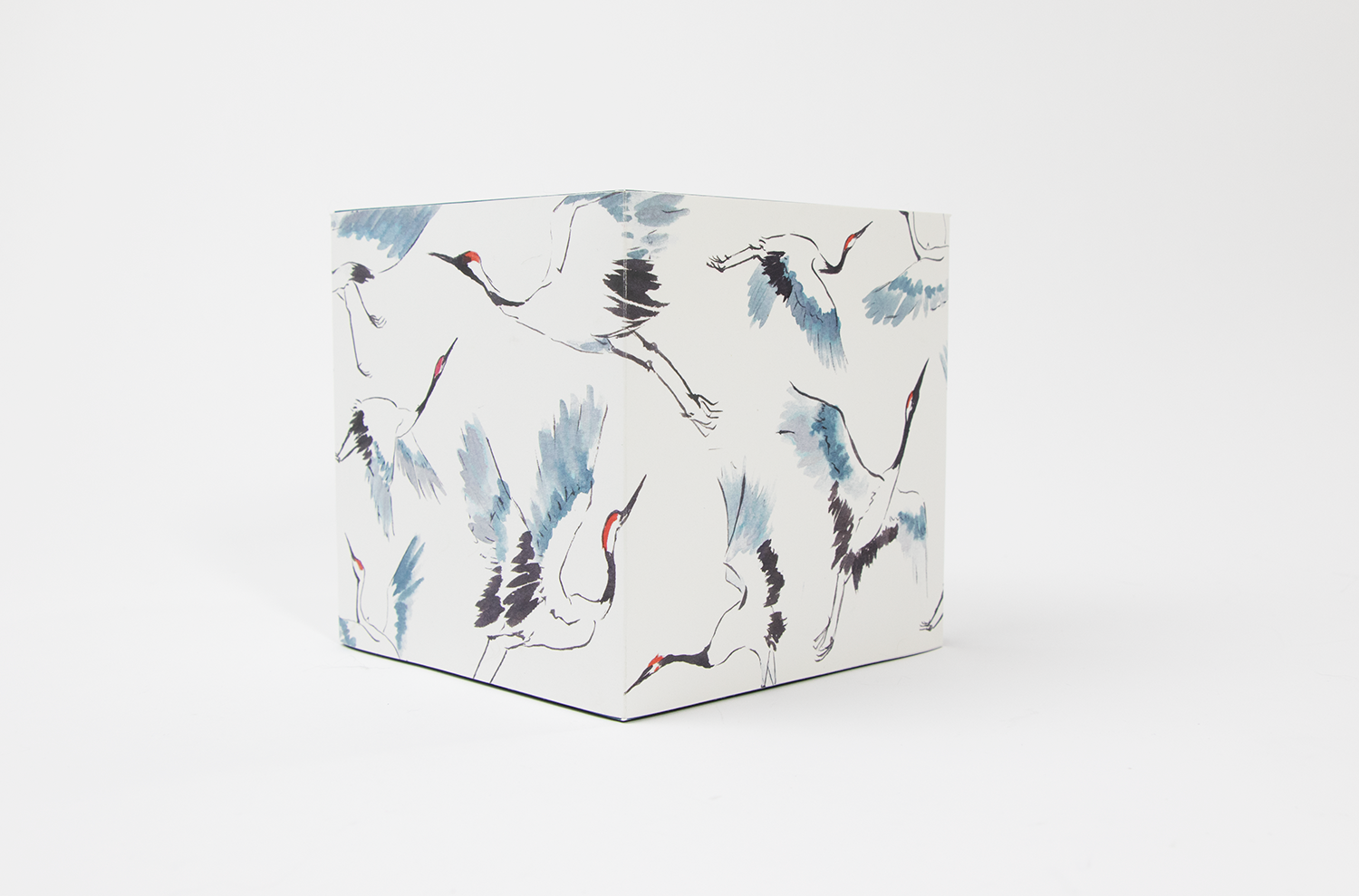
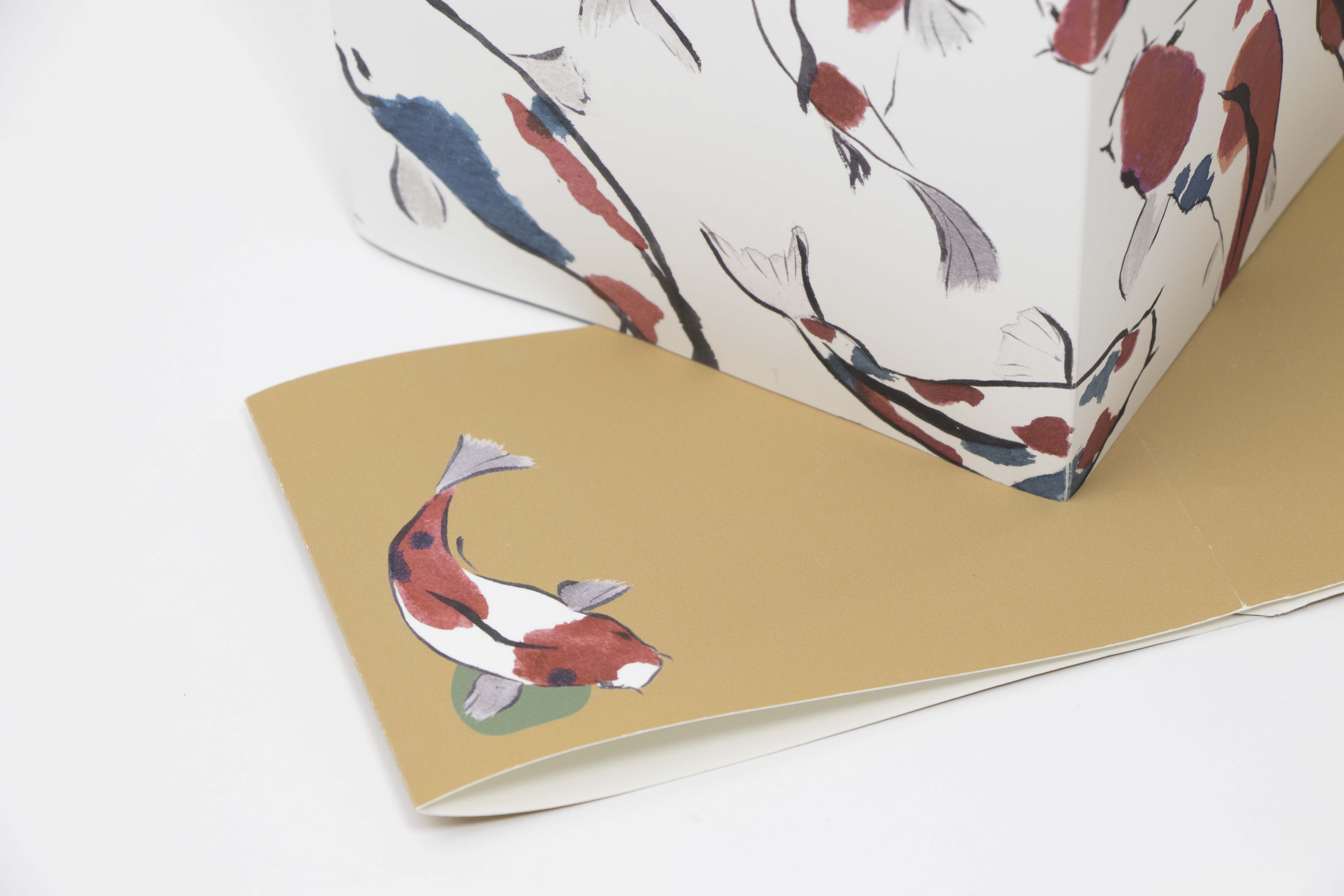
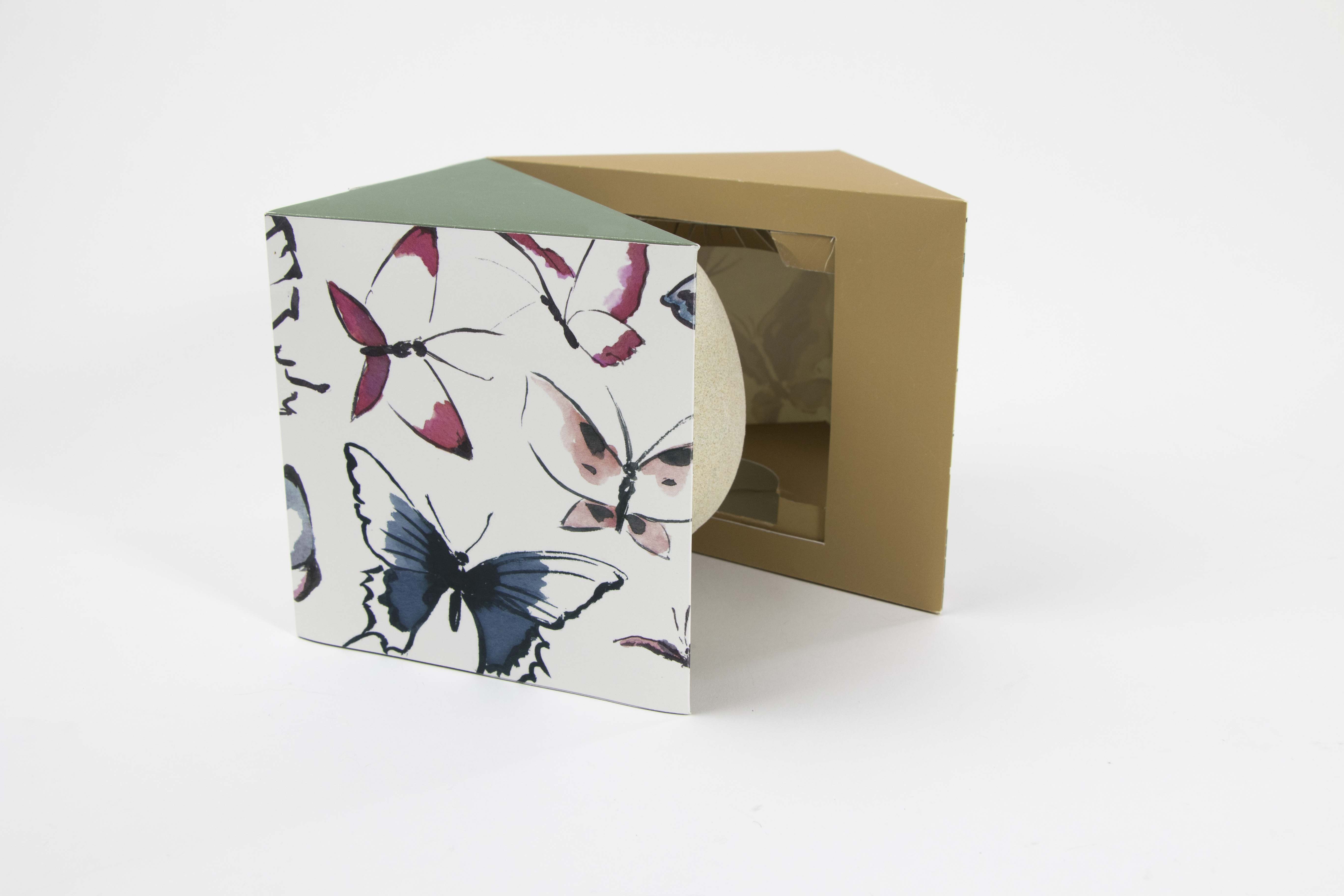
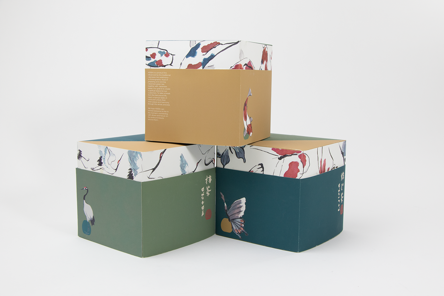
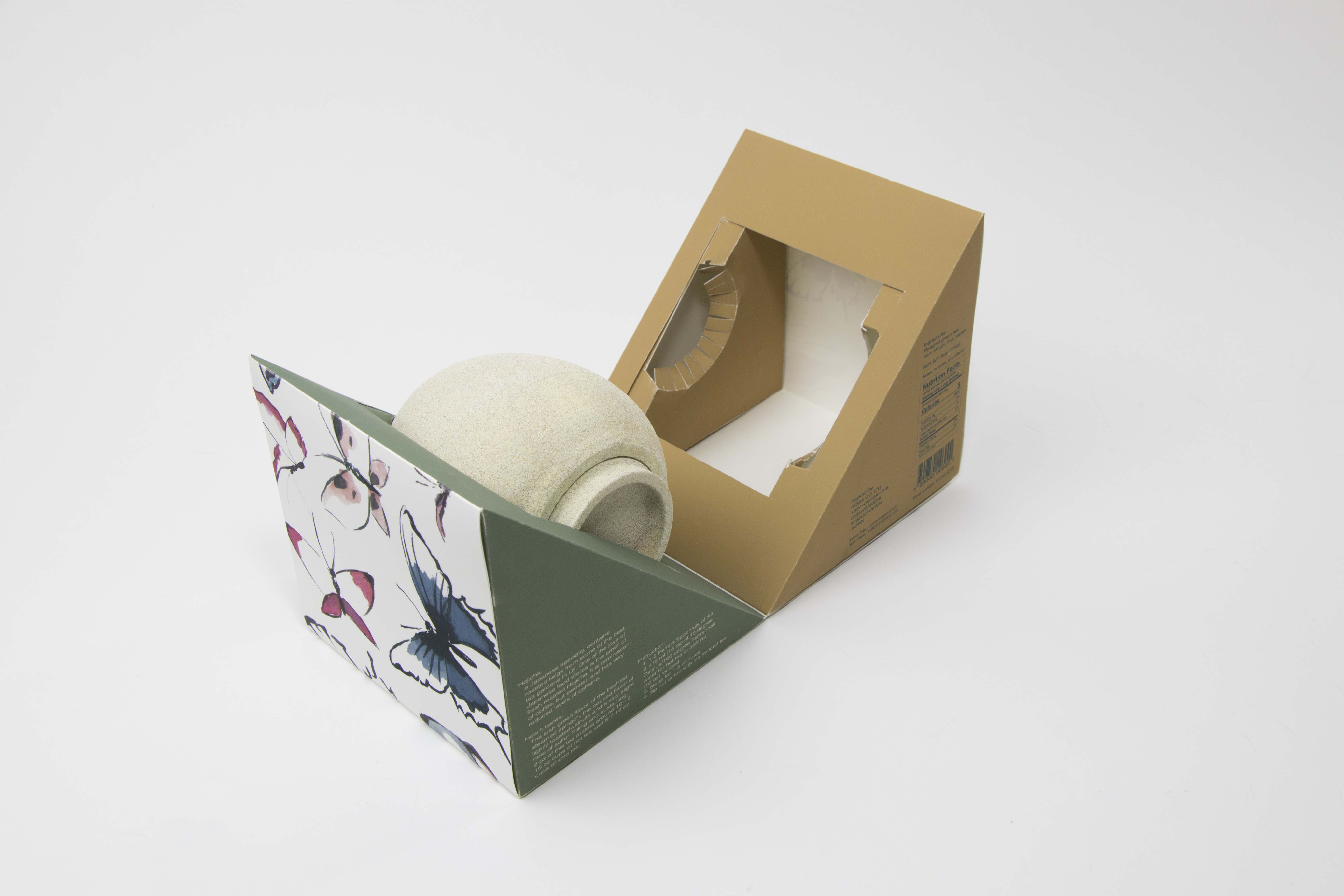
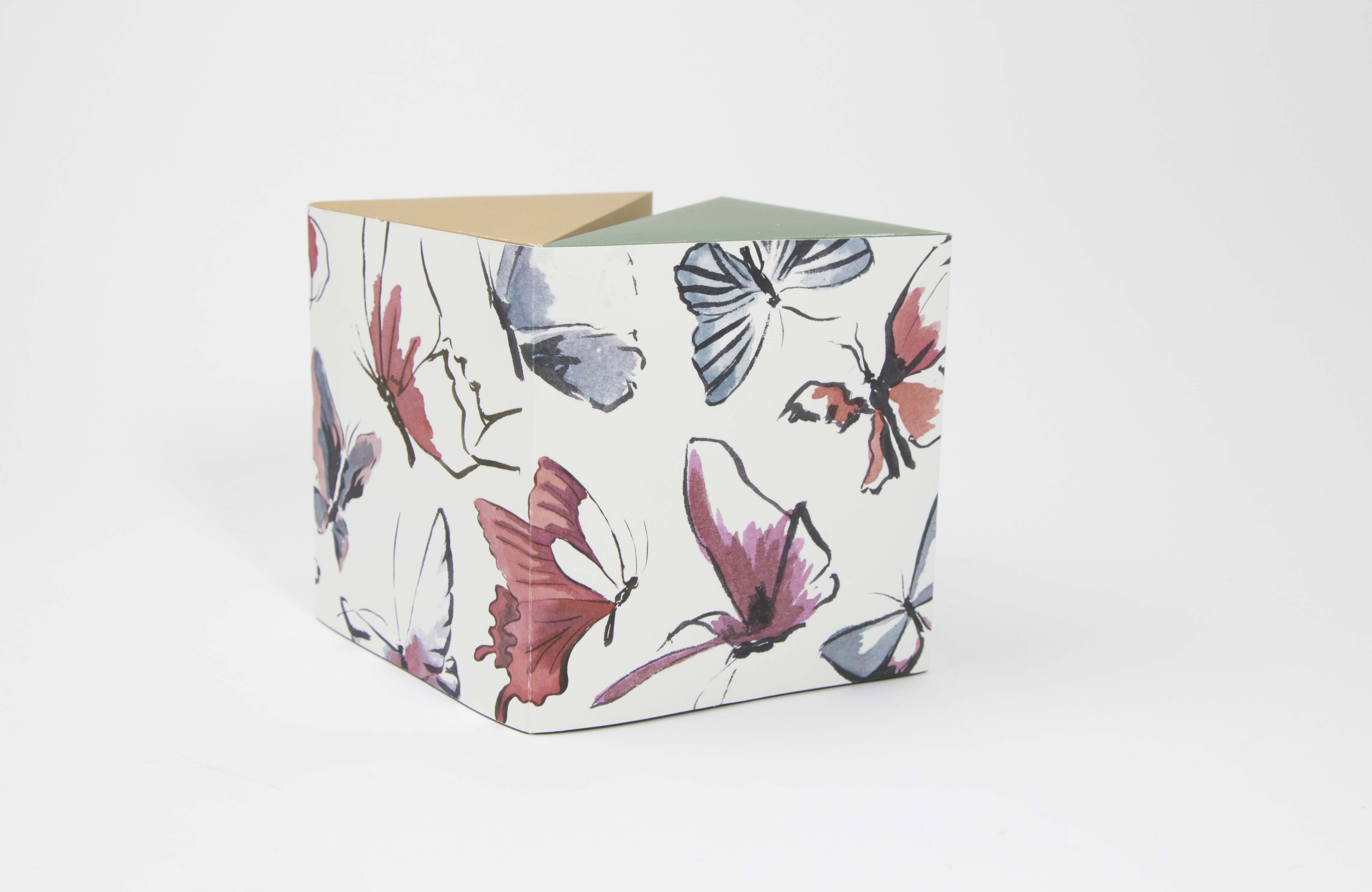
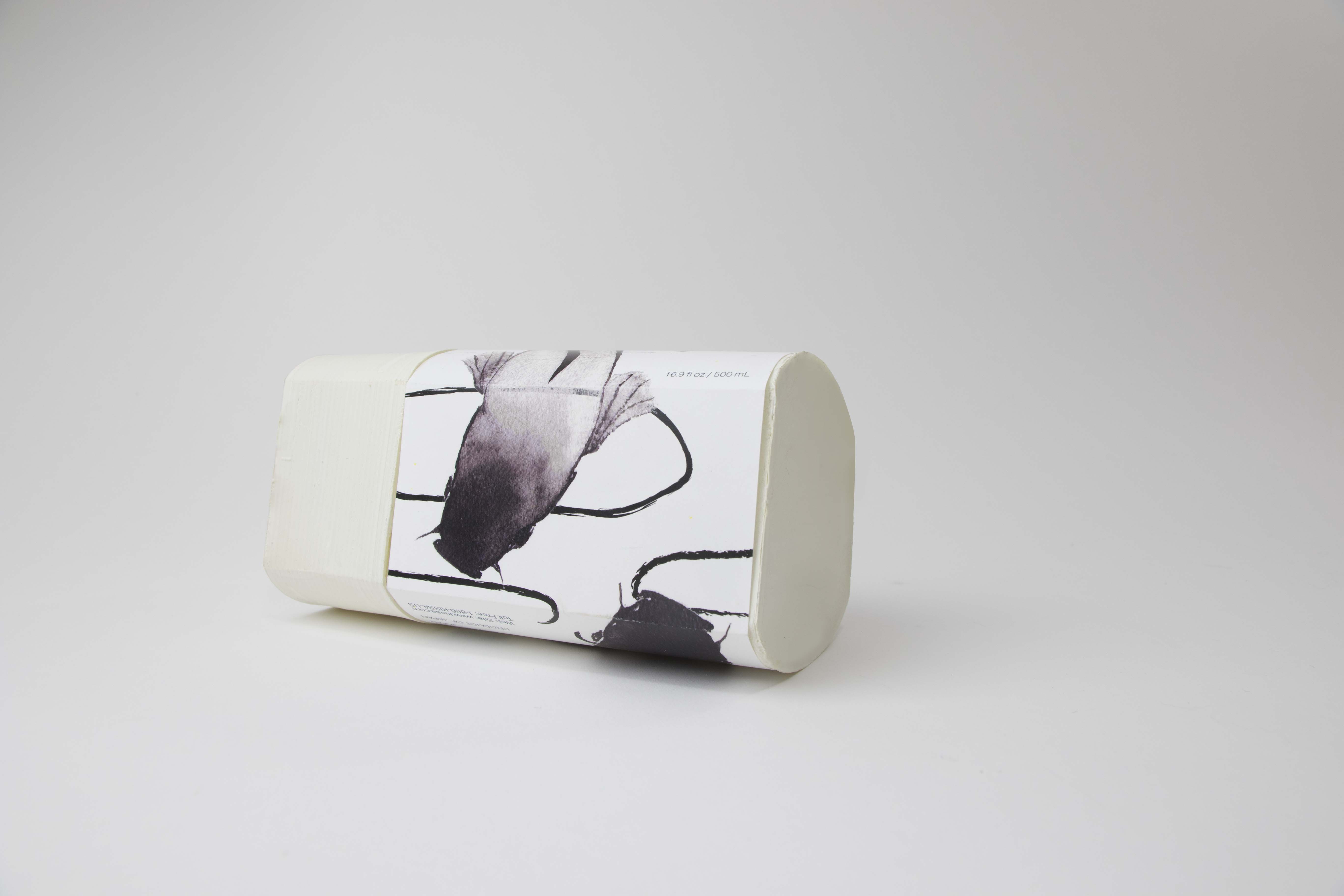
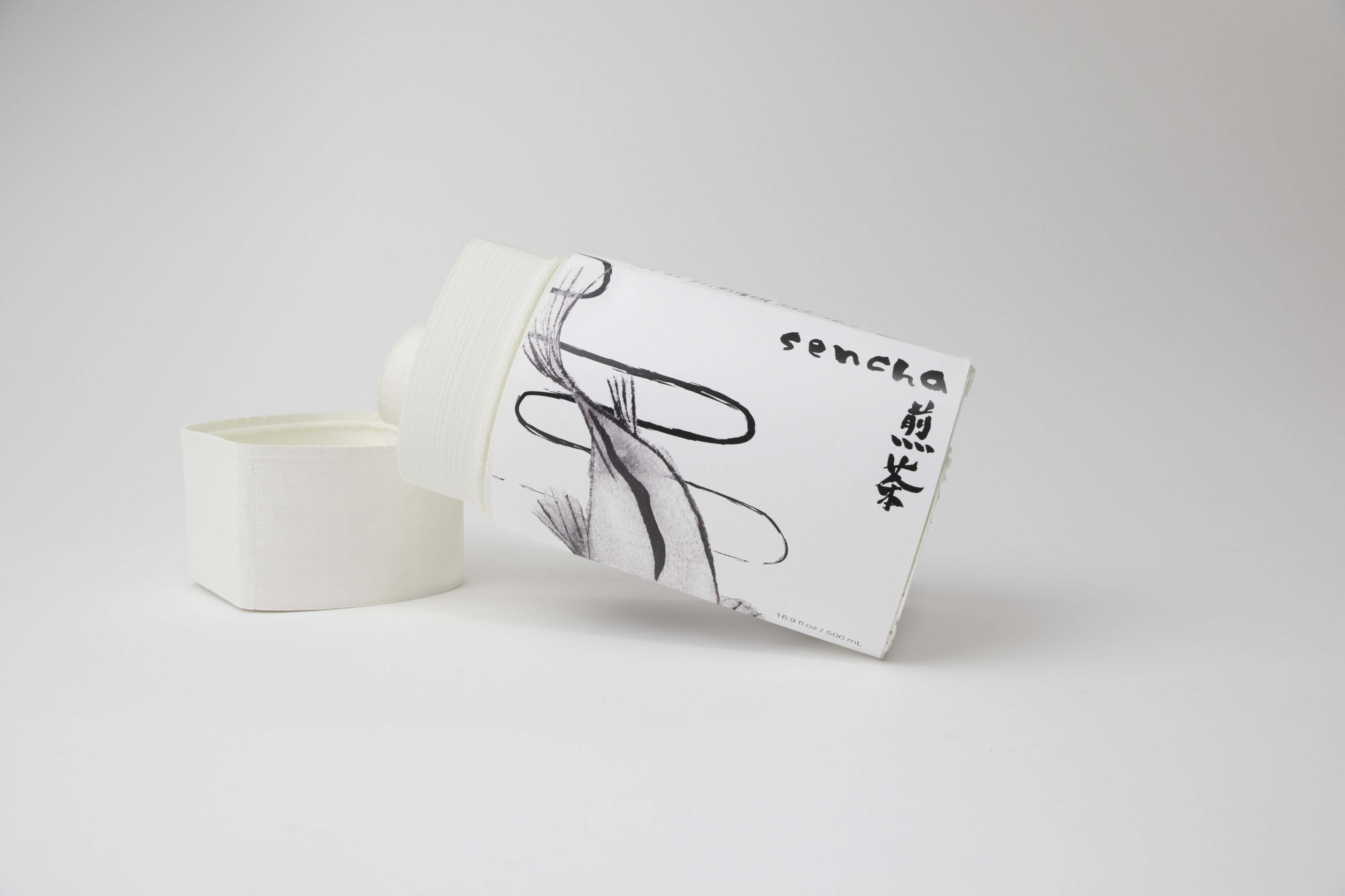
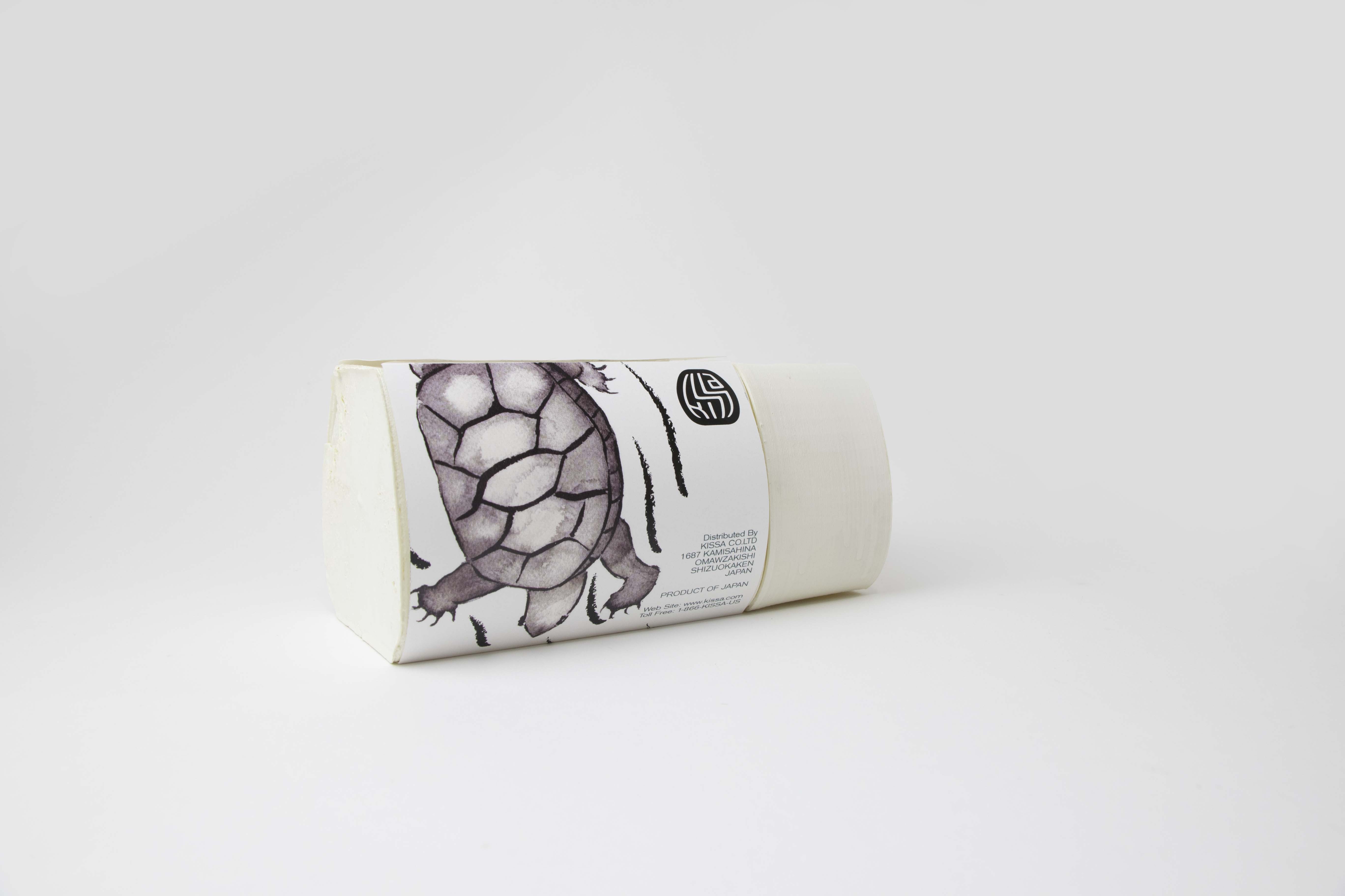
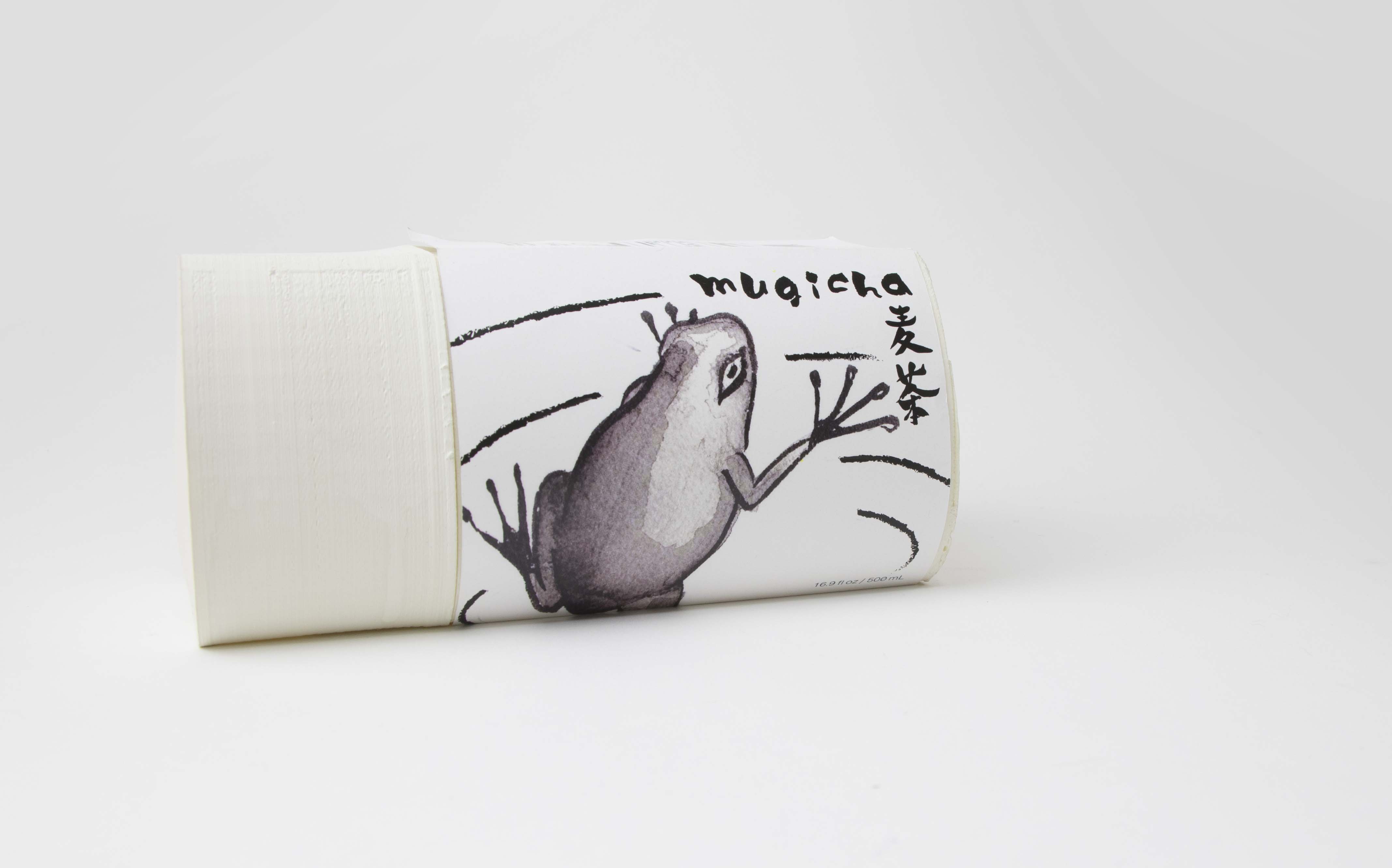
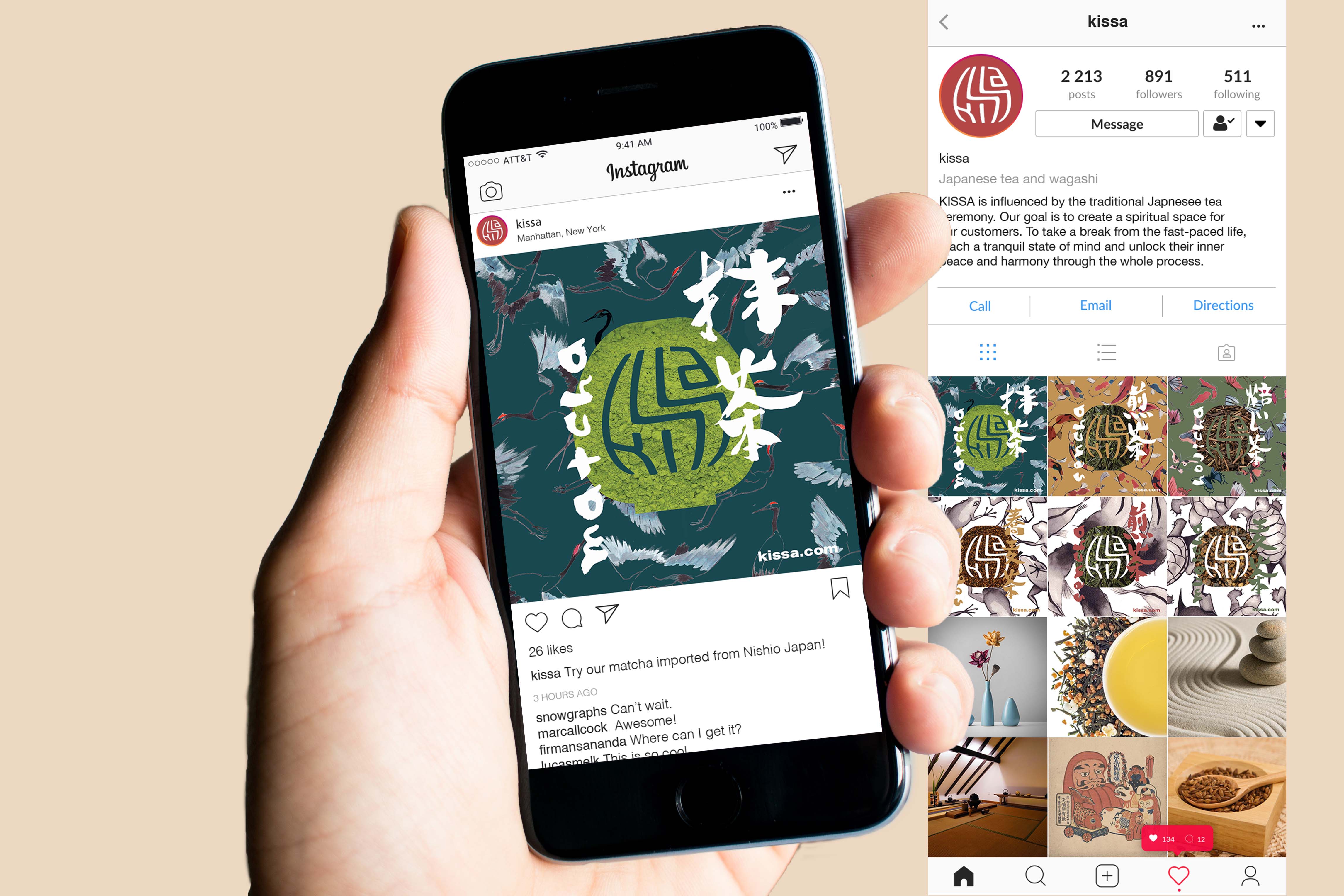
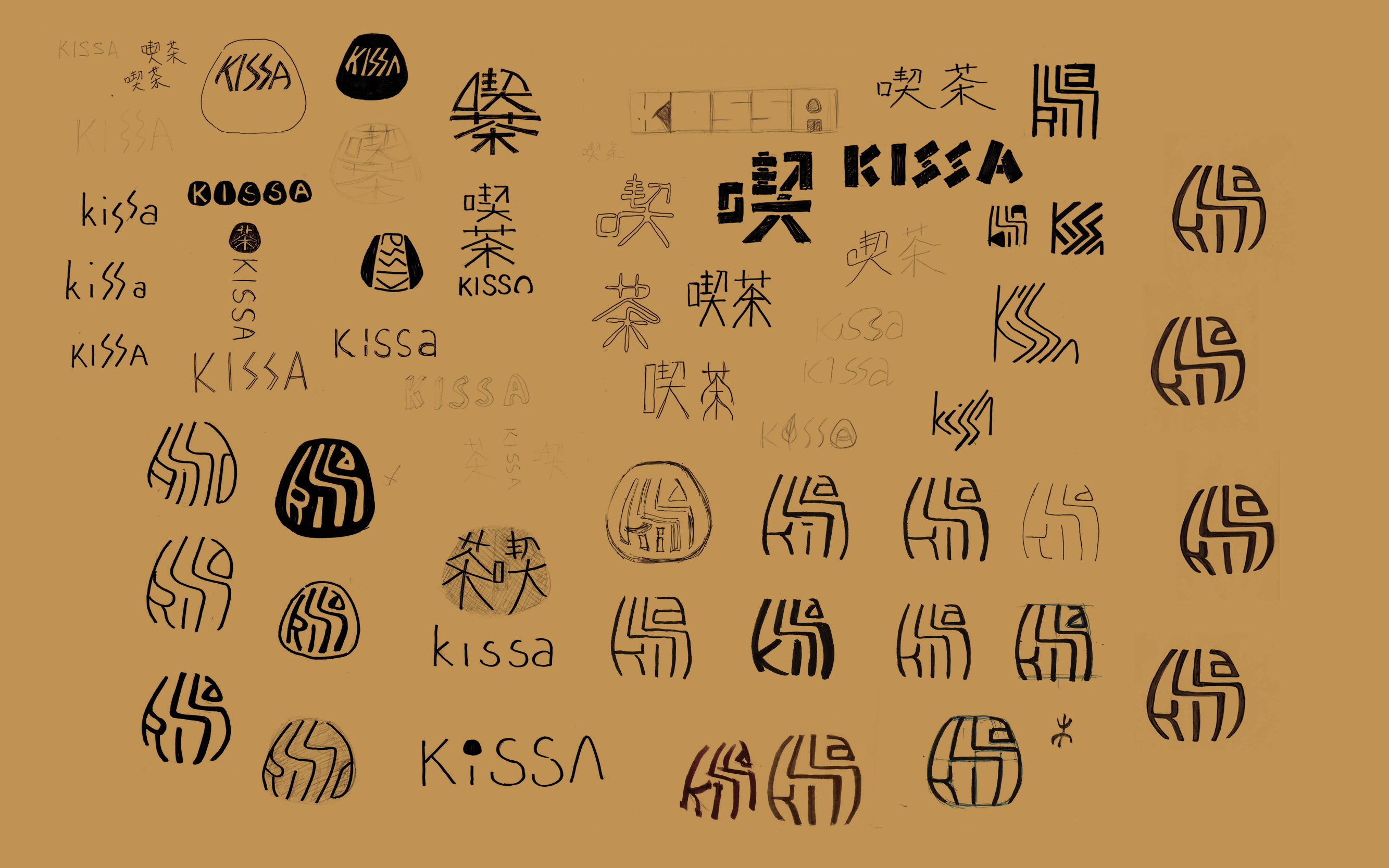
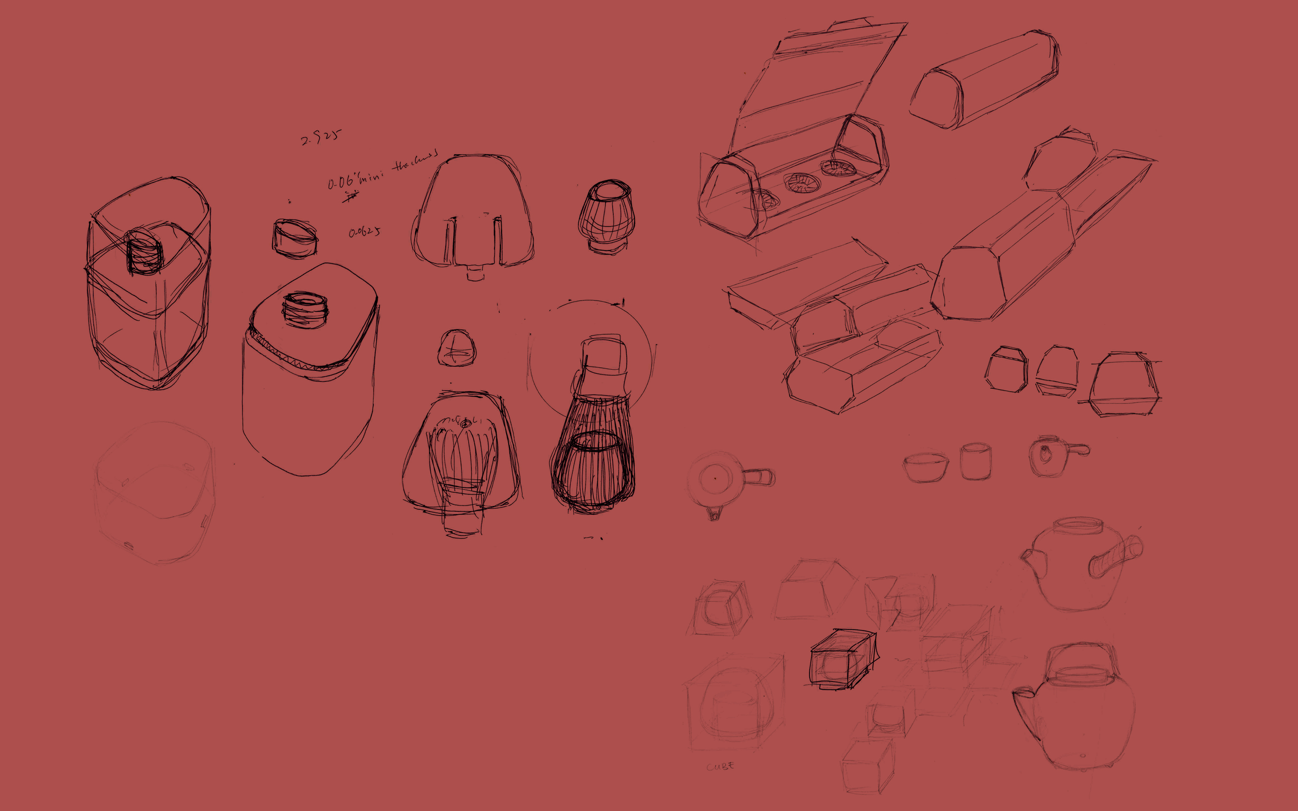
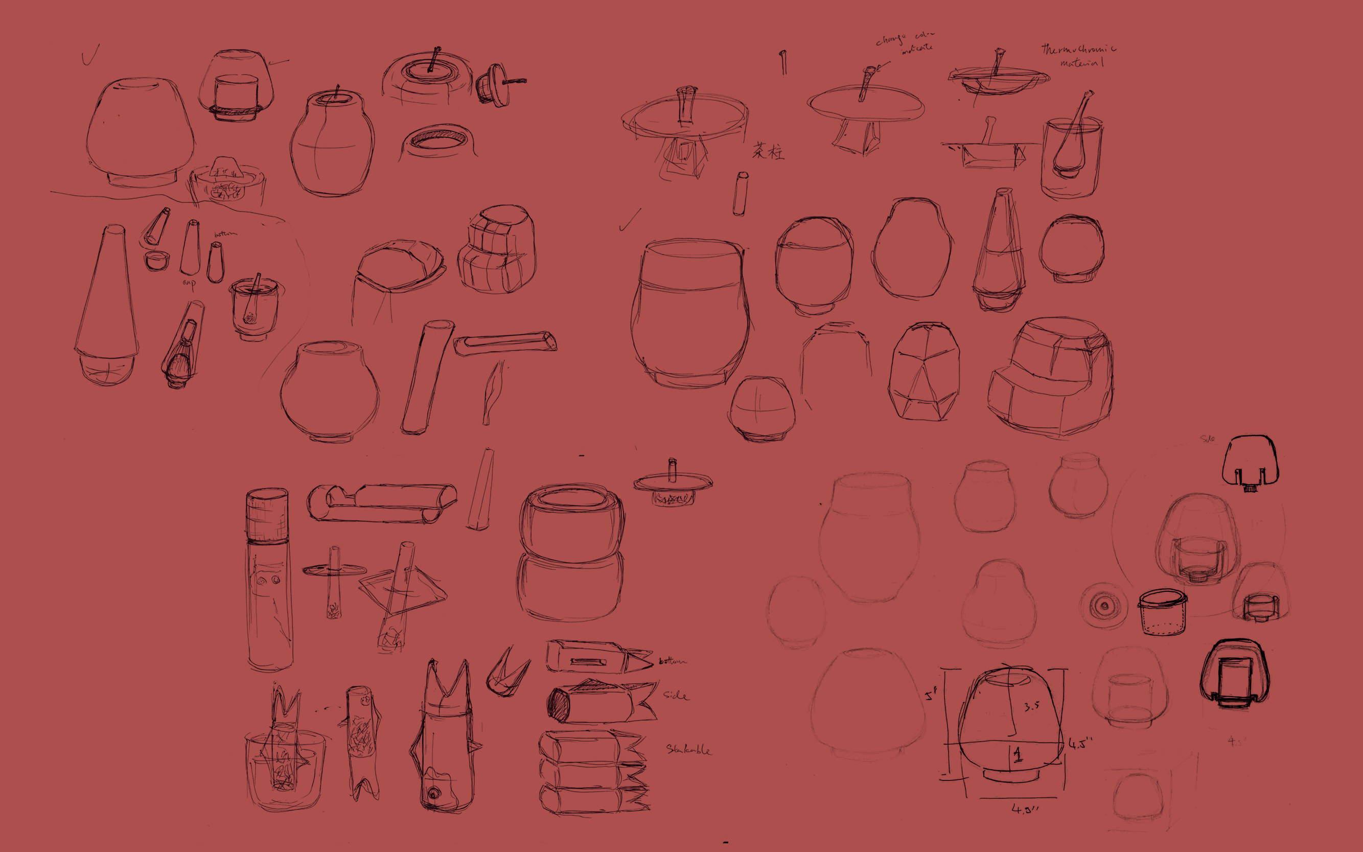
KISSA is a meticulously crafted product line that reimagines the traditional Japanese tea ceremony for contemporary consumers. This project blends ancient rituals with modern design to create a holistic tea experience that offers a spiritual retreat from the fast-paced world.
The Objective:
The primary goal of KISSA was to design a comprehensive tea product line that captures the essence of the Japanese tea ceremony. We aimed to create a brand that not only delivers high-quality tea products but also provides customers with a means to achieve tranquility and inner harmony through mindful tea consumption.
The Opportunity:
In today's hectic world, there's a growing demand for products that offer moments of peace and reflection. KISSA seized this opportunity by creating a tea brand that goes beyond mere consumption, offering a complete sensory and spiritual experience rooted in Japanese tradition.
The Outcome:
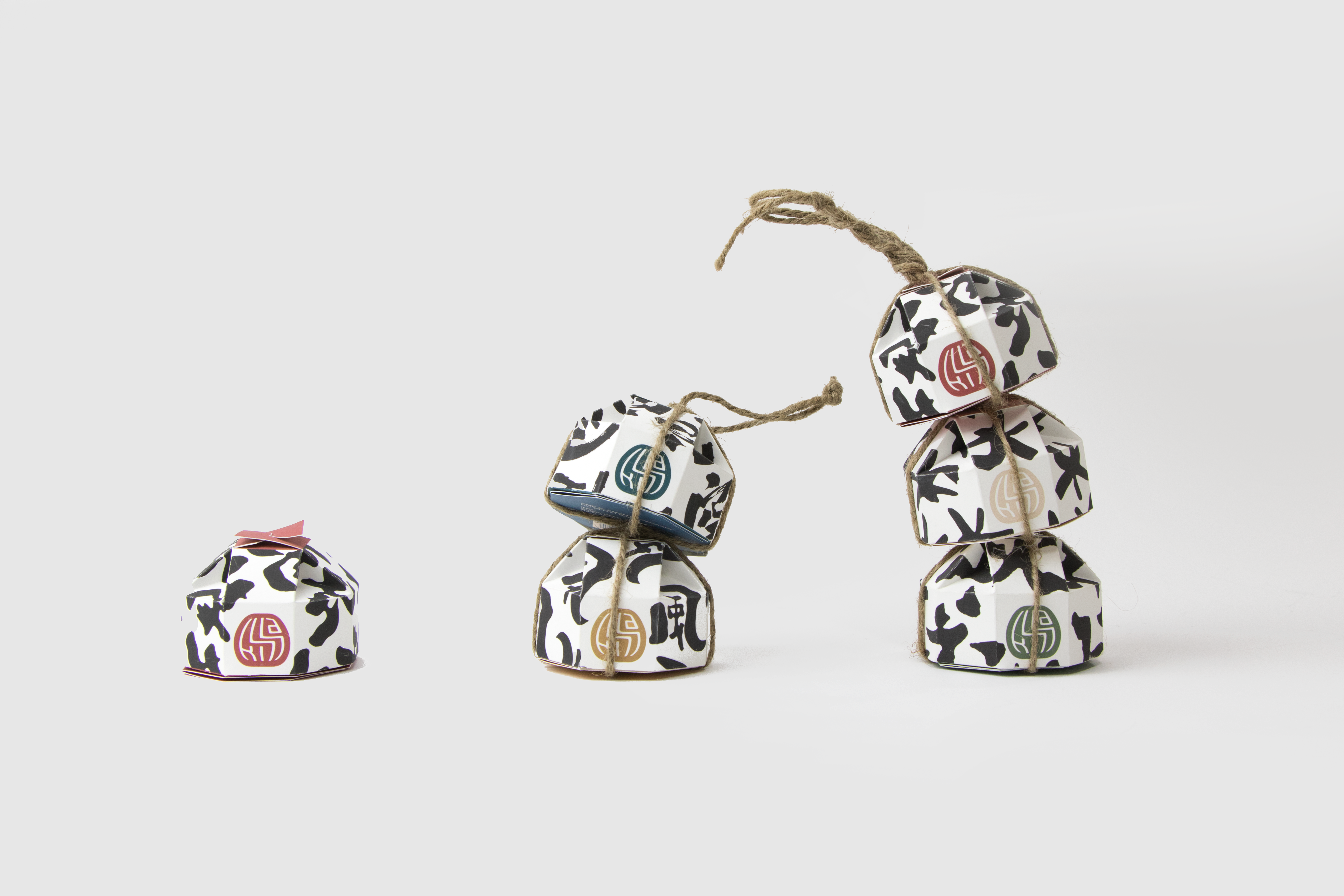
The KISSA project resulted in a cohesive and culturally rich product line:
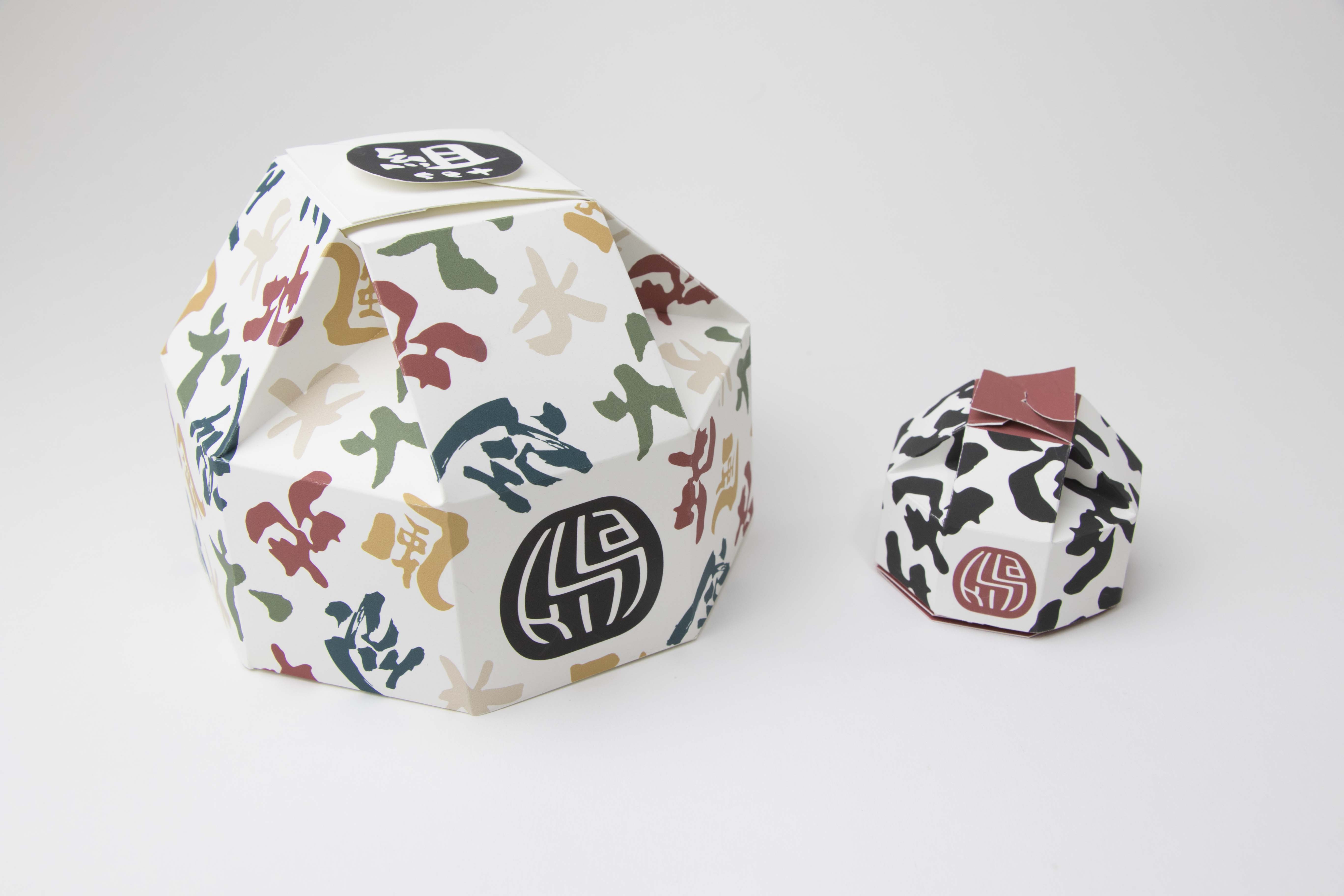
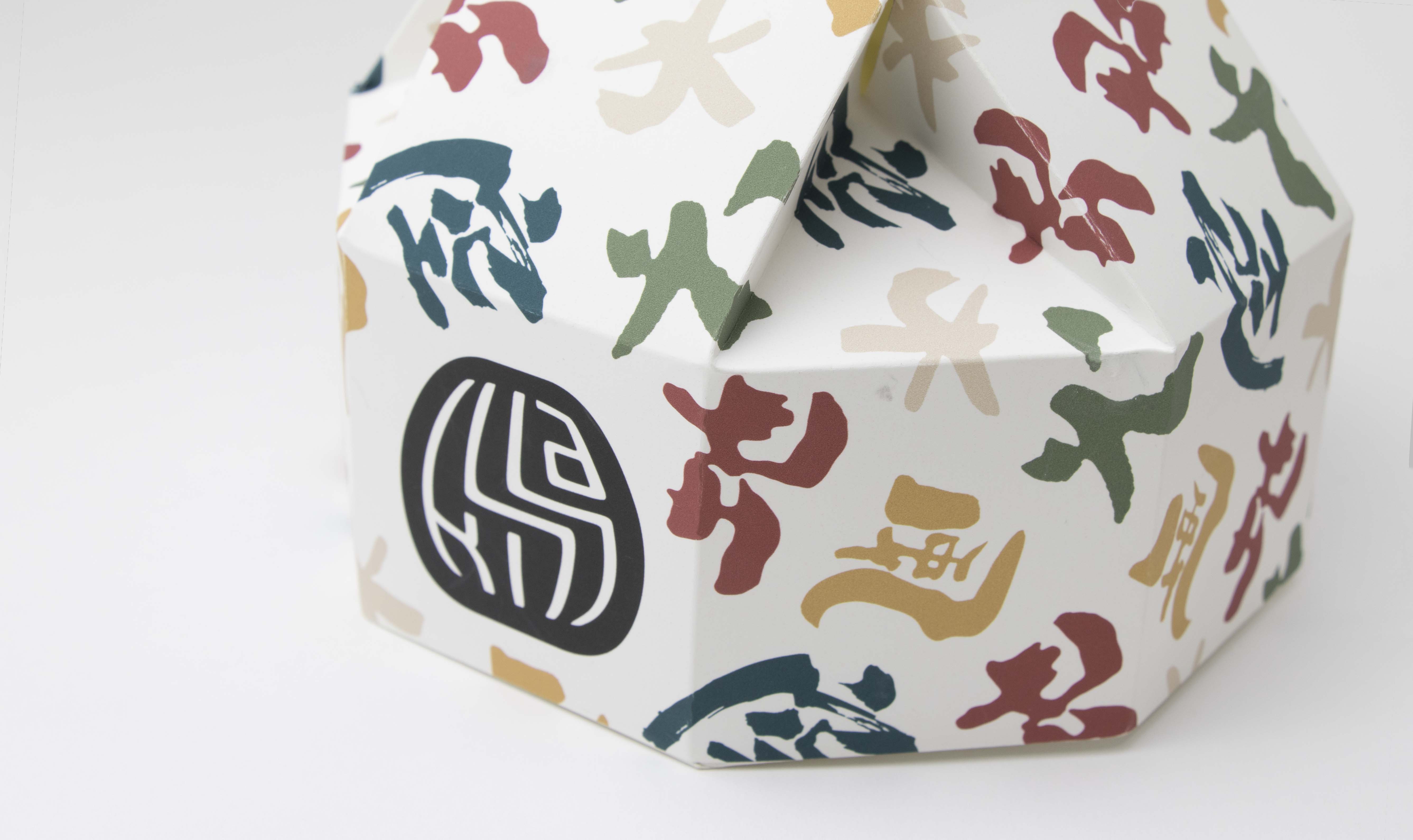
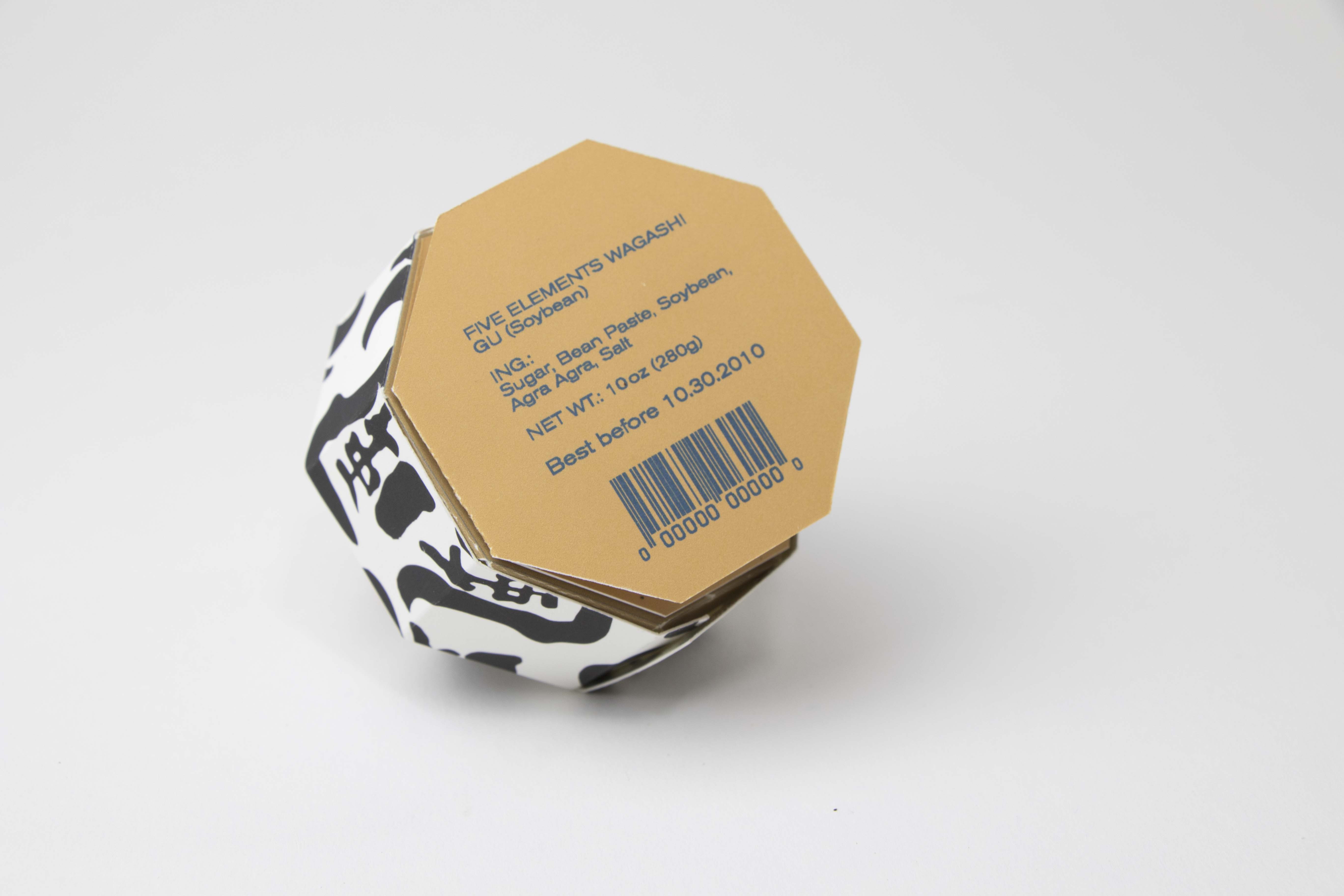
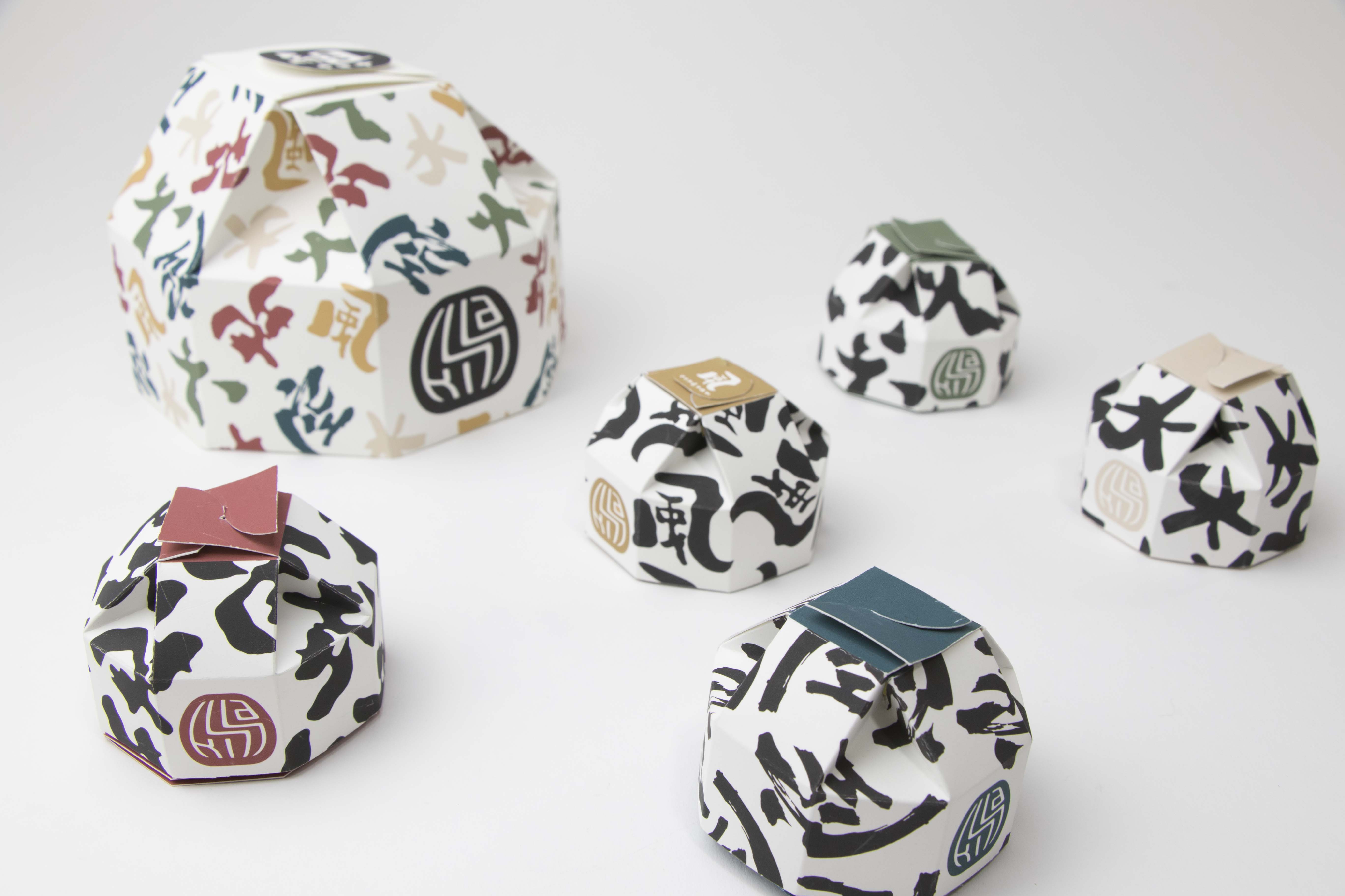
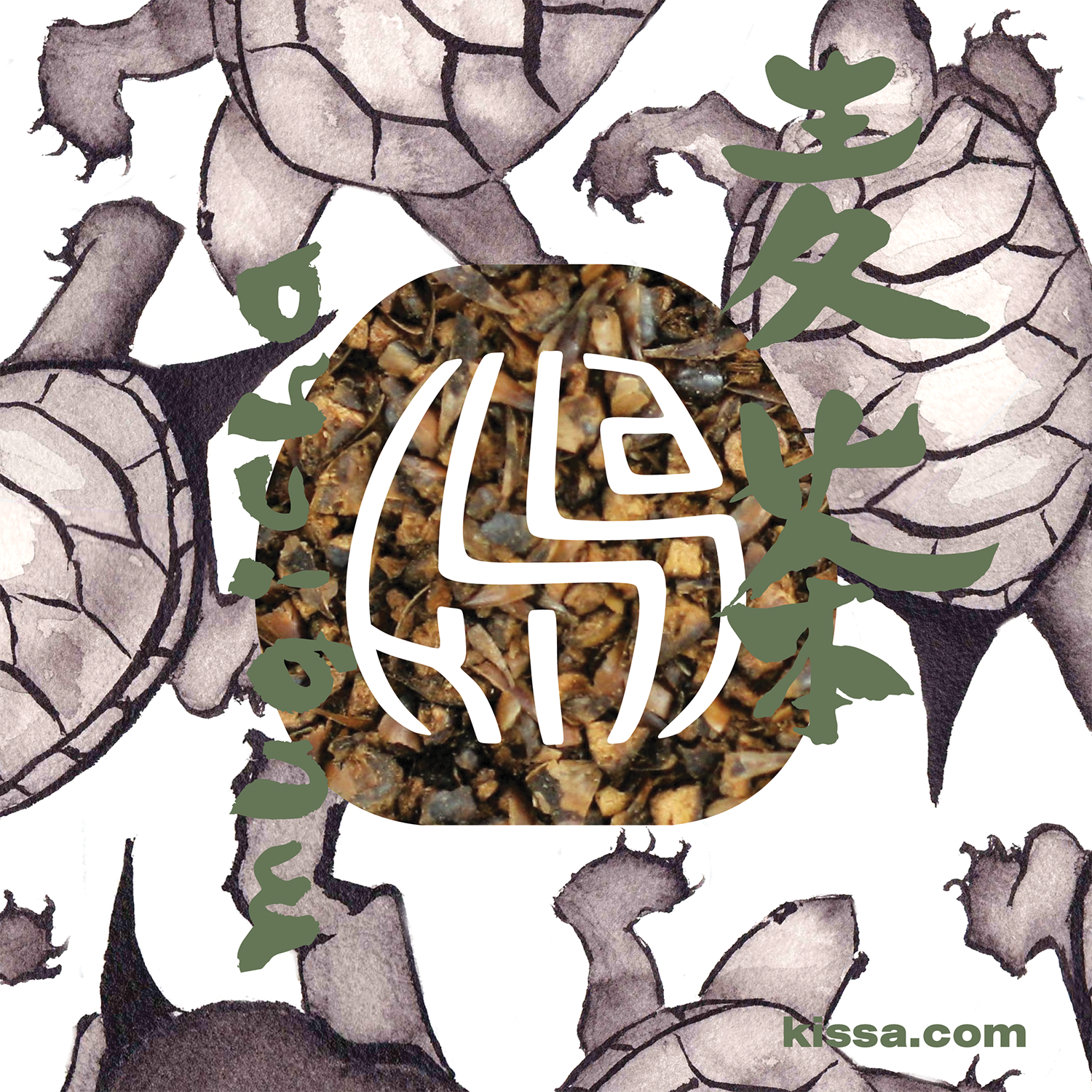
• A diverse range of products including loose leaf tea, bottled tea, wagashi (traditional Japanese sweets), tea utensils, and shopping bags.
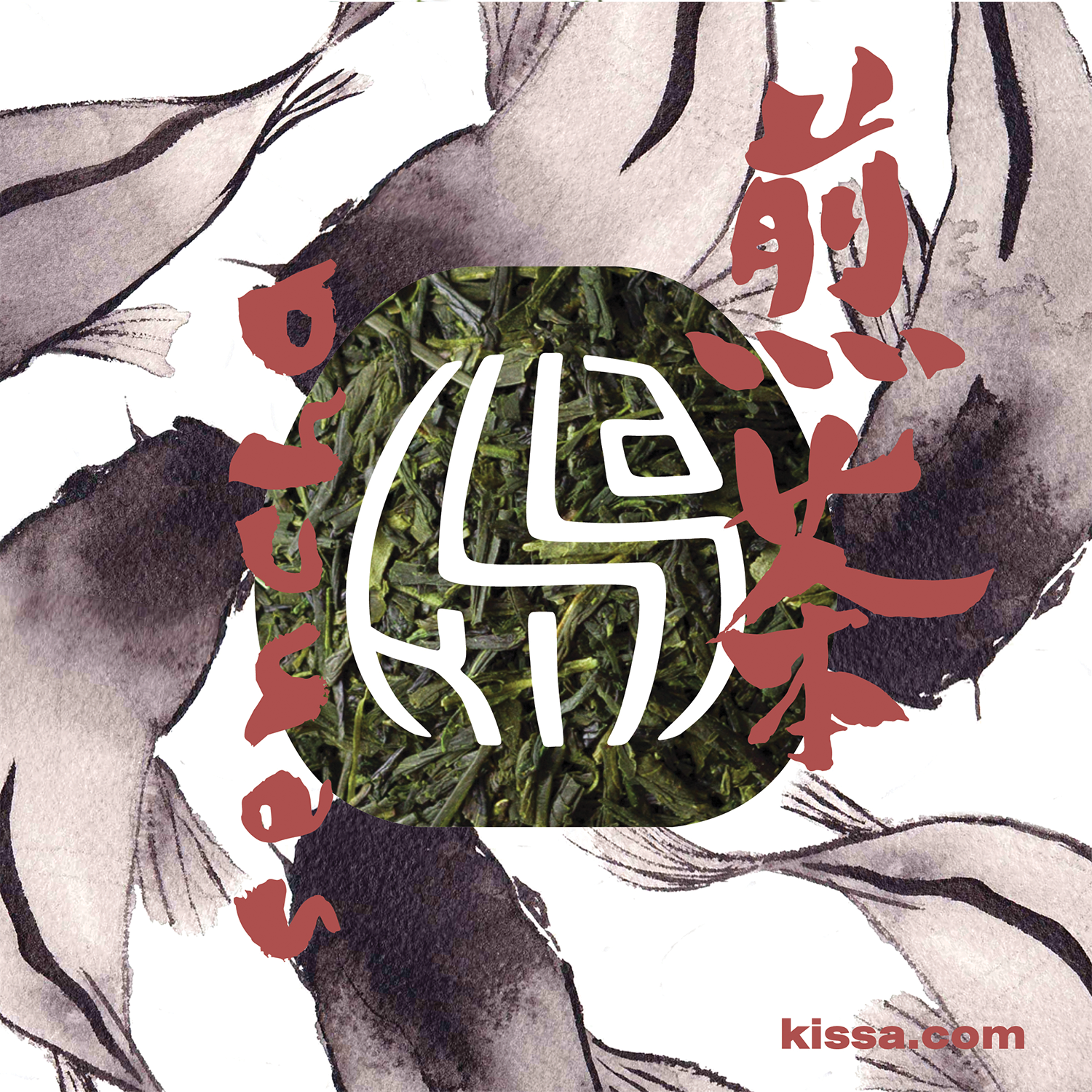
• A brand identity inspired by the Daruma doll, symbolizing perseverance and good luck.
• Refillable loose tea containers, promoting sustainability.
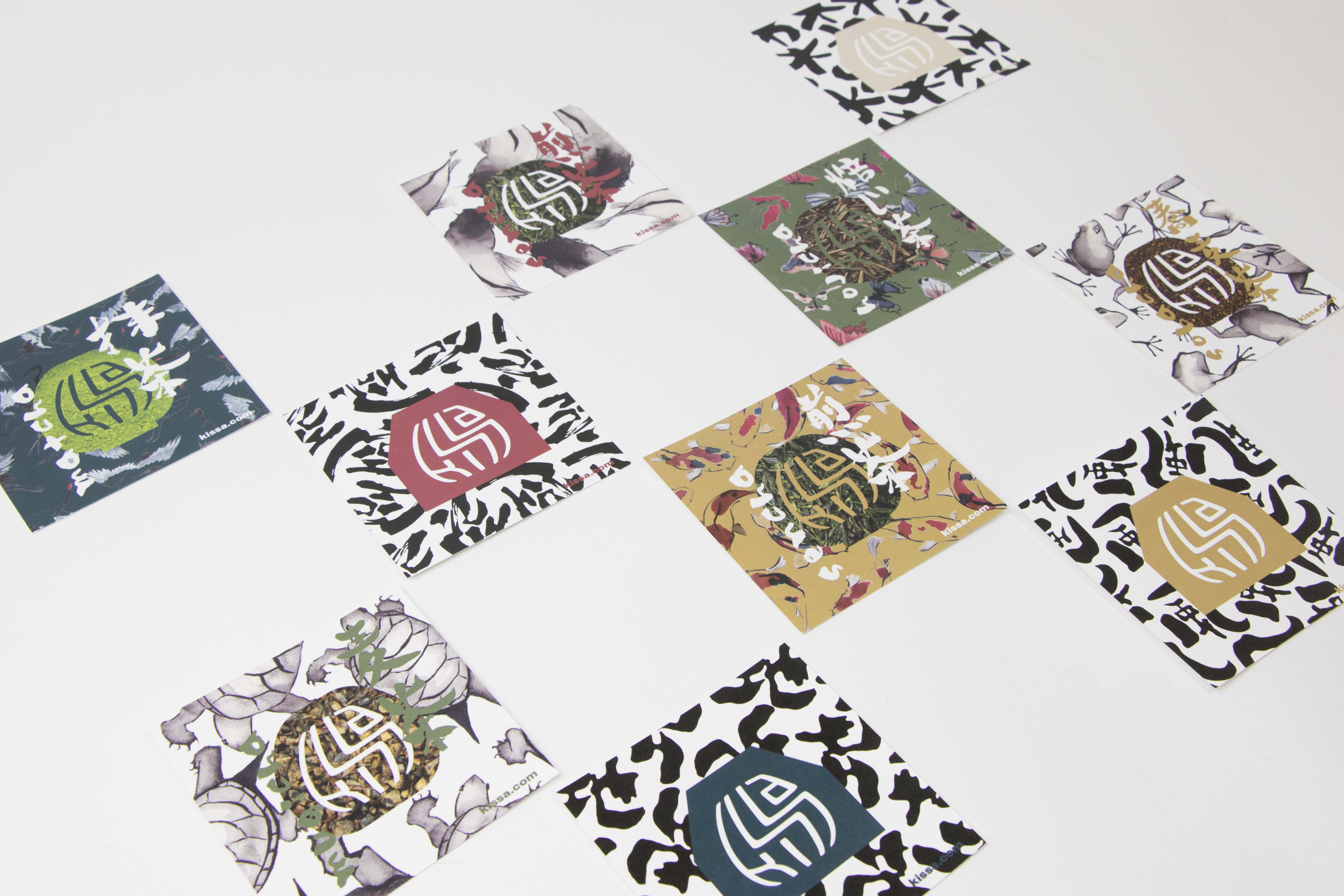
• Hand-drawn illustrations featuring traditional Japanese lucky animals, enhancing the cultural connection.
• Wagashi packaging incorporating Japanese Buddhist philosophy through symbolic elements.
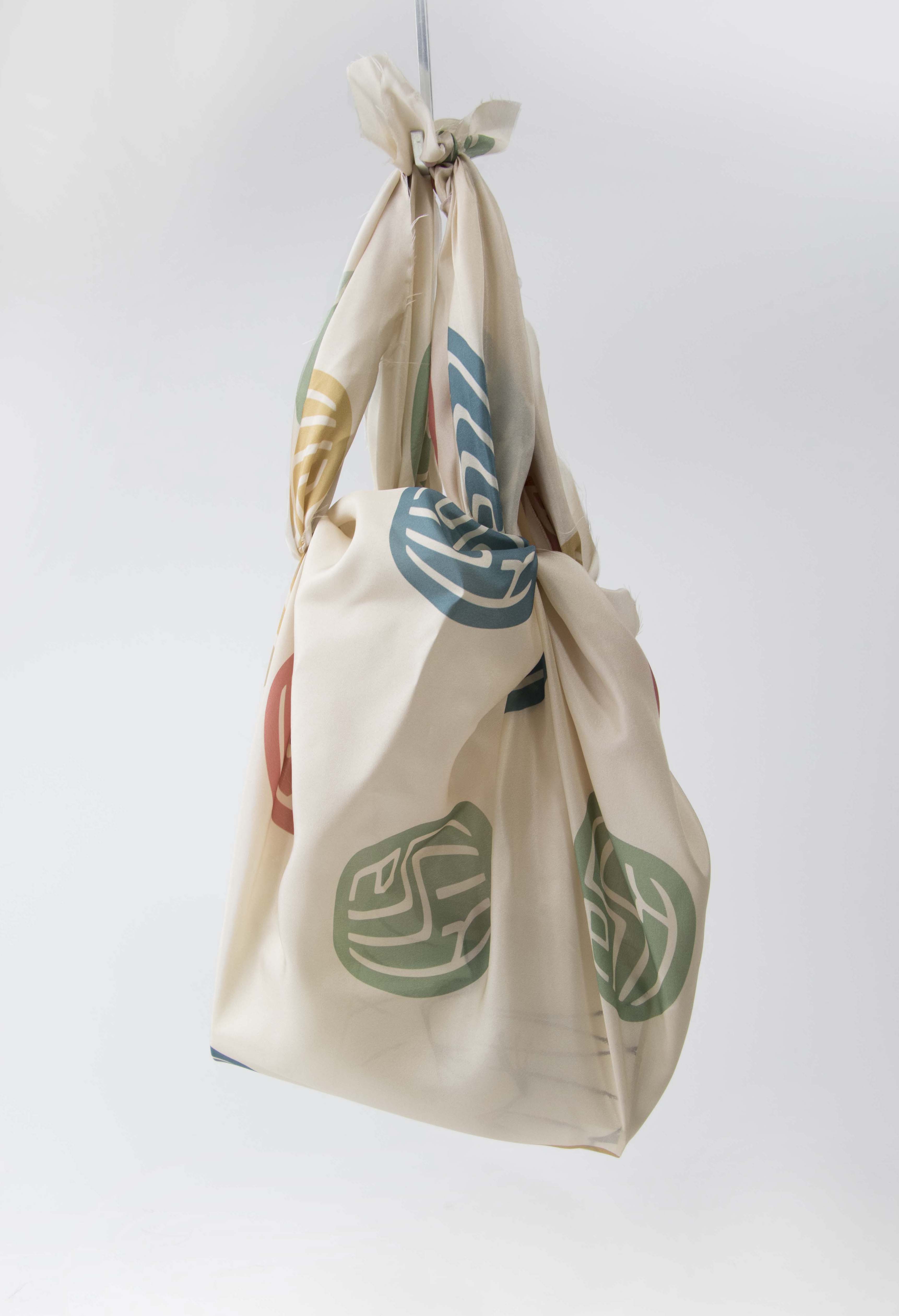
• Furoshiki-style shopping bags that are reusable and multipurpose, aligning with eco-friendly practices.
This thoughtfully designed product line successfully merges traditional Japanese aesthetics with modern functionality, offering customers a pathway to mindfulness through the art of tea.
The primary goal of KISSA was to design a comprehensive tea product line that captures the essence of the Japanese tea ceremony. We aimed to create a brand that not only delivers high-quality tea products but also provides customers with a means to achieve tranquility and inner harmony through mindful tea consumption.
The Opportunity:
In today's hectic world, there's a growing demand for products that offer moments of peace and reflection. KISSA seized this opportunity by creating a tea brand that goes beyond mere consumption, offering a complete sensory and spiritual experience rooted in Japanese tradition.
The Outcome:
The KISSA project resulted in a cohesive and culturally rich product line:
• A diverse range of products including loose leaf tea, bottled tea, wagashi (traditional Japanese sweets), tea utensils, and shopping bags.
• A brand identity inspired by the Daruma doll, symbolizing perseverance and good luck.
• Refillable loose tea containers, promoting sustainability.
• Hand-drawn illustrations featuring traditional Japanese lucky animals, enhancing the cultural connection.
• Wagashi packaging incorporating Japanese Buddhist philosophy through symbolic elements.
• Furoshiki-style shopping bags that are reusable and multipurpose, aligning with eco-friendly practices.
This thoughtfully designed product line successfully merges traditional Japanese aesthetics with modern functionality, offering customers a pathway to mindfulness through the art of tea.
Store Front
Loose Tea Packages


Bottled Tea Packages


Wagashi Set and Single Packages


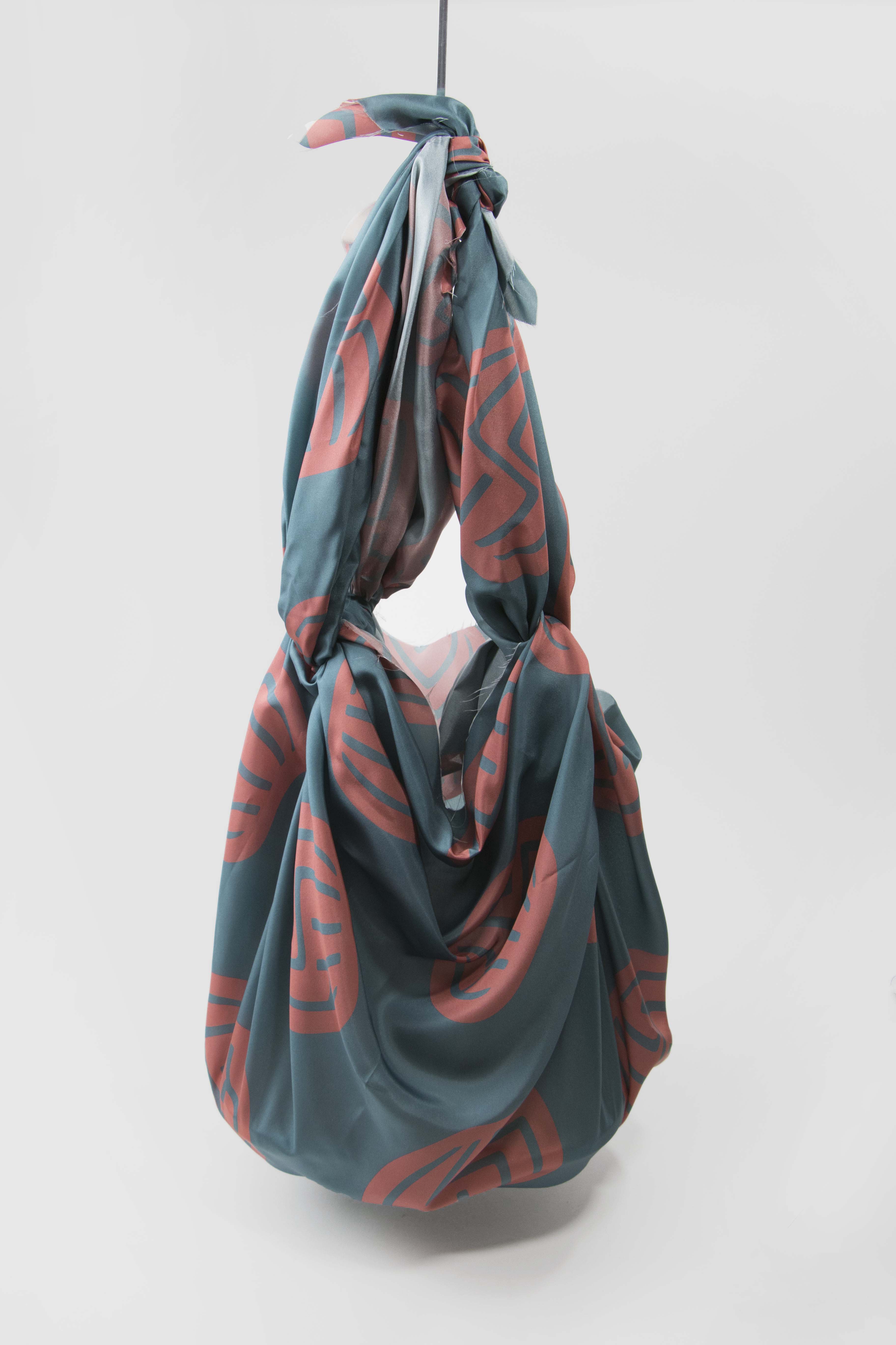
Multi-Use Shopping Bags
Promotional Cards

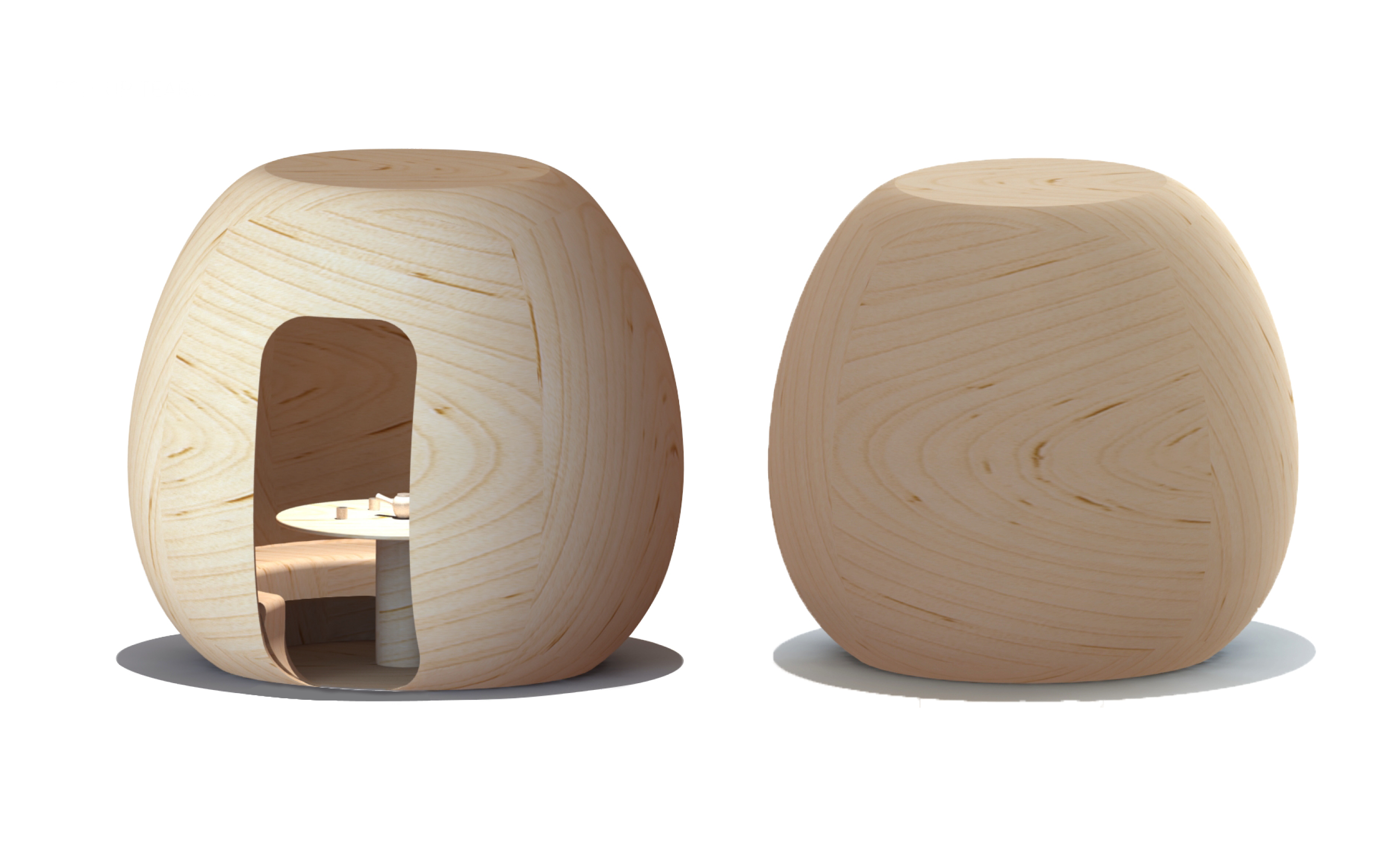
Pop-Up Tea Room

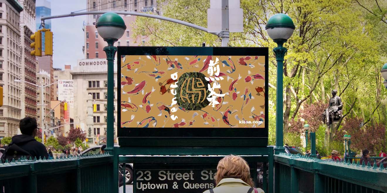
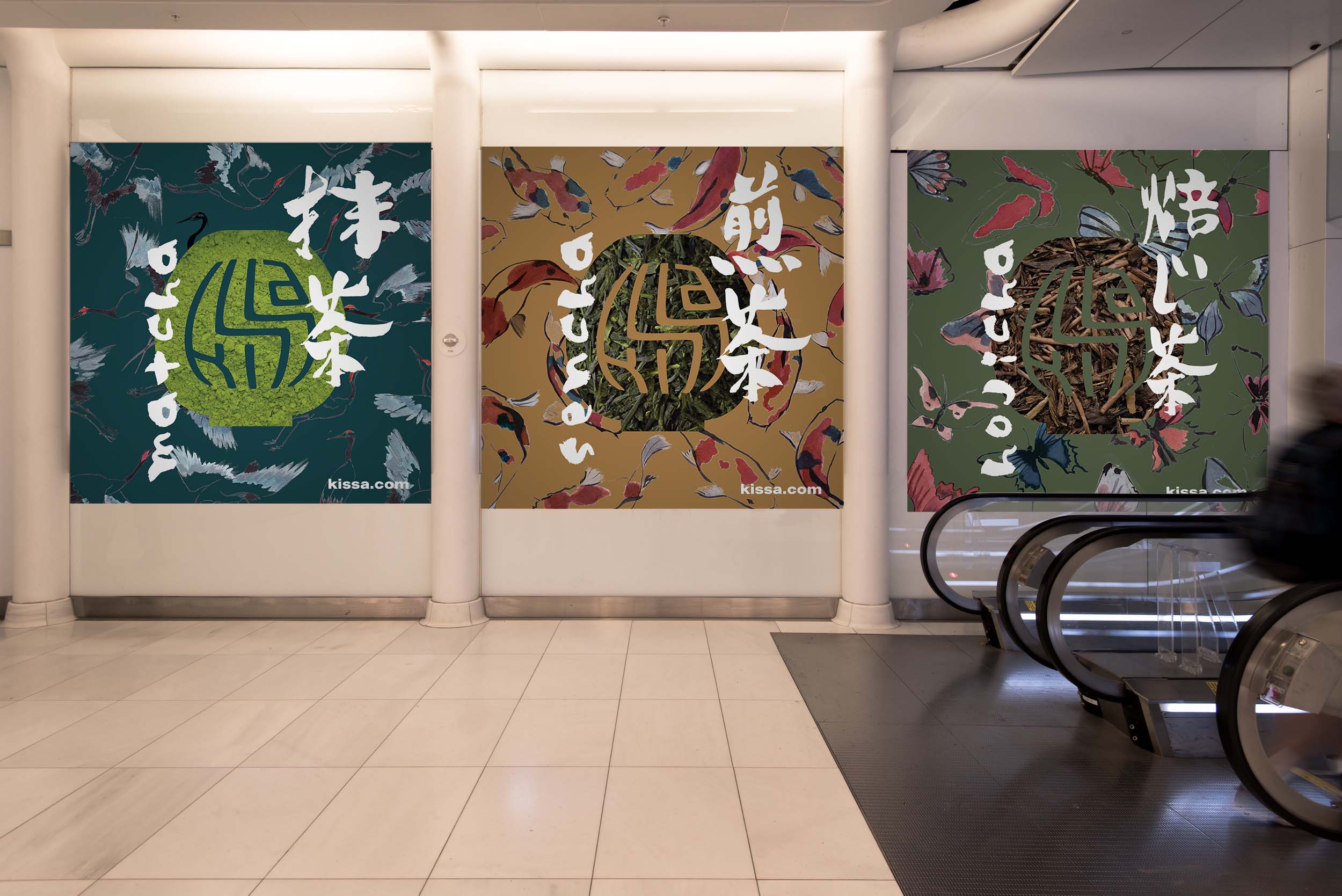
Advertisements

Design Development
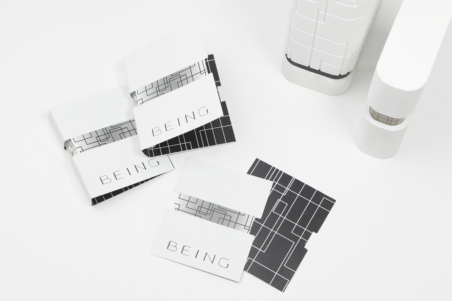
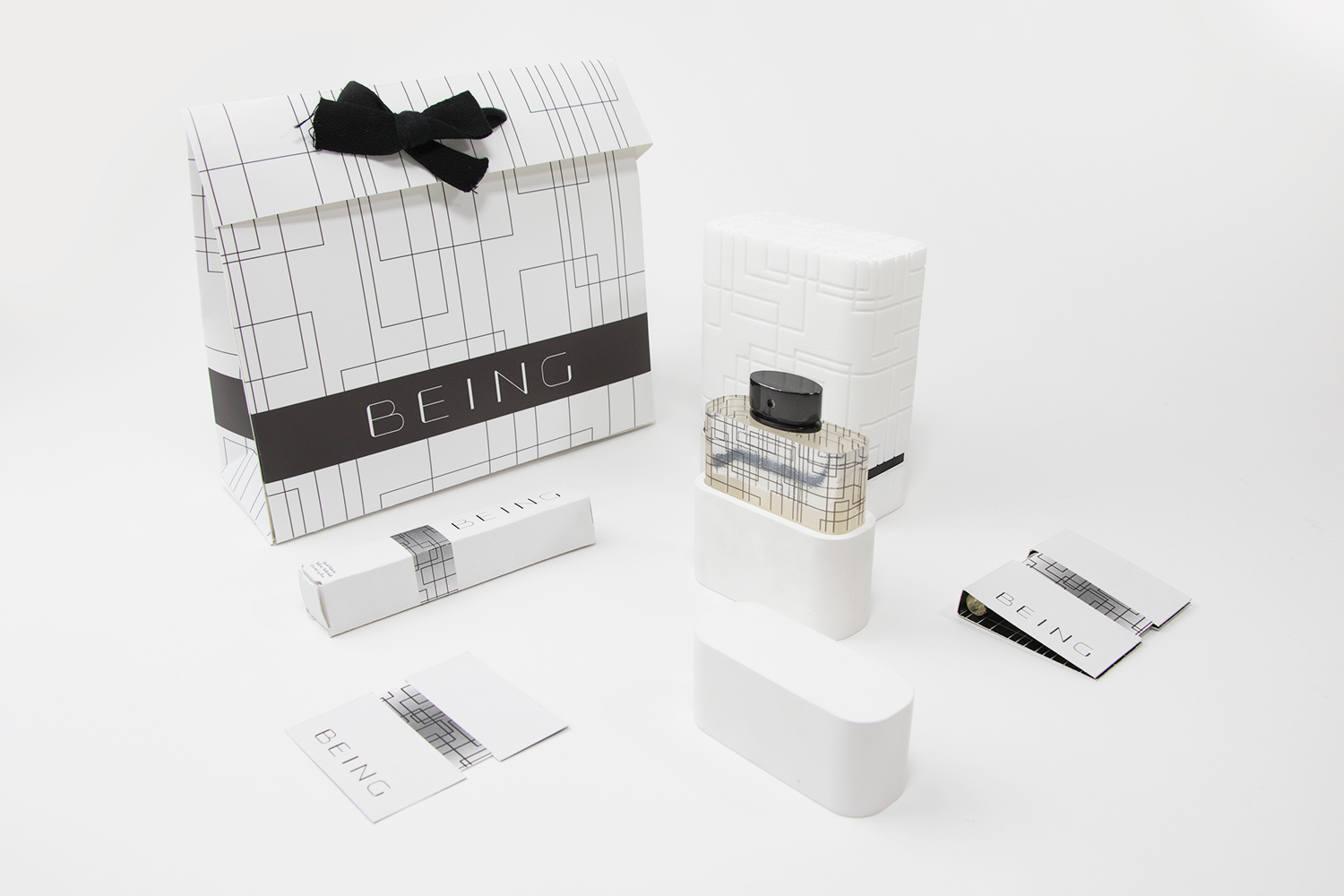
Project:
Being
Sector:
Beauty
Scope of Works:
Brand Identity
3D Modeling
Packaging
Photography
Being
Sector:
Beauty
Scope of Works:
Brand Identity
3D Modeling
Packaging
Photography
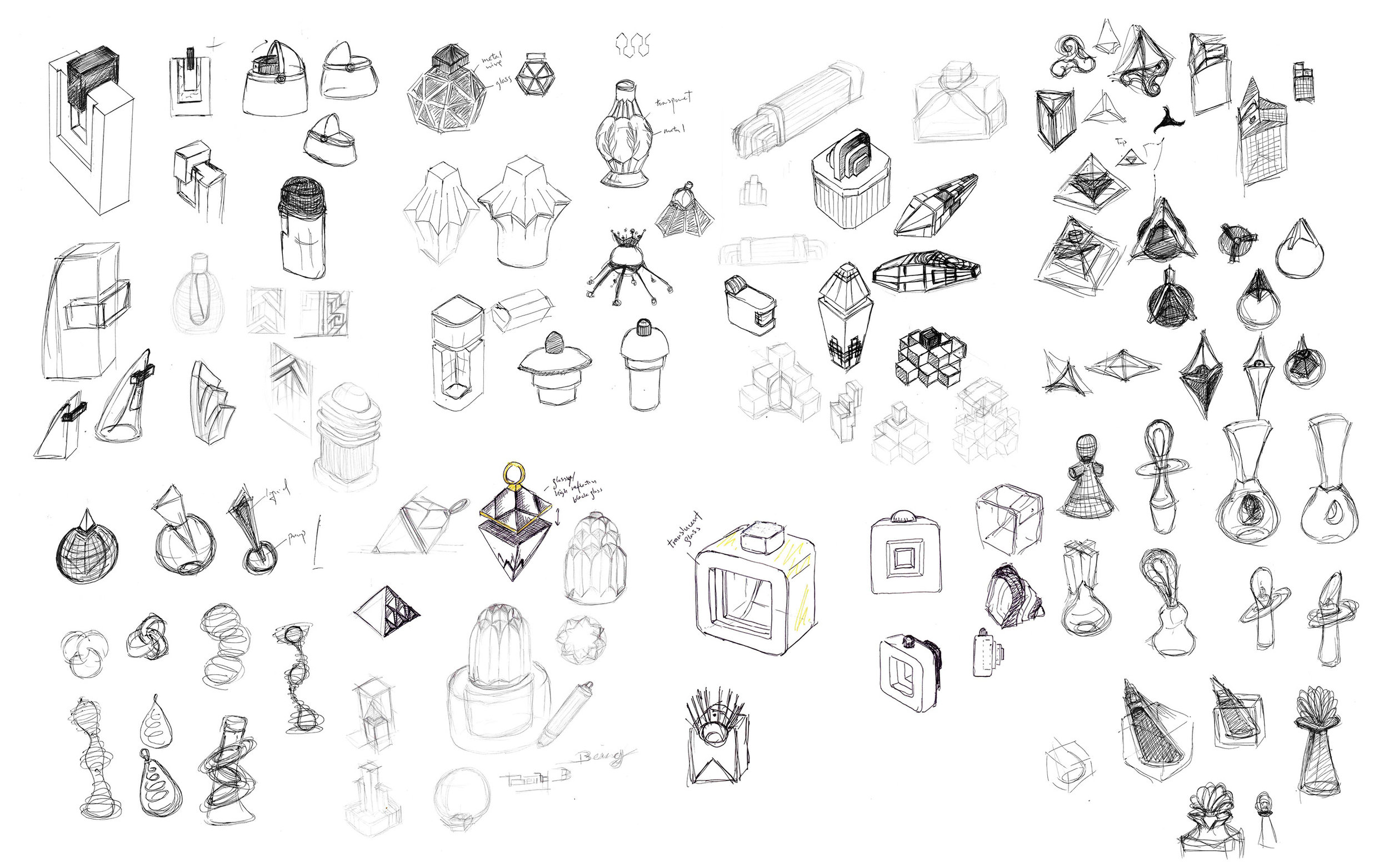
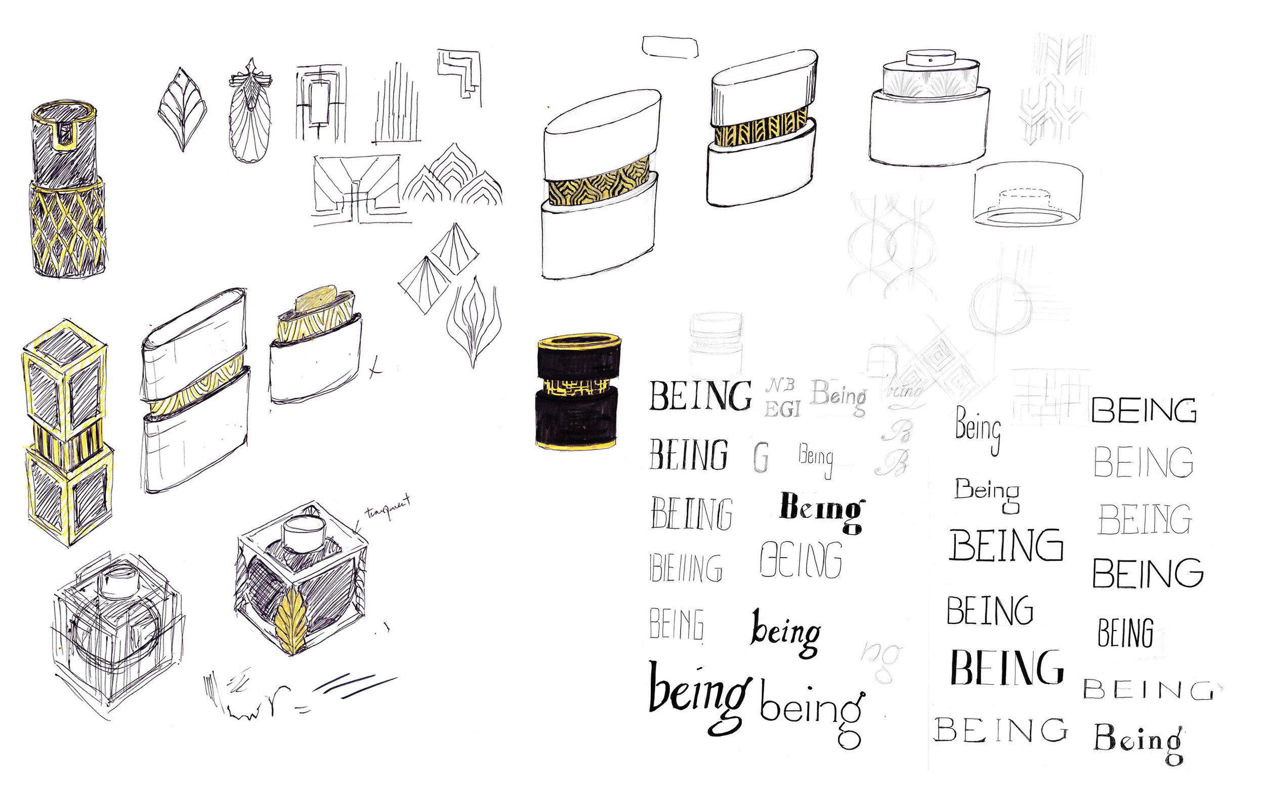
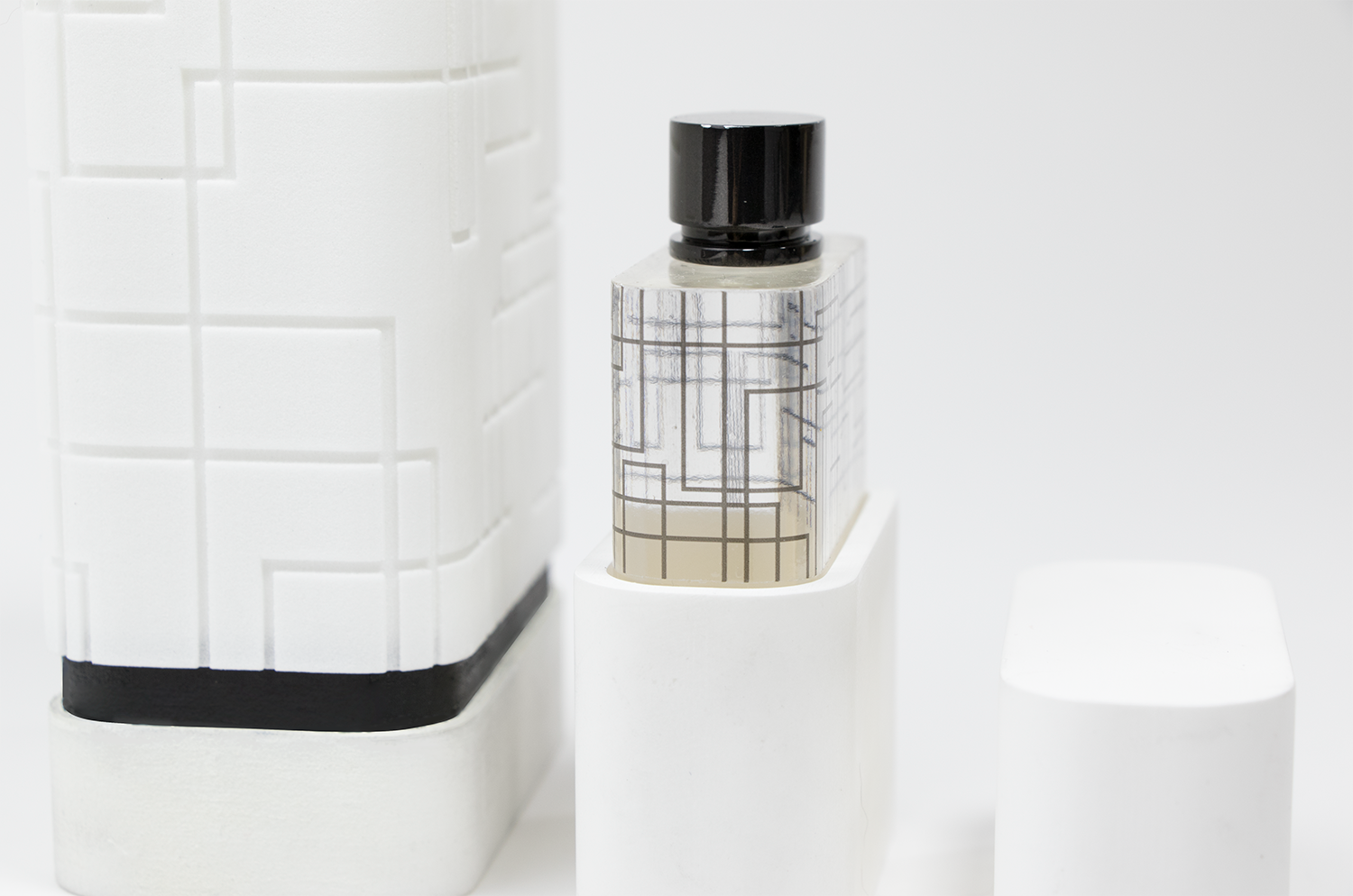
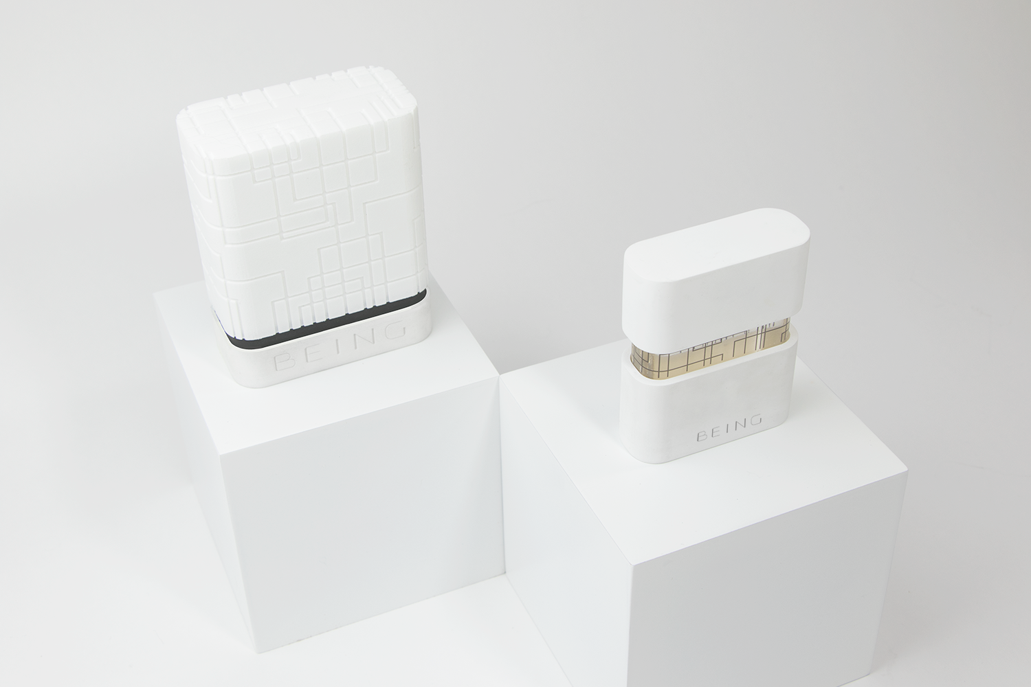
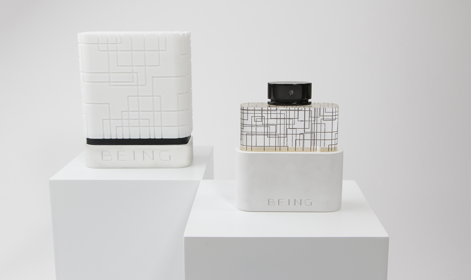
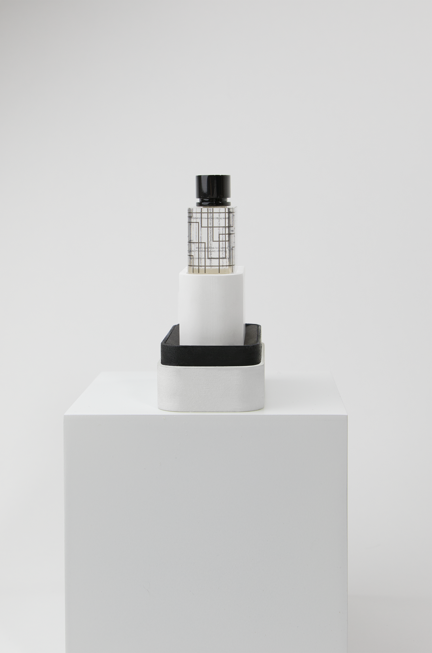
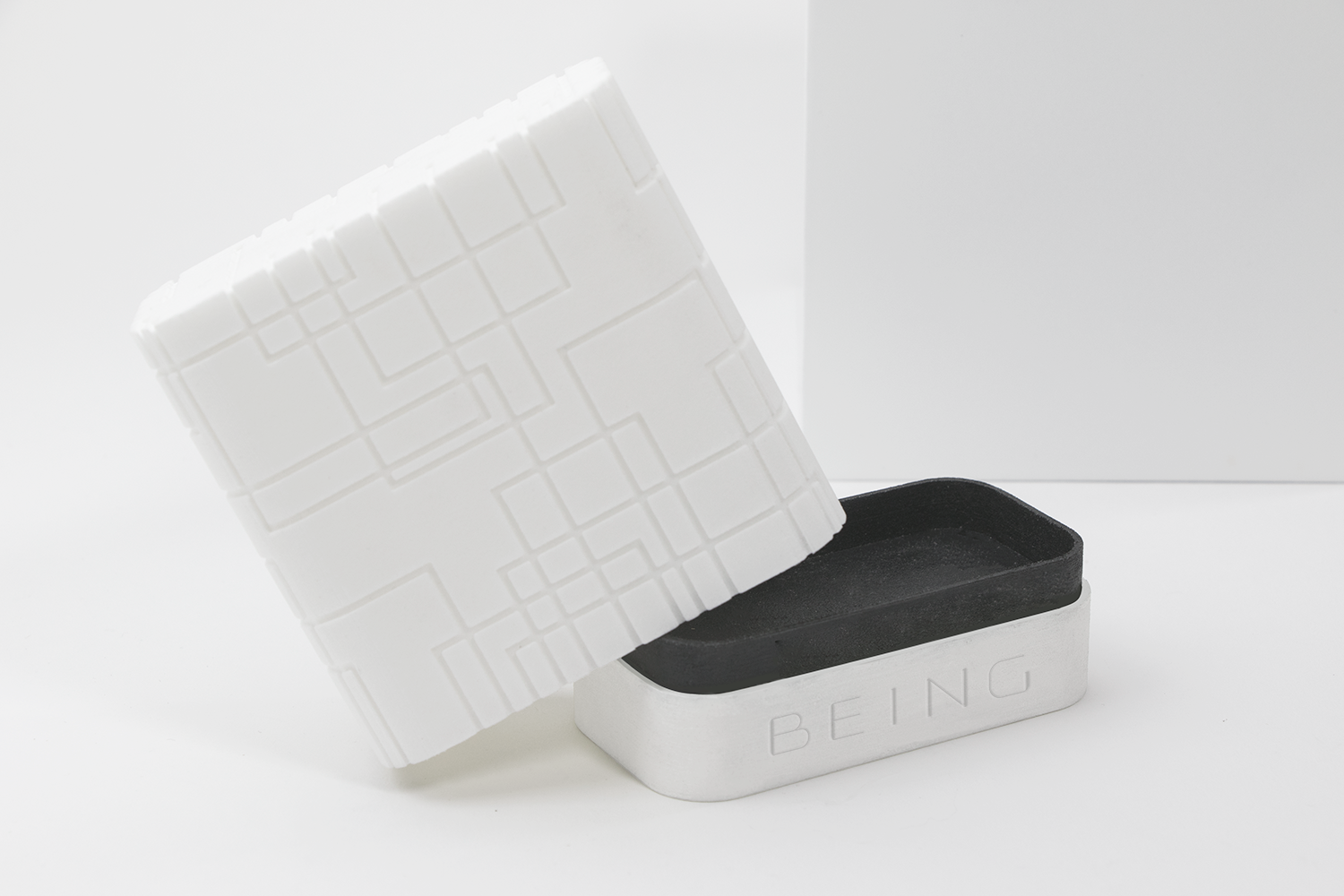
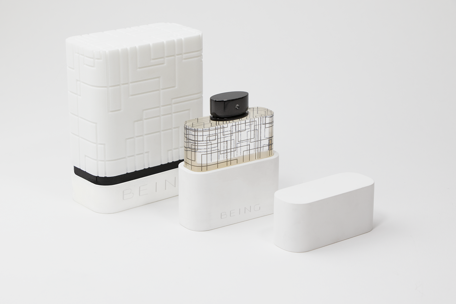
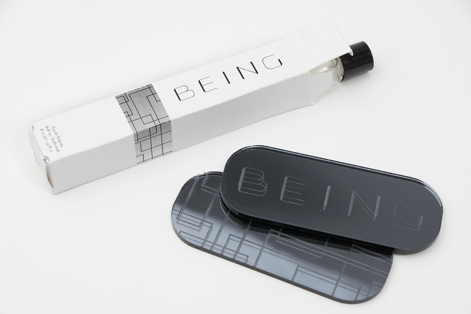
Being is an oriental, sensual fragrance that embodies the confidence, elegance, and sophistication of modern women. This project, mentored by Marc Rosen, embraces Art Deco aesthetics to create a comprehensive brand identity and packaging design that extends beyond the fragrance itself.
The Objective:
The primary goal was to develop a distinctive fragrance brand that captures the multifaceted nature of contemporary women. We aimed to create a cohesive visual language inspired by Art Deco, applying it across all brand touchpoints to reflect the fragrance's oriental and sensual character.
The Opportunity:
With the fragrance industry's rich history during the Art Deco era, there was an opportunity to create a modern interpretation that resonates with today's sophisticated women. By leveraging the timeless appeal of Art Deco design, we could craft a unique identity in the crowded fragrance market that exudes confidence and elegance.
The Outcome:
The Being project resulted in a comprehensive brand and packaging system:
• A distinctive fragrance bottle and packaging design inspired by Art Deco motifs, reflecting the era's geometric patterns and luxurious materials.
• A cohesive visual identity applied across various touchpoints, including shopping bags, store displays, roller ball packages, and promotional items.
• 3D modeling of the product and packaging, ensuring a seamless transition from concept to production.
• Custom structural designs for different product formats, enhancing the brand's premium positioning.
• A holistic store display concept that immerses customers in the Being brand experience, reminiscent of the glamorous vanities of the Art Deco period.
This project successfully translated the essence of modern femininity into a tangible brand experience, positioning Being as a sophisticated choice for confident women.
Design Development