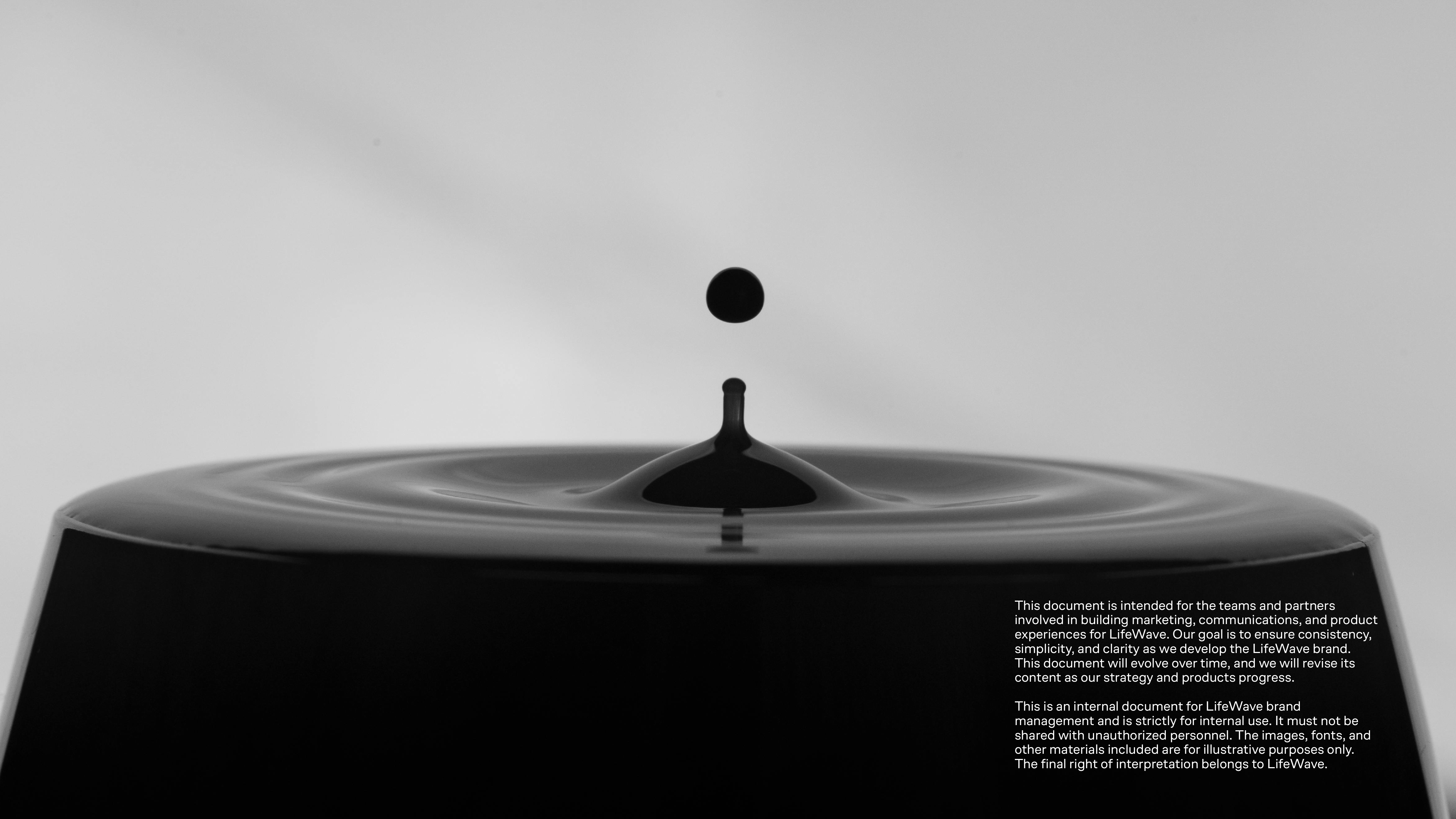
Project
LifeWave X20 — Product Visual System & Launch Campaign
Client
LifeWave
Sector
Global Wellness Technology
Role
Lead Designer / Art Direction
Scope of Works
Product Style Guide
Core Color Palette Development
Icon System
Packaging Exploration
User Manual & Quick Start Guide
Social & Presentation Templates
Launch Page Mockups
Campaign Storyboards
X20 is a high-end, light-infused water machine positioned as a long-term health technology investment rather than a standard appliance.
Working within the broader LifeWave brand ecosystem, I developed the complete visual system and product style guide for X20. The objective was to elevate perception, clarify complex technology, and establish a premium, science-driven presence across packaging, editorial materials, and launch communications.
Logo provided by client. Visual system and applications developed by Jane Wu.
Light as Precision Technology
The system emphasizes clarity, hierarchy, and technical confidence. Typography aligns with the master LifeWave brand for continuity, while the X20 palette introduces cooler tonal shifts and luminous accents to reflect water and light technology.
Visual restraint and structured composition position the product as engineered performance rather than lifestyle wellness.
Product Visual System
The X20 system builds on the master LifeWave brand while introducing a more focused, luminous expression tailored to the product.
Typography aligns with the parent brand for continuity. A cooler core palette and light-driven tonal accents reflect water, filtration, and illumination.

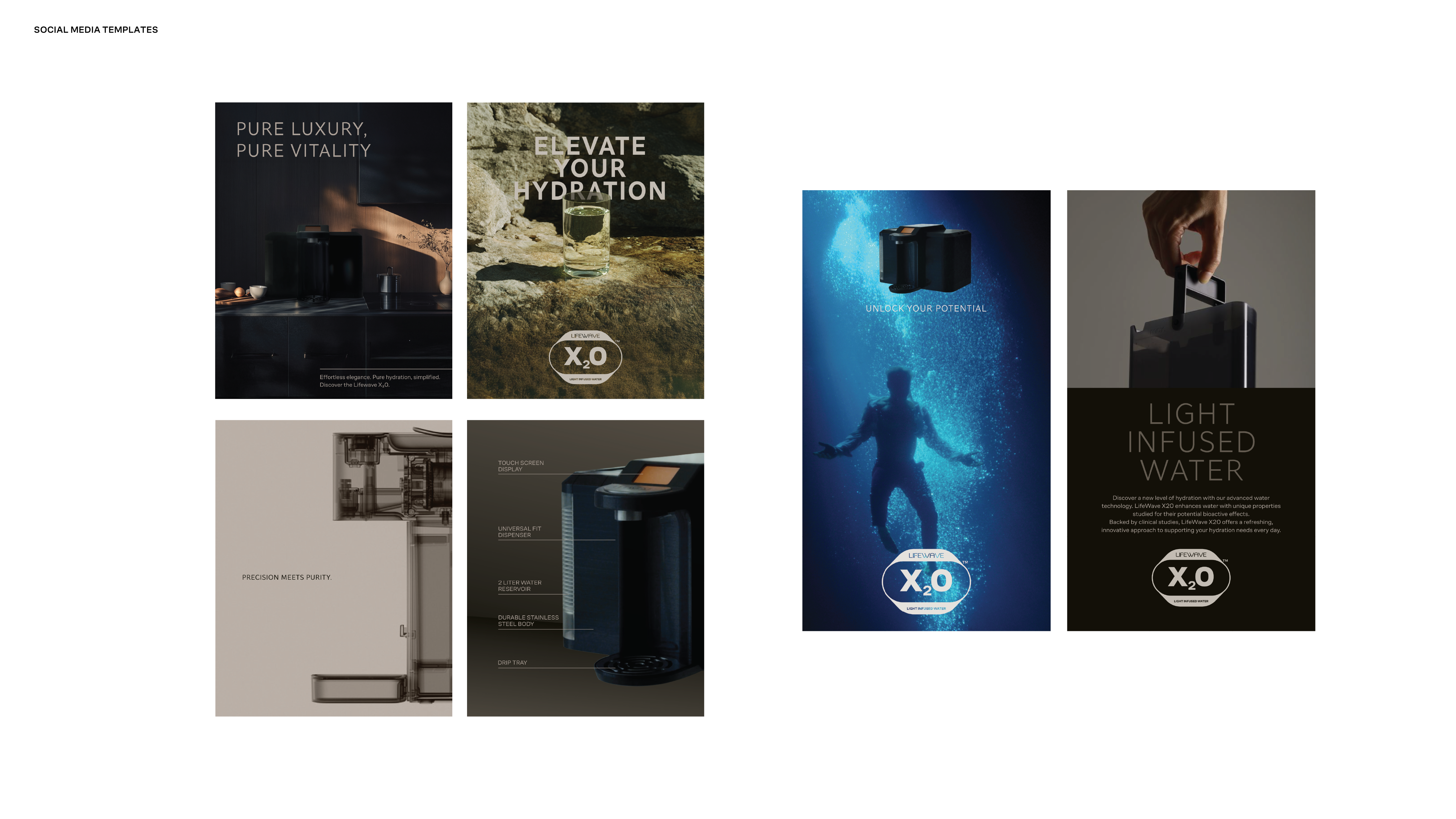
The imagery system positions X20 at the intersection of precision engineering and elevated wellness. It moves between minimal hero product shots, engineered detail, refined lifestyle integration, and abstract expressions of light and water.
Hero imagery is clean and controlled, using warm neutrals and sculpted lighting to emphasize material quality and form. Technical close-ups and transparency-inspired visuals communicate innovation and trust. Lifestyle scenes place the machine within modern, minimal interiors, showing it as part of a daily ritual rather than a standalone object.
Conceptual visuals use light, water, and reflection to evoke vitality and purity, reinforcing the idea of light-infused hydration as both science and experience.

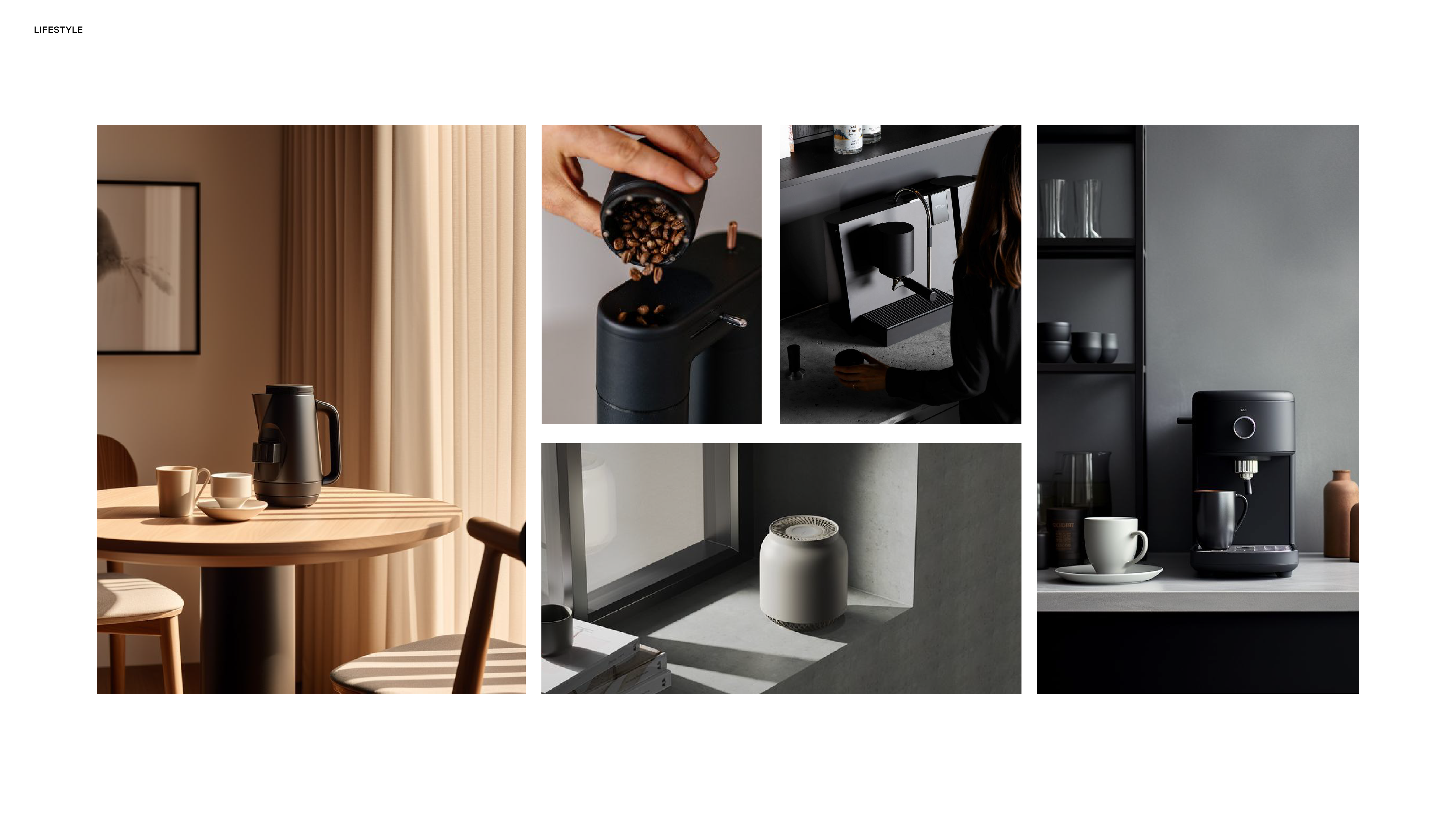
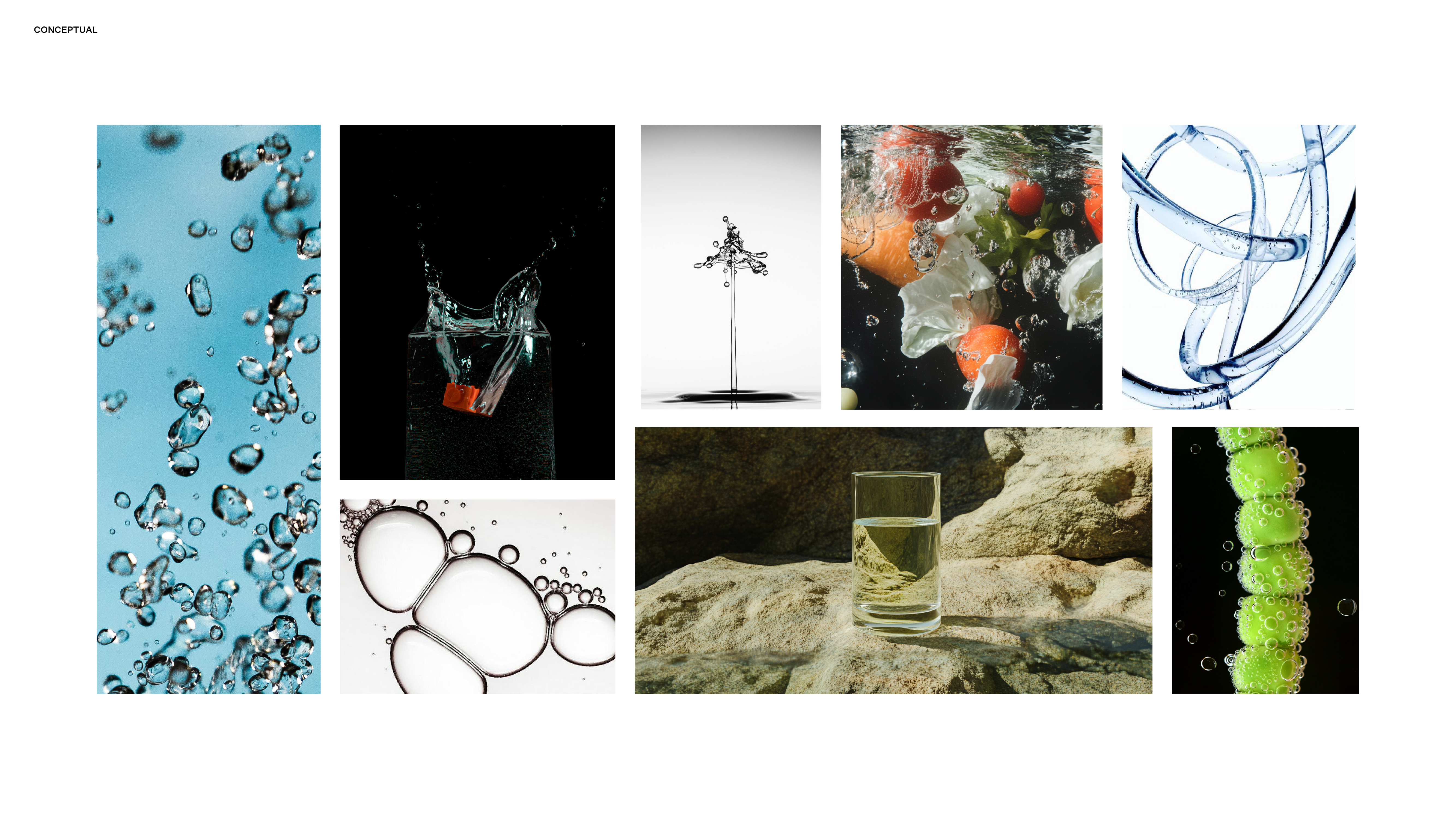
Imagery is shown for directional purposes to illustrate the intended visual system and graphic language.
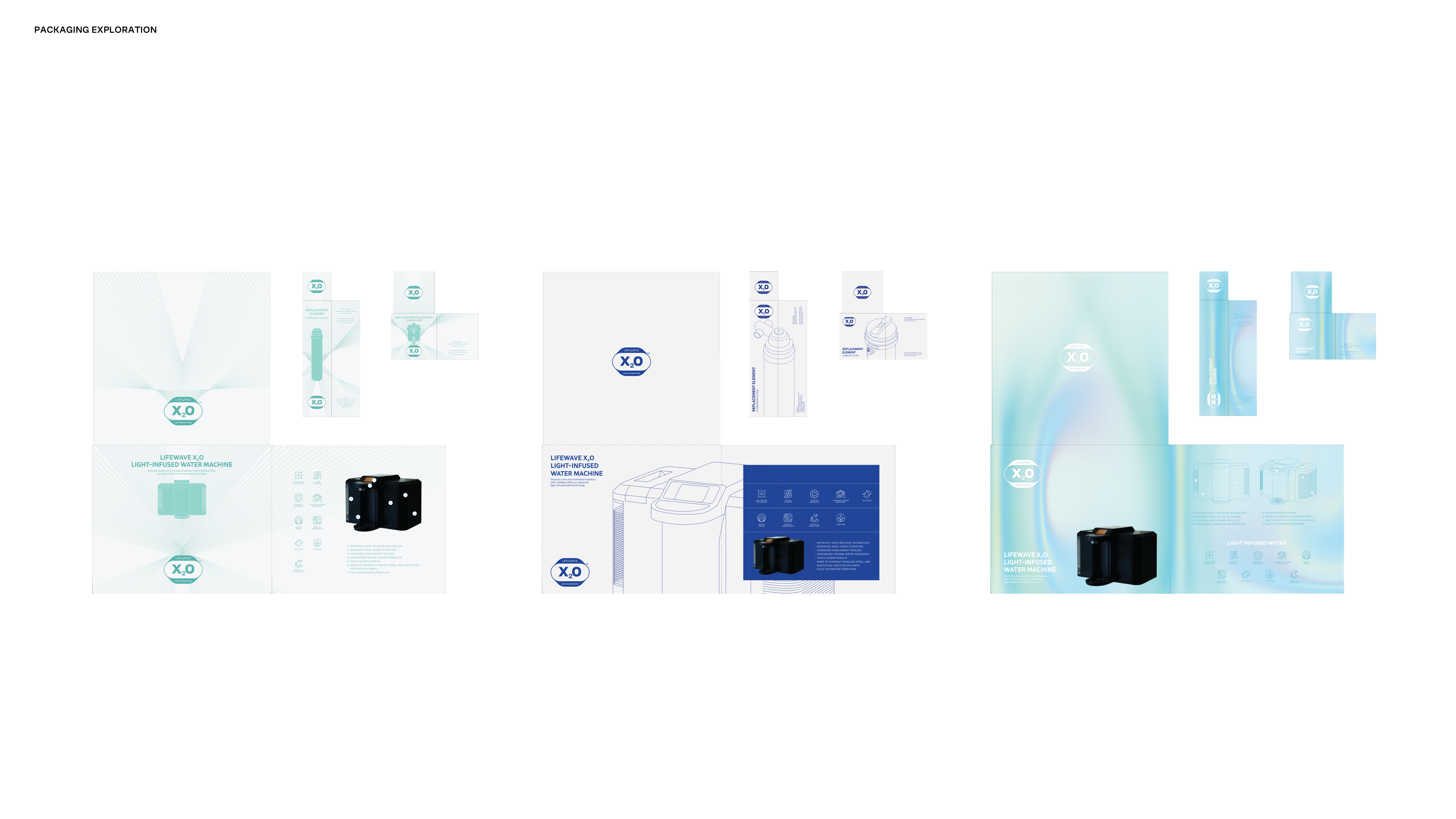
Packaging
The packaging explores how light, water, and technology can be expressed through a refined, structured system. From minimal radiance lines to atmospheric gradients and water textures, each direction balances innovation with clarity while maintaining strong hierarchy and alignment with the broader LifeWave visual language.

Applications
The system extends across print booklets, iconography, presentation templates, outdoor mockups, and launch materials, demonstrating consistency across physical and digital environments.


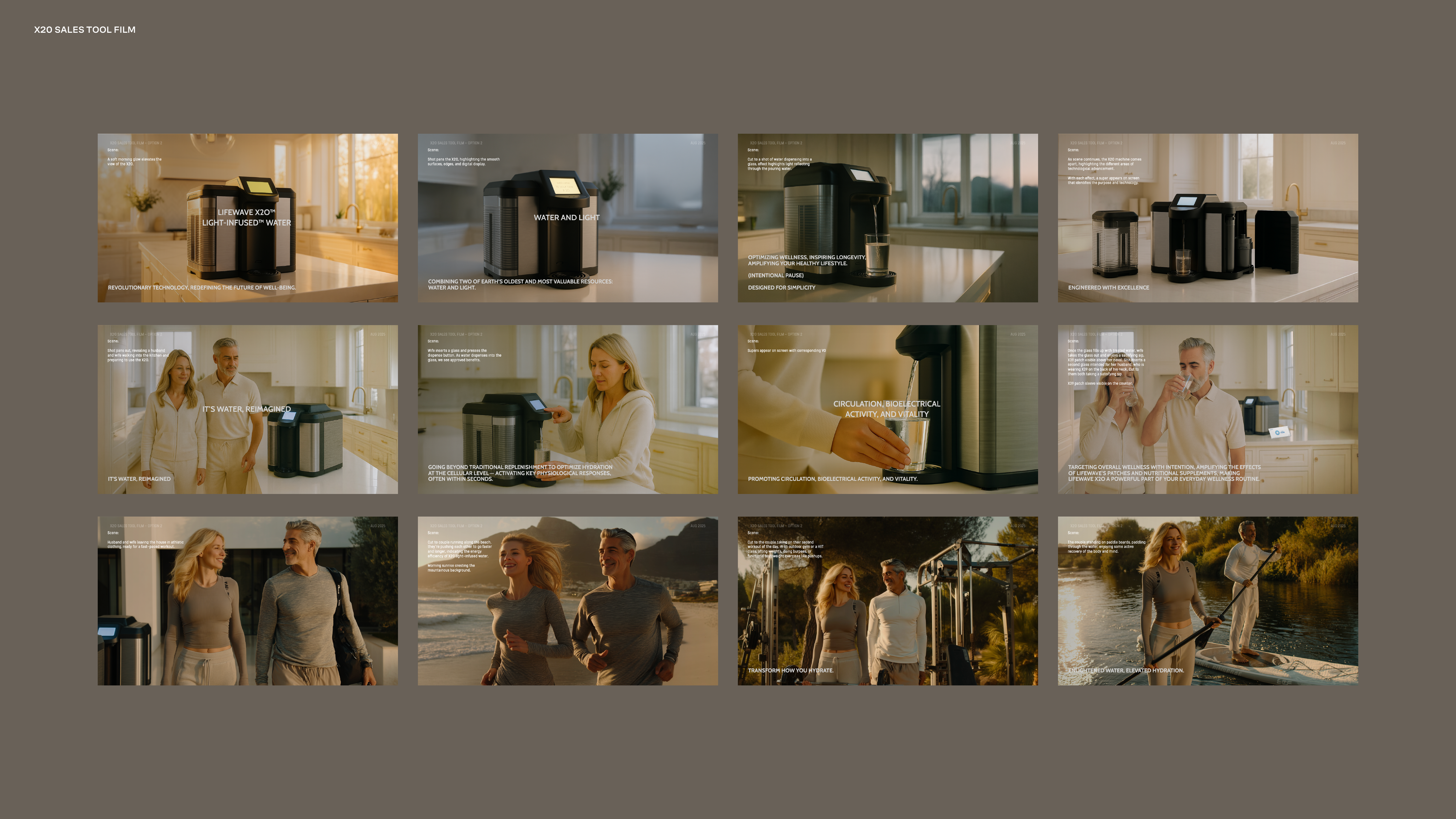
Campaign Storyboards
Launch film storyboards were developed to establish visual tone and narrative direction prior to production. Using AI-assisted image generation and compositing, I translated script concepts into cinematic sequences that defined lighting, pacing, and product positioning across campaign materials.


Project
LifeWave Brand Platform & Visual System
Client
LifeWave
Sector
Global Wellness Technology
Role
Lead Designer / Art Direction
Scope of Works
Brand Film Visualization
Visual Identity System
Typography & Color System
Icon System
Imagery Direction
Global Templates
Packaging Exploration
LifeWave Brand Platform & Visual System
Client
LifeWave
Sector
Global Wellness Technology
Role
Lead Designer / Art Direction
Scope of Works
Brand Film Visualization
Visual Identity System
Typography & Color System
Icon System
Imagery Direction
Global Templates
Packaging Exploration
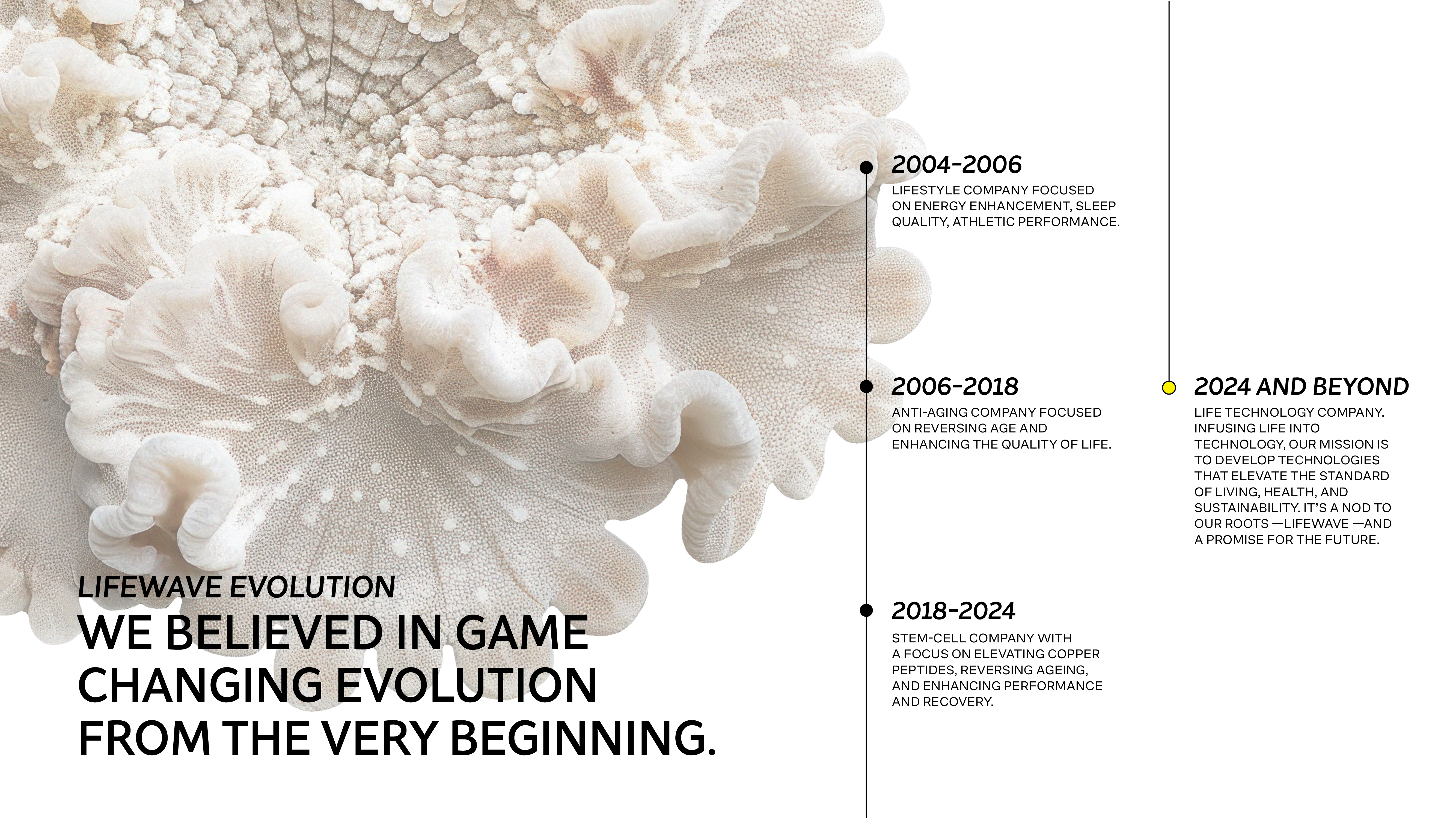
LifeWave is a global wellness technology company seeking to modernize its brand presence and establish greater credibility, clarity, and consistency across markets.
I led the visual rebranding effort, beginning with the cinematic campaign Be The Light, which established the emotional and conceptual foundation for the new direction. From this platform, a cohesive, science-led visual system was developed to elevate the brand’s tone while remaining scalable across products, regions, and languages.
The result is a structured yet flexible identity capable of supporting corporate communications, product marketing, and global localization at scale.
The rebrand began with a cinematic brand film titled Be The Light. Working directly with the Creative Director, I translated the script into a complete visual storyboard, defining mood, pacing, lighting, typography, and narrative structure.
The concept reframed LifeWave around the metaphor of light as both product technology and human potential. Strong contrast, illumination, and restrained typographic statements created a tone that felt forward-looking, confident, and intentional.
This campaign became the emotional foundation of the brand refresh and established internal momentum for a broader transformation.


Design Direction
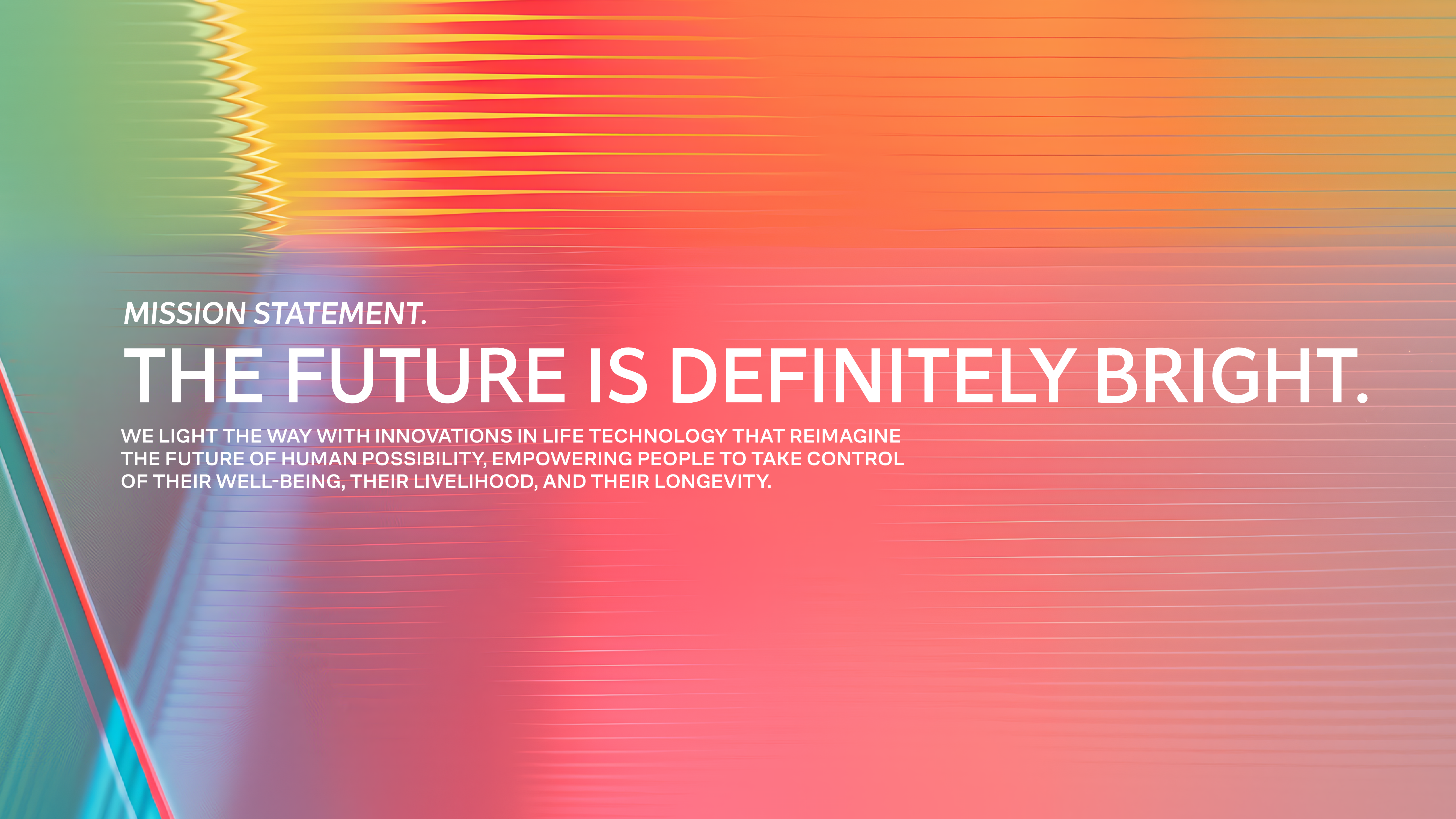
Repositioning LifeWave as a science-led life technology brand
The visual system was designed to move LifeWave away from outdated wellness tropes toward a more refined, science-led identity. The goal was to establish credibility, confidence, and long-term scalability, supporting a global brand with a clear and modern visual foundation.
Brand Vision
LifeWave’s evolving mission required a visual language that could communicate progress, longevity, and innovation. The new brand vision reframes LifeWave as a life technology company, focused on elevating human potential through science rather than traditional wellness marketing.
This vision informed the overall system across typography, color, imagery, and composition.
Visual System
The visual system emphasizes clarity, restraint, and structure. Typography, color, and composition were used intentionally to communicate credibility and confidence, reducing visual noise while creating a cohesive and modern brand presence.
Every element was designed as part of a scalable system to support global use across digital, print, and regional markets.
Color System
The color system moves away from expressive wellness palettes toward a more controlled, science-forward spectrum. Color is used to support hierarchy, focus, and legibility—reinforcing credibility without feeling cold or clinical.
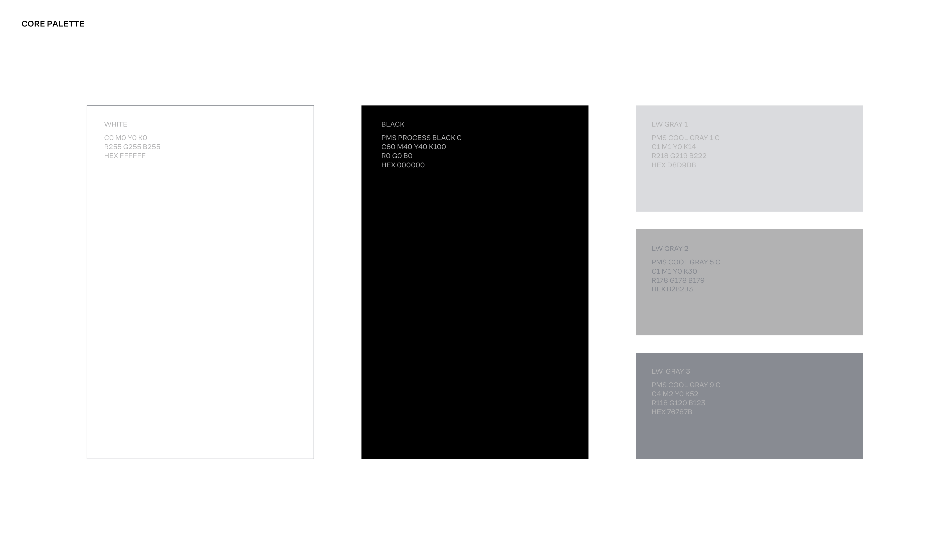
A restrained core palette of white, light grey, and black establishes clarity and structure. This is complemented by a flexible secondary palette inspired by the intersection of nature and technology, available across both print and digital applications.
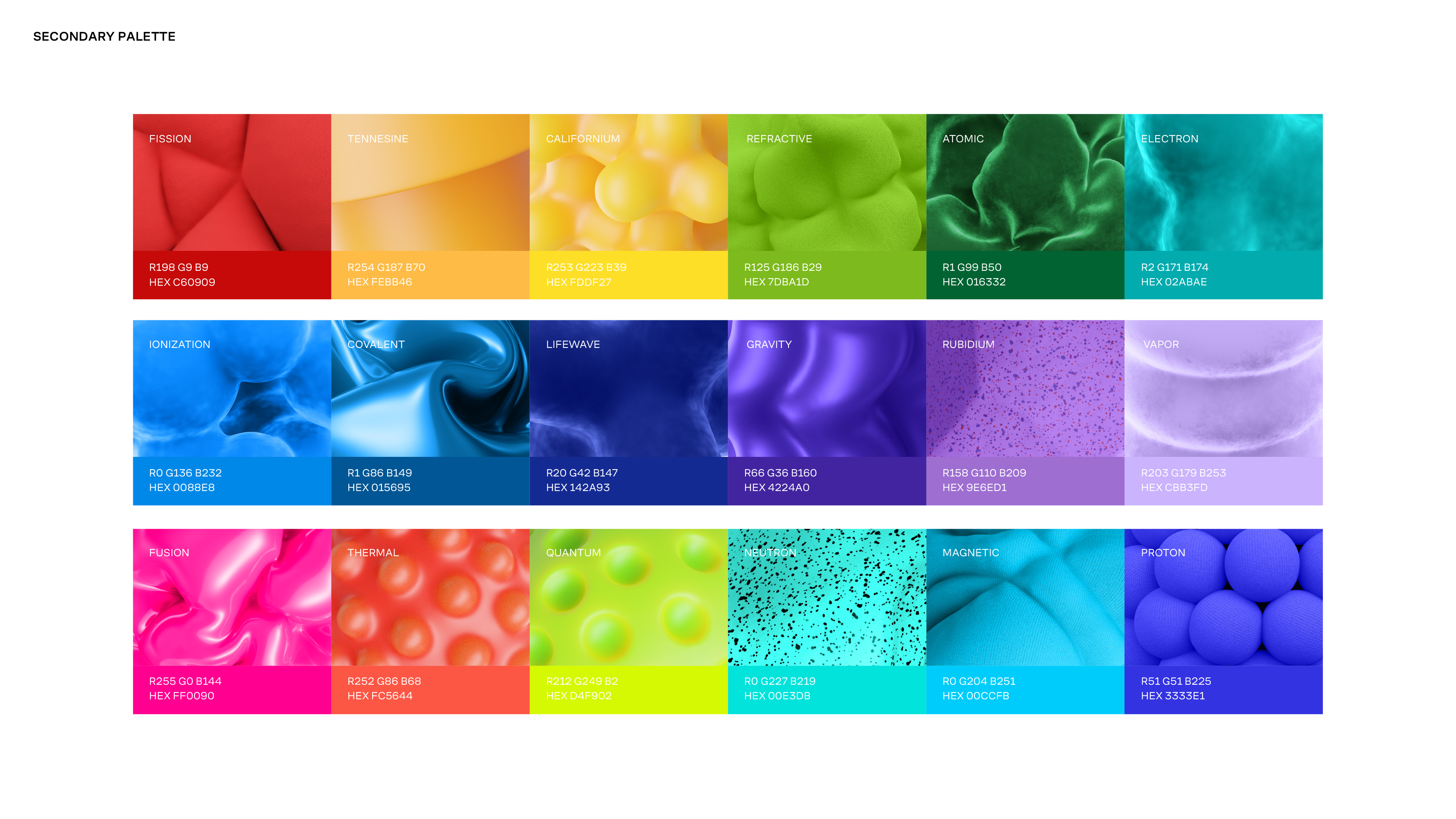
Rather than relying on a fixed set of brand colors, consistency is achieved through composition, hierarchy, and typographic control. Allowing color to adapt while maintaining a cohesive visual language.
Typography
Typography functions as a core structural element of the LifeWave identity. The system prioritizes clarity, hierarchy, and legibility to support both expressive brand statements and clear informational content.
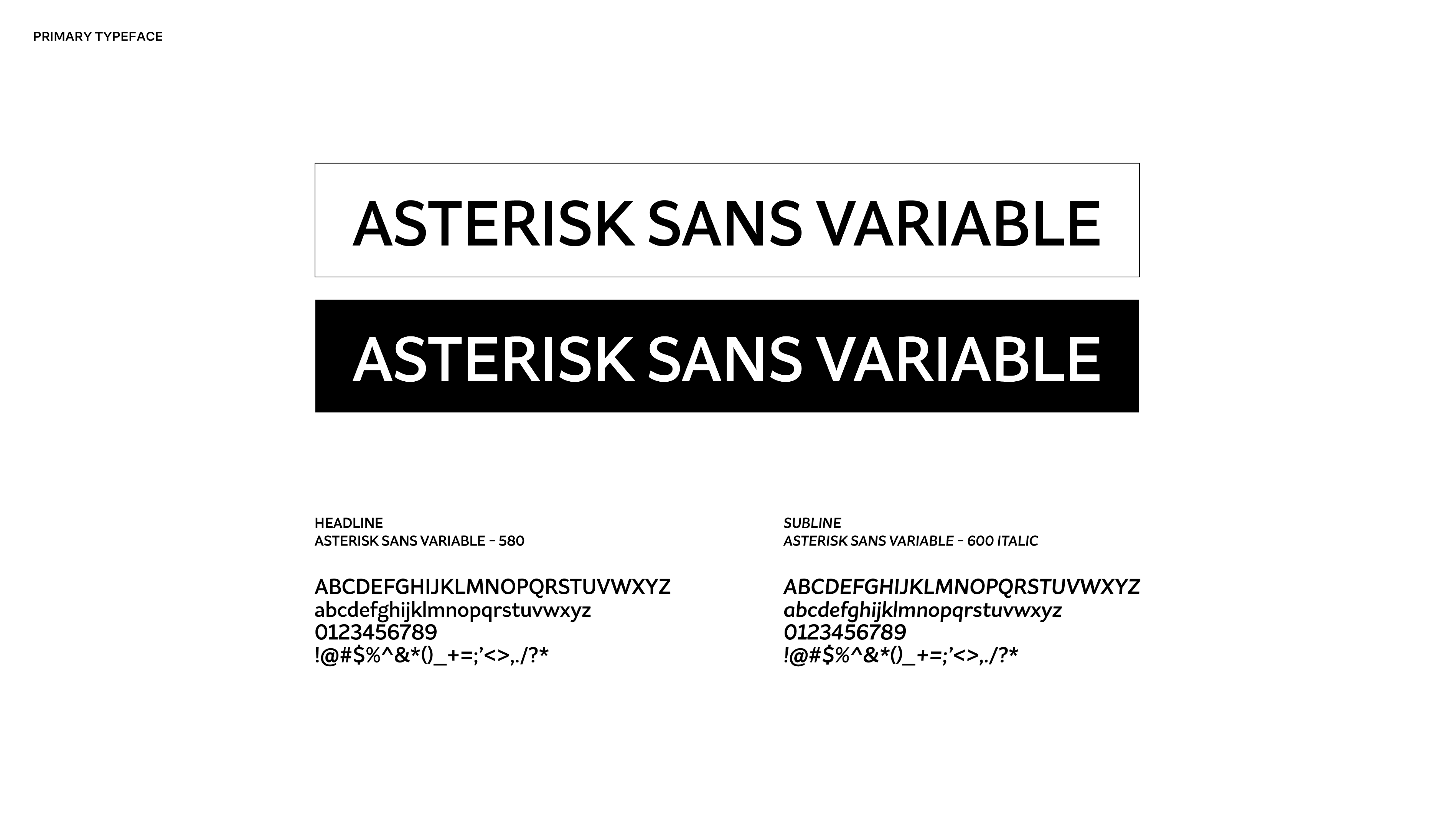
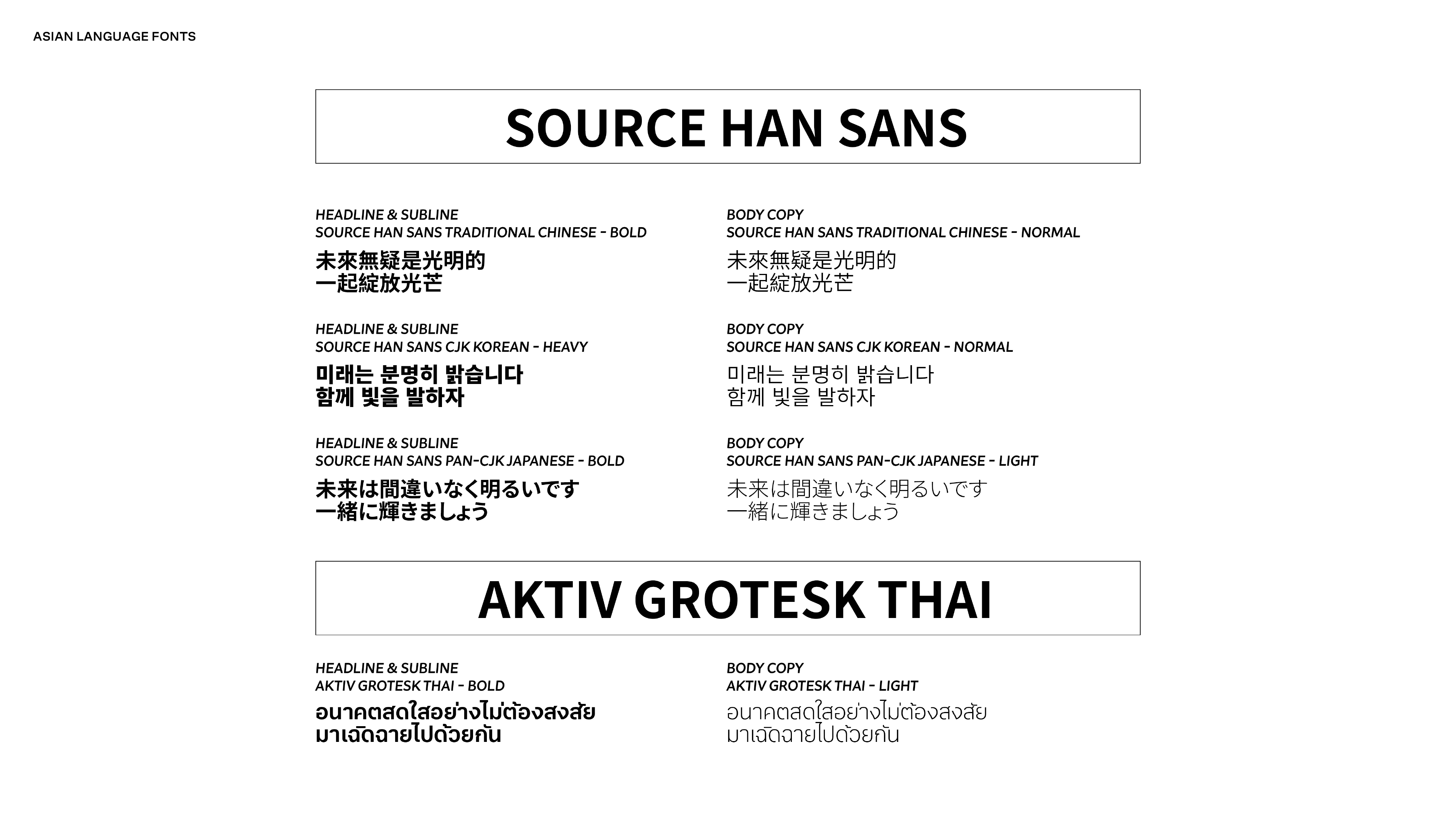
A modern, highly readable primary typeface anchors the brand across all communications, establishing confidence and consistency at every scale. For global applications, complementary Asian language typefaces were selected to match the same modern gothic sensibility, ensuring a unified visual tone across multilingual markets.
Together, the typography system reinforces structure, credibility, and cohesion while remaining flexible across print, digital, and regional use cases.
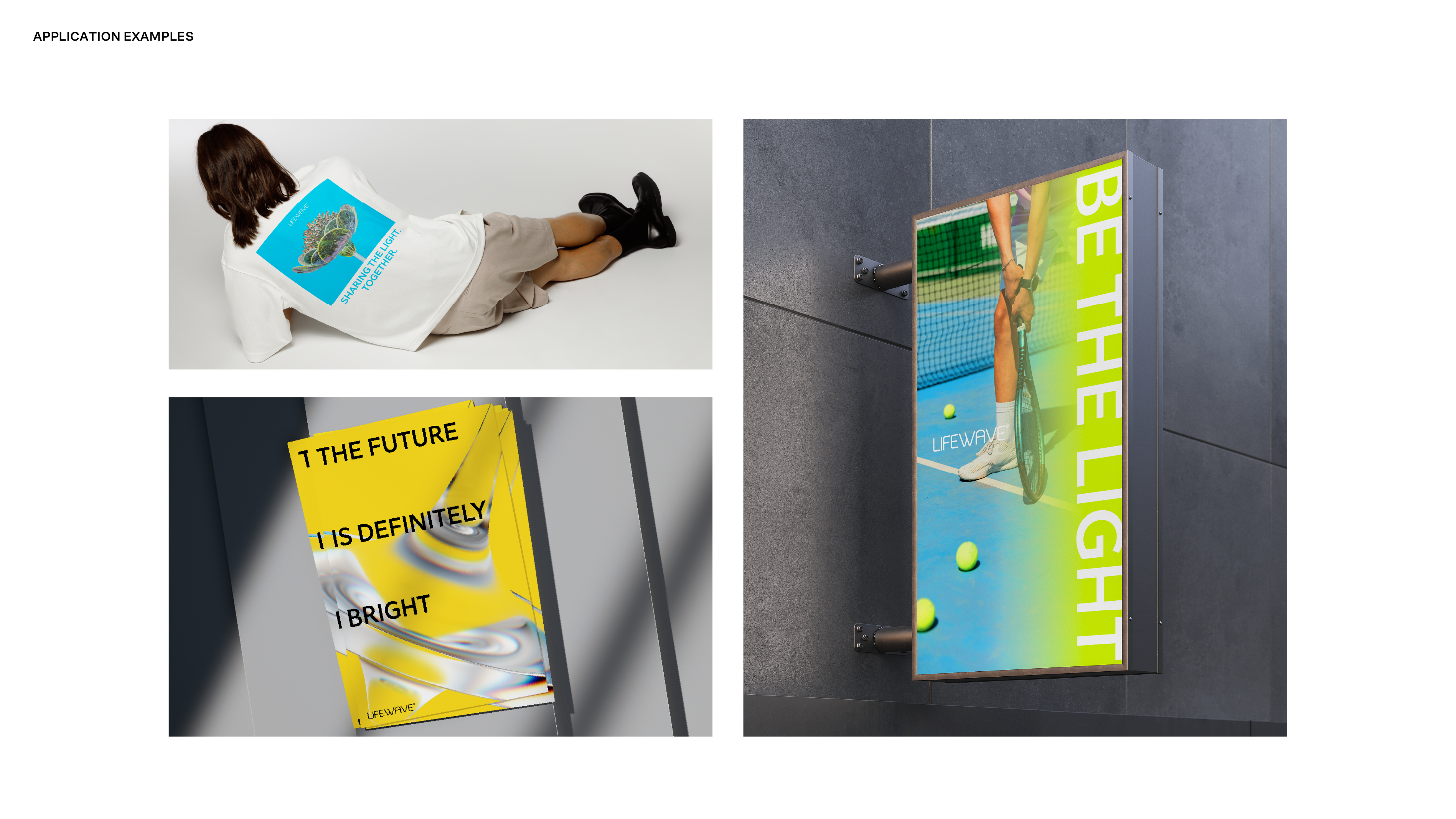
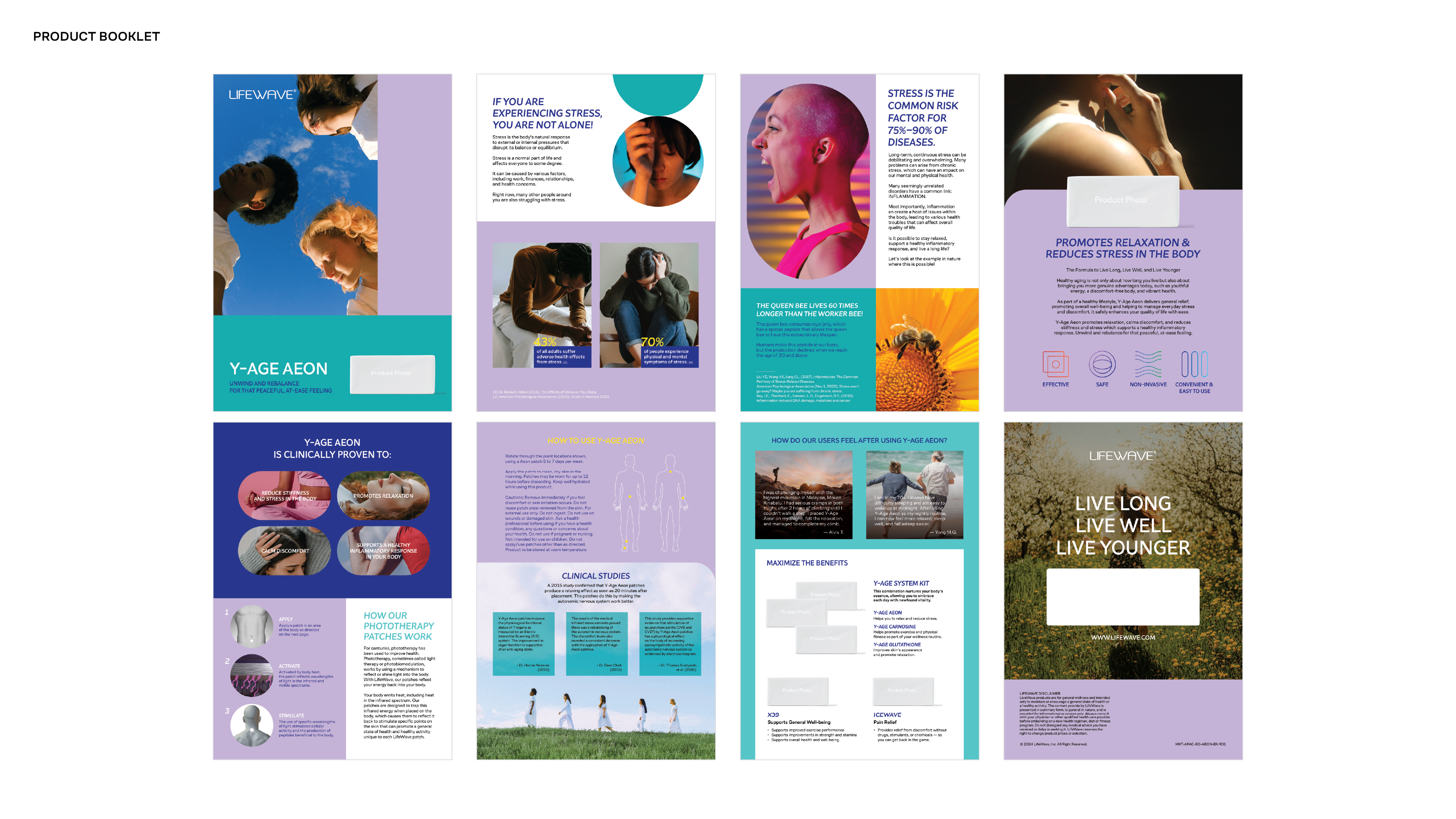
Imagery & Graphic Language
The imagery system was designed to balance science with humanity. Visuals are intentional, refined, and restrained, reinforcing credibility while remaining accessible and modern. Rather than relying on overt wellness cues, the language emphasizes clarity, precision, and confidence through composition, light, and materiality.
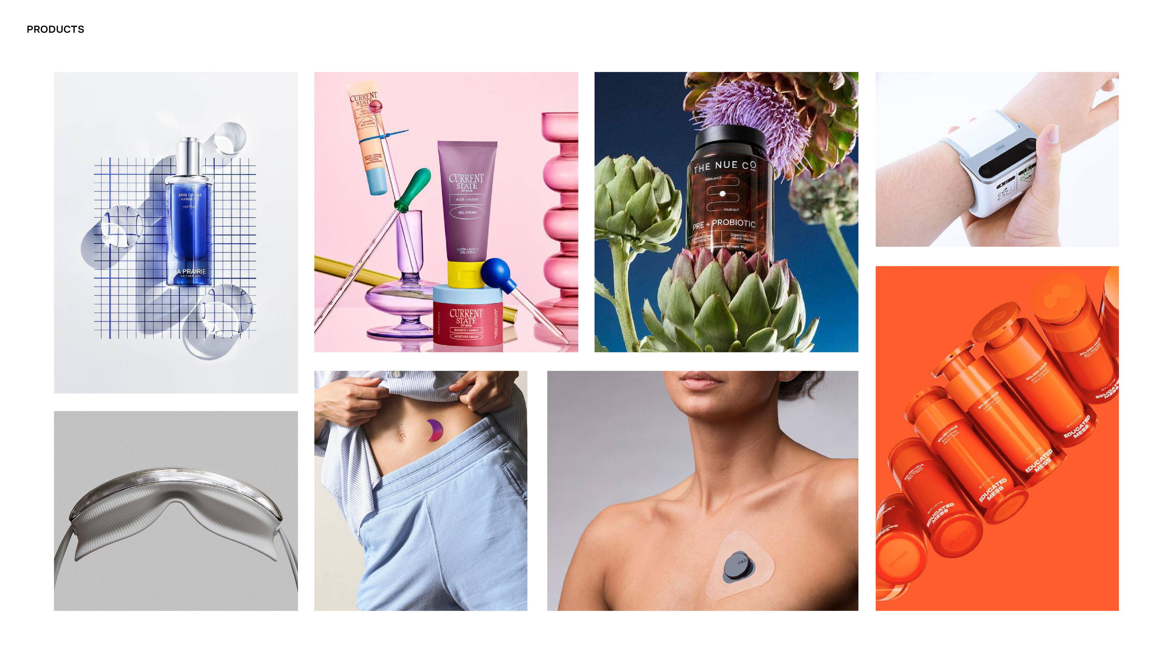
Imagery is organized across product, lifestyle, portrait, and conceptual categories to support a wide range of brand needs without visual fragmentation. Product photography prioritizes accuracy, focus, and clean surfaces. Lifestyle imagery captures real movement and natural interaction, avoiding staged or overly performative moments. Conceptual visuals draw from scientific and natural forms to express innovation, progress, and longevity.
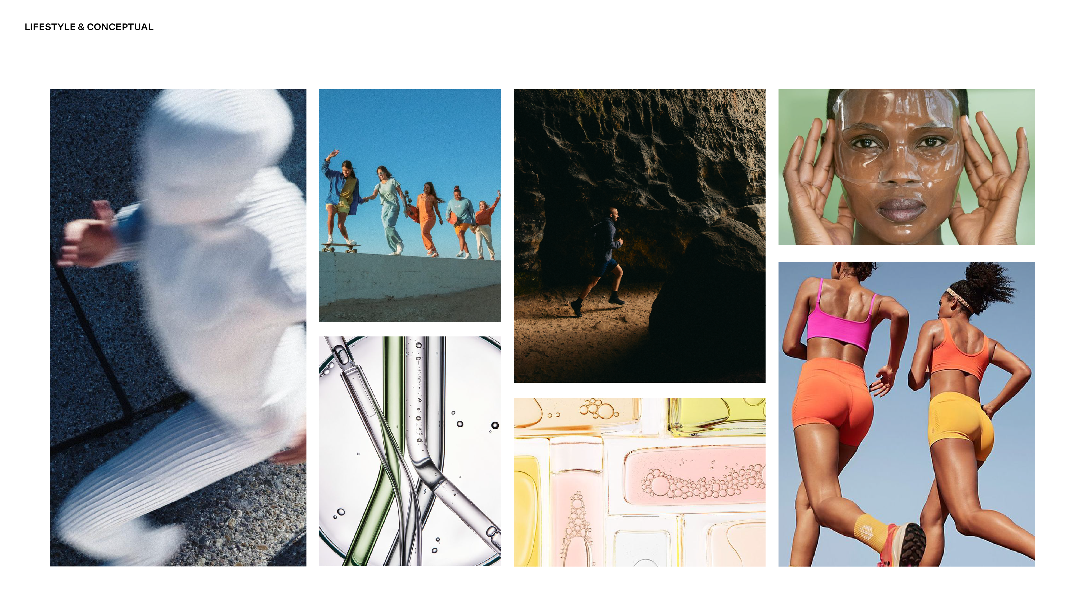
Across all applications, the system favors simplicty and control. Visual noise, heavy retouching, and crowded compositions are intentionally avoided. The result is a cohesive, scalable visual language that supports a science-led brand narrative across global markets, platforms, and cultures.
Imagery is shown for directional purposes to illustrate the intended visual system and graphic language.
Logo & Packaging Exploration
As part of the rebrand, exploratory work was conducted on logo and packaging refinements to align more closely with the updated visual system. These explorations focused on improving clarity, cohesion, and alignment with the new science-led direction.
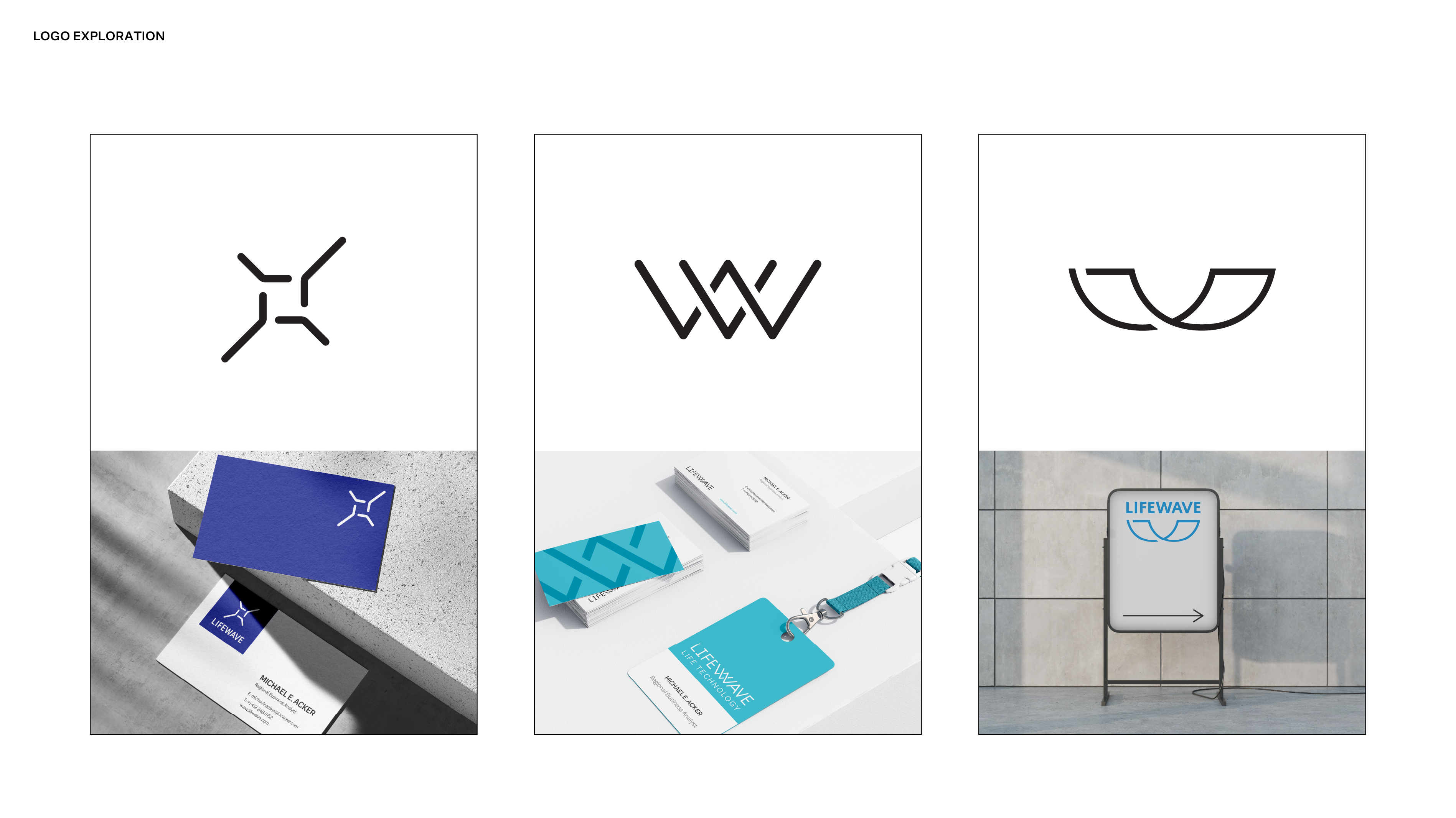
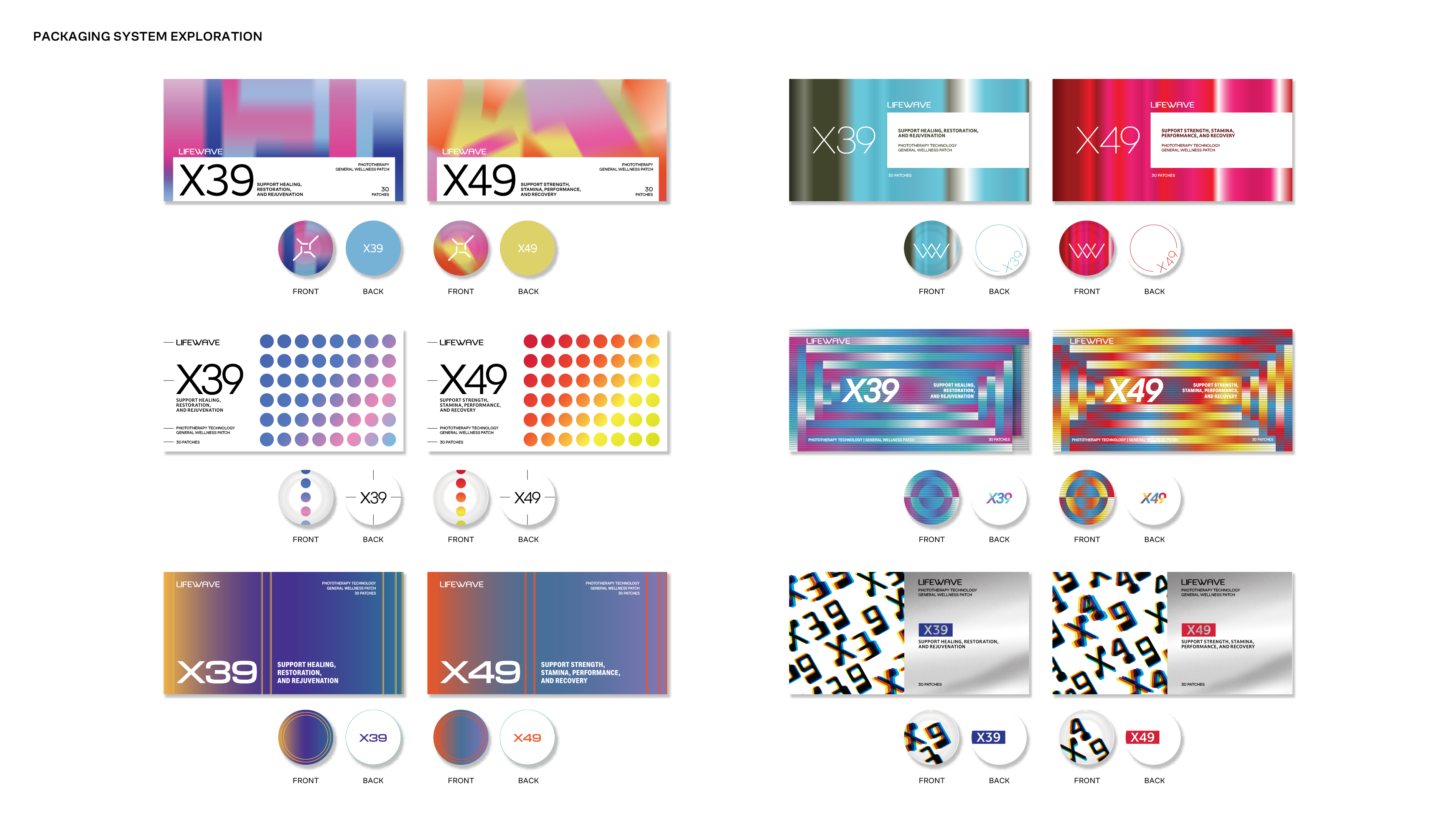
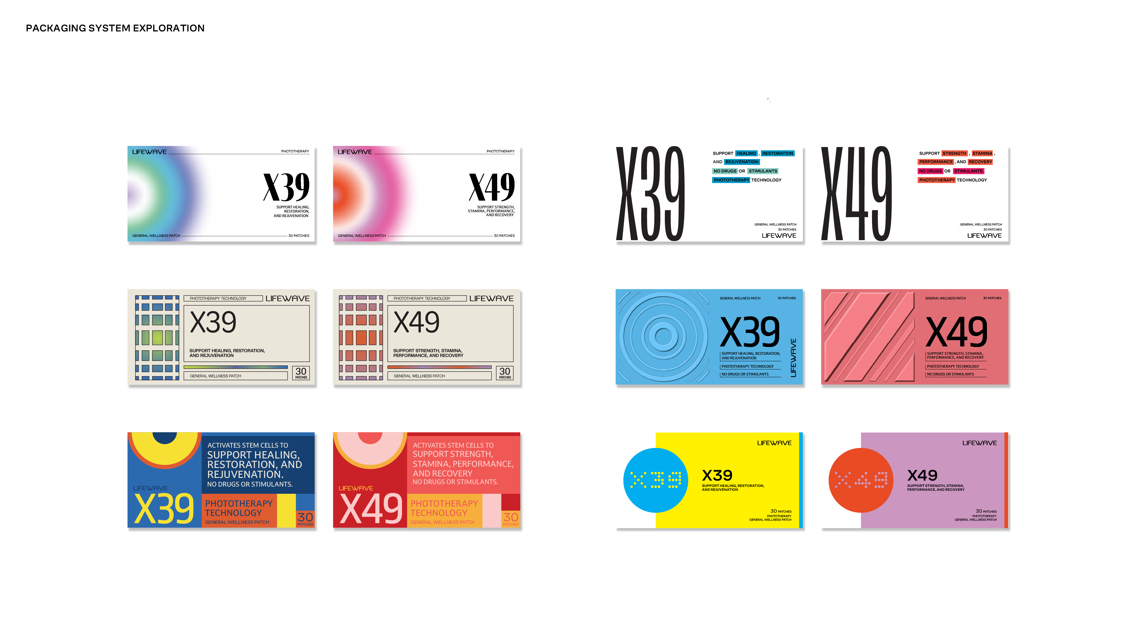
While not implemented in the final rollout, this work demonstrates how the identity could evolve cohesively across products.
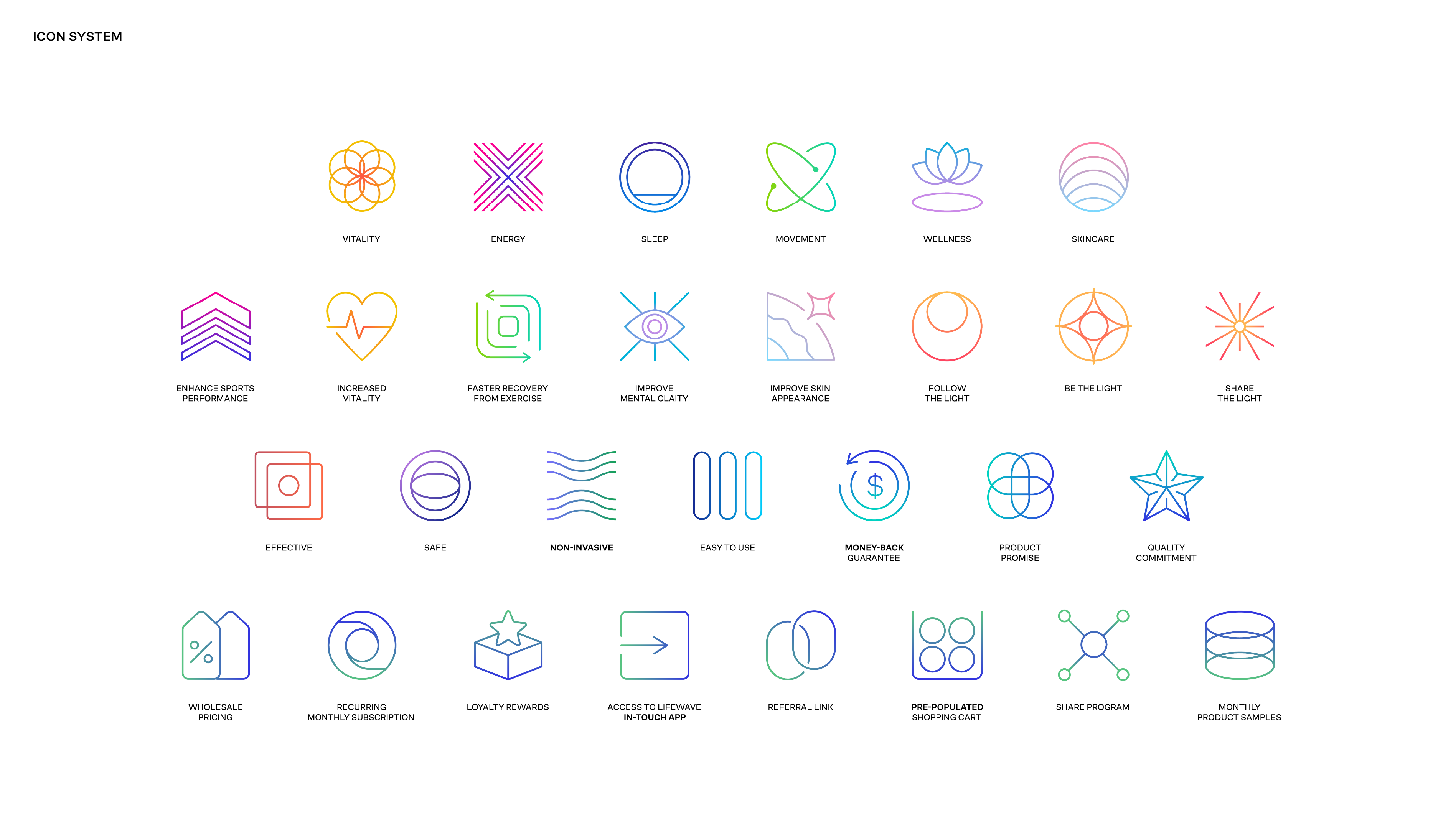
Icon system
A contemporary icon system was developed using abstract geometry, consistent line weight, and subtle gradients to convey LifeWave’s science-driven and high-tech positioning without feeling clinical. The icons balance clarity with visual energy, allowing complex concepts to feel intuitive and approachable. Built on a modular structure, the system scales seamlessly across products, digital platforms, and global applications while maintaining a cohesive visual language.
Global Templates & Localization
To support LifeWave’s global operations, a flexible yet controlled system of templates was developed across digital, print, and internal communications. The work focused on creating clarity and consistency at scale, particularly for international teams where visual execution had previously varied widely.
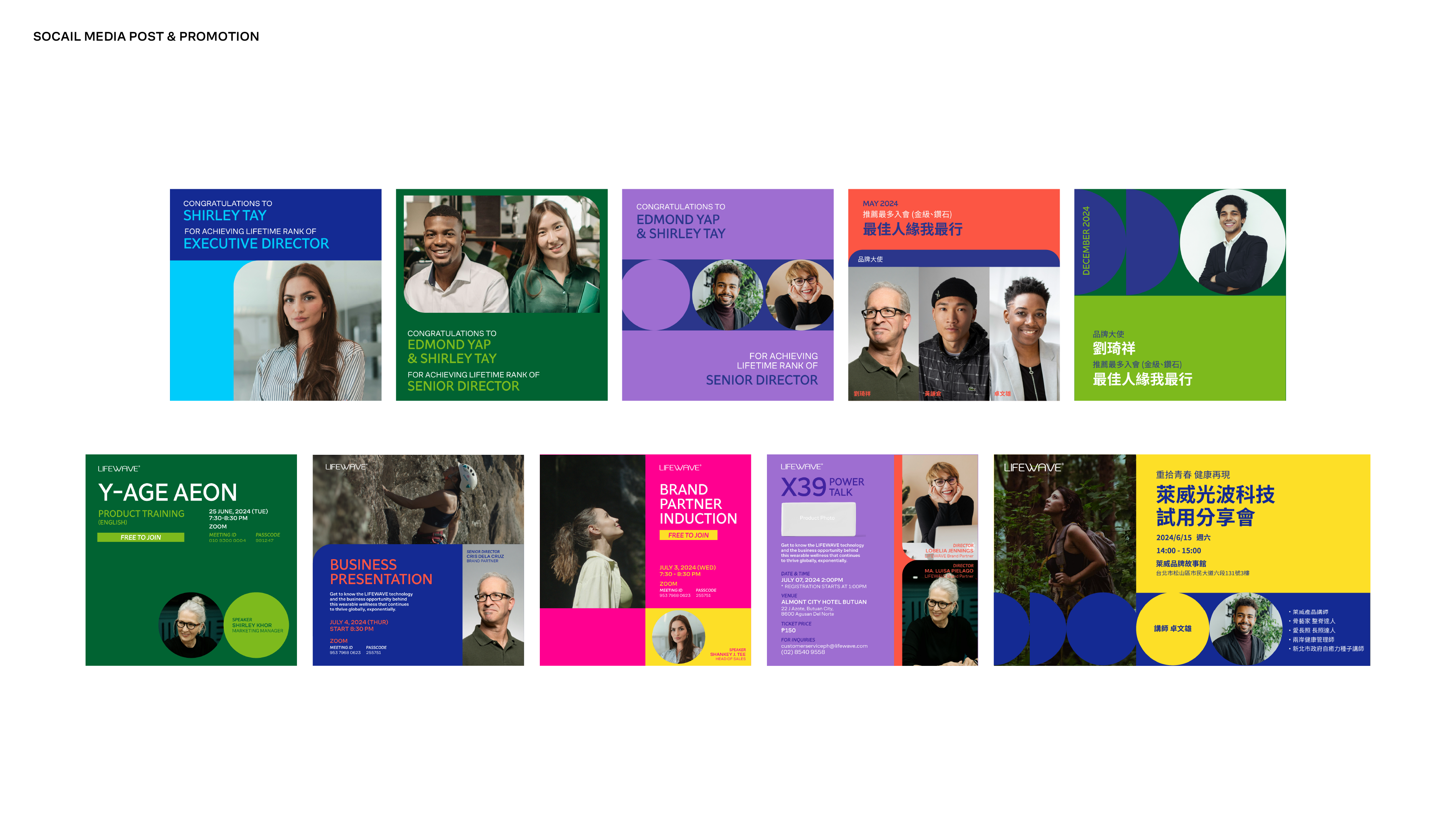
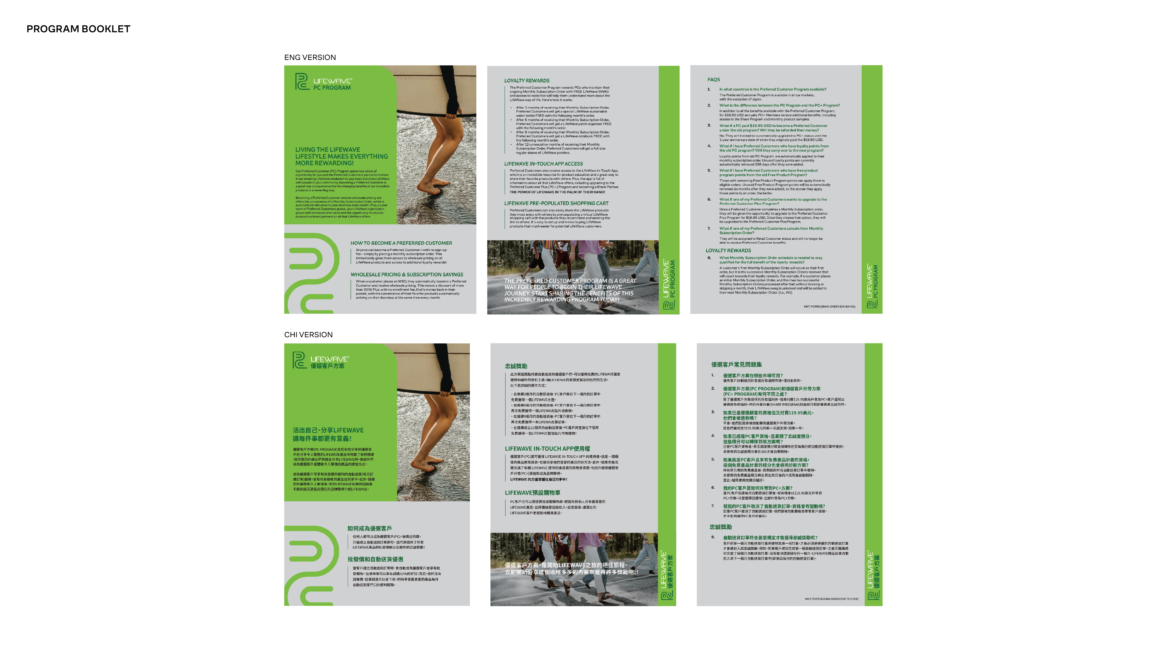
The system establishes clear rules for layout, hierarchy, typography, and spacing, allowing teams to work efficiently without compromising brand integrity. While the core templates were developed in English and Chinese, the structure was designed to scale easily across additional languages and regions, with Asian language applications maintaining the same modern, clean typographic tone as the primary brand system.
This approach ensured that regional teams could localize content confidently while preserving a unified, professional brand presence across markets.
Applications
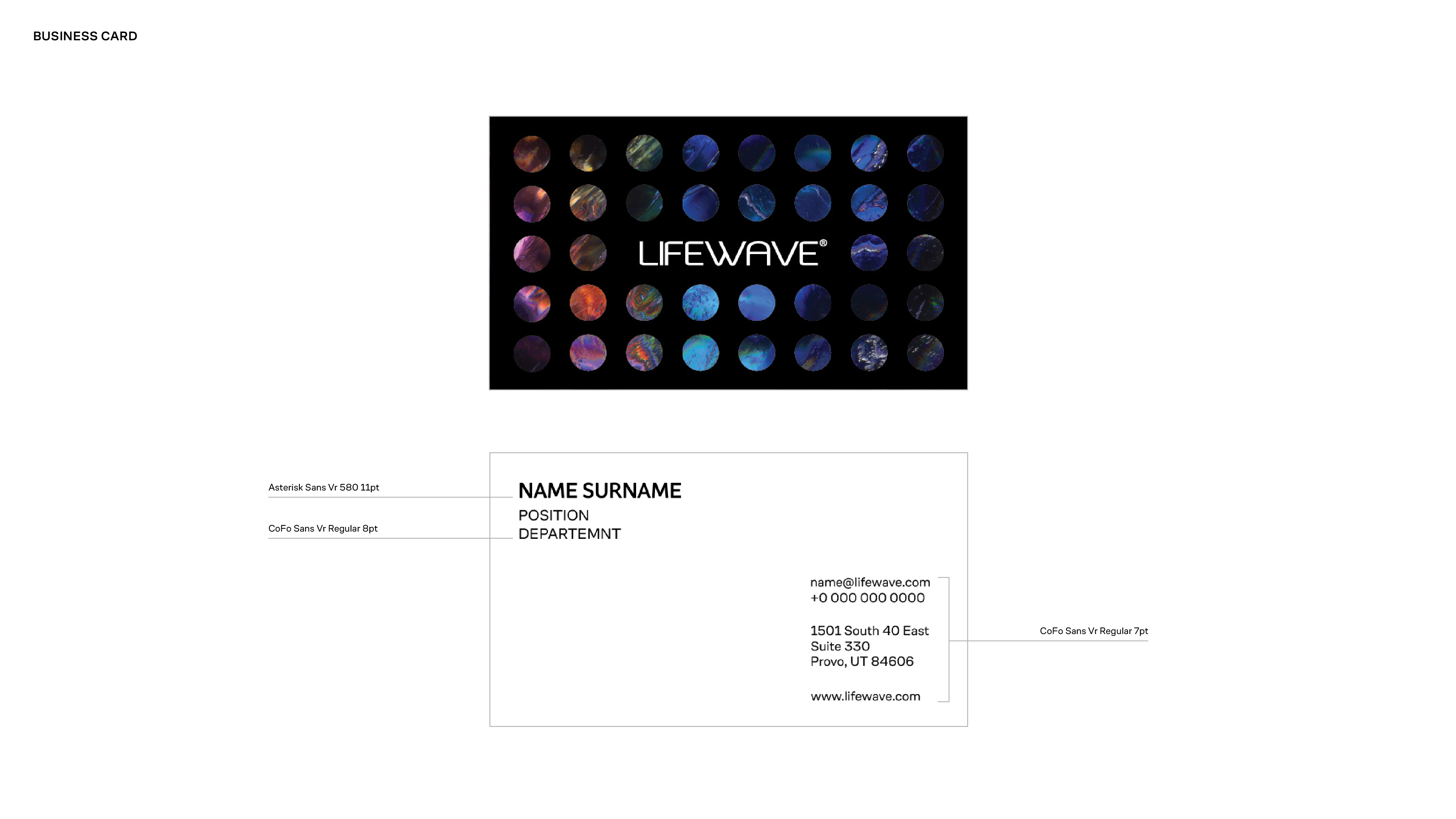
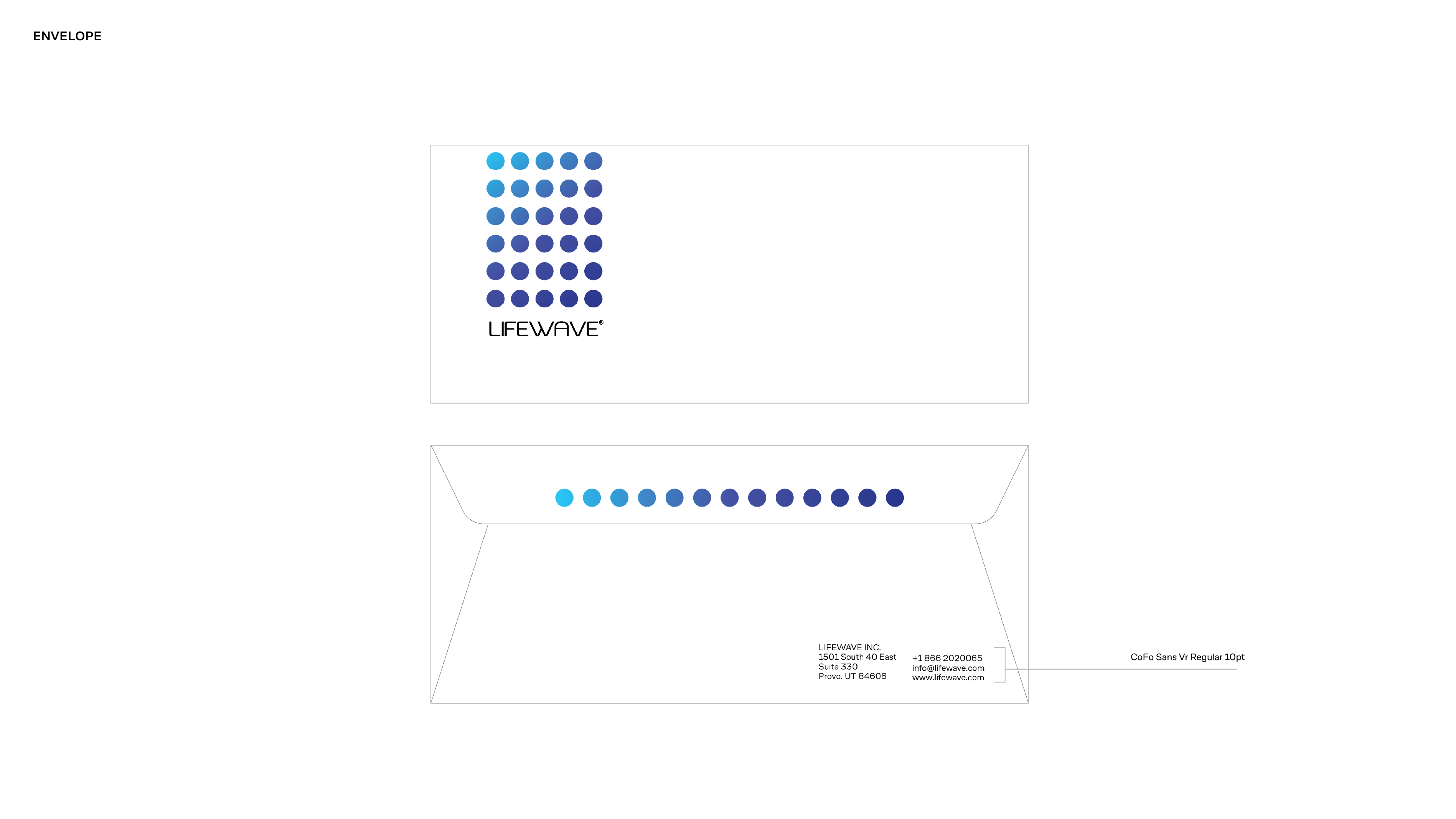
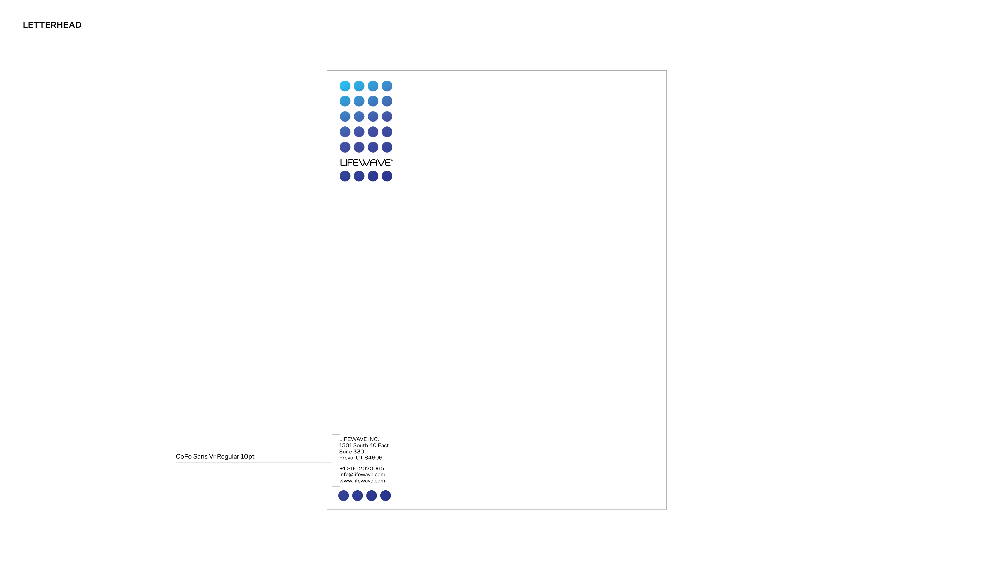
The visual system was translated into core brand materials including the brand booklet, stationery, and foundational print assets. These applications establish tone, hierarchy, and consistency, serving as a clear reference point for future digital, marketing, and regional executions.
Outcome
The project established a modernized visual foundation for LifeWave—introducing a clearer, more credible, and more scalable brand language. The system elevated the company’s perception while providing internal teams with the tools to maintain consistency across global communications.
Project
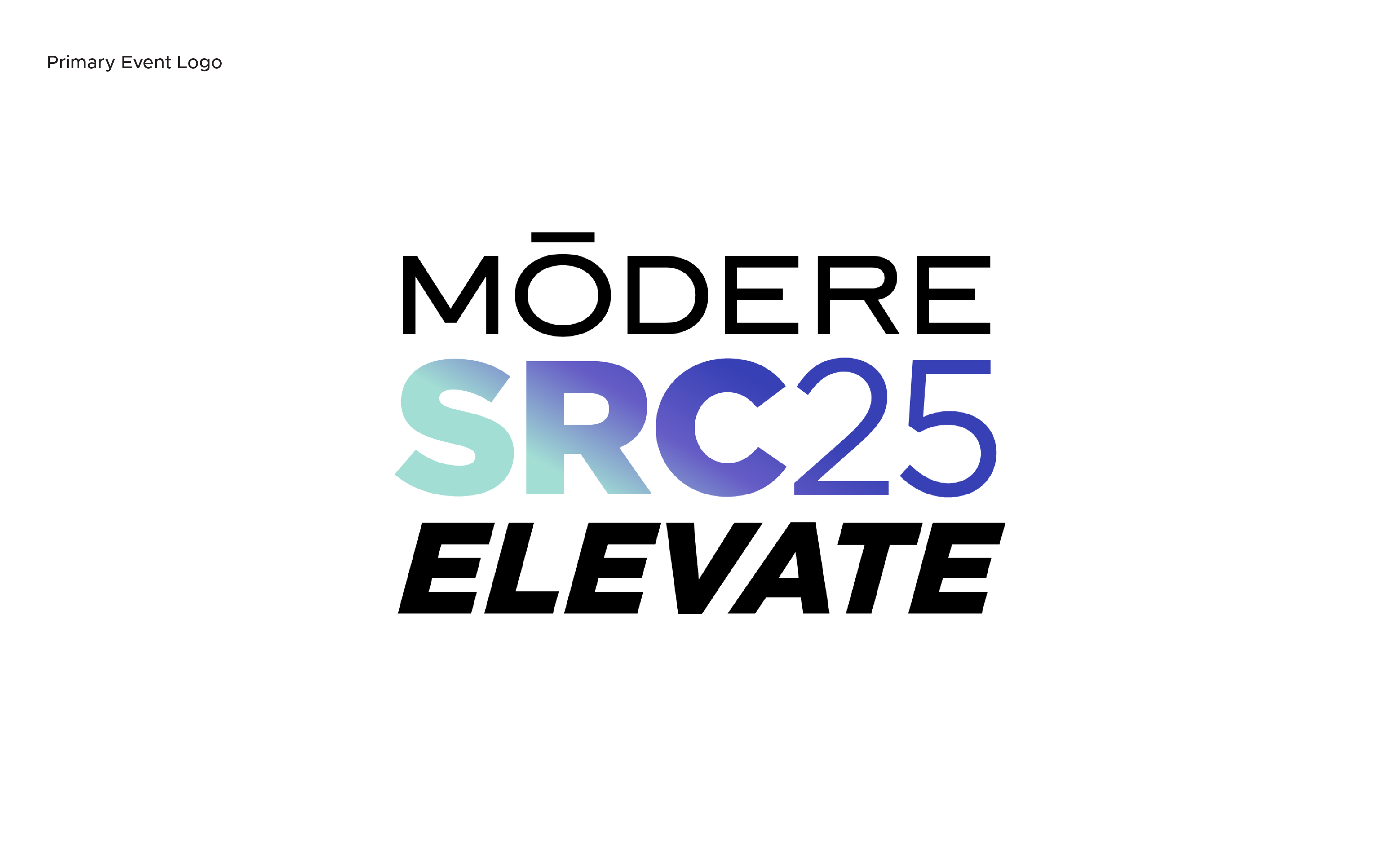
Modere SRC 2025 — Elevate
Client
Modere
Sector
Health & Wellness / Global Events
Role
Creative Director / Lead Designer
Scope of Works
Event Brand Identity
Visual System & Motifs
Typography & Color Systems
Style Guide & Vendor Guide
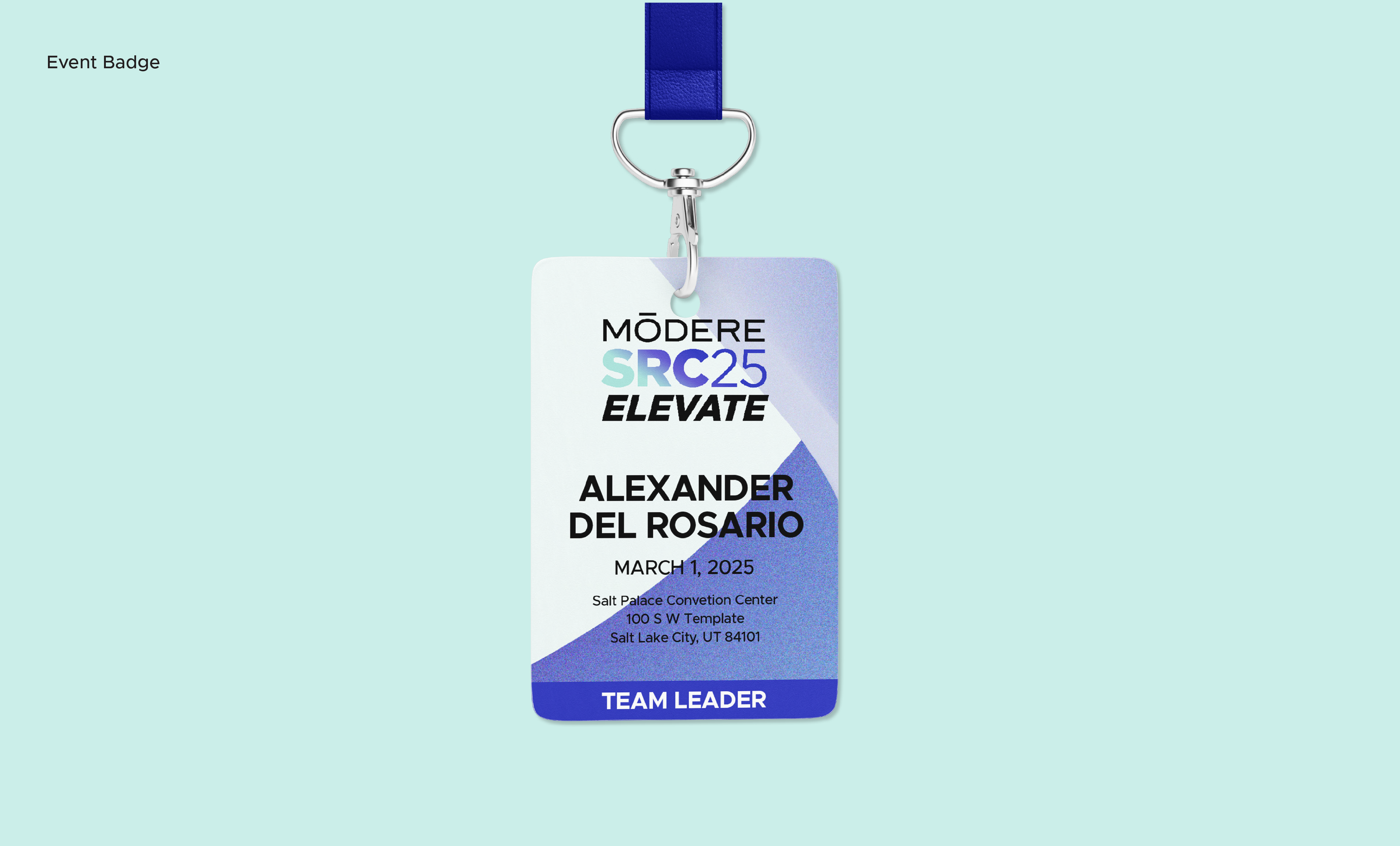
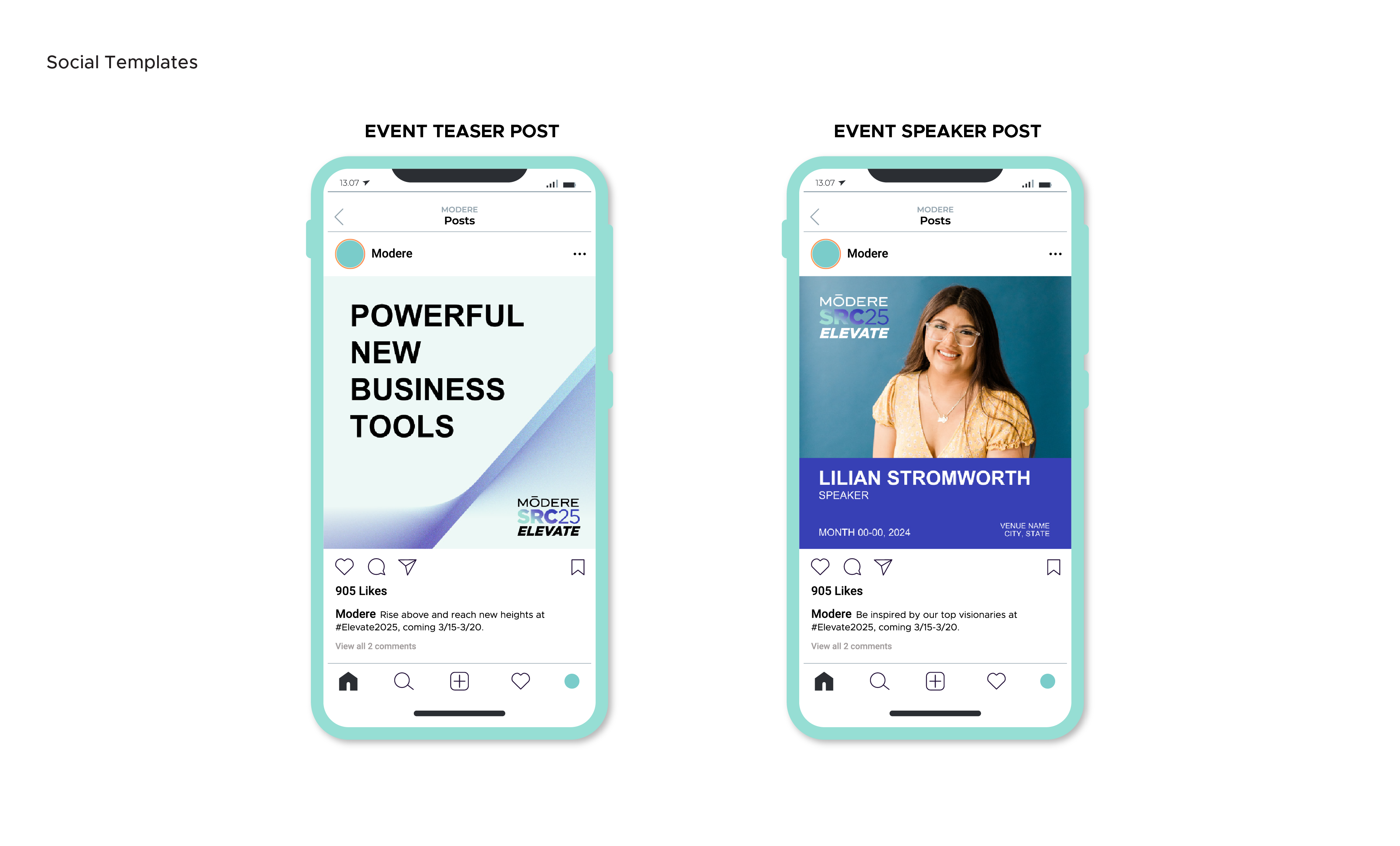
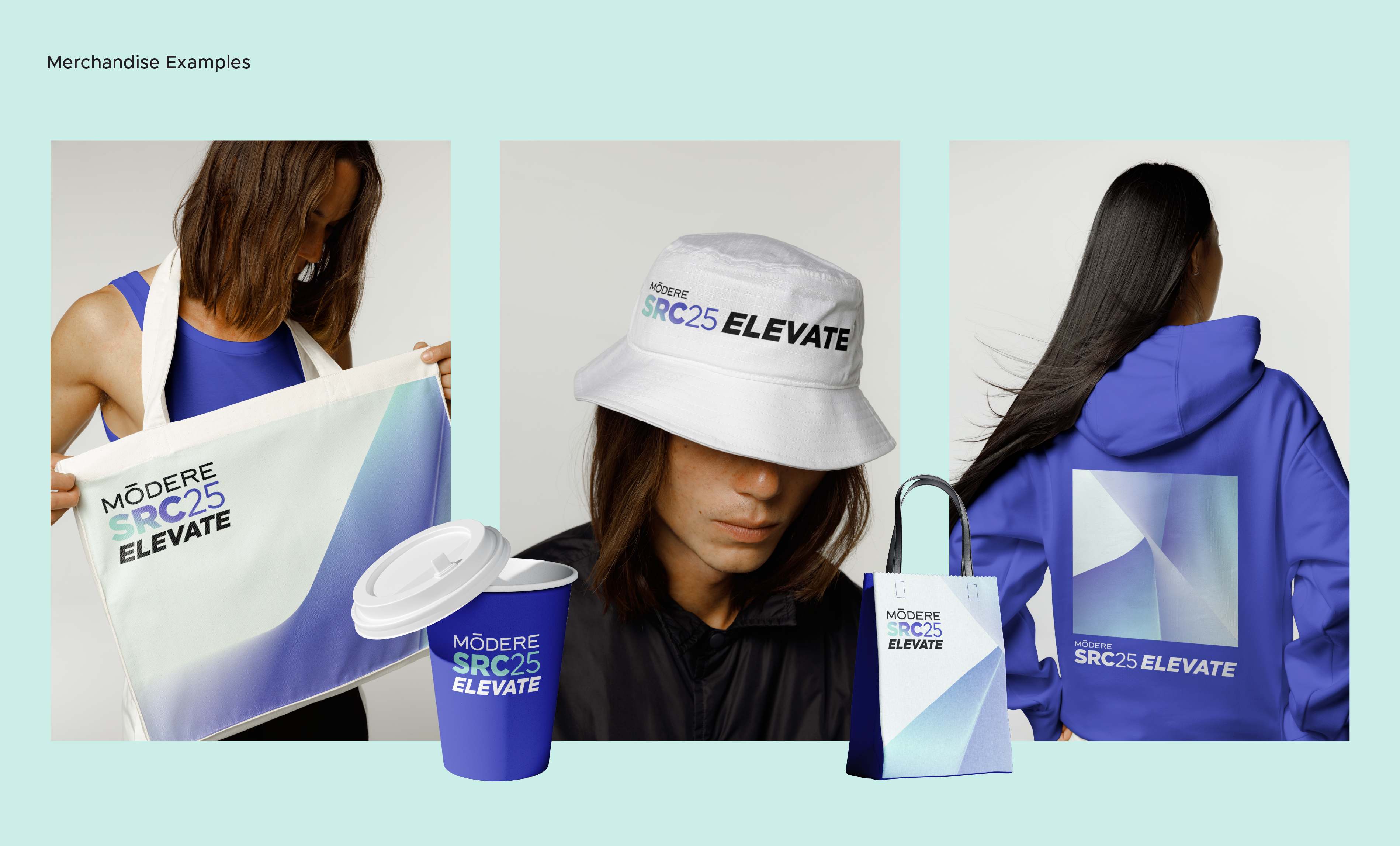
Presentation, Social & On-site Applications
Modere SRC 2025 — Elevate
Client
Modere
Sector
Health & Wellness / Global Events
Role
Creative Director / Lead Designer
Scope of Works
Event Brand Identity
Visual System & Motifs
Typography & Color Systems
Style Guide & Vendor Guide
Presentation, Social & On-site Applications
Elevate is the 2025 theme for Modere’s global Social Retail Conference. The objective was to create a flexible, inspiring event brand system that could scale across regions while remaining consistent, intuitive, and unmistakably Modere.
The identity needed to support a wide range of applications, from keynote presentations and social media to vendor assets and on-site signage, while reinforcing Modere’s “Life By Design” philosophy.
Concept: Elevate through Updraft
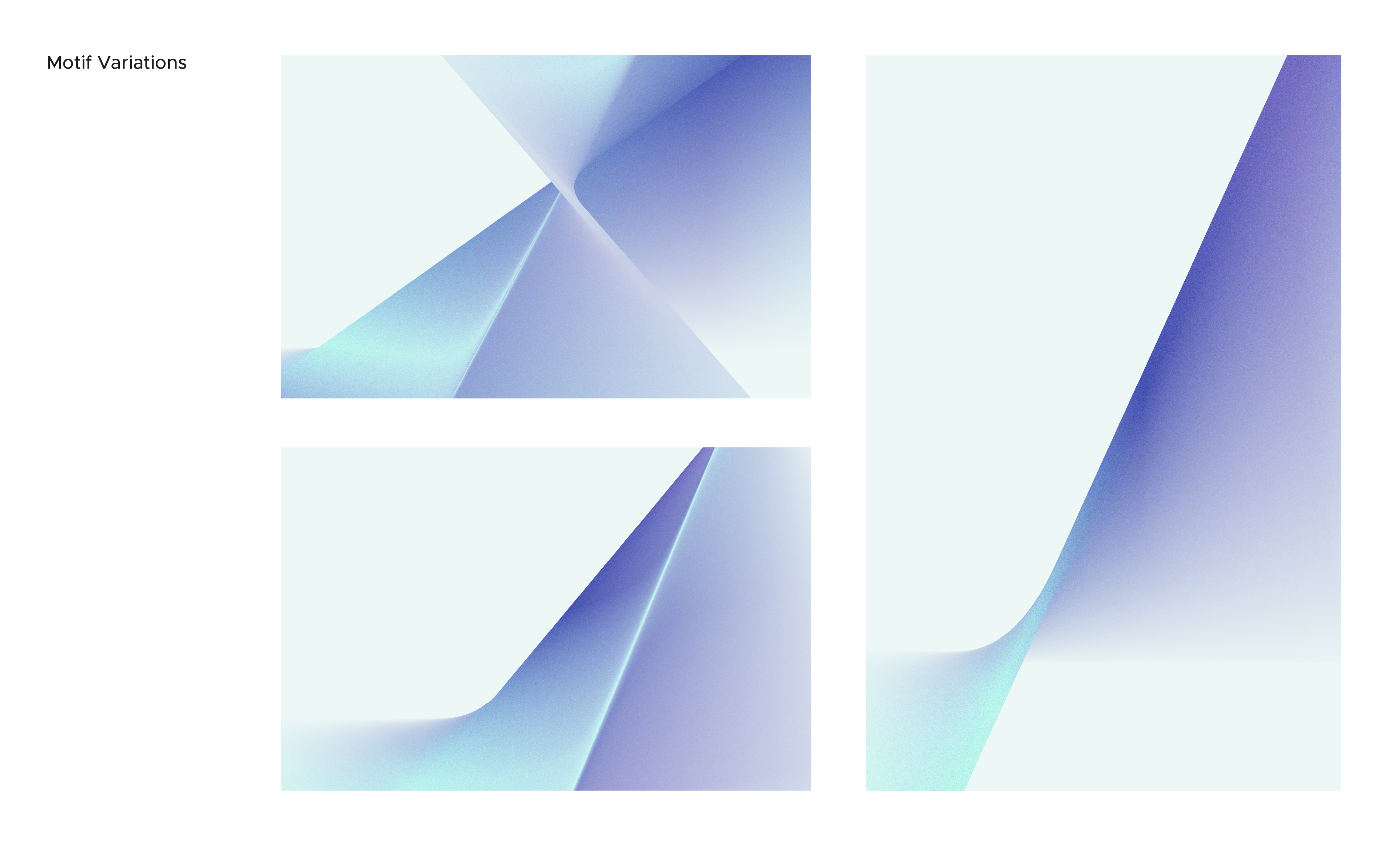
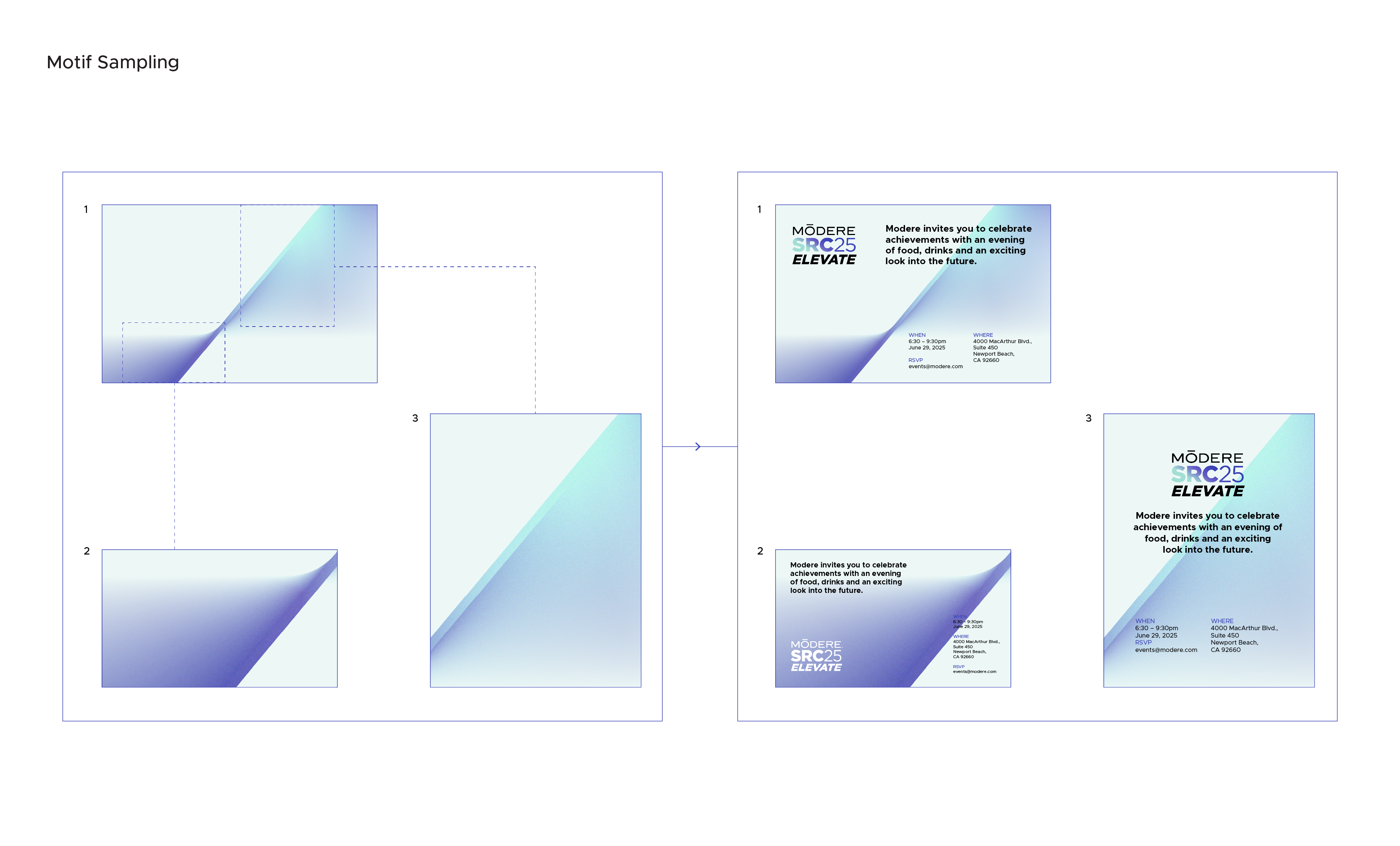
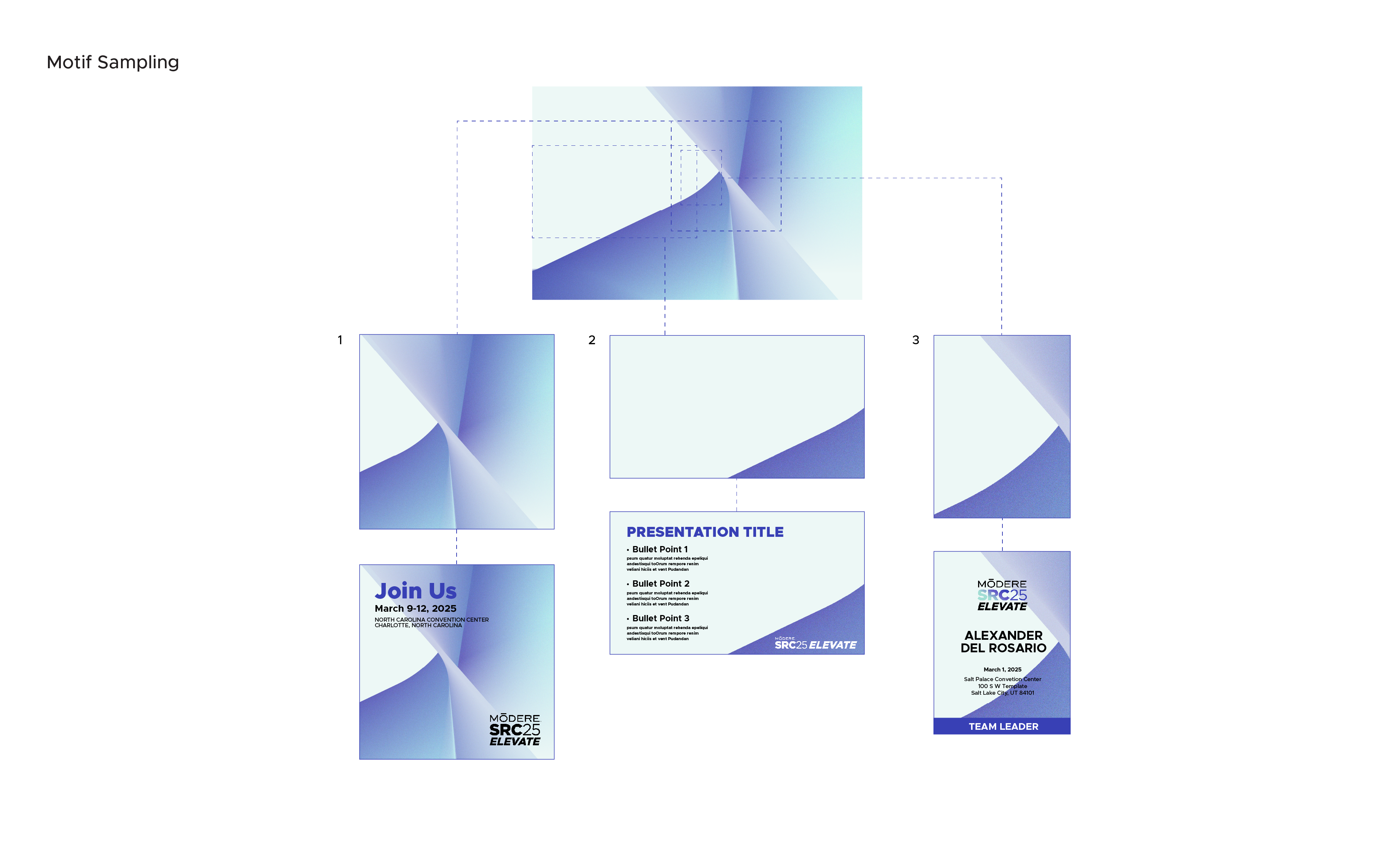
The visual system draws inspiration from updrafts, an unseen atmospheric forces that lift, accelerate, and sustain upward motion. This idea informed everything from the motif geometry to the gradient behavior, embedding a sense of elevation and momentum across the system.

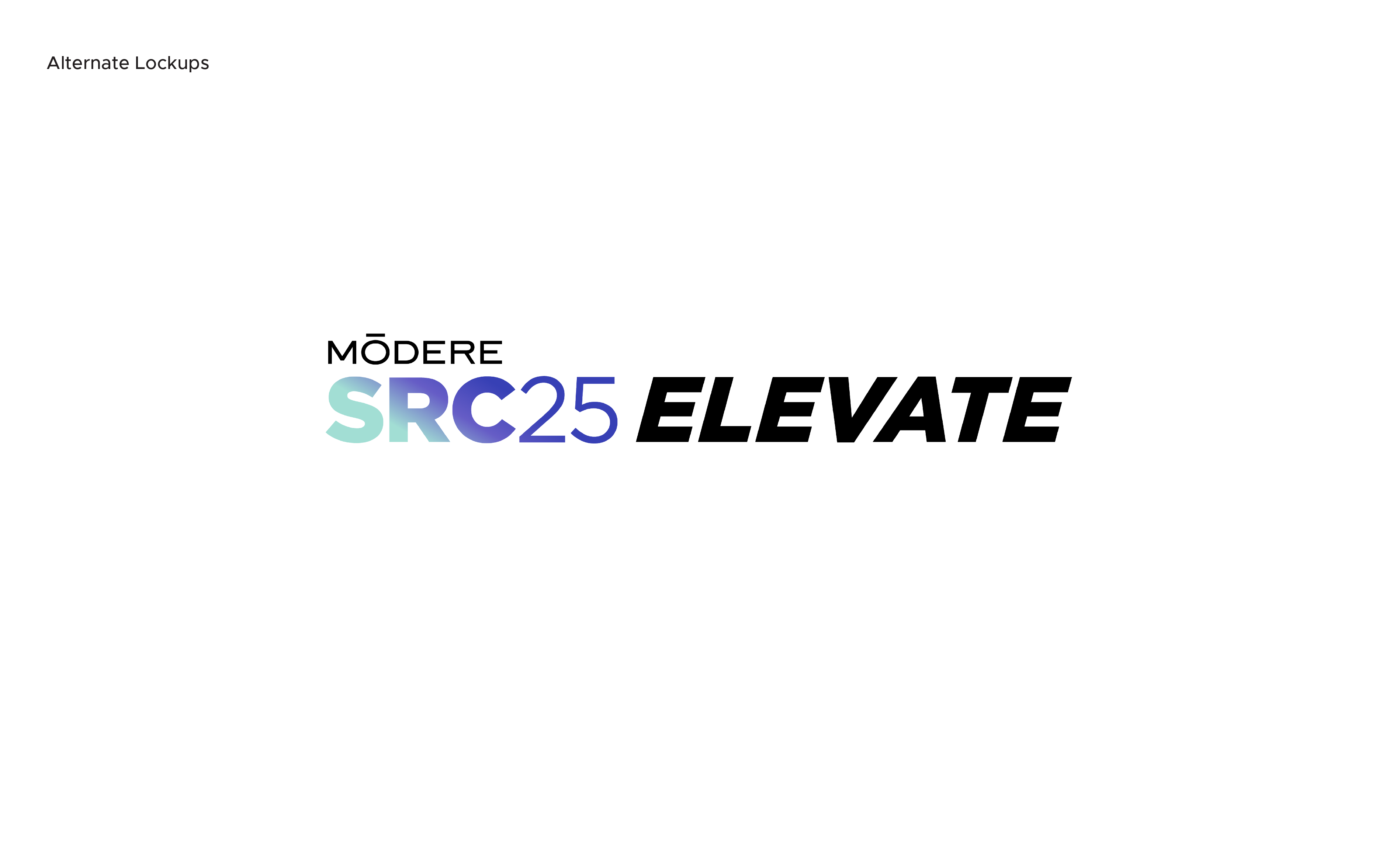
Brandmarks
Color System
The color system is designed as an atmospheric spectrum, blending cyan and deep blue tones to create a sense of depth, motion, and dimensionality rather than a fixed directional shift. Gradients introduce energy and movement across motifs and key moments, while solid color fields provide clarity, contrast, and structure across applications.
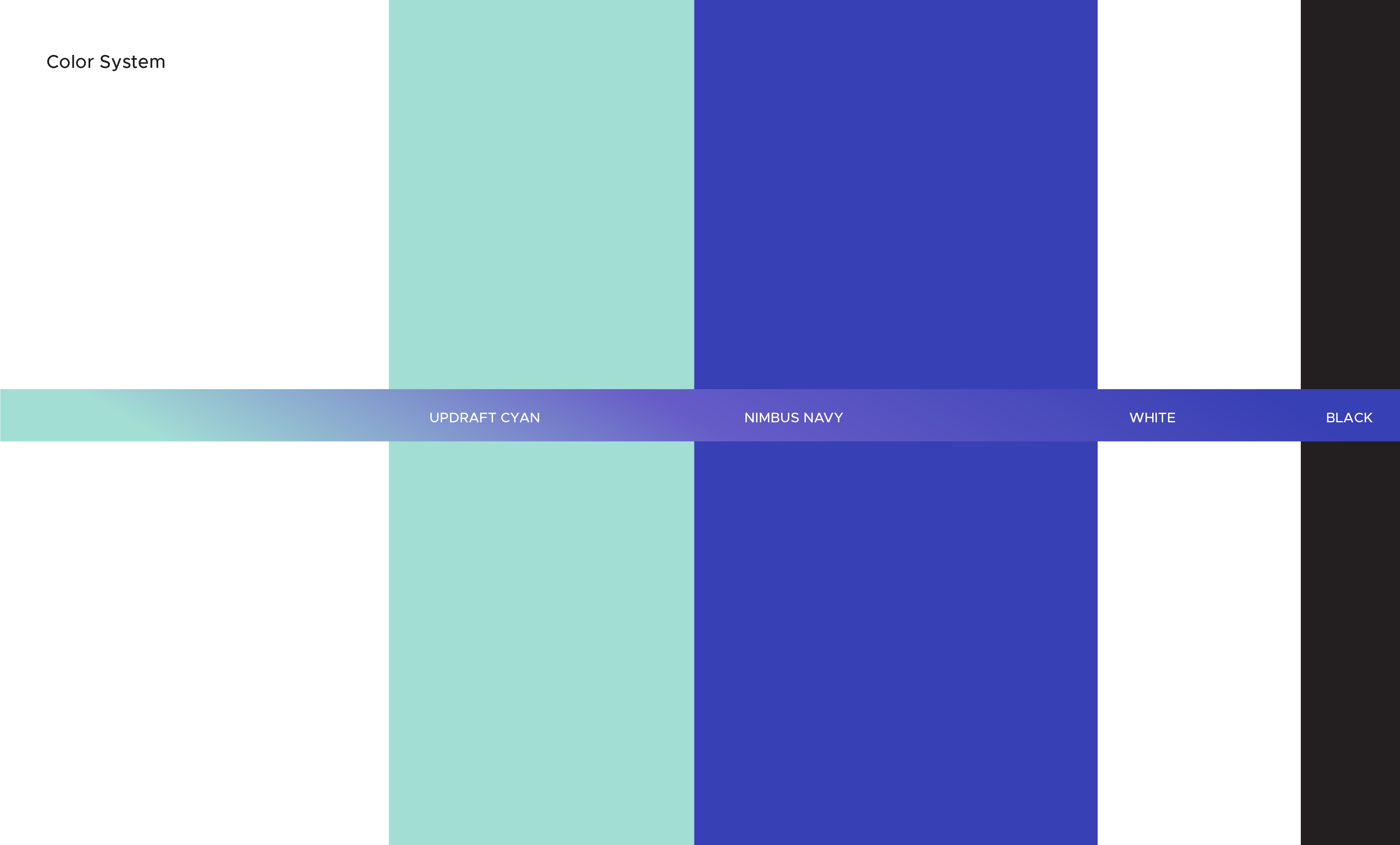
Updraft Cyan represents the open atmosphere where momentum begins, symbolizing clarity, possibility, and forward-looking ideas. Nimbus Navy anchors the system with depth and confidence, reflecting ambition, expertise, and scale. White introduces openness and focus, allowing the system to breathe, while black provides grounding and authority. Together, the spectrum balances motion and stability, supporting a visual language that feels expansive, confident, and elevated.
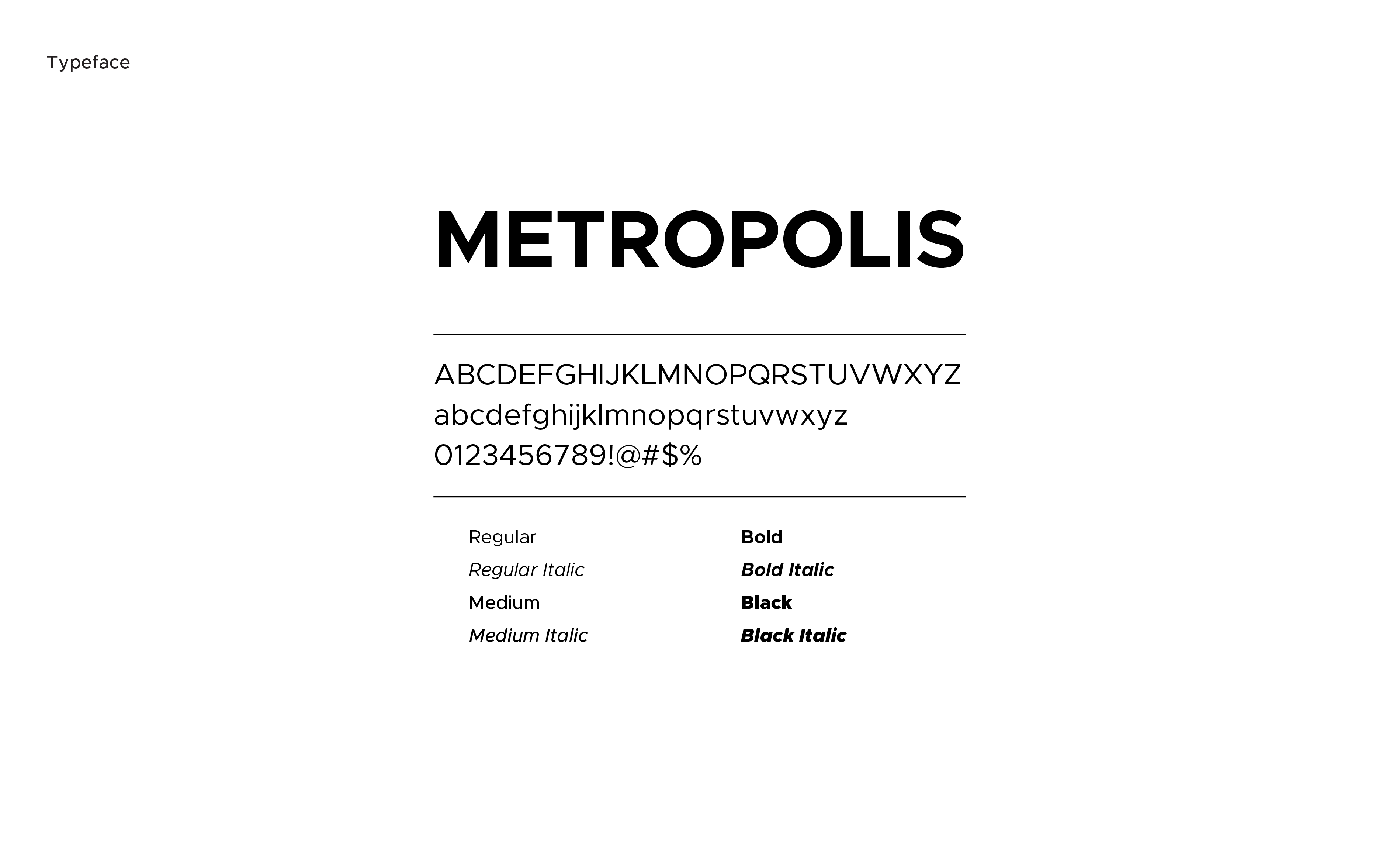
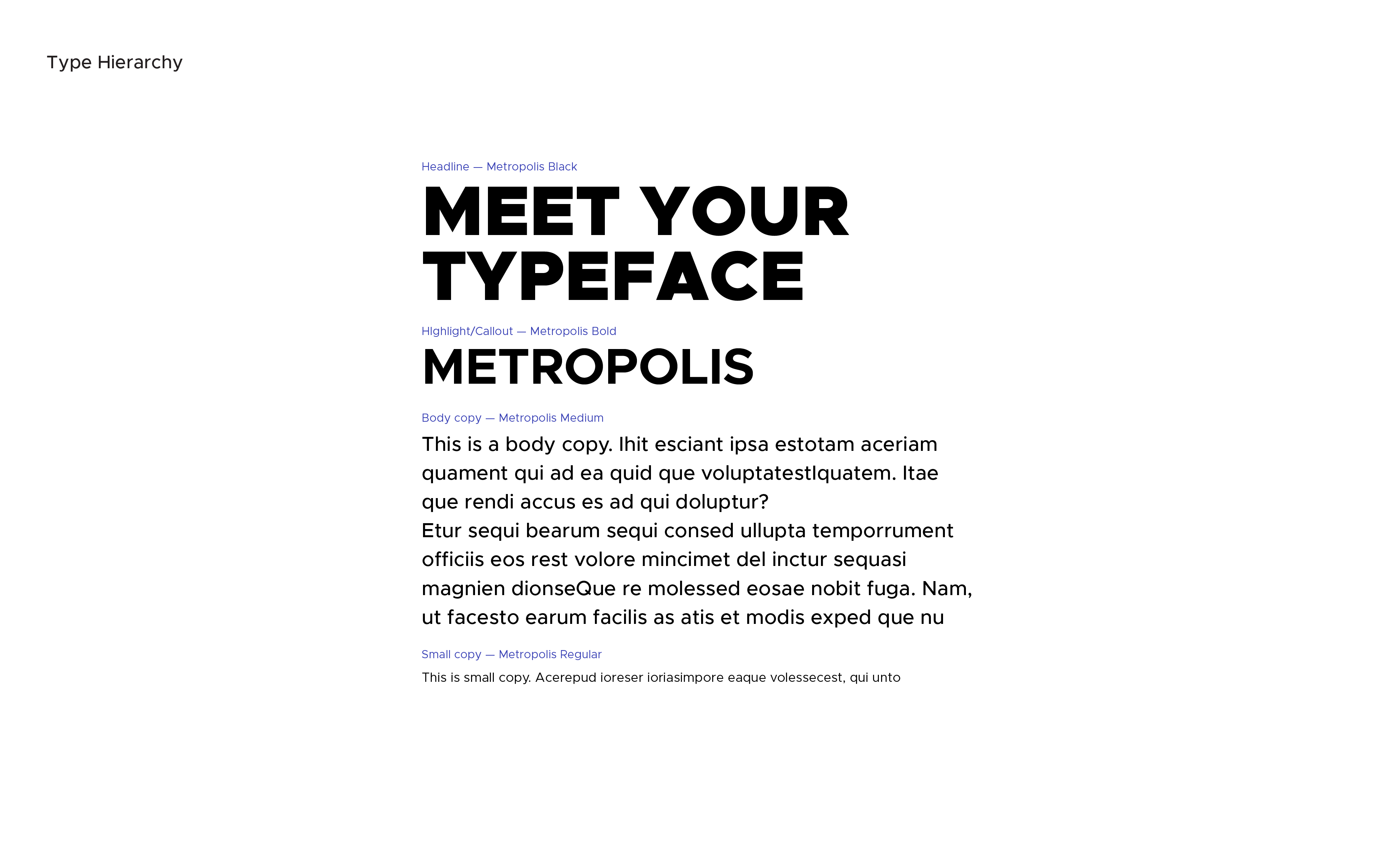
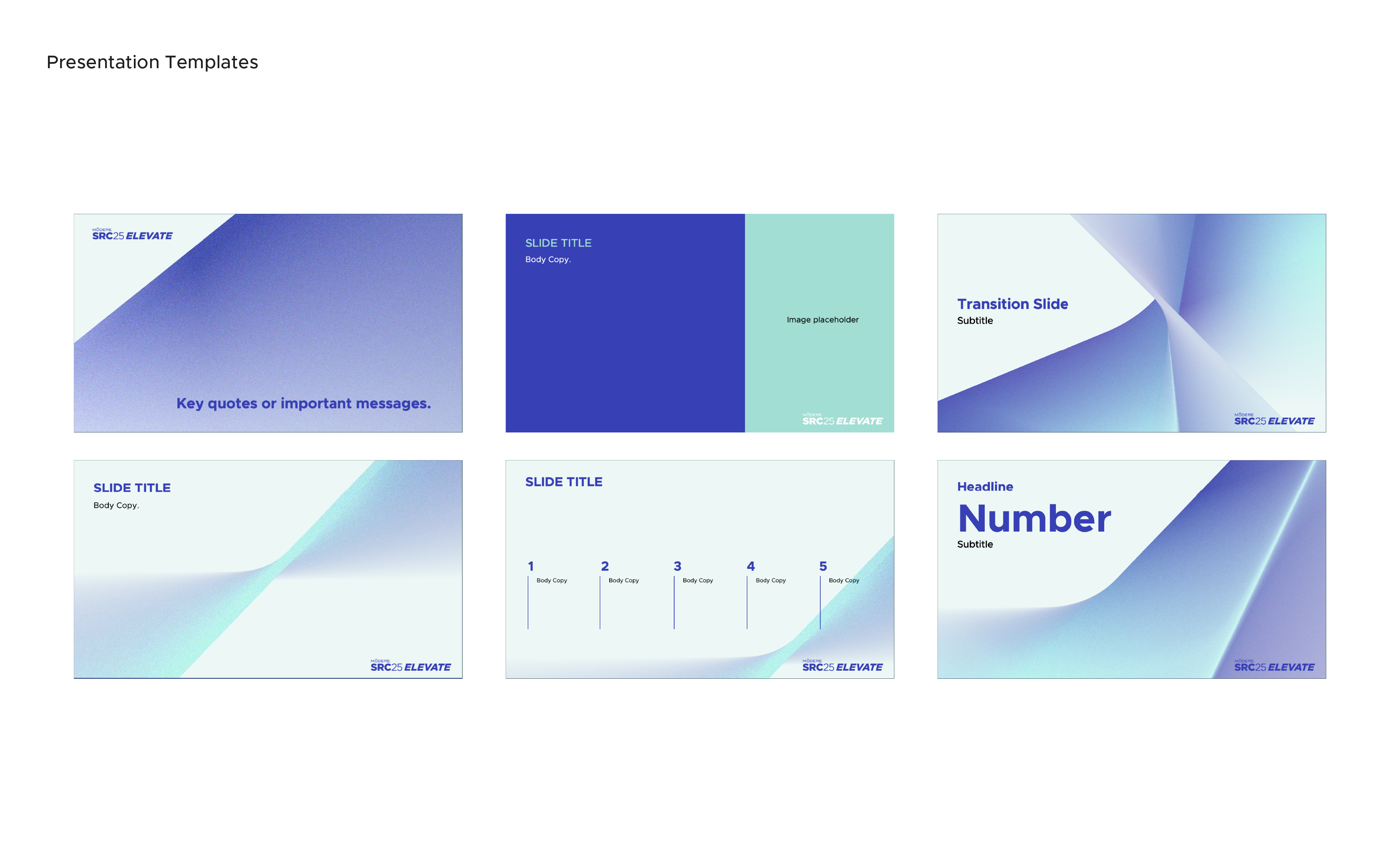
Typography
Metropolis serves as a modern, confident typographic foundation for the Elevate identity. Its clarity and versatility across weights support both expressive headlines and dense informational content, grounding the system with structure, consistency, and legibility at scale.
Motifs & modularity
Motifs are designed as modular components that can be sampled and recomposed across formats. Cropping and scale variations allow the system to remain flexible, dynamic, and consistent across touchpoints without relying on repeated full-frame usage.
Applications
Outcome
The final system was adopted as the official global brand guide for Modere SRC 2025, supporting internal teams, external vendors, and regional markets with a cohesive, scalable visual language.
Project
HerForce
Engagement
Brand Direction Sprint
Sector
Women’s Wellness
Scope
Brand Direction
Visual Identity
Logo Design
Typography & Color
Social Story Mockups
HerForce
Engagement
Brand Direction Sprint
Sector
Women’s Wellness
Scope
Brand Direction
Visual Identity
Logo Design
Typography & Color
Social Story Mockups
Context
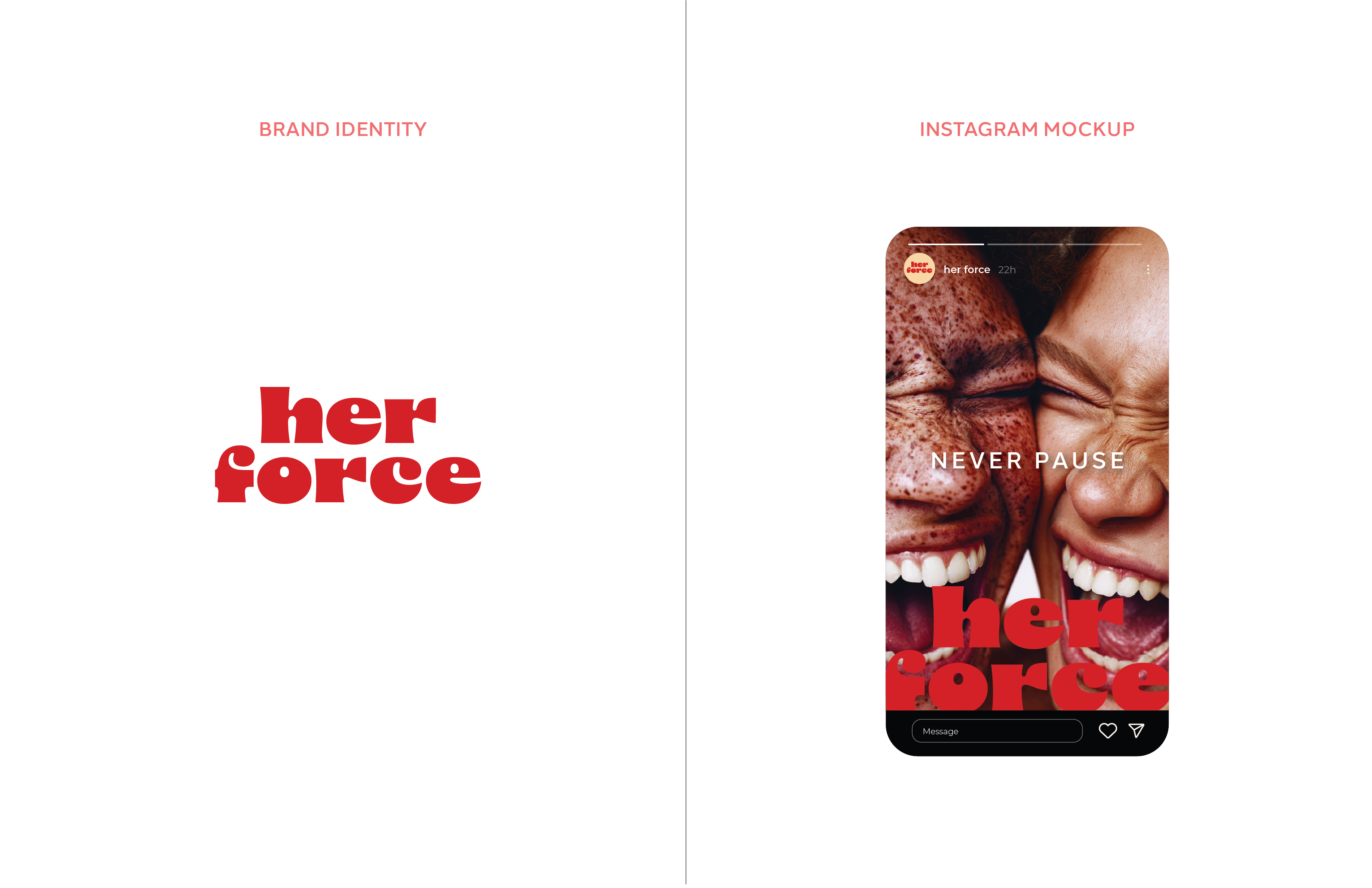
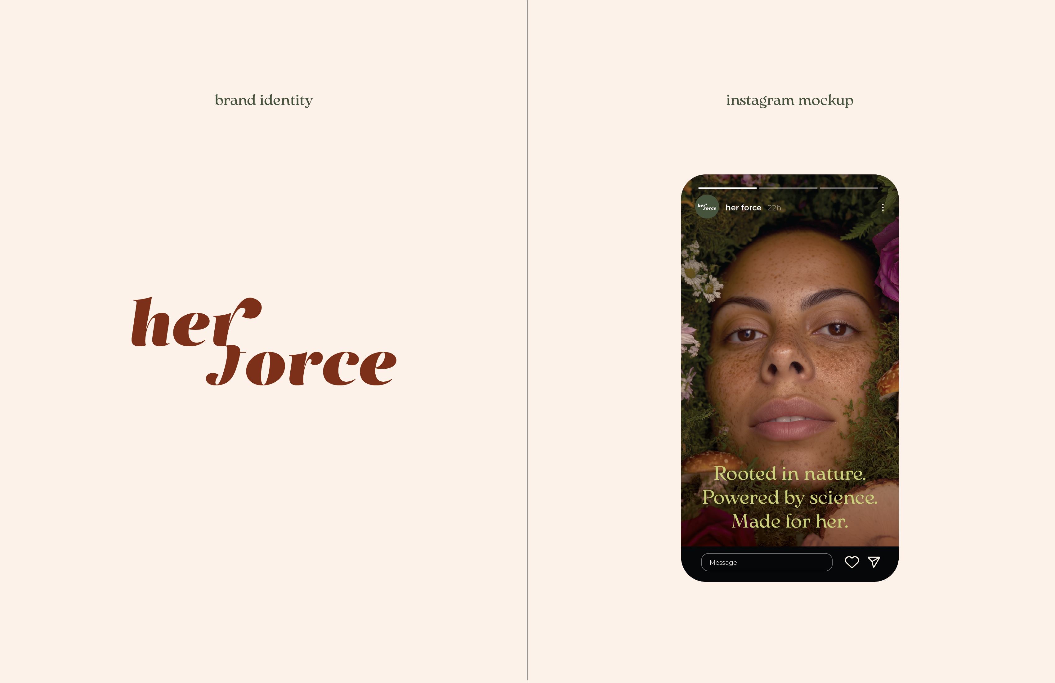
HerForce is an early-stage women’s wellness brand created to challenge how women’s health is seen, discussed, and supported. Grounded in visibility, empowerment, and science-backed integrity, the brand aims to move beyond “pinkified” wellness toward clarity, credibility, and strength.
Sprint Focus
This engagement was structured as a focused brand direction sprint, designed to quickly define and visualize multiple strategic identity paths. The goal was not to finalize a brand, but to provide the client with clear, contrasting directions that could be evaluated, discussed, and selected with confidence.
Direction Development
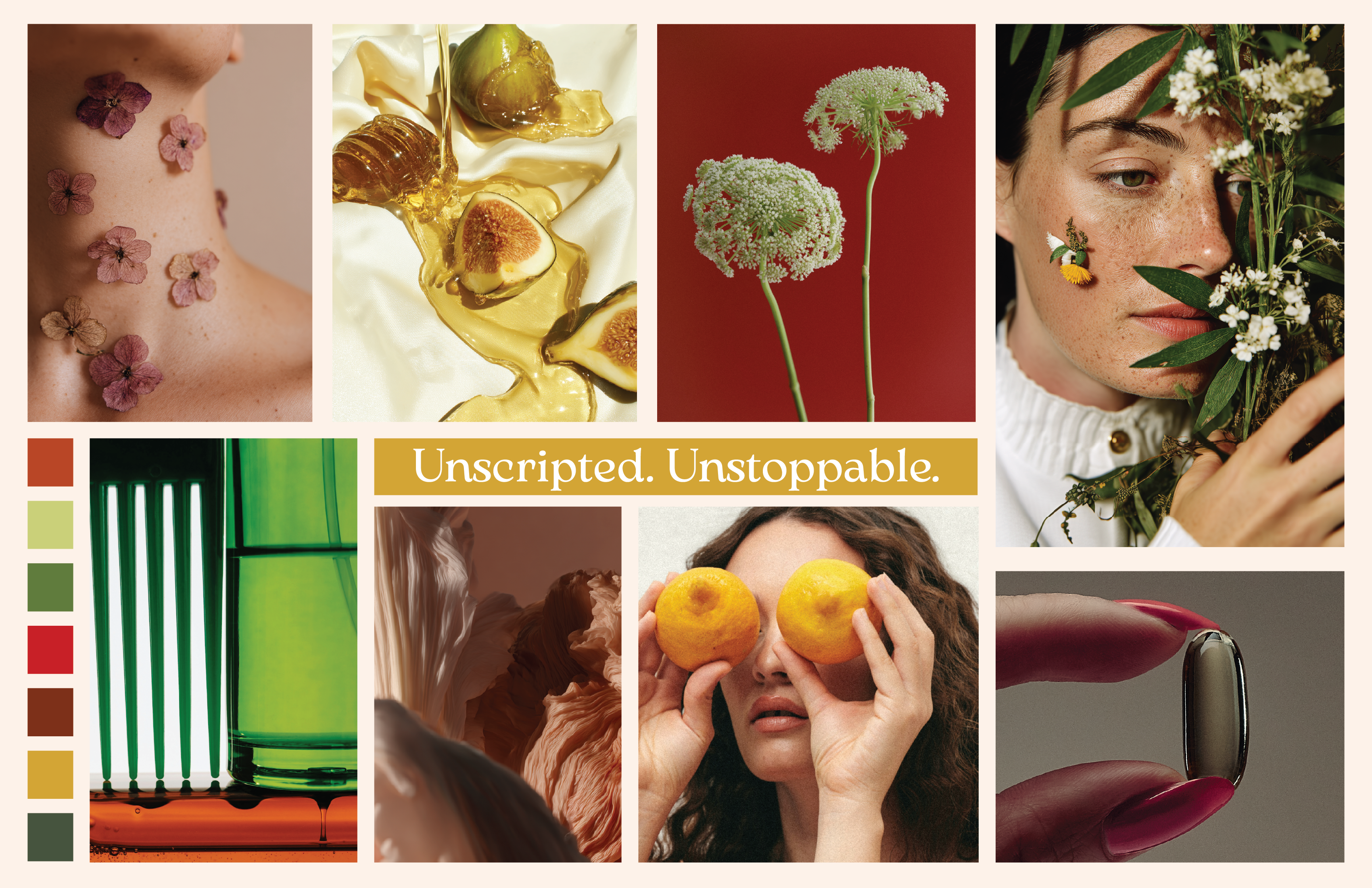
Two distinct brand directions were developed, each presented as a condensed brand snapshot. For each direction, I defined mood, color palette, typography, logo exploration, and social story mockups to demonstrate how the identity could look, feel, and function in real-world contexts.
Select imagery was developed using AI-assisted image-making tools as part of early concept exploration.
HerForce is an early-stage women’s wellness brand created to challenge how women’s health is seen, discussed, and supported. Grounded in visibility, empowerment, and science-backed integrity, the brand aims to move beyond “pinkified” wellness toward clarity, credibility, and strength.
Sprint Focus
This engagement was structured as a focused brand direction sprint, designed to quickly define and visualize multiple strategic identity paths. The goal was not to finalize a brand, but to provide the client with clear, contrasting directions that could be evaluated, discussed, and selected with confidence.
Direction Development
Two distinct brand directions were developed, each presented as a condensed brand snapshot. For each direction, I defined mood, color palette, typography, logo exploration, and social story mockups to demonstrate how the identity could look, feel, and function in real-world contexts.
Select imagery was developed using AI-assisted image-making tools as part of early concept exploration.
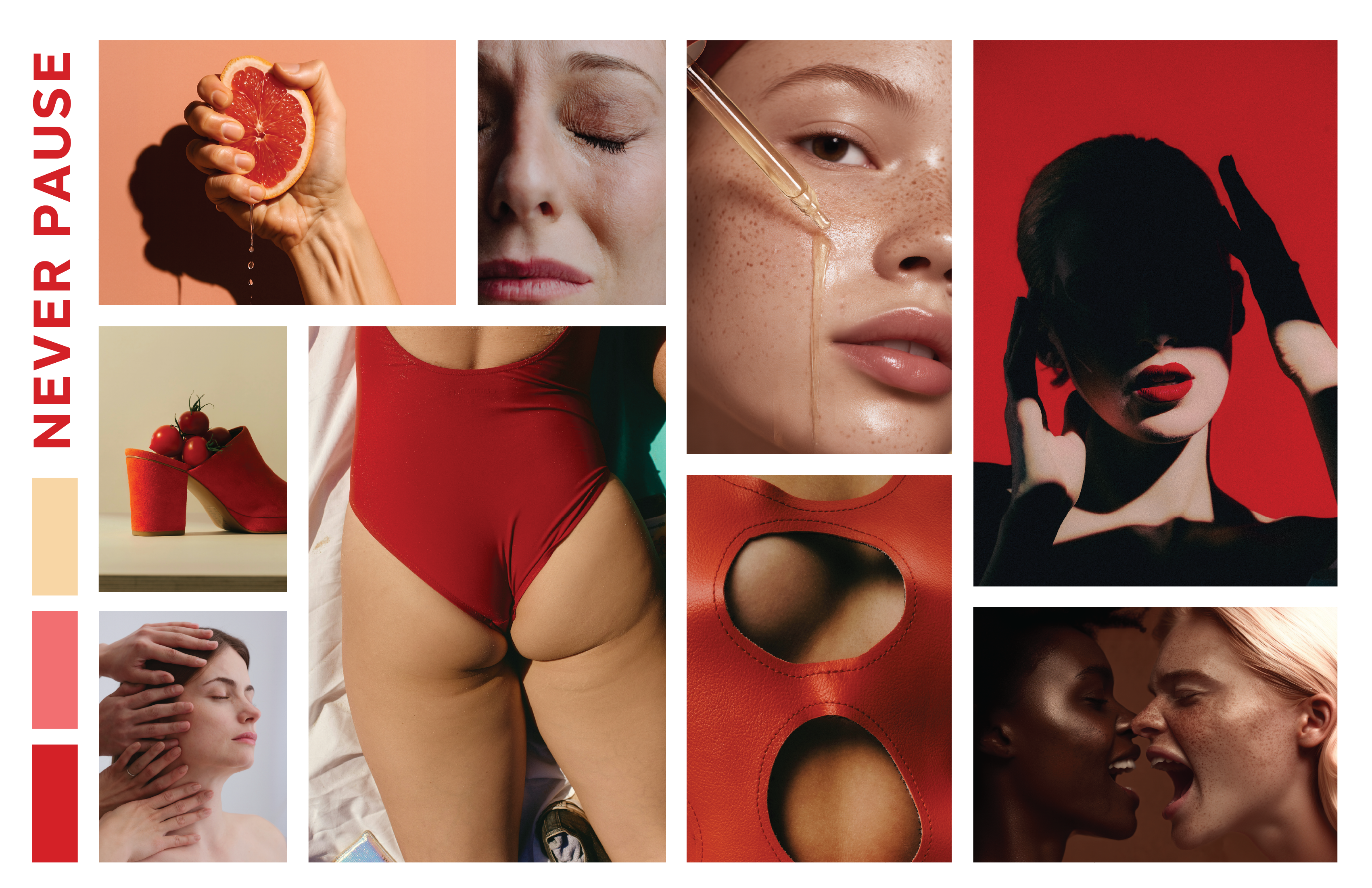
Brand Direction A — Condensed Identity Snapshot
Color · Typography · Logo · Social Story Mockup
Brand Direction B — Condensed Identity Snapshot
Color · Typography · Logo · Social Story Mockup
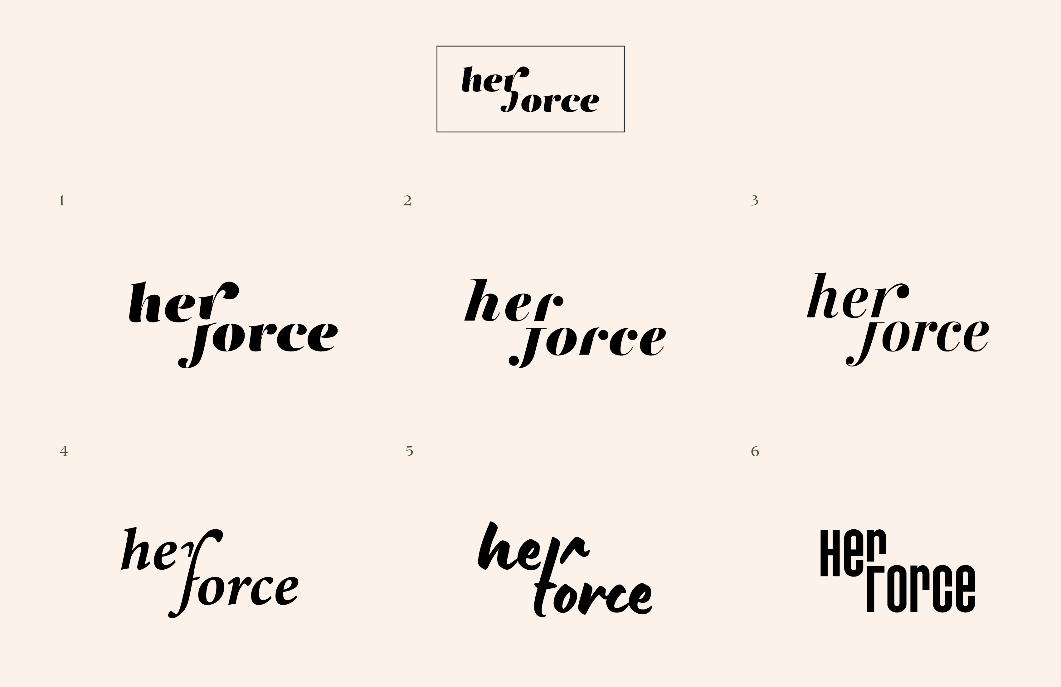
Selected Direction
Logo Refinement
Status
The engagement concluded following direction selection and initial refinement.
The work shown reflects the outcomes of the brand direction sprint.
Project
Rebranding Zest:
Nutrition with Purpose
Sector
Health & Lifestyle
Role
Creative Director
Scope of Works
Brand Strategy & Identity System
Packaging Architecture
Product Line Expansion
Art Direction & Campaign Development
E-commerce & Digital Experience
Rebranding Zest:
Nutrition with Purpose
Sector
Health & Lifestyle
Role
Creative Director
Scope of Works
Brand Strategy & Identity System
Packaging Architecture
Product Line Expansion
Art Direction & Campaign Development
E-commerce & Digital Experience
Zest, a crowdfunded tea-based beverage company founded in 2014, underwent a strategic transformation from an energy-focused tea brand into a broader nutrition-led platform. The rebrand redefined its visual identity, packaging architecture, and digital presence to align with growing demand for simple, science-backed functional beverages.
The system balances performance and clarity. A refined typographic structure, controlled color hierarchy, and illustrative elements communicate functionality without sacrificing flavor or personality. Packaging was redesigned across existing formats, including chipboard, tea sachets, and ready-to-drink cans, while expanding into new product categories such as hydration mixes and gummies.
The work extended beyond packaging into art direction, photography, advertising, and UX/UI for the website and Amazon storefront. The result is a cohesive brand language that positions Zest as a modern nutritional beverage company, built on transparency, efficacy, and purposeful formulation.


Project
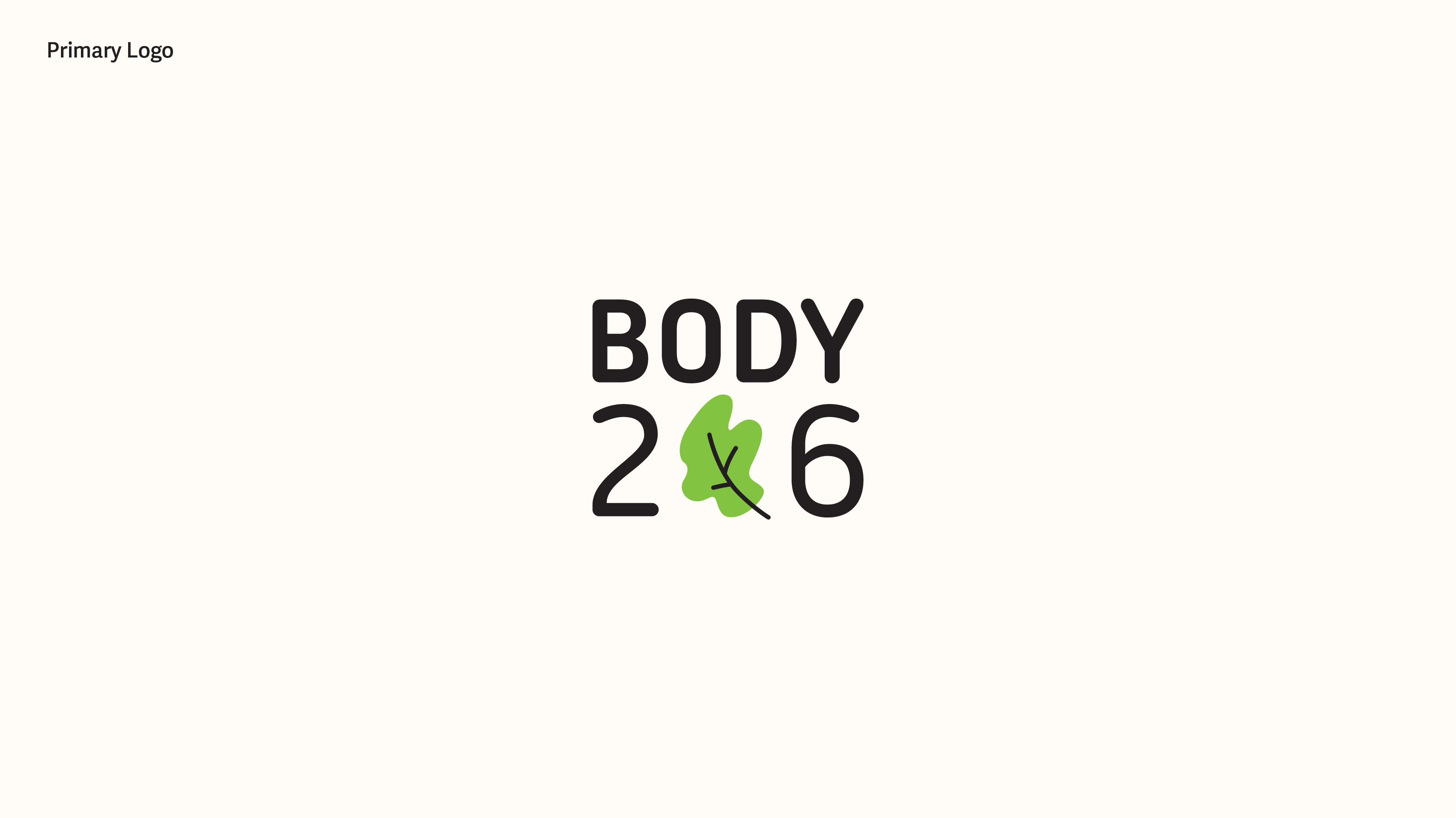
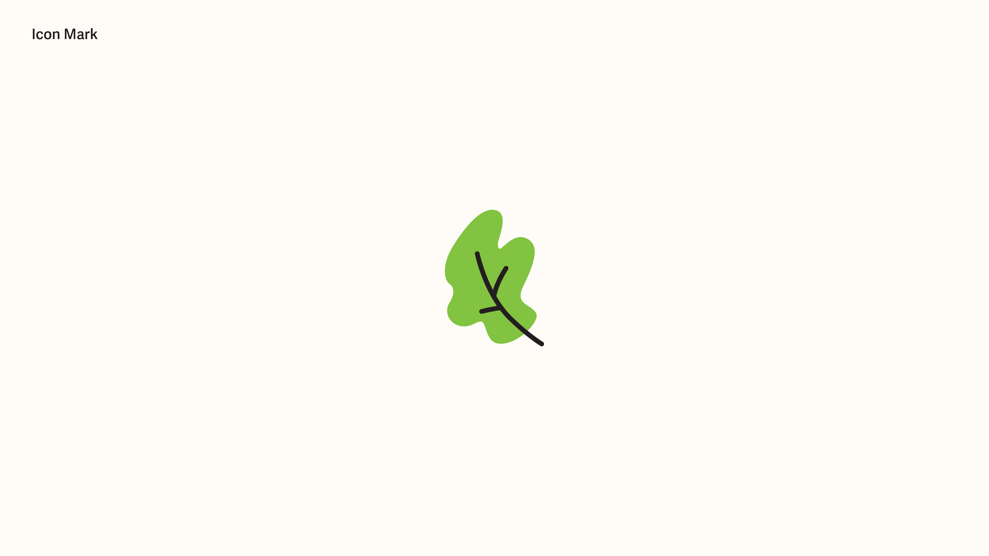
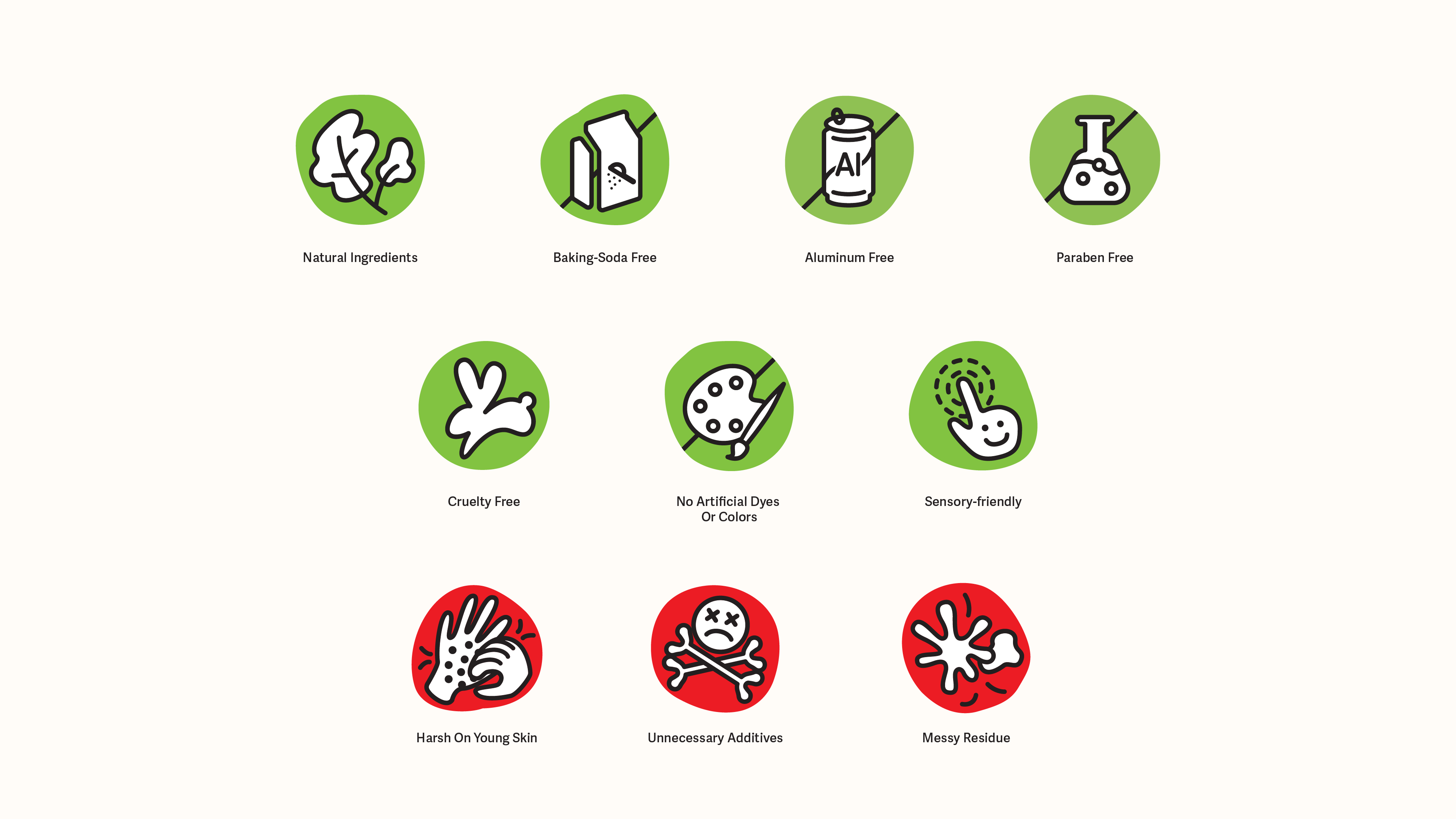
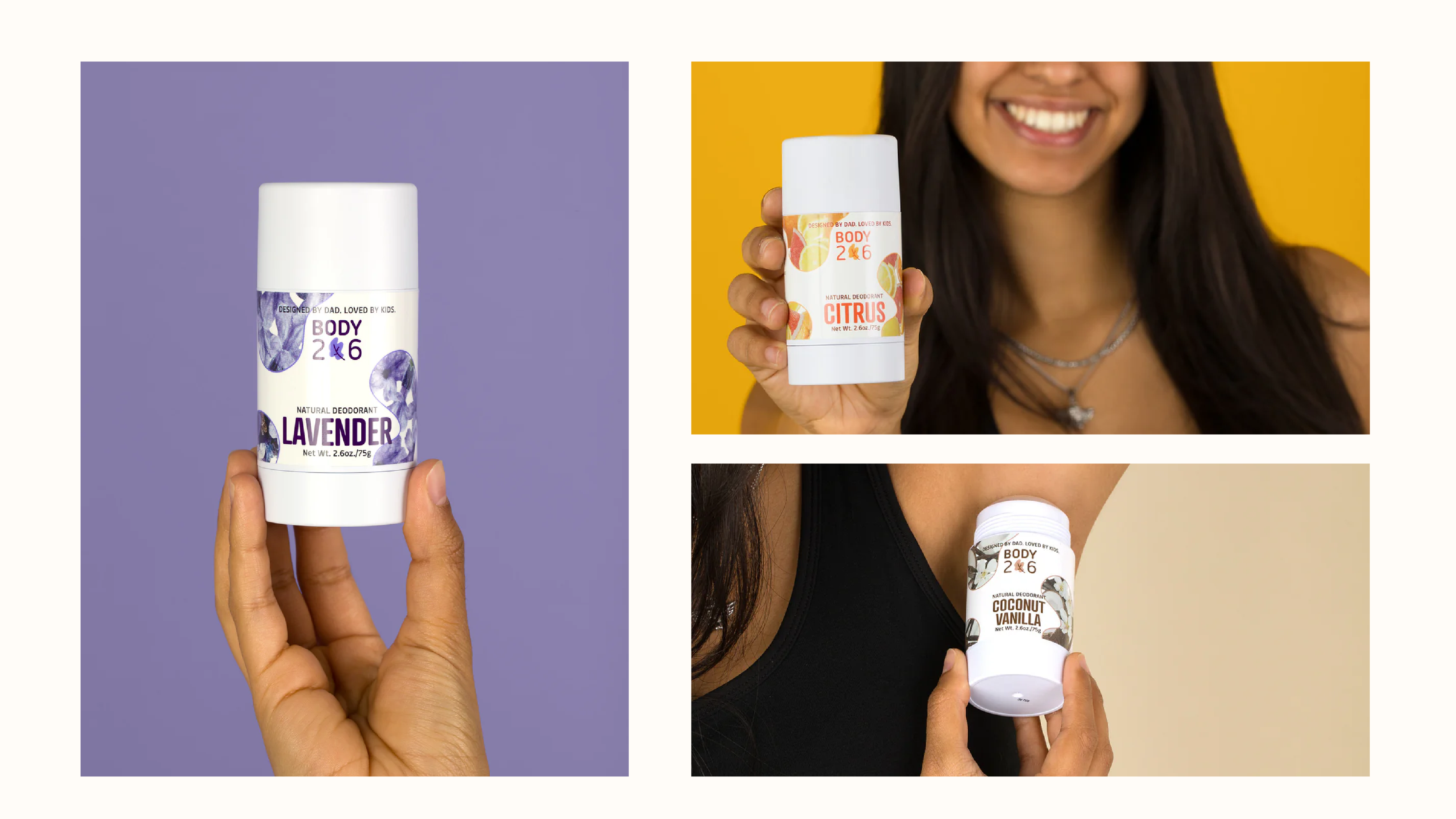
Body206 Brand Identity & Packaging
Sector
Health & Lifestyle
Role
Brand & Packaging Designer
Scope
Brand Identity
Packaging Design
Icon System
Audience
Parents of kids ages 6–13 / Kids ages 6–13
Body206 Brand Identity & Packaging
Sector
Health & Lifestyle
Role
Brand & Packaging Designer
Scope
Brand Identity
Packaging Design
Icon System
Audience
Parents of kids ages 6–13 / Kids ages 6–13
Body206 is a kids’ personal care startup focused on helping families build healthy daily routines.
The identity and packaging system were designed to feel calm, natural, and trustworthy—balancing kid-friendly warmth with the clarity and restraint parents look for at shelf.
The identity and packaging system were designed to feel calm, natural, and trustworthy—balancing kid-friendly warmth with the clarity and restraint parents look for at shelf.
Icon System
Packaging Application

Outcome
The final identity delivers a calm, trustworthy shelf presence that balances kid-friendly warmth with parent-focused clarity, supporting Body206’s launch into the natural personal care space.
Project
Global Footwear Brand (NDA)
Sector
Fashion / Lifestyle
Role
Freelance Designer
(Reporting to Creative Director)
Scope of Works
Presentation Design
Brand Visualization
Internal Event Marks
Client name and select assets withheld due to NDA
Global Footwear Brand (NDA)
Sector
Fashion / Lifestyle
Role
Freelance Designer
(Reporting to Creative Director)
Scope of Works
Presentation Design
Brand Visualization
Internal Event Marks
Client name and select assets withheld due to NDA
This project involved supporting the Creative Director on a global footwear brand initiative through visual development and presentation design. My role focused on translating strategic and conceptual ideas into clear, compelling visual systems—primarily across internal decks, brand storytelling materials, and event-related assets.
While the work was not externally facing, it played a critical role in aligning stakeholders and visualizing creative direction across teams.
While the work was not externally facing, it played a critical role in aligning stakeholders and visualizing creative direction across teams.
Visualizing Creative Direction
Developed presentation systems to help communicate creative direction, brand narratives, and design rationale across internal teams and stakeholders.
Internal Event Marks
Designed a series of internal-facing logos and visual assets for brand events and presentations. These marks were created to align with broader brand principles while remaining flexible across formats.
Outcome
The final system was adopted as the official global brand guide for Modere SRC 2025, supporting internal teams, external vendors, and regional markets with a cohesive, scalable visual language.