Rebranding Zest:
Nutrition with Purpose
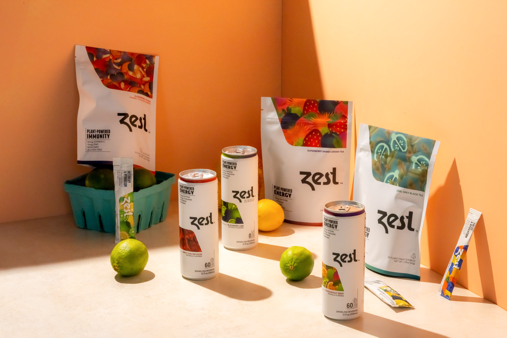
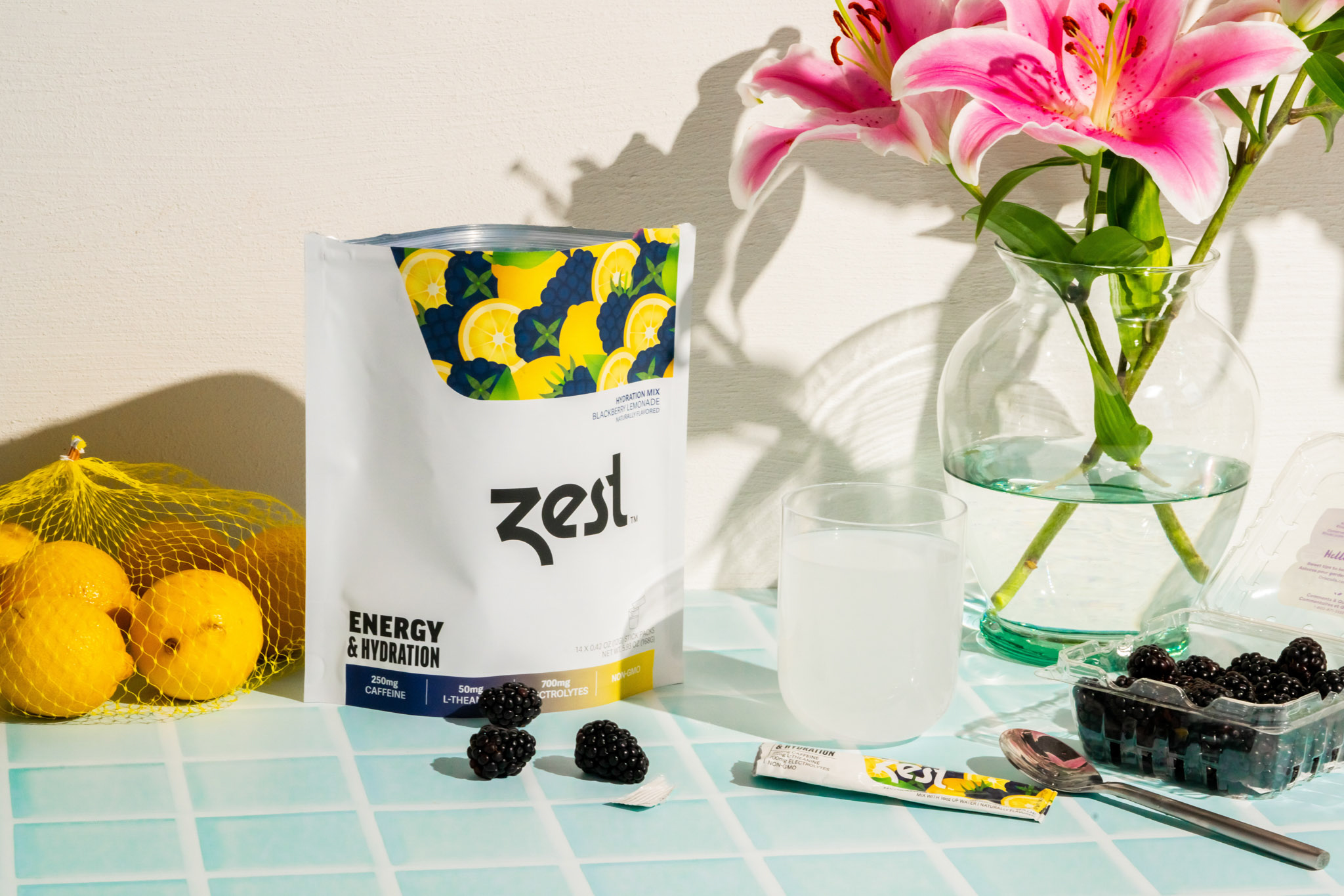
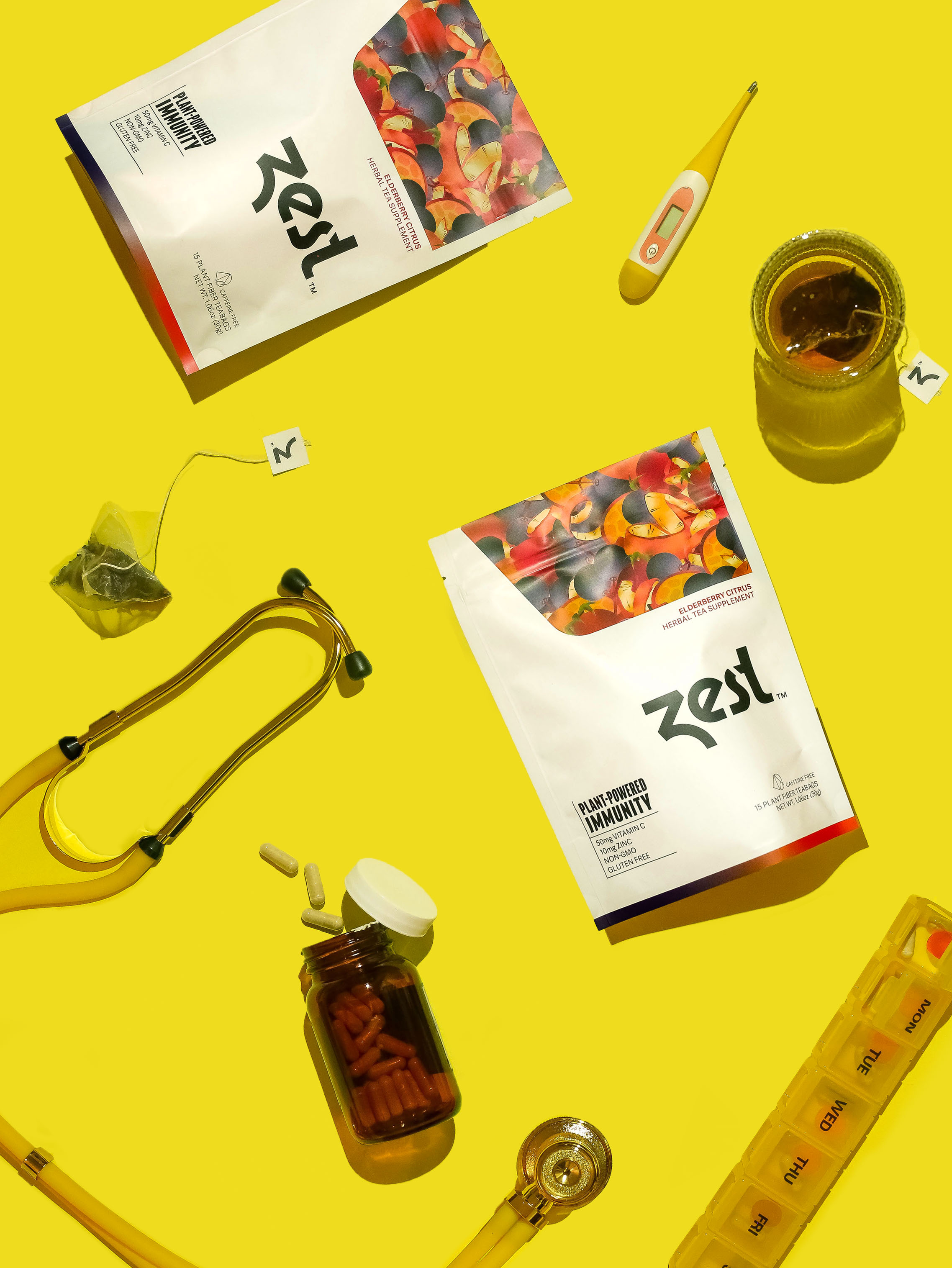
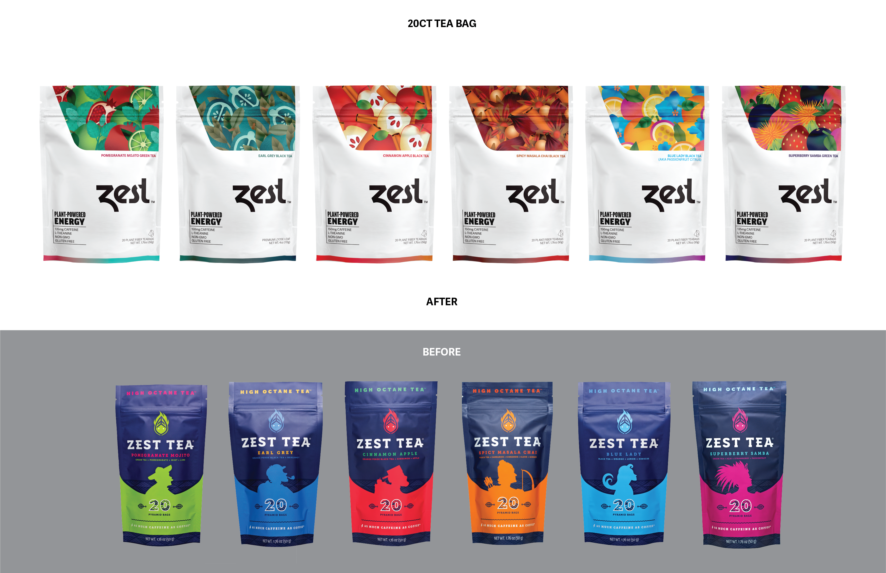
With our new visual identity and packaging, we have set out to make the brand feel more professional and ensure a level of consistency among our current products, in preparation for the expansion of the new line of functional beverages and retail presence.
As a supplement brand, we believe we can all achieve more by adding some Zest to our lives. Our design focuses on balance, showing both functionality and flavor. By providing a direct and straightforward ingredient list, customers can easily find what they are looking for. The illustrations reflect the rich, delicious flavors that customers crave. The typography, tone of voice and color palette create a modern brand with a determined and tasteful character.
