Project:
The Gendermore Package
Sector:
Beauty & Health
Scope of Works:
Packaging System Design
Structural & Form Exploration
Visual Identity Development
Illustration Direction
Product Line Development
The Gendermore Package
Sector:
Beauty & Health
Scope of Works:
Packaging System Design
Structural & Form Exploration
Visual Identity Development
Illustration Direction
Product Line Development
The Gendermore Package explores gender neutrality in product design through amplification rather than reduction. Instead of stripping away gender-coded qualities, the project intensifies them, pushing form, color, pattern, and structure toward deliberate ambiguity. The result is a maximalist packaging system that challenges the assumption that neutrality must be quiet or minimal.
The work investigates how contemporary gender-neutral design often defaults to muted palettes and simplified forms in an effort to avoid categorization. This project proposes an alternative approach, one that embraces complexity, ornamentation, and visual tension as tools for inclusivity. By blurring conventional visual cues, the system reframes neutrality as expansion rather than erasure.
The outcome is a comprehensive product line spanning foundation sticks, moisturizers, face wash, hair paste, shampoo, lip gloss, and other personal care formats. Structural forms, layered graphics, and exaggerated detailing are used to dissolve binary distinctions while maintaining clarity and shelf presence. Through this approach, the thesis argues that inclusivity in packaging can be expressive, bold, and commercially viable, redefining how identity is represented in consumer products.
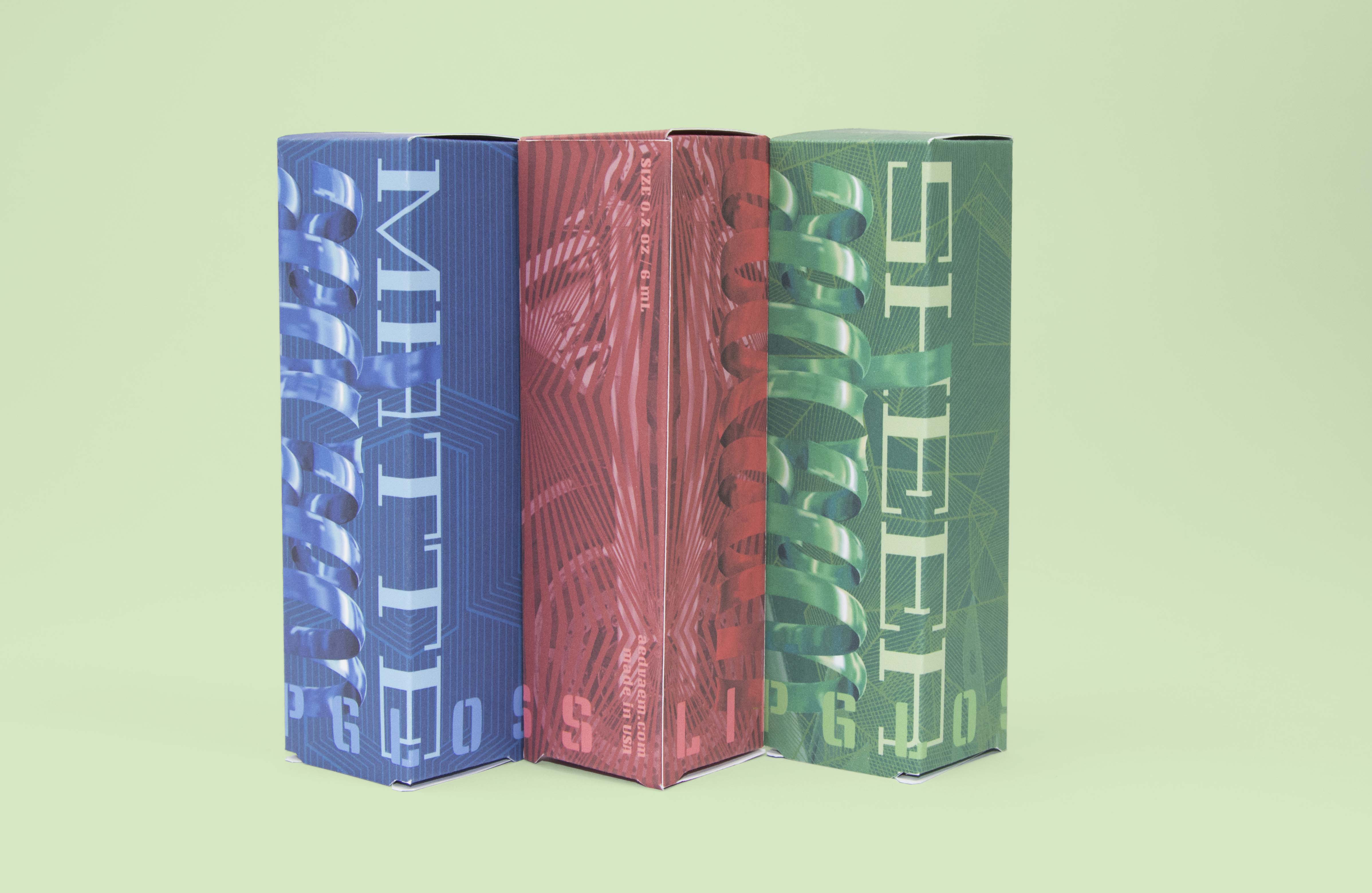
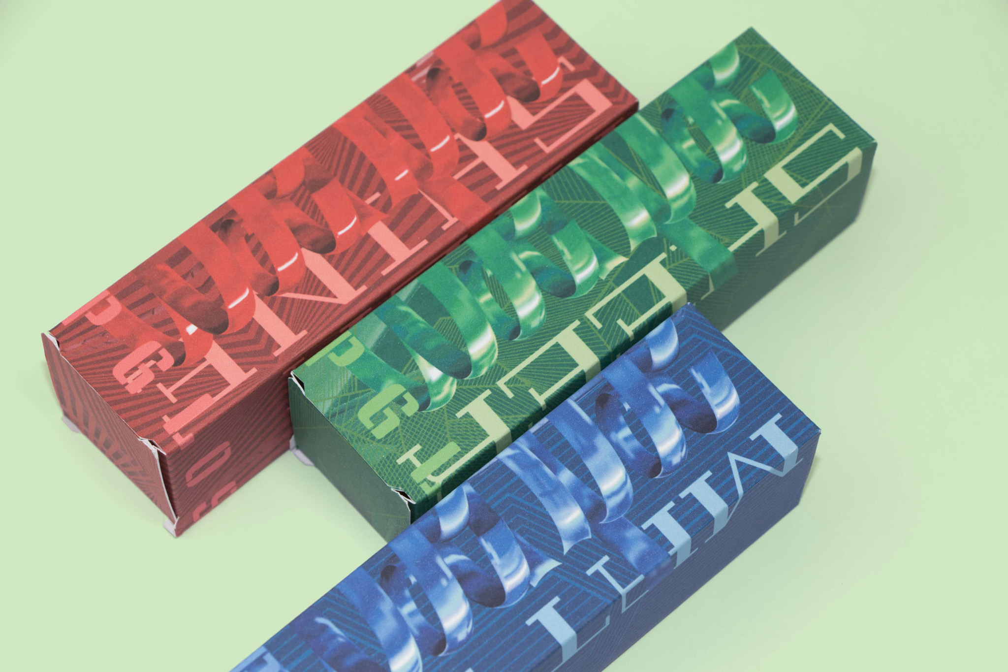
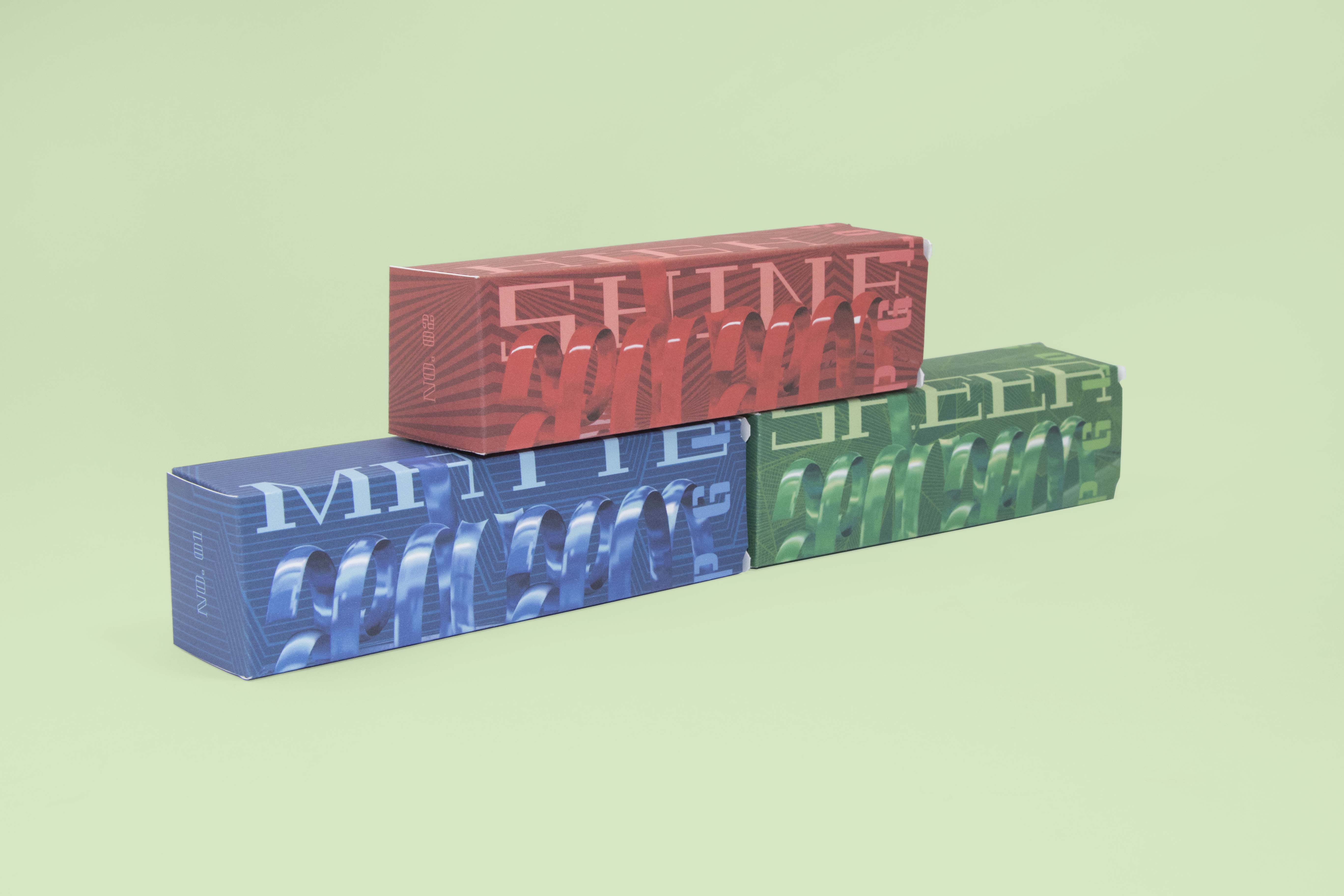
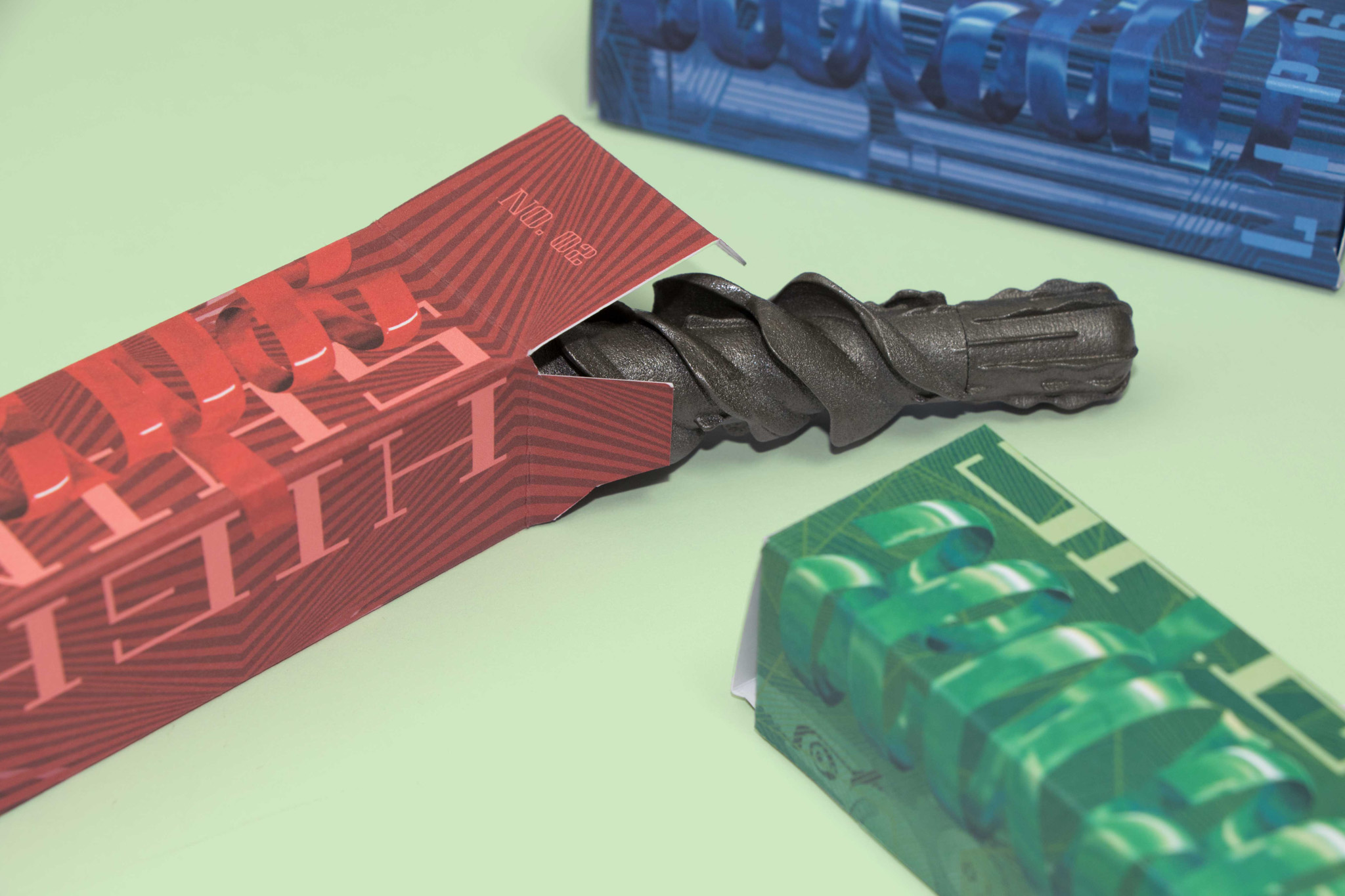
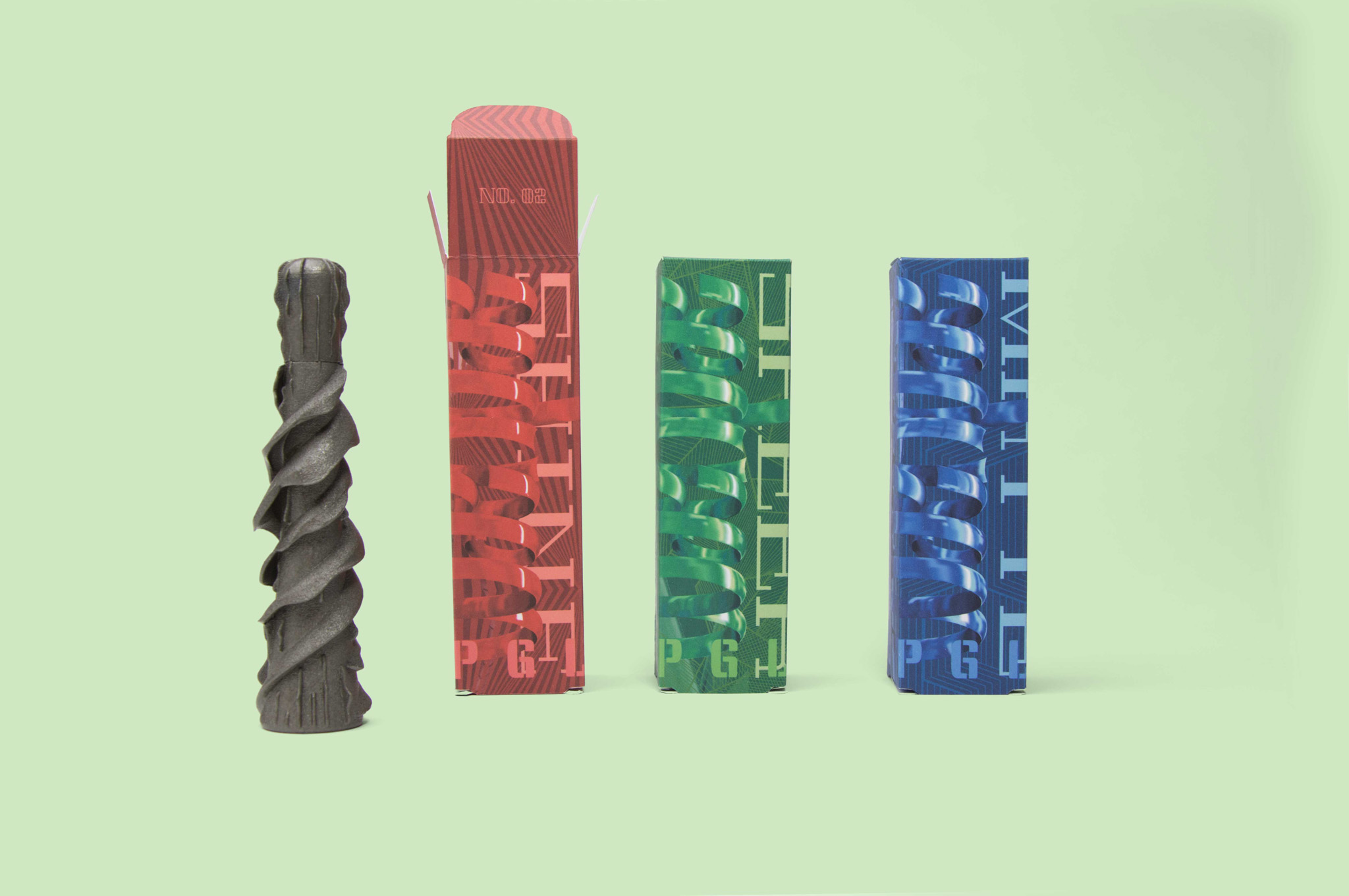
Makeup for All Genders
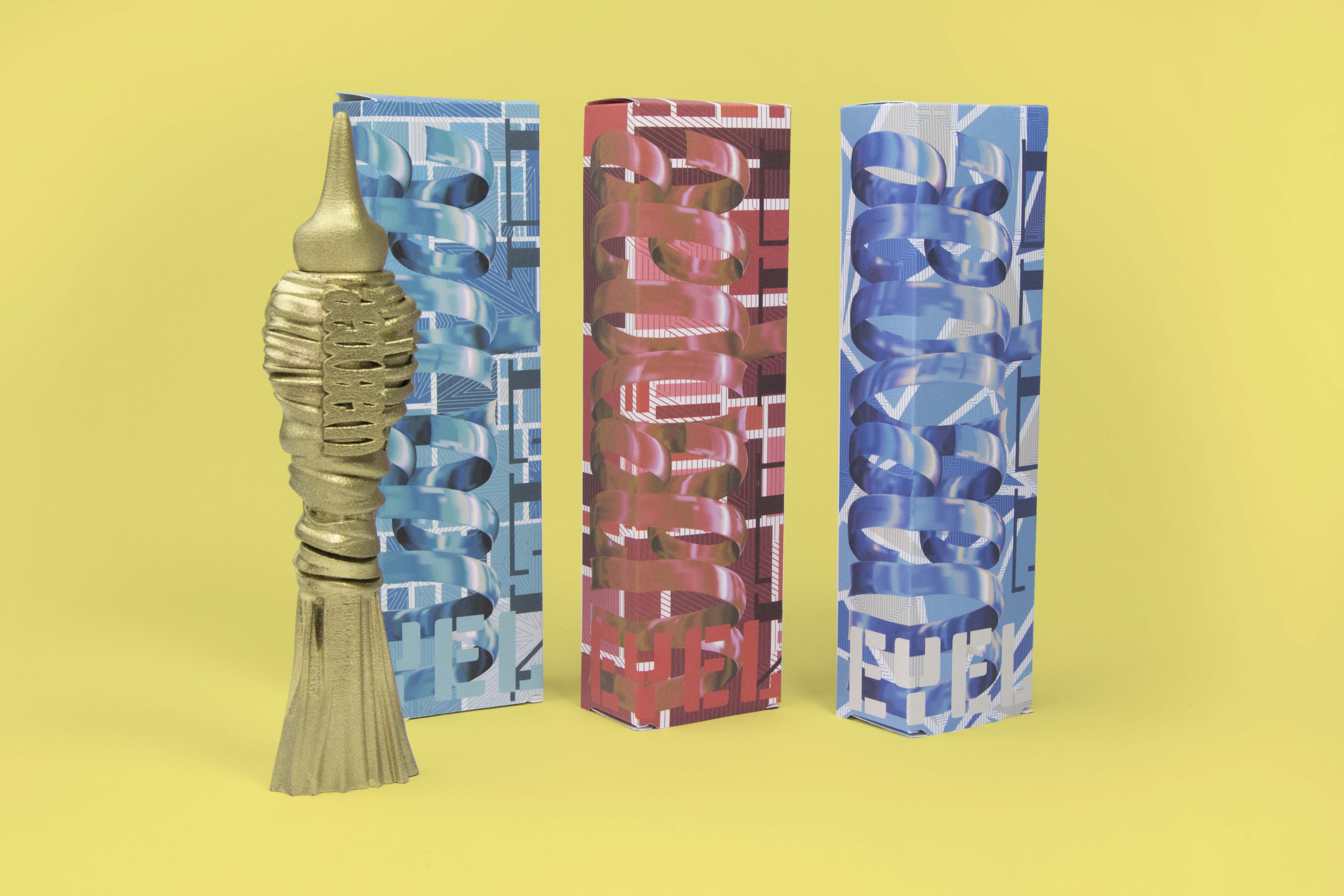
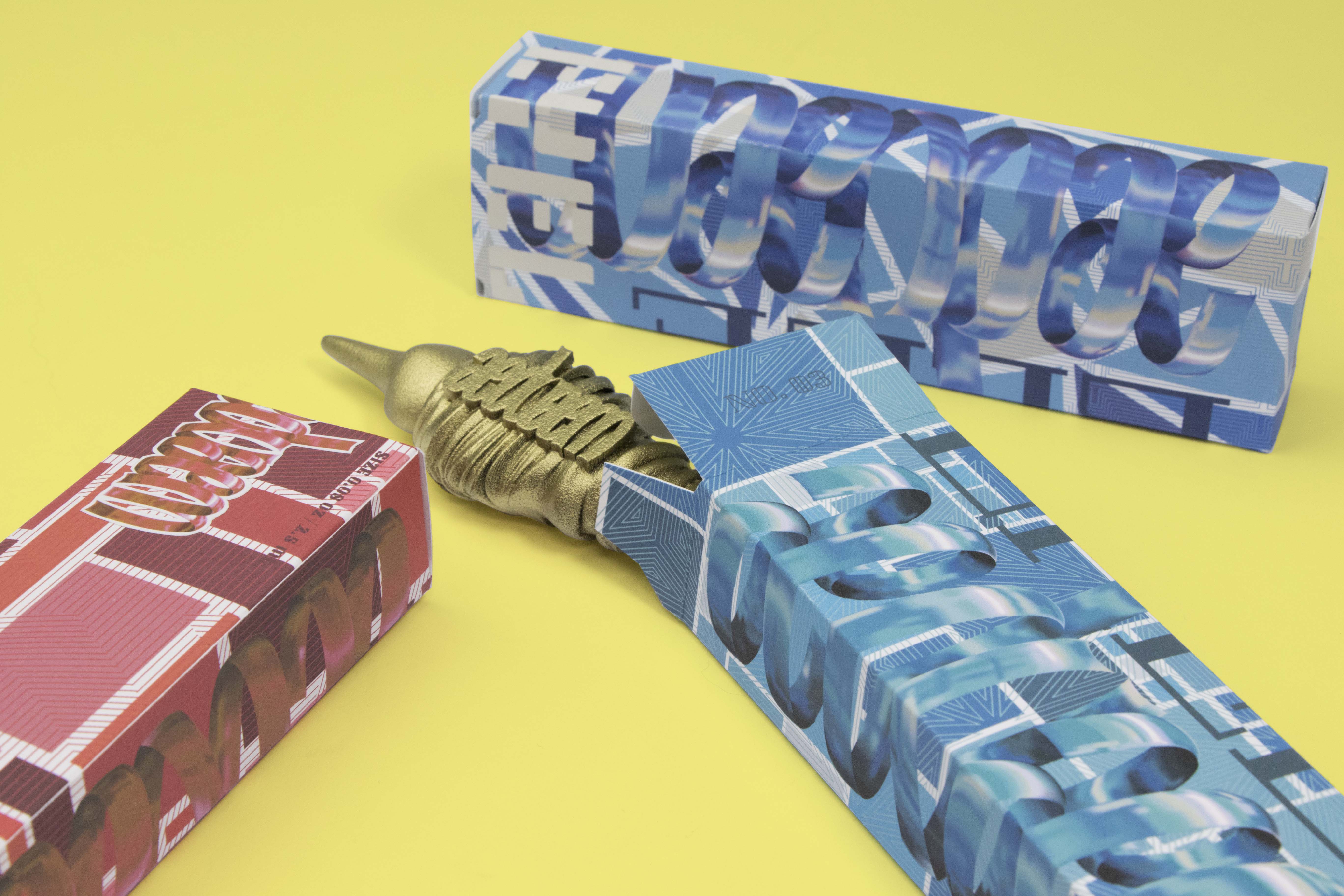
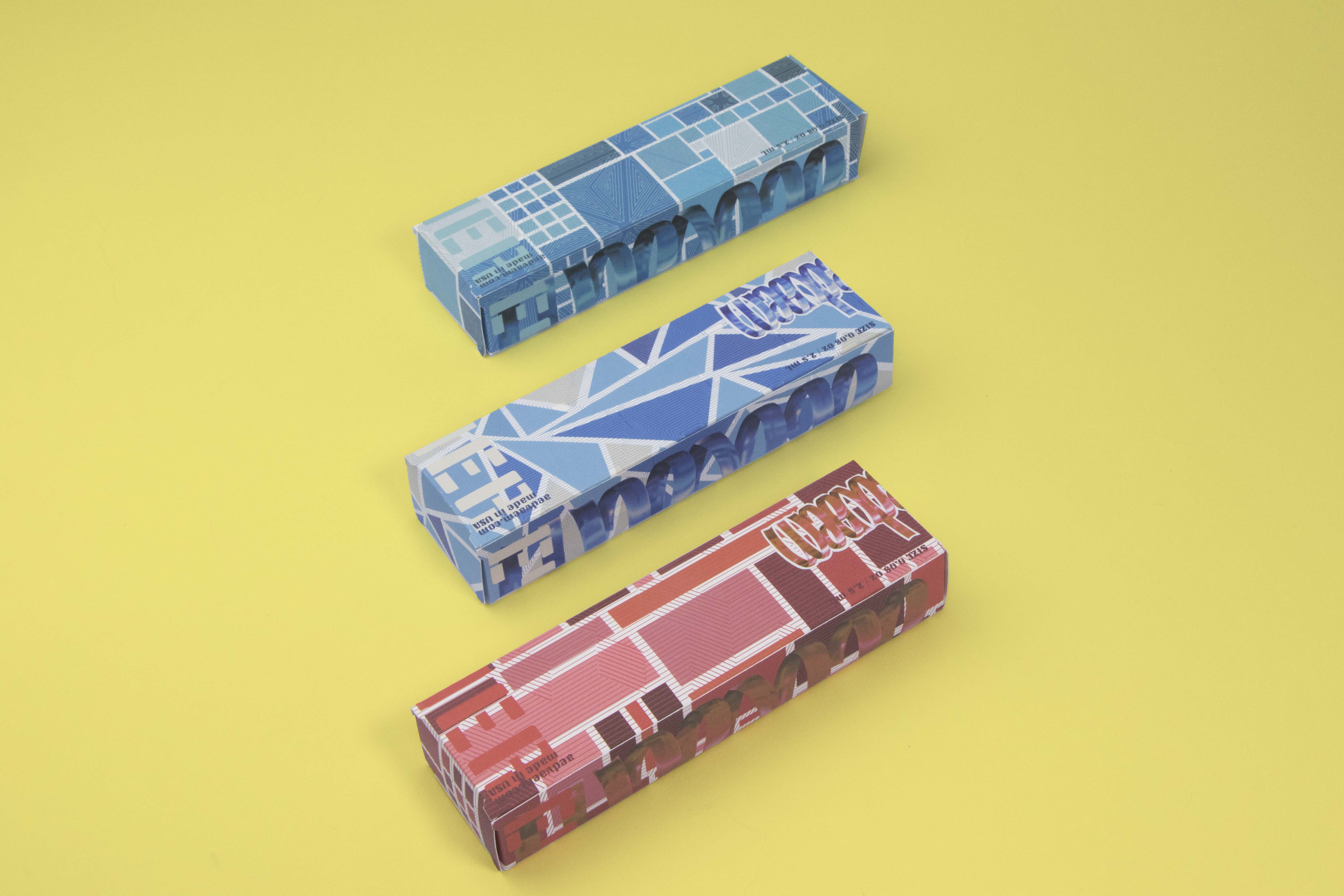
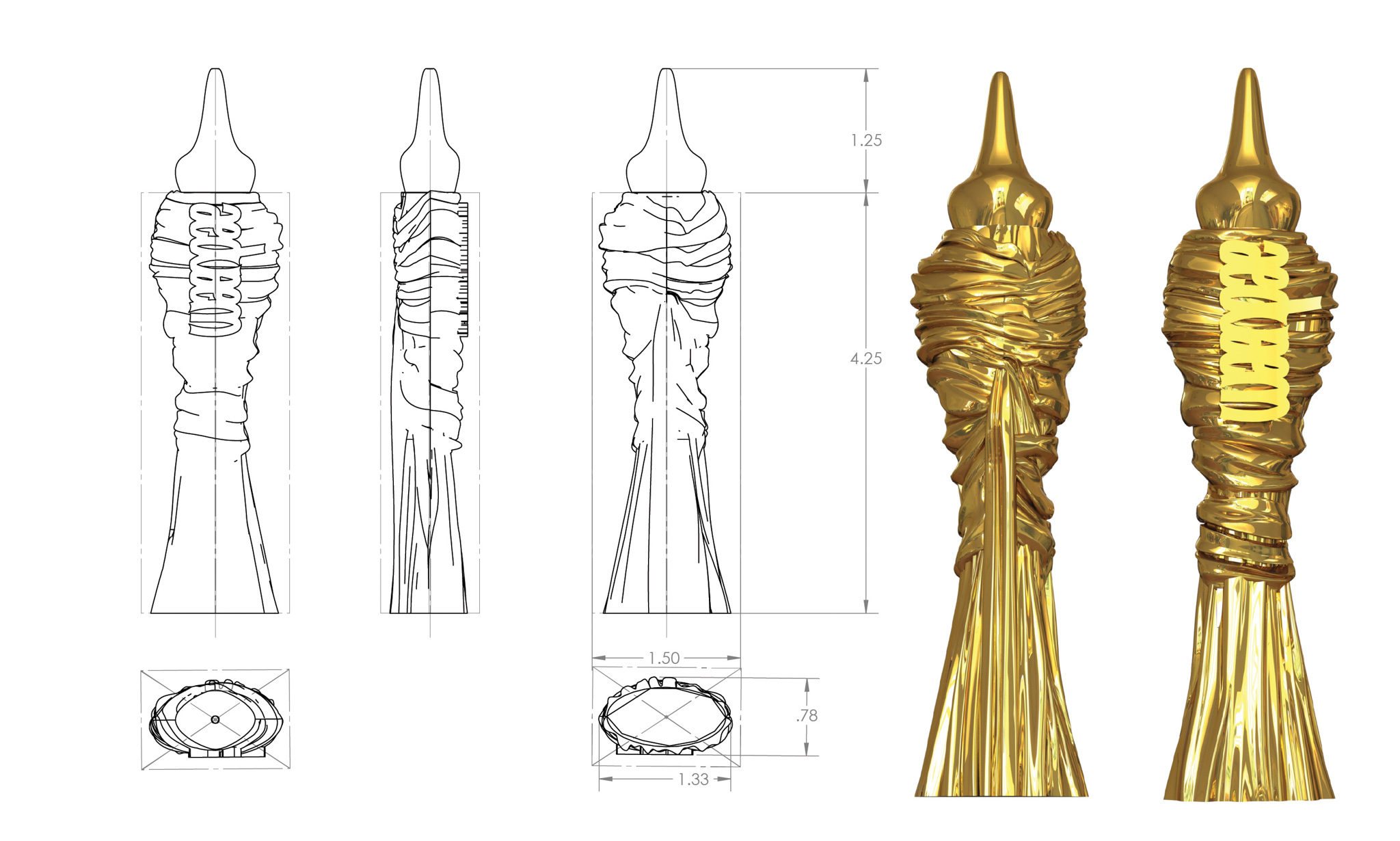
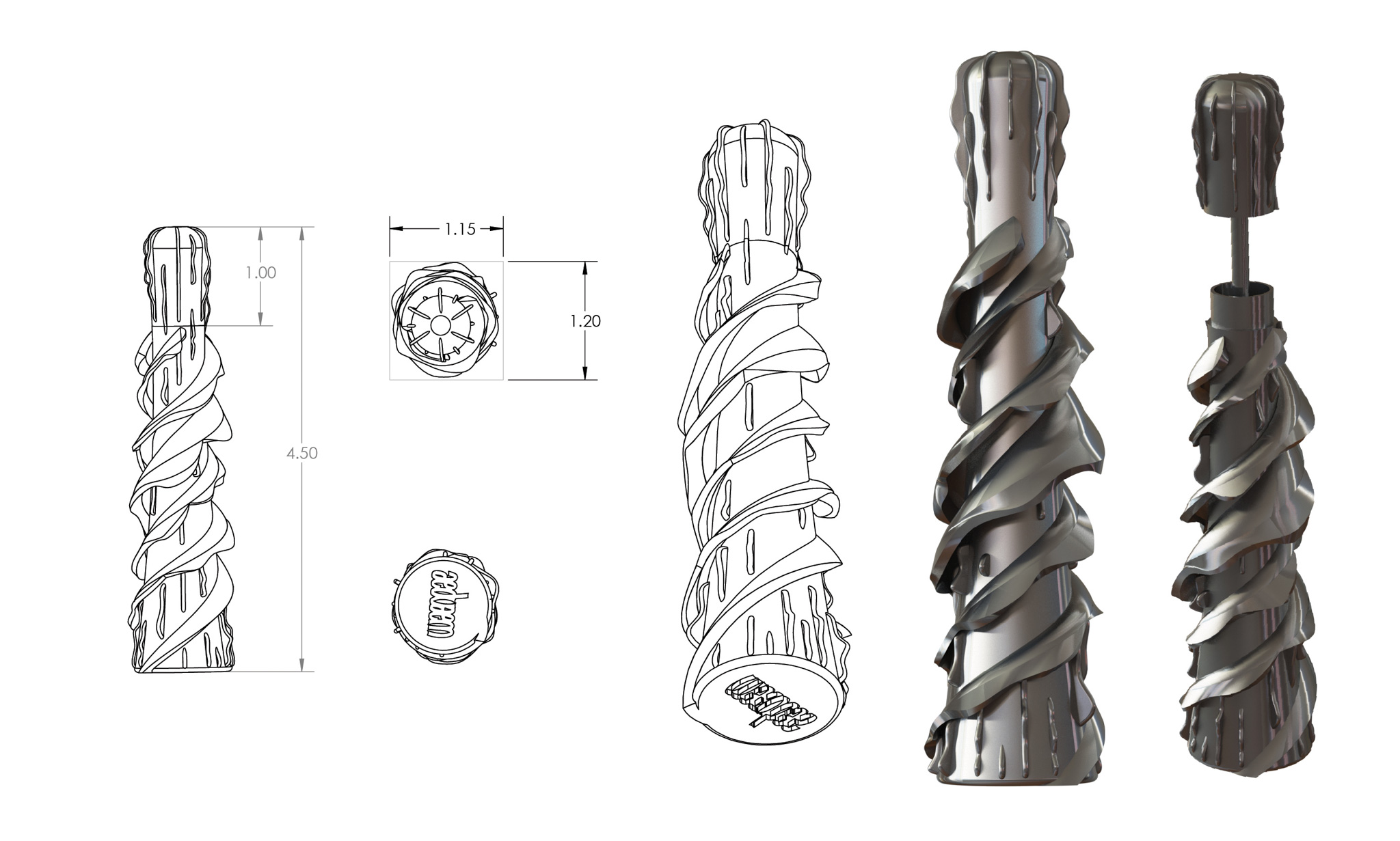
Liquid Eyeliner & Lip Gloss
The primary packages of eyeliner and lipgloss are designed in feminine forms, inspired by drapery and curvy forms. They are in gold and gunmetal which are portraying a masculine feeling. For the secondary packages, patterns made of straight lines, geometric shapes, and photos of metal are used to decorate based on male preference.
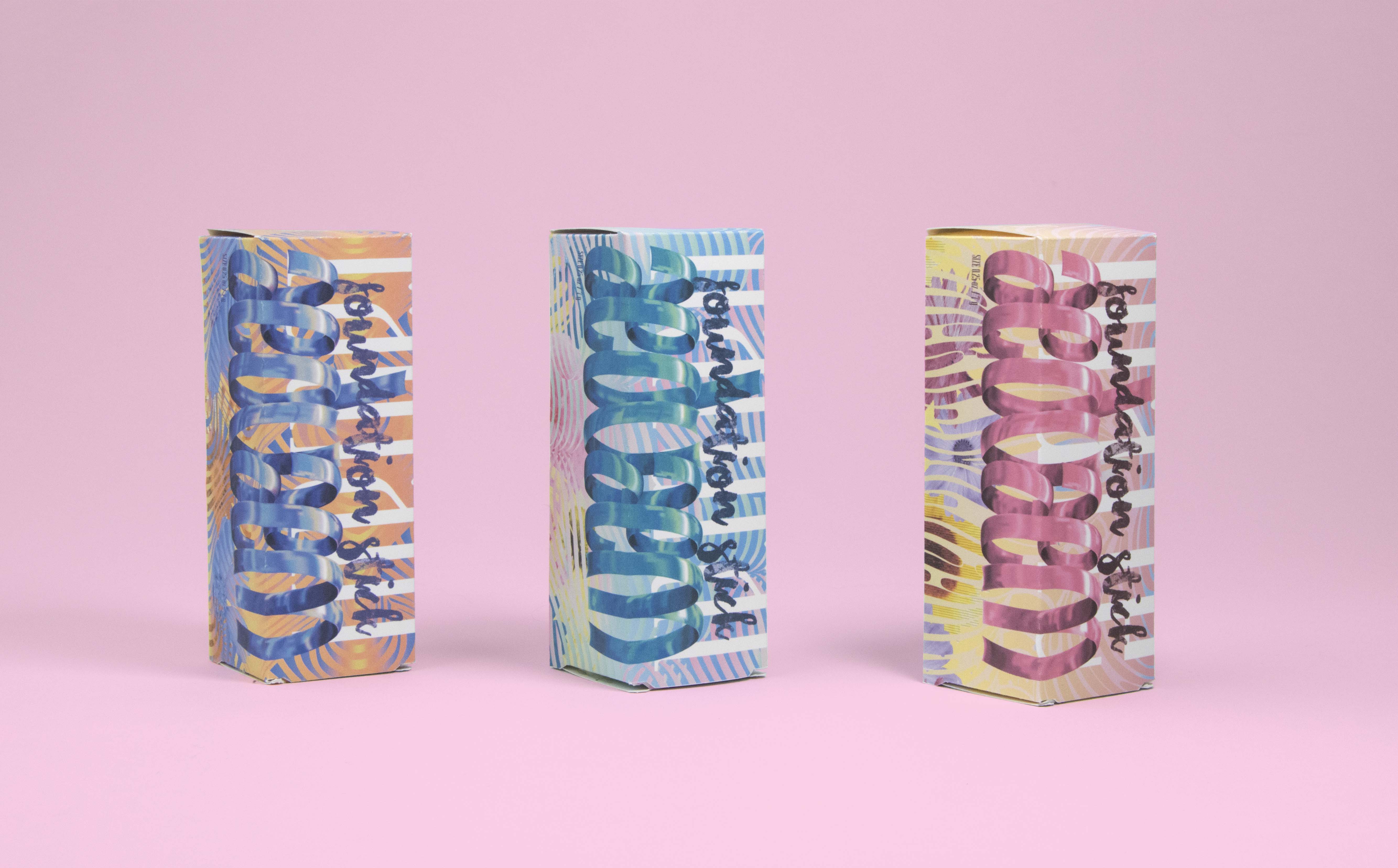
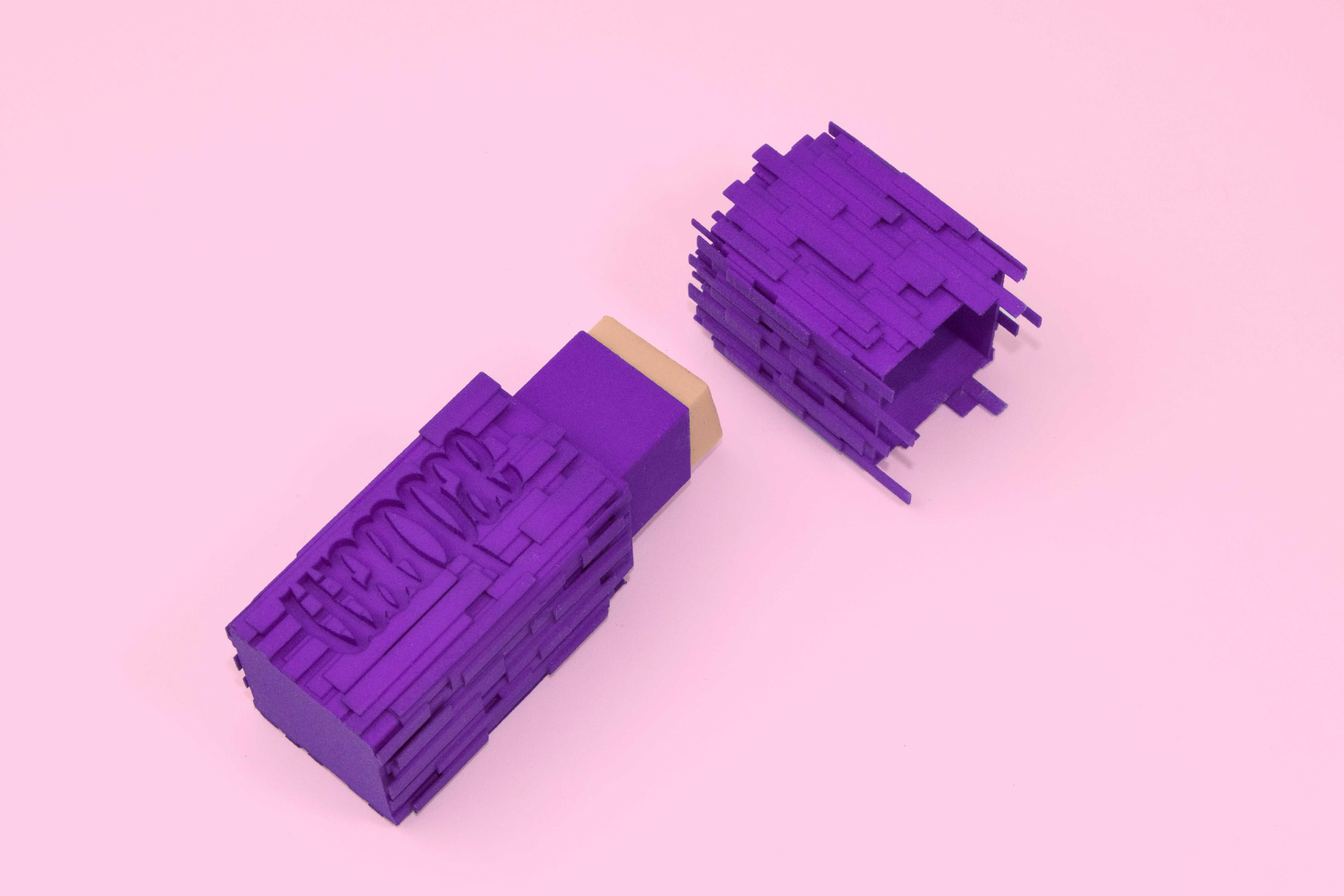
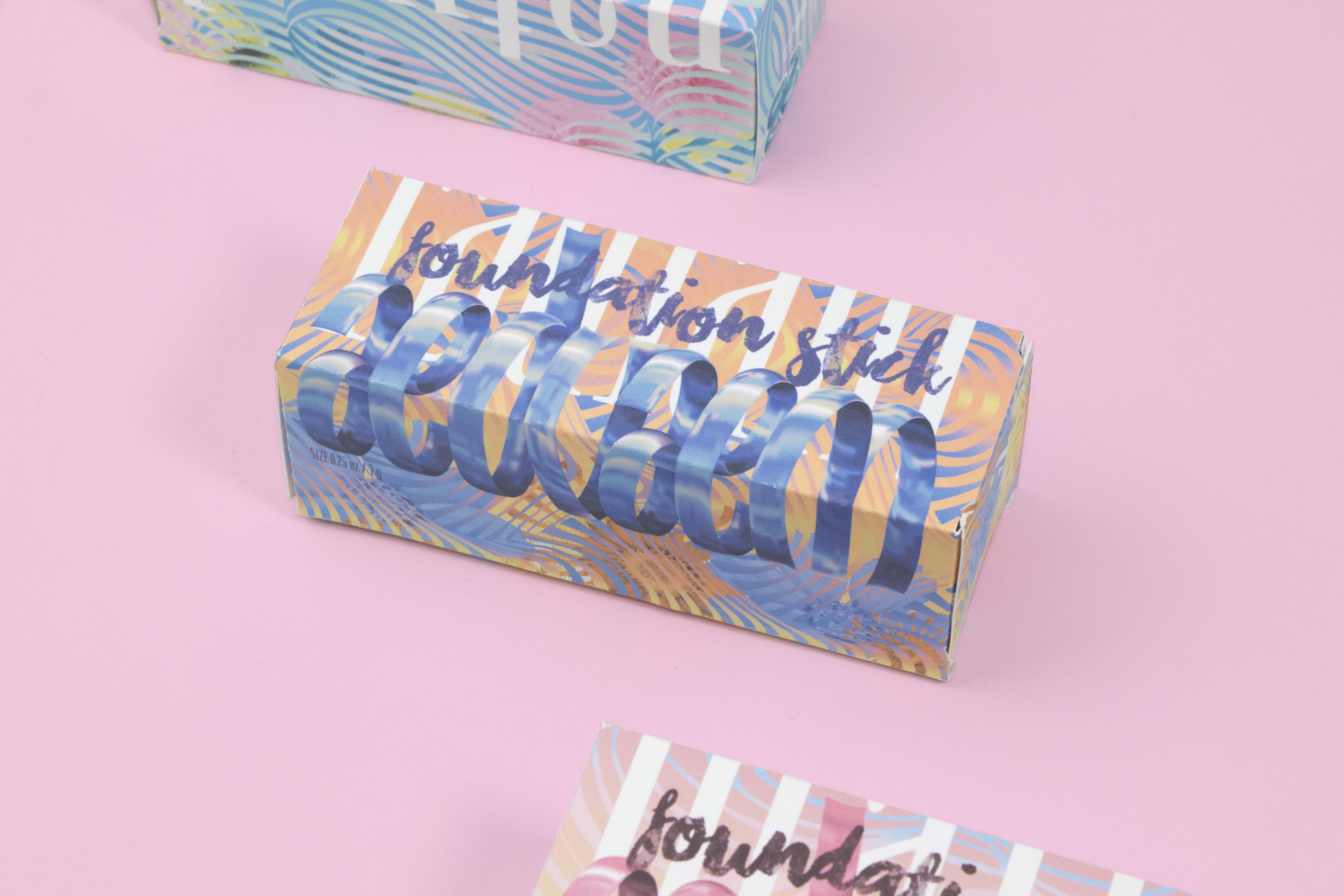
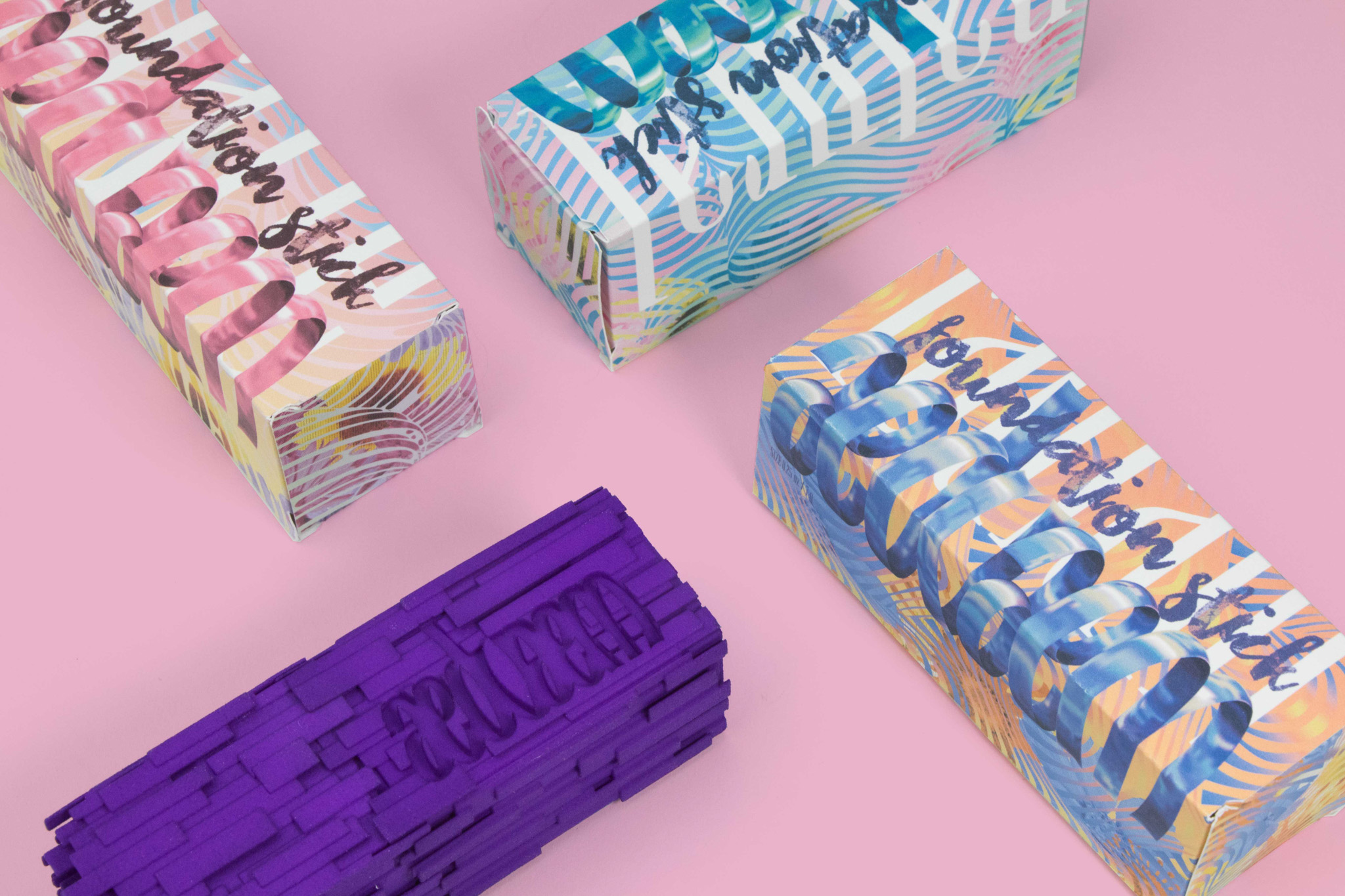
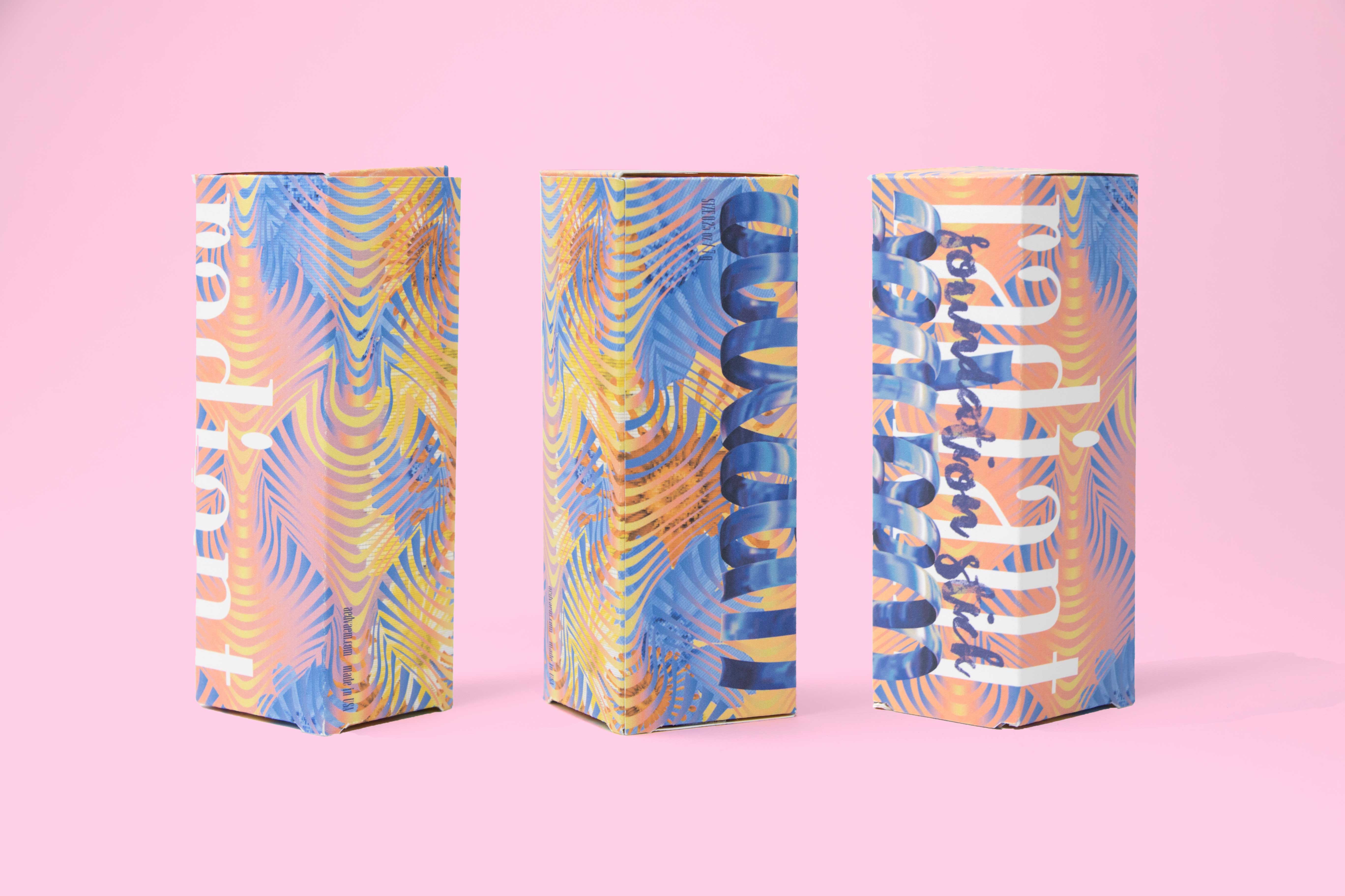
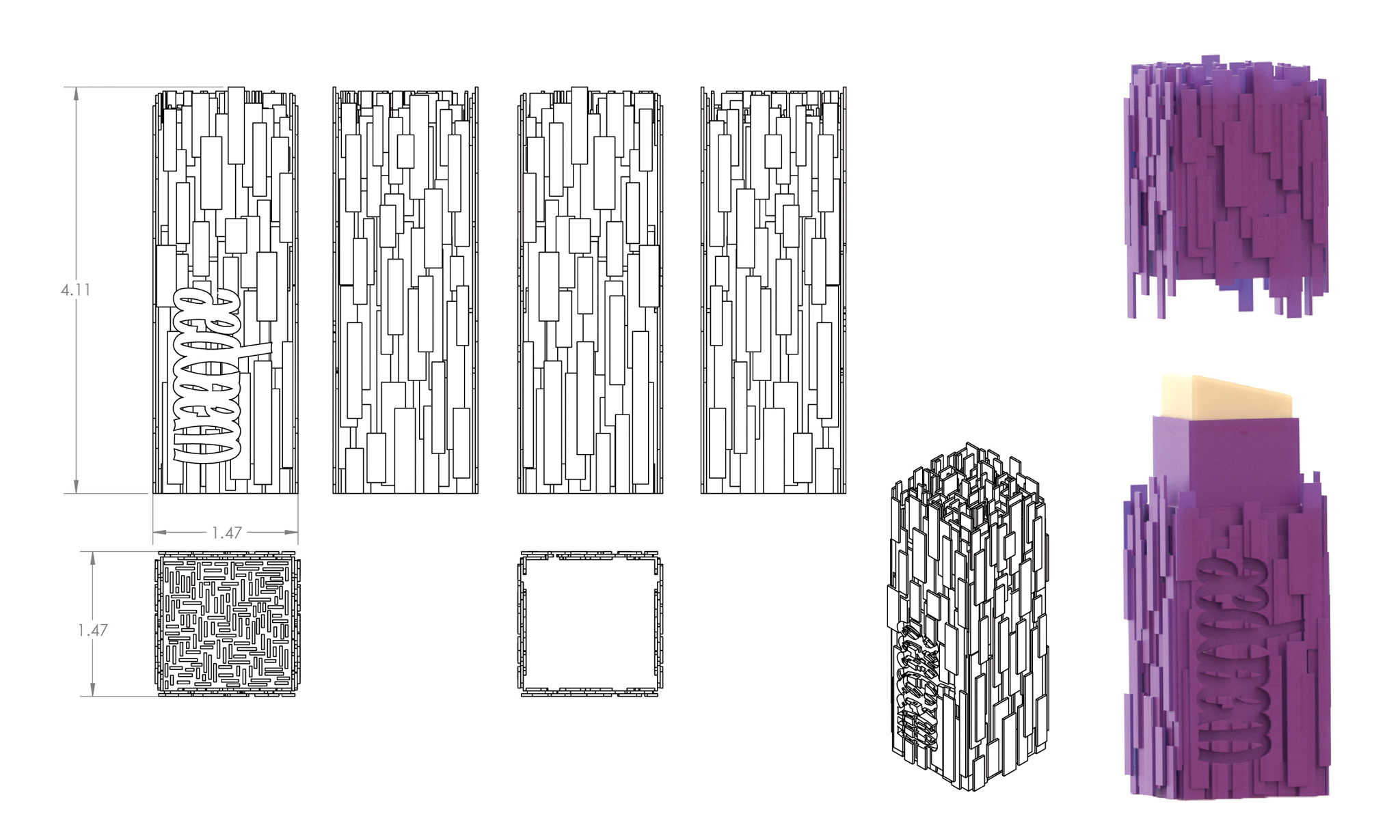
Foundation Stick
The foundation stick is packaged in an upright cuboid form with rectangular textures. It is in purple which is the least preferred color for males. The secondary packages are in pastel gradient with feminine typefaces and organic patterns, photo collages of flowers are also used.
Skincare for All Genders
Moisturizer
The primary package of the moisturizer is designed based on male preference, which is cubic shape according to my research. The whole package is covered with a texture made of straight lines. A female-preferred color, pink, is chosen to create a gender-ambiguous perception.
The secondary packages are designed depending on female preference. Condensed, hand script and gothic typefaces are used since they are usually associated with femininity. Cones, spheres, and organic shapes are used as patterns. Iridescent effect background and pastel color tones are also added as decorated elements.
Face Wash
As for face wash, the primary package is designed based on female preference—an organic form with sphere cutouts. It is in blue to create a multi-gender feeling. The secondary packages are designed based on male preferences. Typewriter fonts, typefaces with hard edges, and rigid forms are used. Rectangular and cube patterns and glitch effect backgrounds are used as male-preferred decorated elements.